Kraft typeface

Overview   Process  

Problem. Design a simple rough typeface.

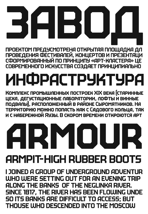
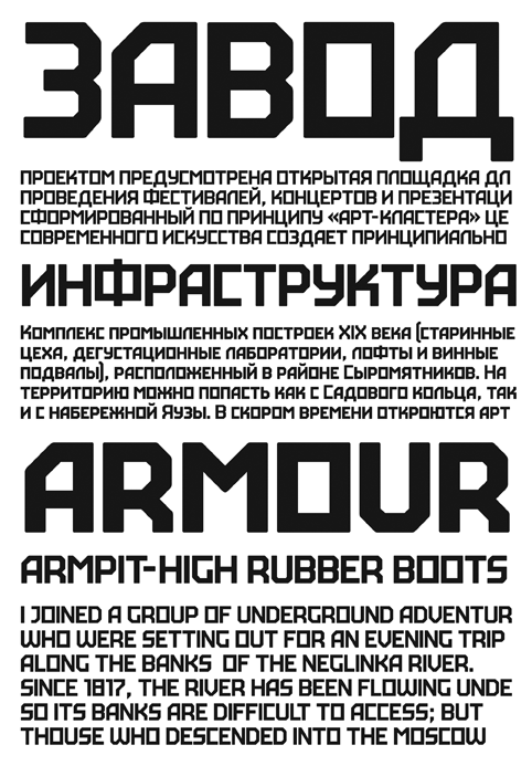
Kraft is a rough industrial sans serif meant for setting text in all caps. Instead of lowercase letters there are capitals of smaller height but with the same stroke width. They make tighter type.

kraft ver1
kraft ver2
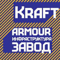
Main and alternative sets

Letter spacing is very tight, which creates the visual rhythm of very narrow and very wide openings.


Irina Smirnova


«
The wide strokes of the letterforms allow them to serve as picture frames or wear different textures. The perfect fit would be imitations of any coarse surfaces. You can freely play with this type by breaking, crumbing, scratching the letters, or turning them into stencils on concrete.»


I want to be yours

Kraft

Online price:  32.39  $
  ≈ 30  €
  ≈ 2999  руб.


Release date: February 06 2008

Cast:

artistic director
art director
designer
manager

Font use example


Order a design...