Making of Yandex Mail 7.0
Overview Process
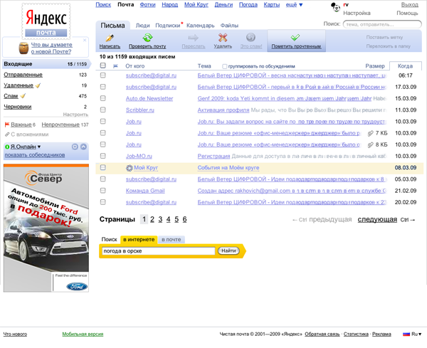
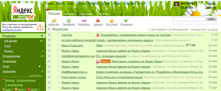
It all began with the header. We tried to bring together all message actions. Extras, such as calendar and search tool, were made separate tabs.
We tried various header designs.
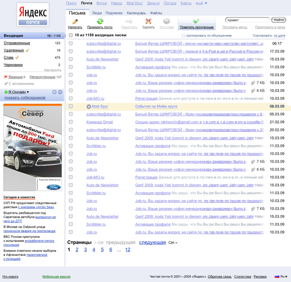
It grew larger and absorbed the column headings.
Back to smaller size, with added awesome gradient hover feature. Everyone seemed to like that, design approved.
We kept thinking and tried the inverse.
Right on.
Along the way, we redesigned the box on the left. We marked the currently open folder with an arrow pointing to the list of messages. Both folders and marks were meant to organize the mess, so we brought them together.
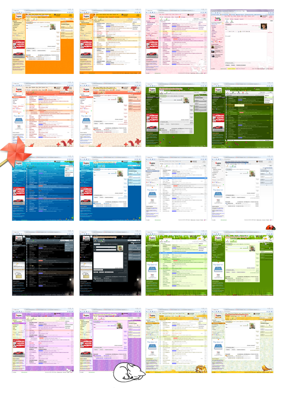
All done with the interface, off to design. We created a rich variety of backgrounds.
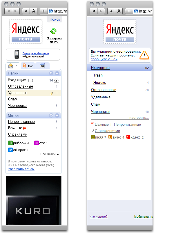
Old version icons obviously wouldn’t work. The new ones had to fit into the new interface without being loud. Here came the transparent set that would get highlighted on mouse over and look good against various backgrounds.
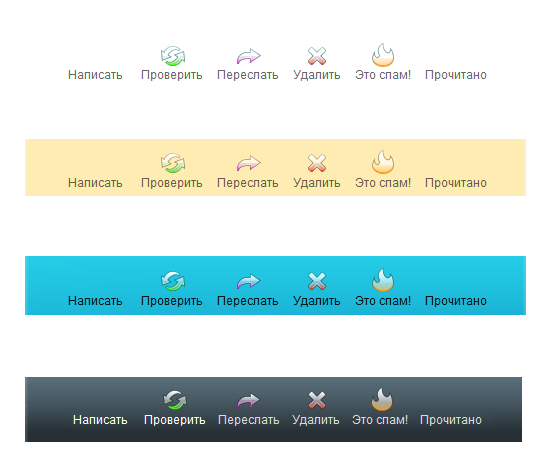
It proved okay, but what about a light background? The icons appeared too pale.
So we tried a brighter design.
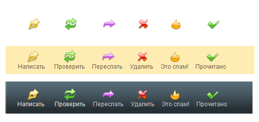
But that would be too much color.
We went for single color icons, using the same color for similar actions.
Further we went to arrive at the final design.

Everyone liked it. Then came the smileys.
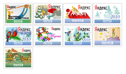
And stamps to decorate Yandex Mail for holidays.