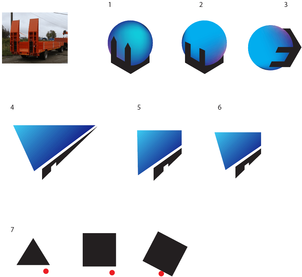
Client: We move non-standard freight. Primarily vessels, yachts, modular buildings. The load has to be of a very big size. We employ both sea and truck transport.
Requirements for the logo. An image that would look good on trucks. The logo should reflect our business: transportation of very large, non-standard but not very heavy loads, should point out the exclusive character and uniqueness of our services and the premium class in logistics of large freights (big yachts, vessels, expensive equipment, etc.). Black and white color scheme or something close to it, it’s important not to have too many colors or an excessively complex geometry.
Requirements for the identity. We need a livery style for trucks pulling low-bed trailers for tall large loads (important: there are no tents on the flatbeds!!!) and one piece of the driver’s uniform (windbreaker, hat, t-shirt, gloves, anything you like). And also a souvenir of some kind.
The rest is up to you.
Getting started.
Art director: No.
Second designer: Geometric letters + non-standard loads.
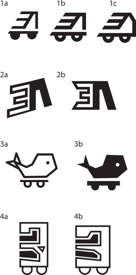
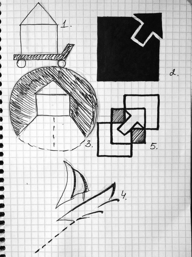
Second designer: Another idea: letters Э and Л, an arrow and a truck.
Art director: No, that’s not it.
Third designer:
Art director: More.
Fourth designer:
Art director: Do you want to make it into the Best Logos of 1978 list?
Third designer:
Art director: No.
Second designer:
Art director: No.
Third designer:
Art director: Wrong direction.
Second designer: Large non-standard freights.
Art director: No.
Third designer: Impossible objects.
Art director: No.
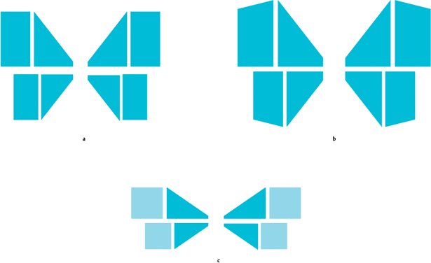
Third designer: A butterfly made of cargo. Handling something massive with a light touch.
Art director: At least it’s an interesting idea.
Second designer:
Art director: The first ones aren’t trashy enough. The bottom ones look like the ant was crashed.
Third designer: To follow up, a butterfly made of arrows and a route with letters.
Art director: No.
Second designer: Delivering cargo from one point to another by sea and land + exclusivity = outline of a star.
Art director: No.
First designer:
Art director: No.
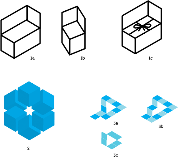
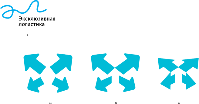
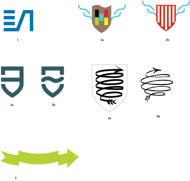
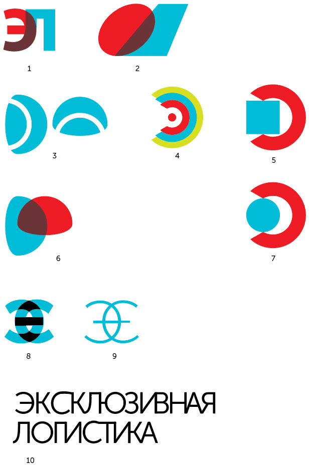
Third designer: 2. Heraldic shield + a ship’s bow. 3. + the letter Э. 4. A complex calligraphic arrow in the shape of a shield or a sphere. 5. Heraldic ribbon + arrow.
Art director: No.
First designer:
Art director: No.
First designer:
Art director: No.
Second designer: What if we make the emphasis on exclusivity? A crown, a rotated Э on its head and a platform for the load.
Art director: Looks like it has some Hindu roots.
Third designer:
Art director: No.
Fifth designer: Large exclusive cargo. Variants with blue are for sea transportation.
Art director: No.
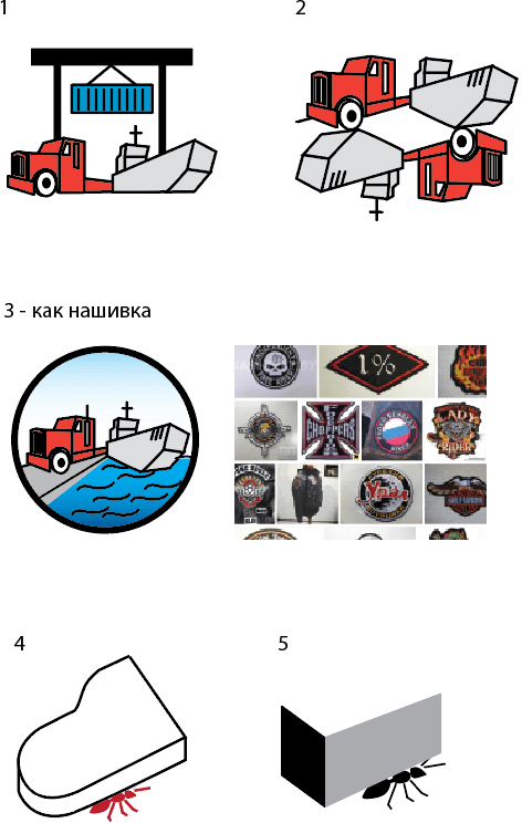
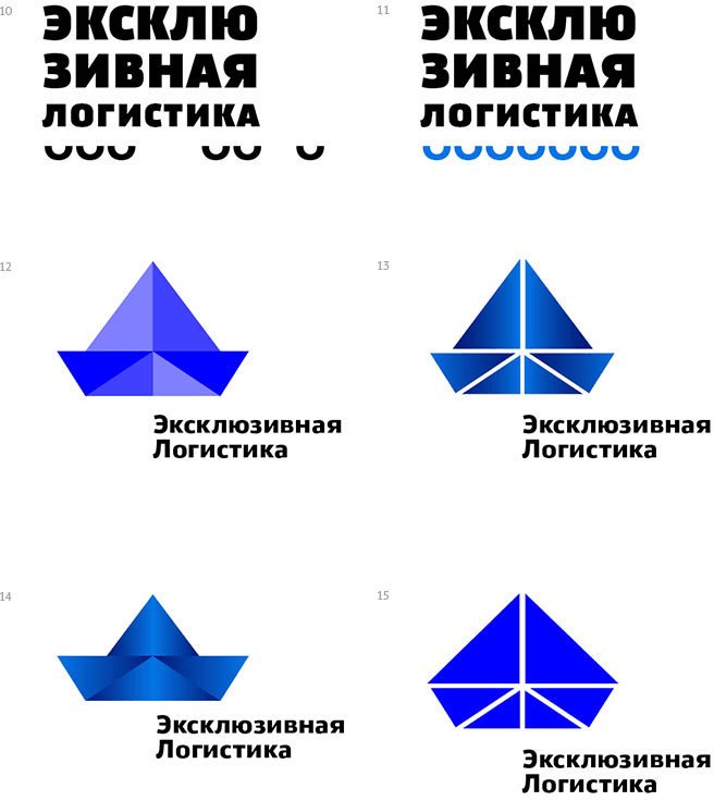
Fifth designer: A paper boat: moving ships with ease. A crowned stone: expensive loads, exclusivity. Plus a couple more ideas about a large load on a platform and on water.
Art director: No.
Third designer:
Art director: Not what they’re about.
Fifth designer: Left to right: 16, 17, 18, 19.
Art director: But it’s simply not cool enough. Guys, read the task over again.
Sixth designer: Hi) I read it and for some reason instantly thought about a kite. It’s dimensional, light, modular. Here.
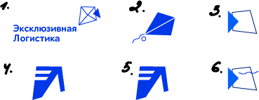
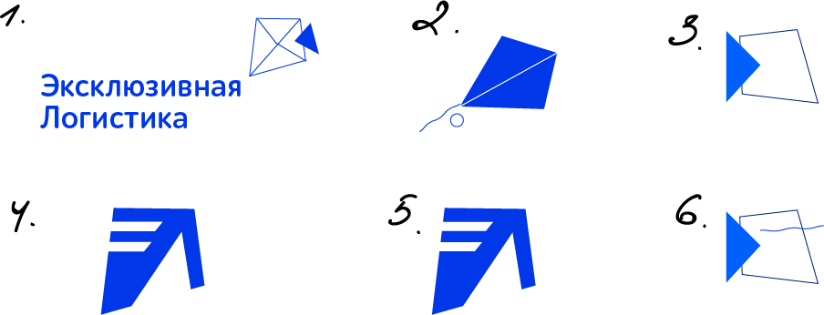
Art director: But it doesn’t look like some sort of a logistic heroic deed.
Sixth designer: What about the image of a bird? Plus the first letters of the name.
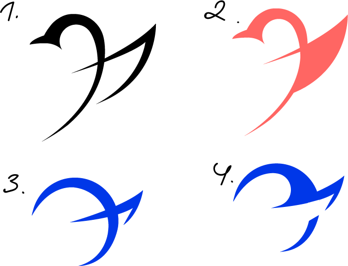
Art director: No.
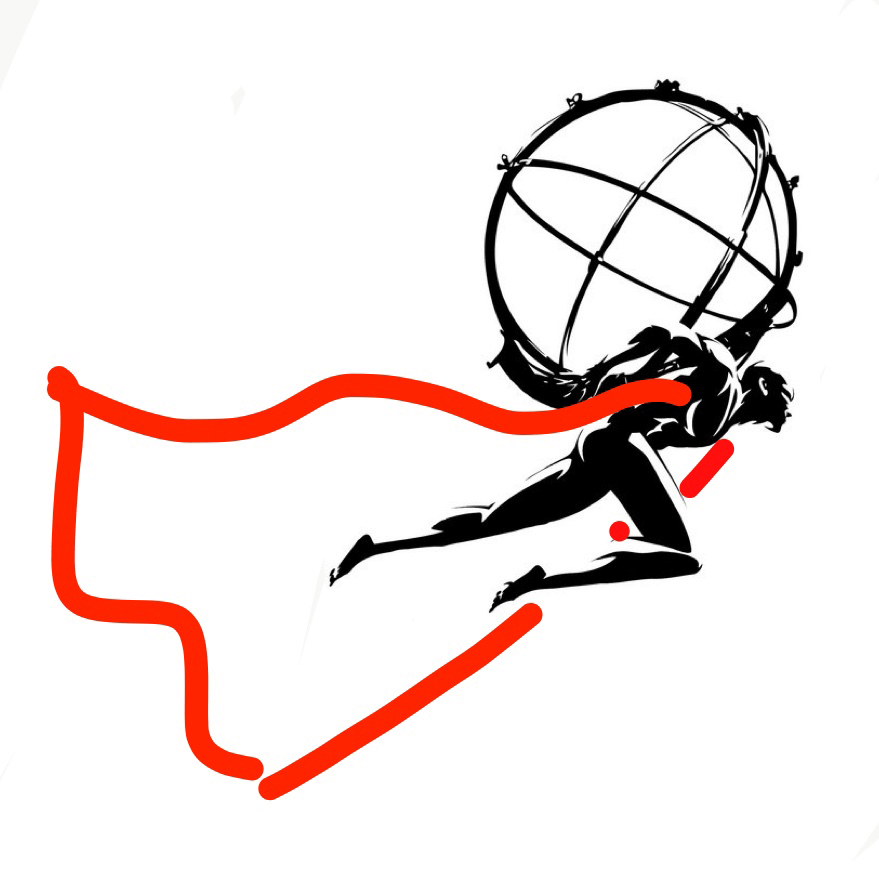
Third designer: A super hero Atlas?
Art director: No.
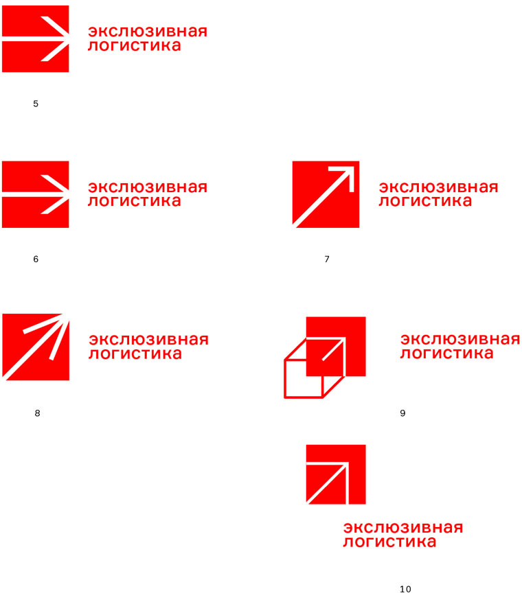
Seventh designer: Maybe, the magic carpet would work? It’s low, exclusive, will deliver anything anywhere. Or we can simply draw a flatbed using the letters.
Art director: No.
Third designer: In collaboration with Anna Balabas.
Art director: Delovie Linii, a stop sign and a torn tablecloth? Are you serious?
Fourth designer: The first one looks a lot like Dessa Decor logo https://www.artlebedev.com/dessa-decor/.
Third designer:
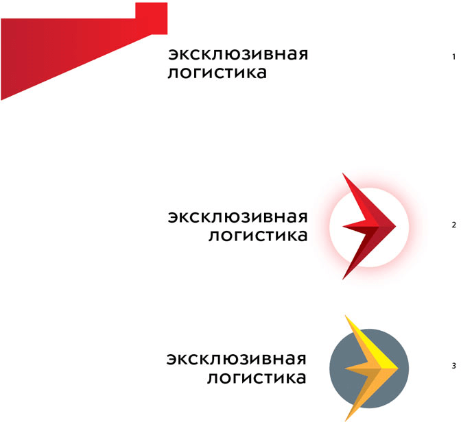
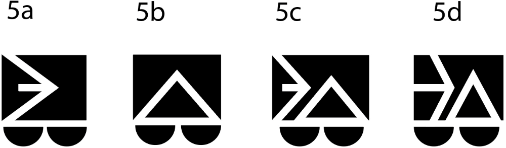
Art director: Try to put the white fat arrow in the center of the red square.
Third designer:
Art director: No, without that thing on the left. Something like 2 but with the arrow’s beams not filling the full height of the square.
Third designer: By the way, this is starting to look like the letter E, as in exclusive.
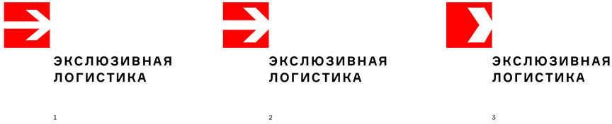
Art director: No shit. Now let’s try to have the arrow thinner.
Third designer:
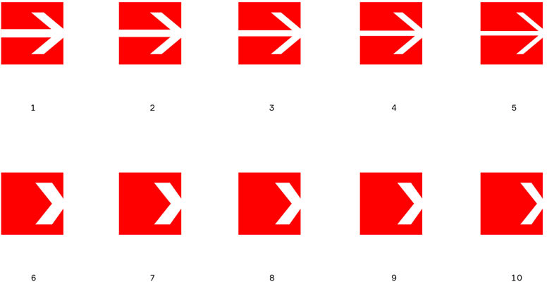
Art director: Try number 5. And also try to make the arrow smaller. And point it straight into the top right corner.
Third designer:
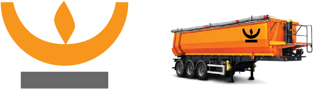
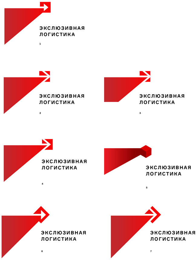
Art director: That’s it. That’s what the logo should be. Now we just need to add the text properly (and with no typos).
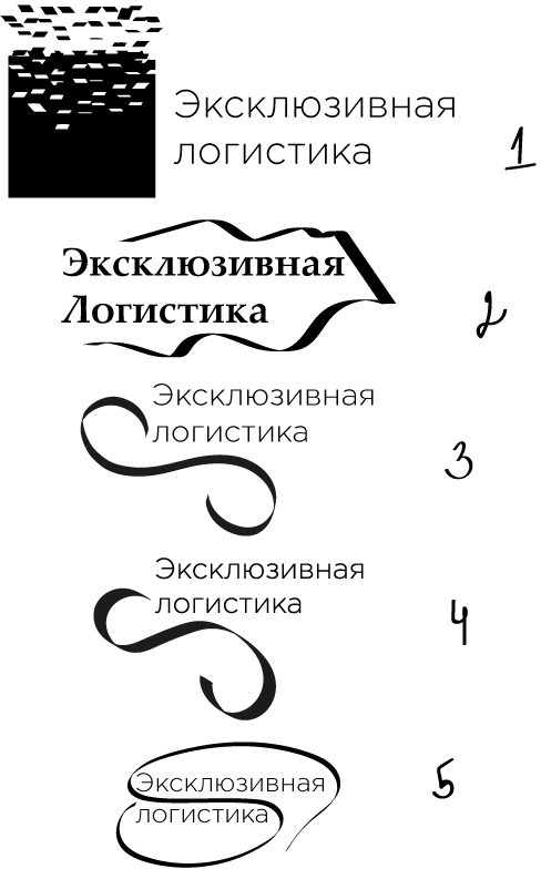
Third designer: The text should probably be positioned in some interesting way, since the symbol is so simple?
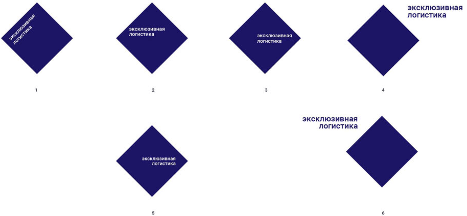
Art director: No, it should be exactly the way text usually is on good logos.
Third designer:
Art director: That’s what the text looks like on bad logos.
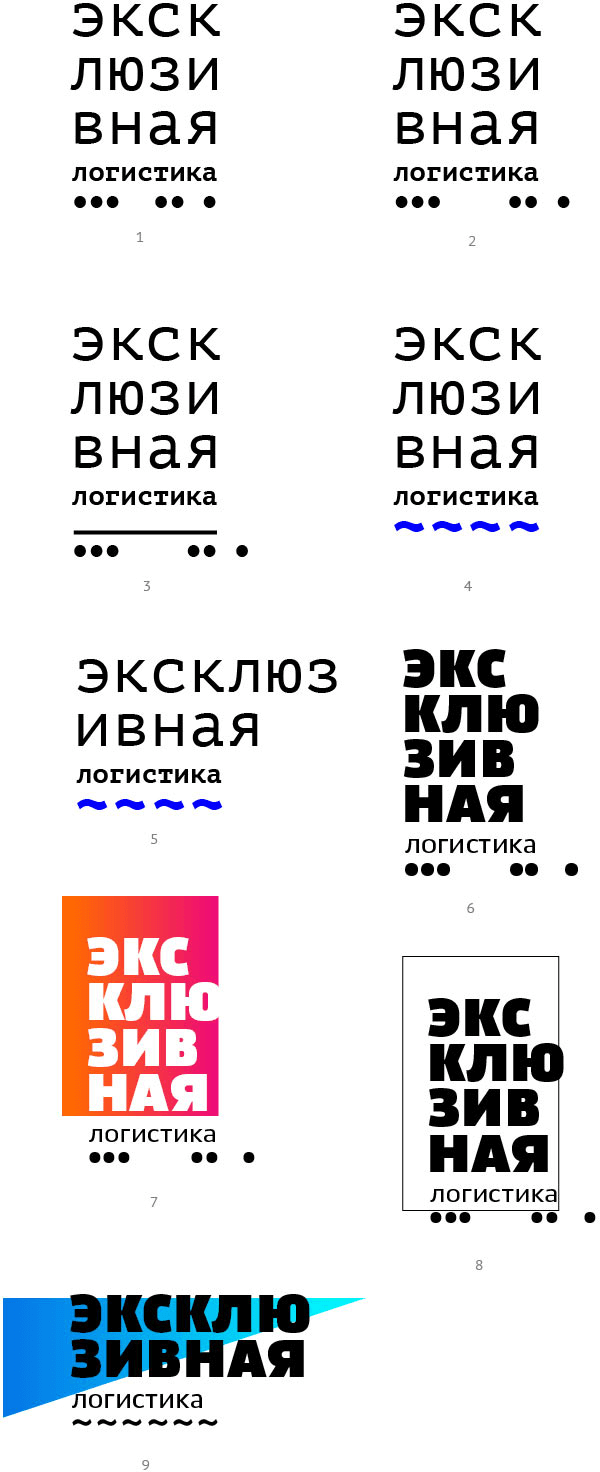
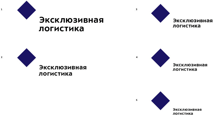
Third designer: The classic spacious layout and large margins.
Art director: It’s a logistics company, not a jewelry store.
Third designer: Dense typesetting and a slight slant.
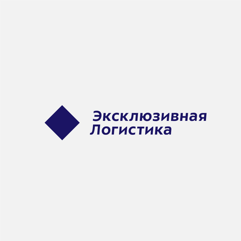
Art director: The text is positioned poorly. There should be no slant. The second word should start with a lowercase letter.
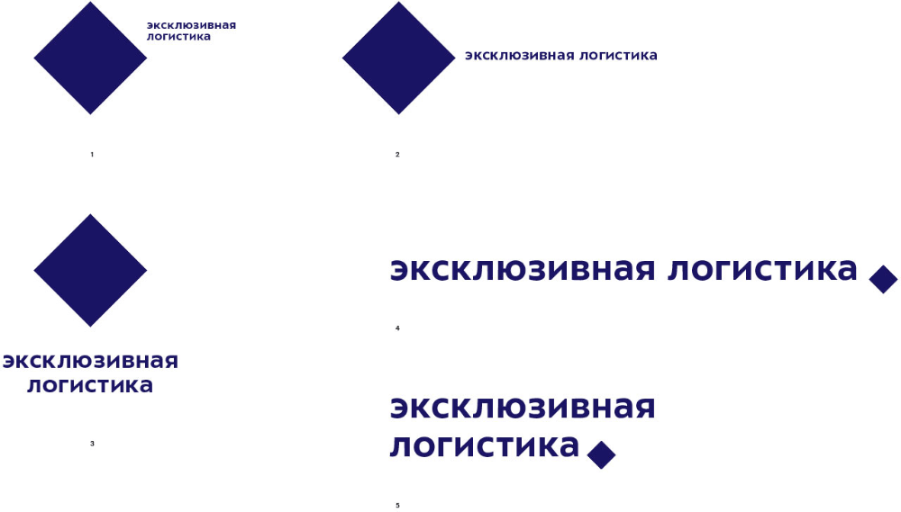
Third designer:
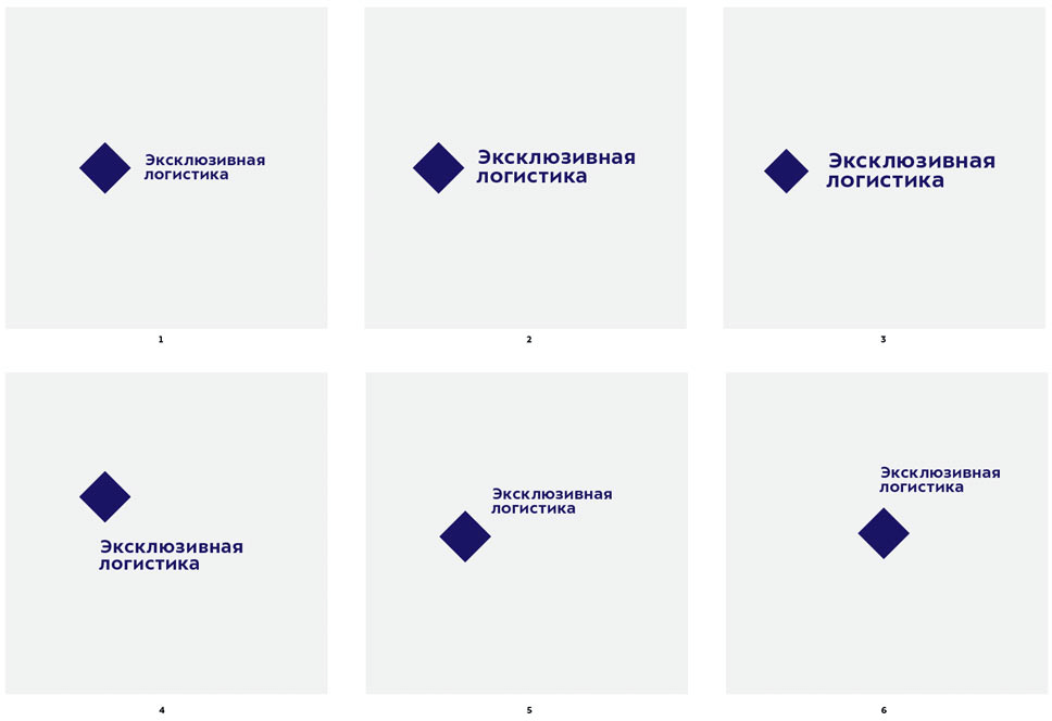
Art director: The text should be at the bottom right corner. Now search for its size.
Third designer:
Art director: Yes, this is better. Now try different sizes.
Third designer:
Art director: Go with 4 but bring the text up higher.
Third designer:
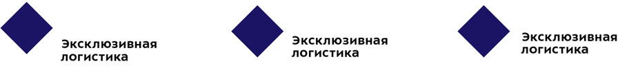
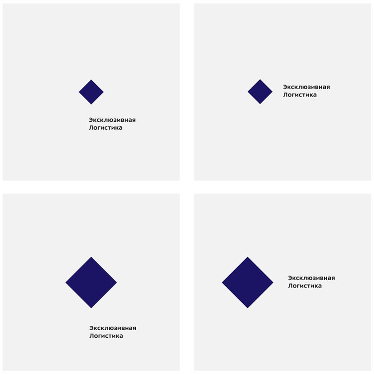
Art director: The one on the right.
