Client: We are a small and poor company called Expecto (expecto.me). We help other small and poor companies spend less money on search engine advertising. Simply put, we designed an online platform for small business with a very simple interface that allows users to automatically generate search ads, manage them and track everything that owners of small companies usually need to know about advertising: how much does each customer cost and where do they come from. And when we learned that some small business owners keep customer lists in Excel or (God forbid) in a notebook, we added a simple CRM to the website. Out target audience are small poor businesses from small and poor regions, plucked by freelancers, dumped by agencies and disappointed in information marketing specialists. If you choose us, you will help the small and poor Expecto and all our small and poor clients by translating the simplicity of our service through your design. Triple kindness :)
Our main requirements:
1. To keep the color (blue).
2. The logo should reflect the company’s name (‘Expecto patronum’ is a spell from Harry Potter that summoned a magic moose. The moose was the only good thing that the young wizard had.) In Latin translation, ‘expecto’ means ‘waiting for the miracle’.
3. In this perspective, we want to present our platform to our clients and partners as something magical (because everything is fast and very simple).
We would like to avoid large blocks of black in the logo.
Designers: A deer and magic.
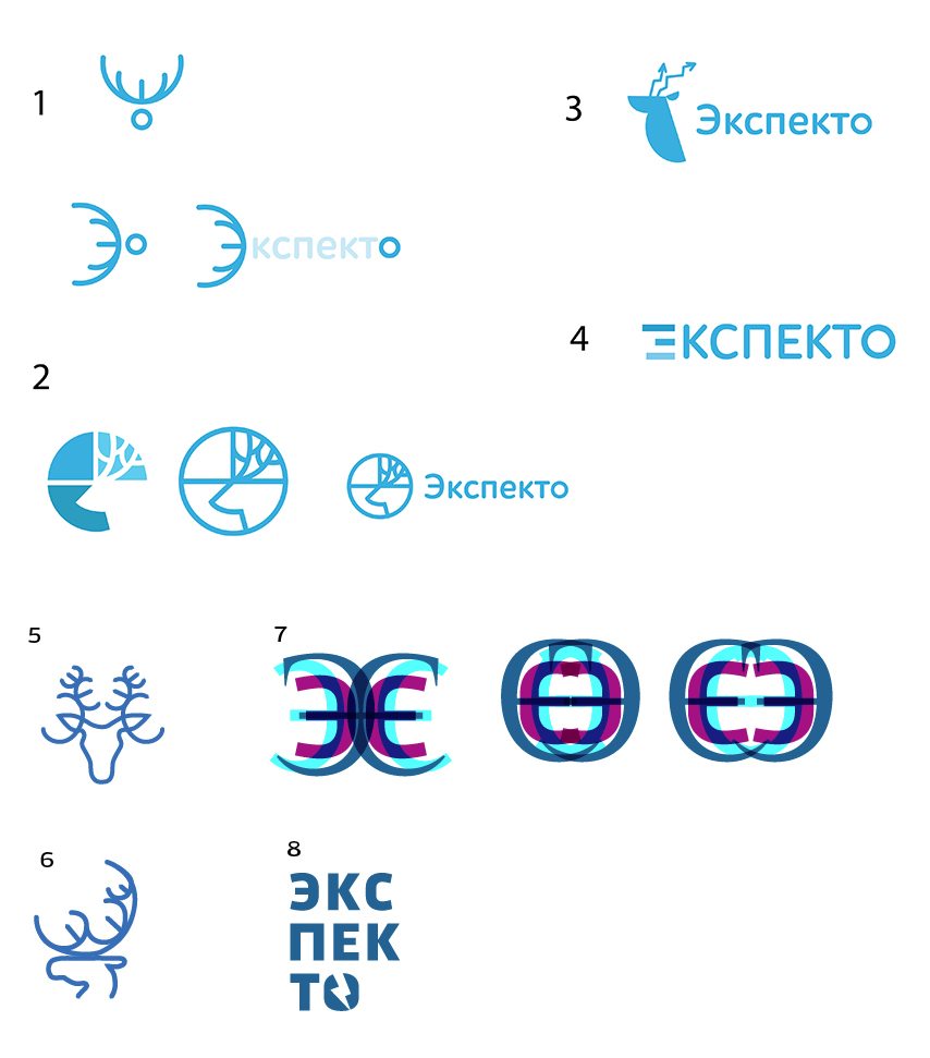
Art director: Number 5 is OK. But I don’t recognize a moose in the outline. It looks more like a deer or a donkey.
Designer: The thing is, Potter’s patronus is a deer, not a moose. Make a moose anyway?
Art director: Hmm... Good point. Let it be a deer then :-)
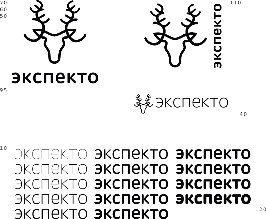
Sending the logo to the type designer to create the text.
Designing style elements and choosing colors.
Done.
