The making of the J.S. Antel website
Meeting with the client, exploring the manufacturing process and setting tasks.
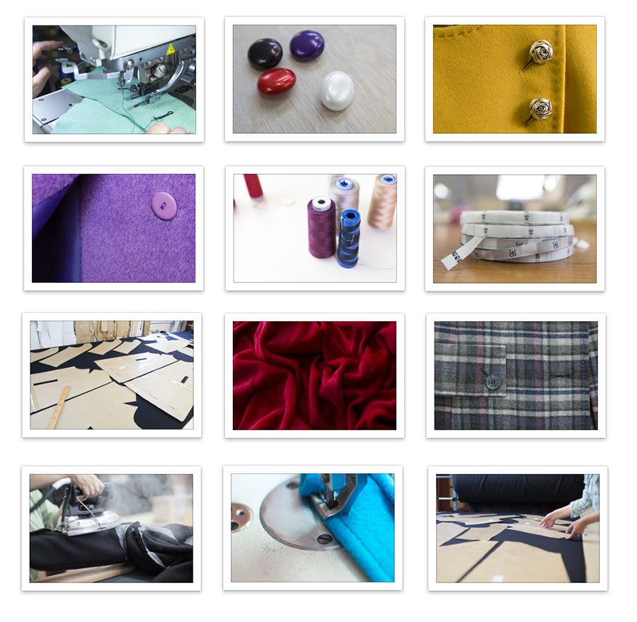
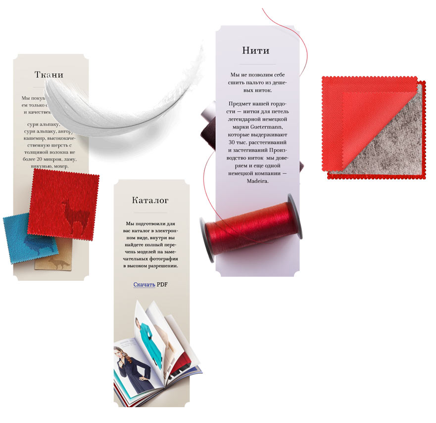
During the meeting, the client strikes us with extreme attention to product quality: everything, from the choice of the upper material to design of buttons and quality of the thread is carefully controlled by designers and managers of the company. The core audience of the website will be made of wholesale buyers and outlets’ representatives.
The first part of the task: we need to explore the idea of attention to quality on the website. The second part: the website has to be a simple and functional tool for viewing current collections.
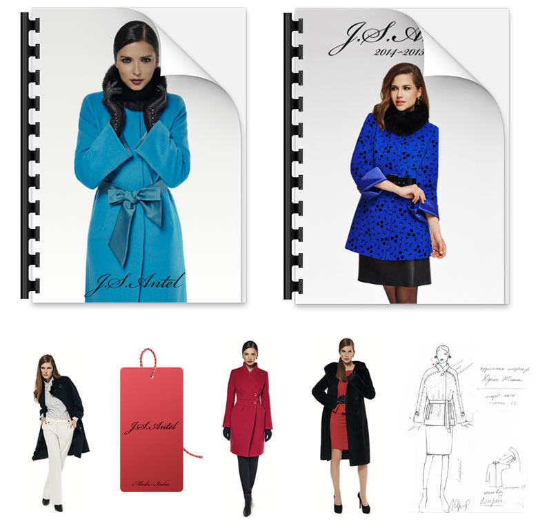
This is the first version of the company’s website, which means we will be starting from scratch. Looking at the brand’s printed catalogs, labels and sketches.
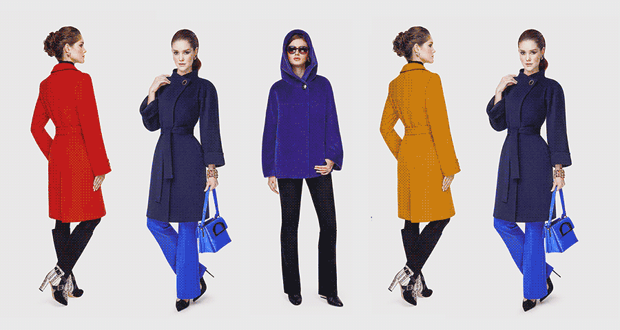
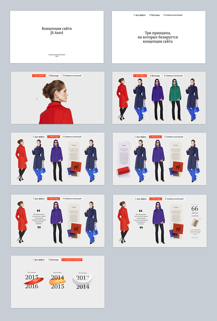
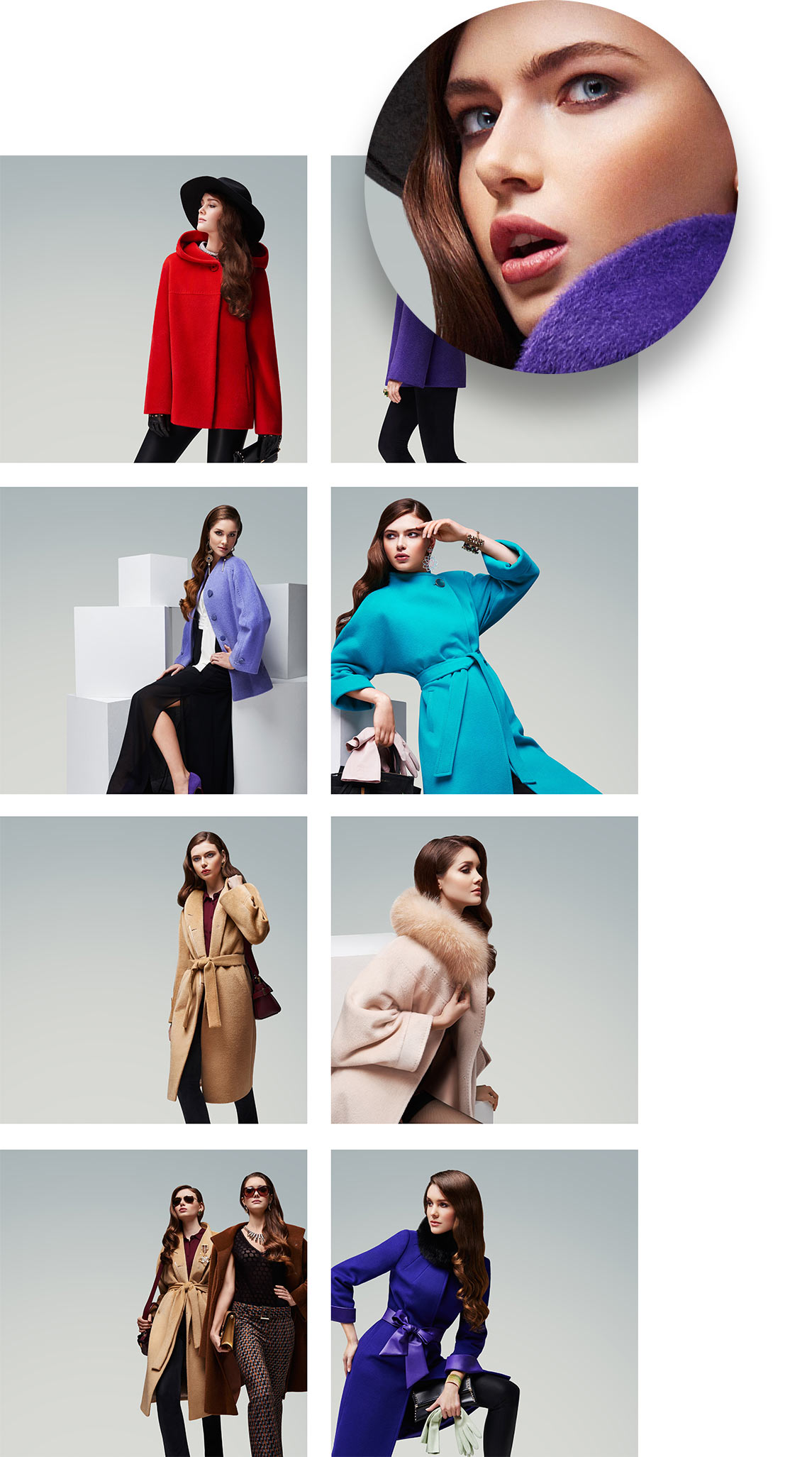
Creating a website map and starting to generate drafts. By the time the website is ready, the 2015–2016 collection will be launched. Taking the first retouched photos from the catalog and putting them on the canvas together with product cards. Deciding to add trivia about manufacturing to break down the rhythm and share information about the production process and quality.
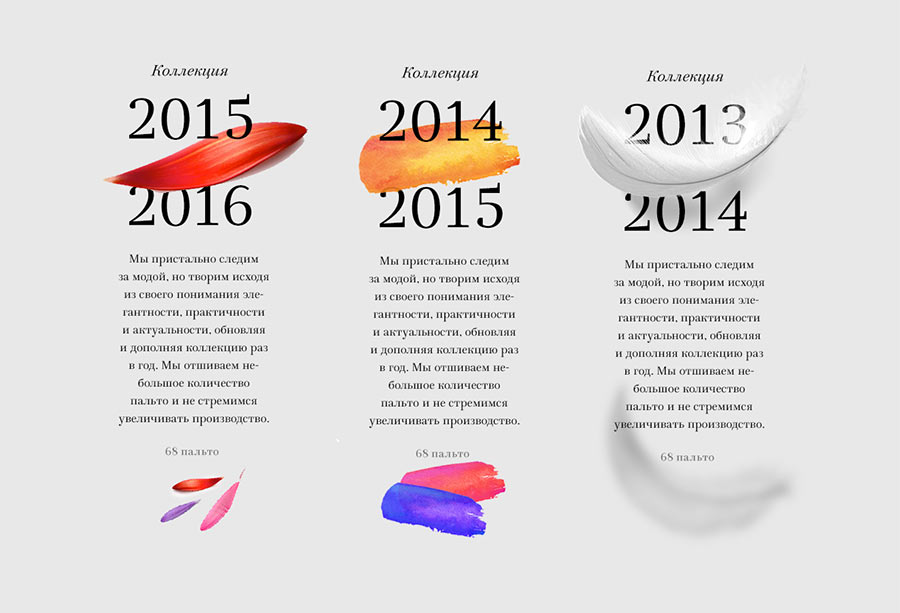
For collection identifiers, coming up with a type structure of a “2015–2016” format where the dash will be replaced by various natural images: flower petals, feathers, colors, etc.
The first drafts start to emerge. We get the idea to show pictures in maximum zoom on product cards in order to highlight the quality of the materials. To make sure the silhouette can still be seen, adding a large switch to change photo angles. All the supplementary information floats freely around the photo as trivia. Following these simple steps we turn a product card into a promo page.
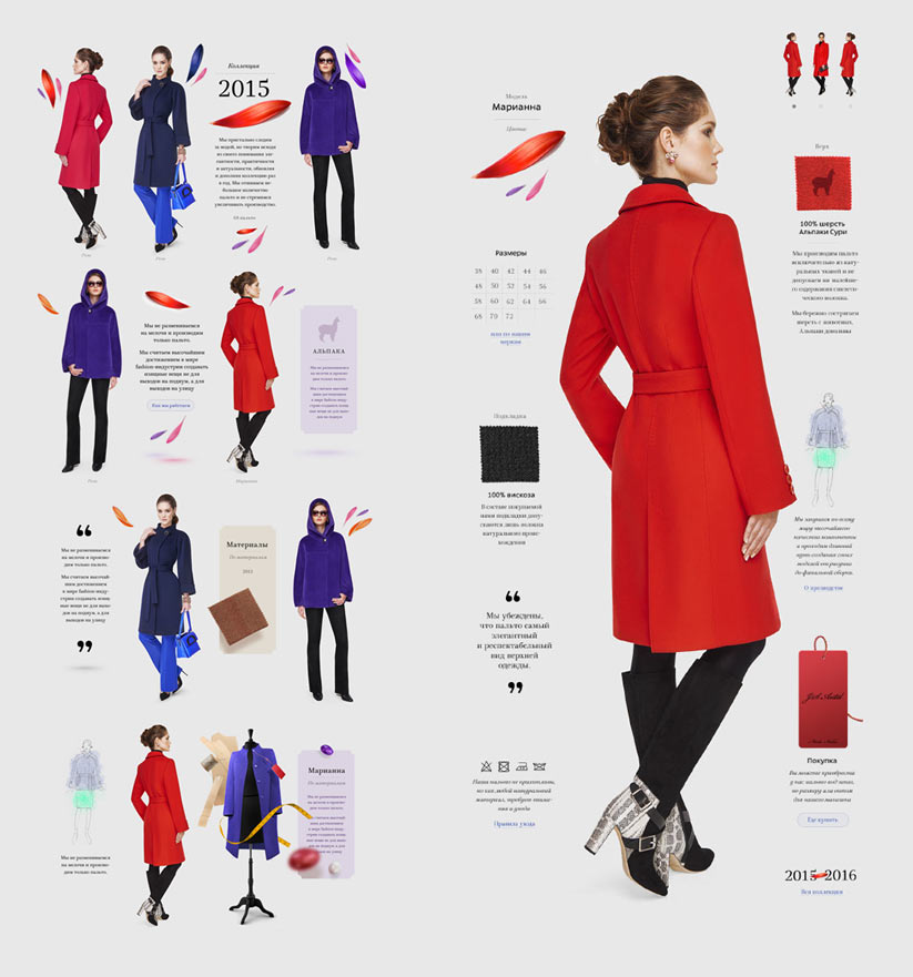
The idea with the card looks fortunate and effective. We get the idea to create an “inverted website” where one of the model cards will become the main page. At the top we’ll add the “Entire collection” hyperlink clicking on which will zoom the card out and put it in the collection grid.
The designer starts to write the code and tries the idea in the browser. Coming up with a really rad zoom effect. A magnifier is fixed at the bottom of the screen, an enlarged fragment of an image appears when scrolled through it. On mouse hover, the magnifier gets larger; scrolling further, the viewer sees the material in even more magnification. Combining this block with an additional photo switch to better direct the viewer’s attention. Neat!
Assembling ideas into a presentation and demonstrating to the client.
The client likes the ideas and the overall approach. But at the meeting we find out that the client has prepared a new lookbook for the collection and put a lot of time and effort into it. It is the company’s first lookbook and their first ideas on brand presentation. Reaching the agreement that the current concept is very functional and lacks an effective presentation of the brand, something that the client has started to develop in the new lookbook.
Taking a break to think and study the lookbook.
The lookbook and client’s brand presentation ideas change our task: now apart from being the product catalog and providing information on the quality of items, the website needs to present a brand.
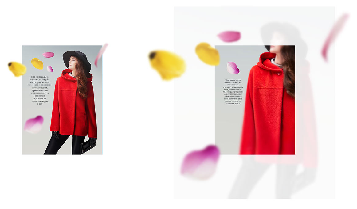
Building on the current ideas and thinking how we can create a bridge between emotional perception of the brand and its “technical specifications.” Coming up with a new story with zooming in and out. Creating a façade on the main page: a story about the brand and its values presented in a couple of sentences. Each thesis is illustrated by a picture from the lookbook. On each “level” there is a plus button. When it’s clicked, the picture zooms in and another thesis appears, this time about manufacturing and product quality. Now there are two narrative levels and a functional bridge between them: the zooming-in of the photograph.
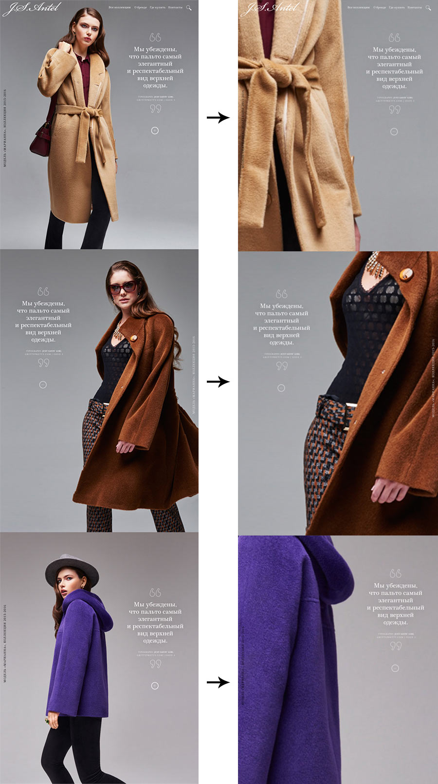
Continuing to work on design in the browser. Apart from the functional bridge, we want to find a simple visual solution that would underline the core idea. Building on the previous concept with petals and other natural objects, we come up with a way to enhance the appearance of the zoom effect. The images of petals and feathers will float around photographs on the main page. Clicking the plus button will zoom the entire composition to show that petals are made of hundreds of fine threads.
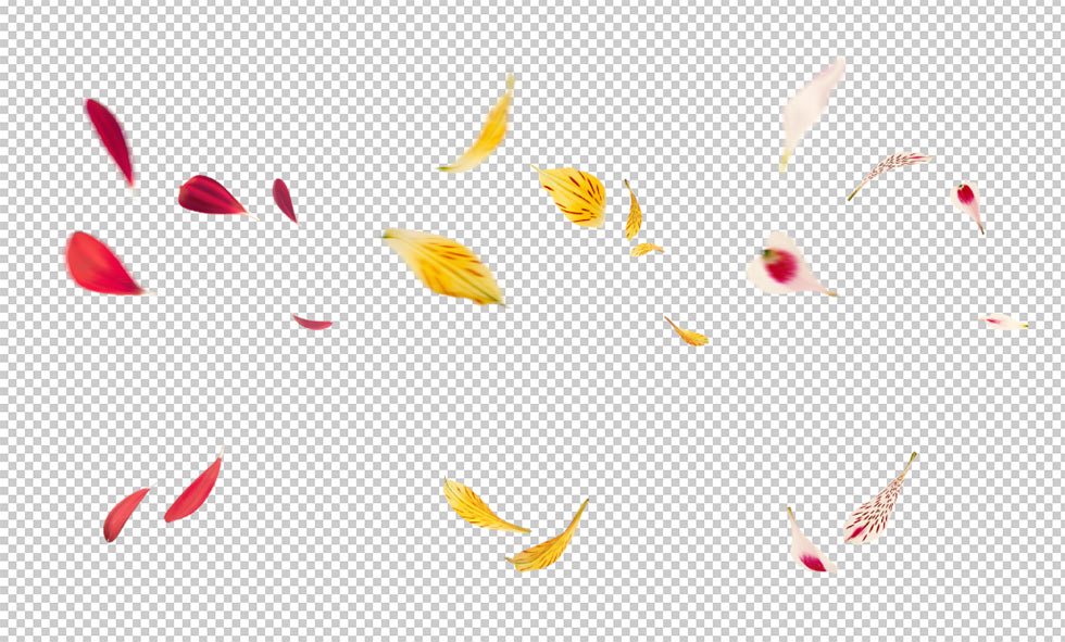
Using the petal image from the classic New Order album cover for the prototype.
Refreshing the visual language as we go, making the style stricter and the product card simpler. Fitting all gallery photos in a scrolling feed.
Presenting the idea to the client. The idea is accepted. An issue arises of the contrast between the brightness of the fragments of the first concept with its facts and petals, and the coldness of the illustrations of the second concept.
Two approaches are born. The first one is based on photorealistic petals and emphasizing the magnification effect with petal textures. The other one relies on illustrations.
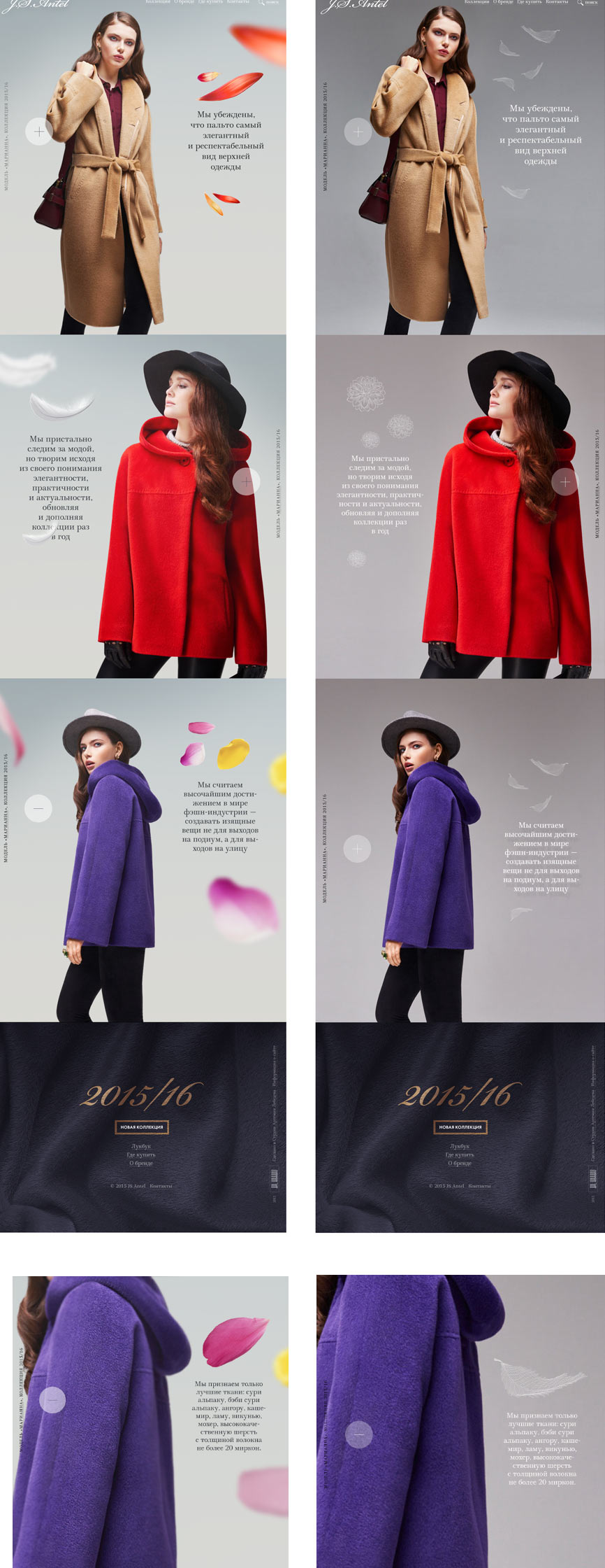
After much deliberation, getting the client to approve the photorealistic petal idea. People start thinking about purchasing a coat when it’s cold, in autumn or in winter, and we want to make this process a bit warmer.
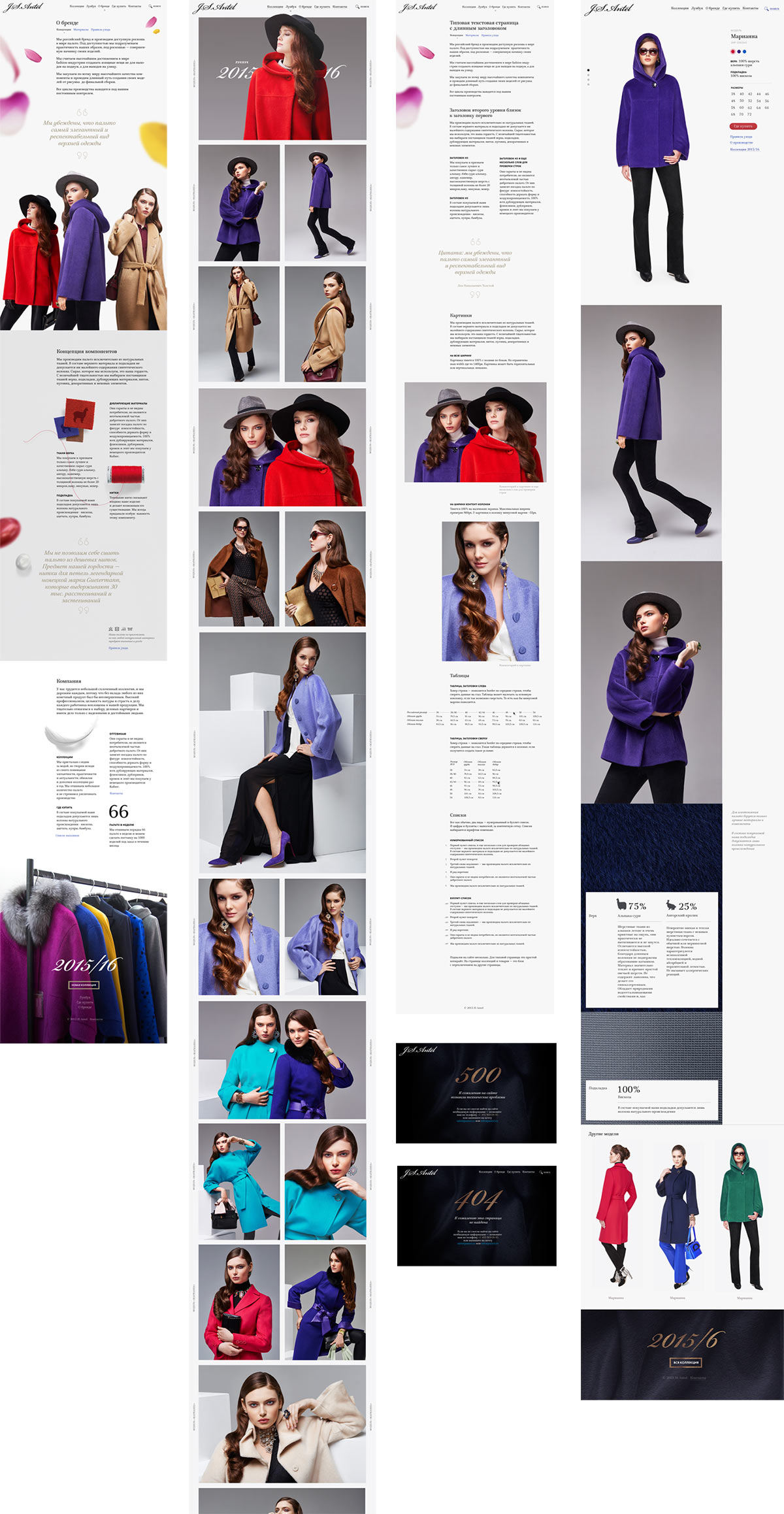
Launching the development of the website. Starting the simultaneous typesetting of key mock-ups from the concept, development of internal pages and creation of technical graphics.
Calculating the mechanics and zoom coefficients for the main page.
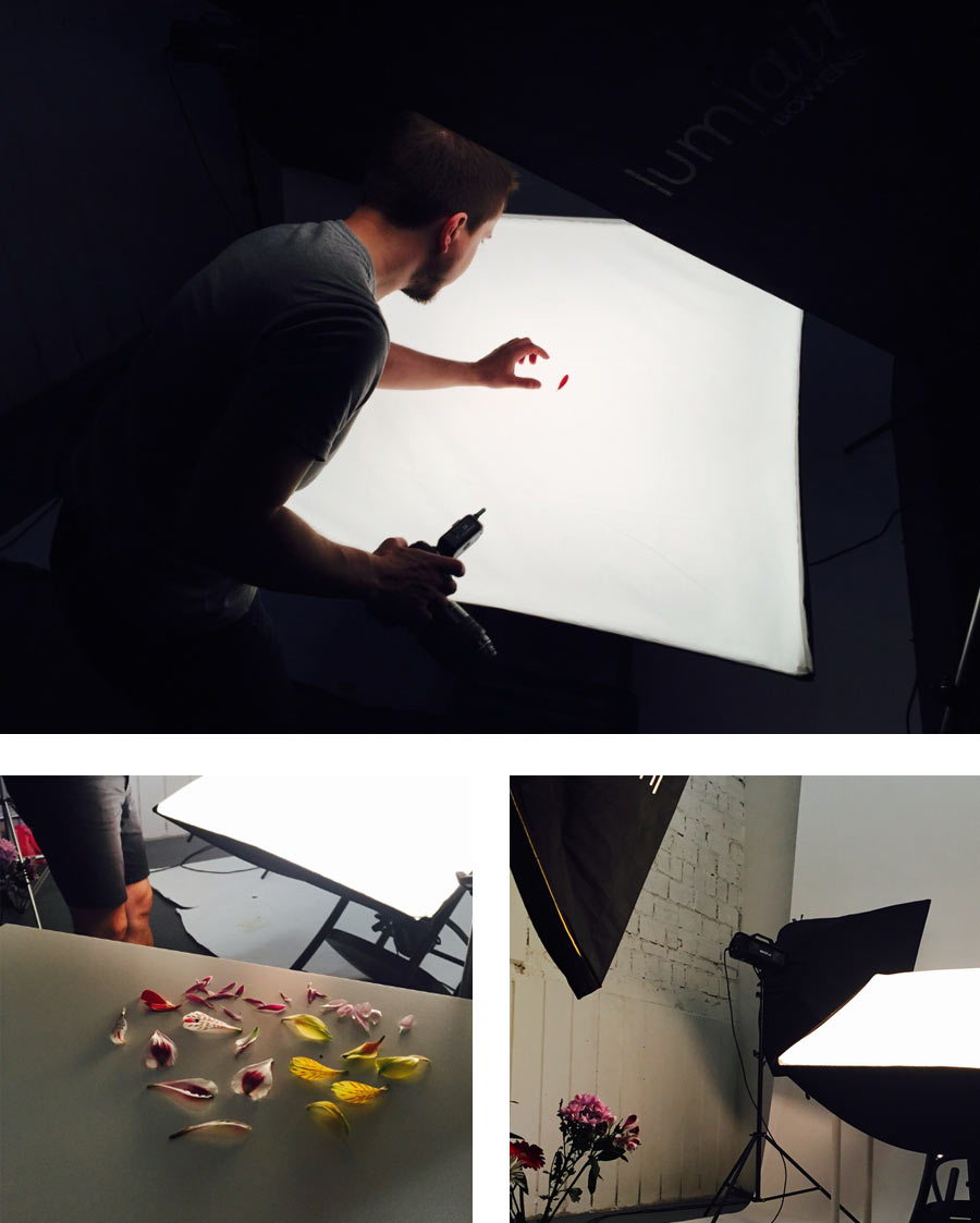
Going to the florist and holding a photo shoot. Choosing plants that blossom in the autumn.
Beautiful!
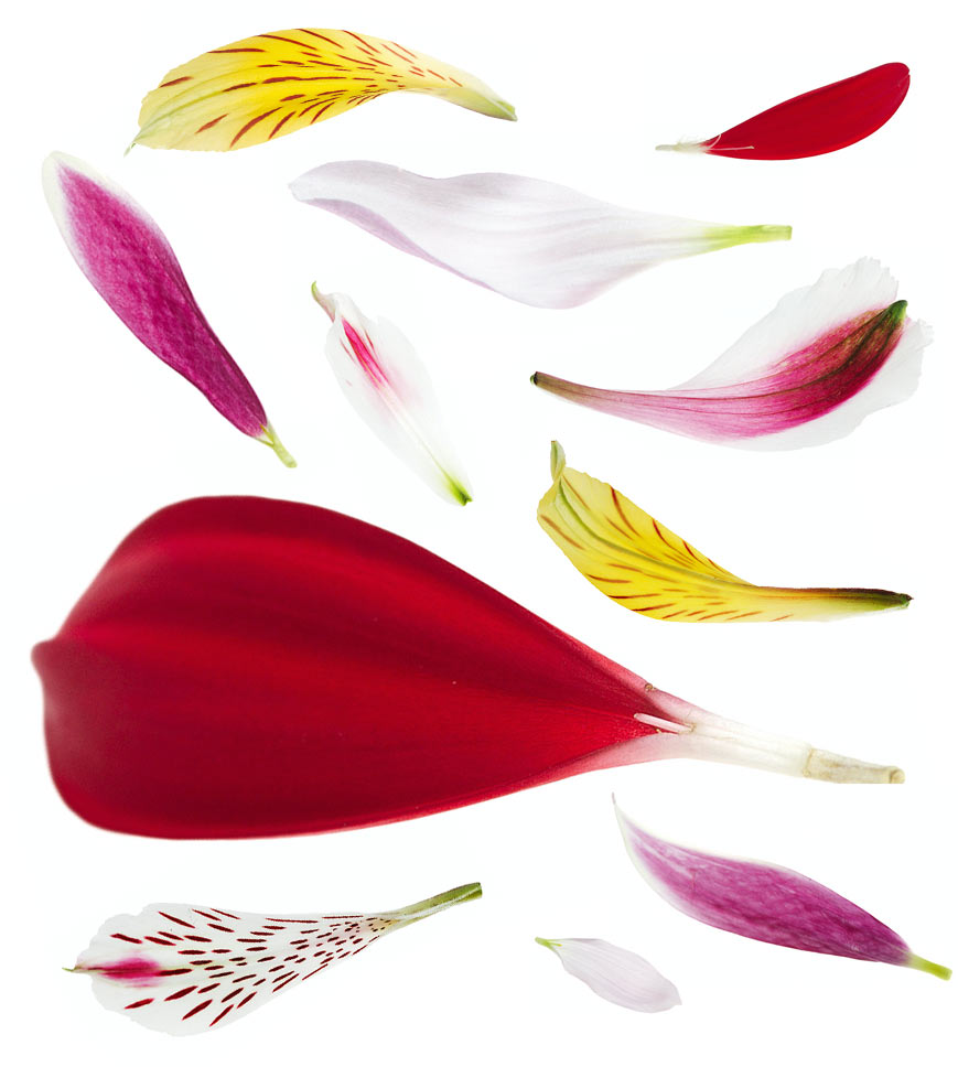
Retouching and assembling into compositions for the main page.
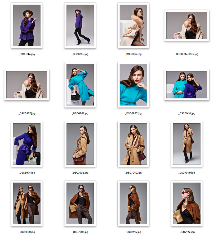
Retouching photos from the lookbook in maximum resolution.
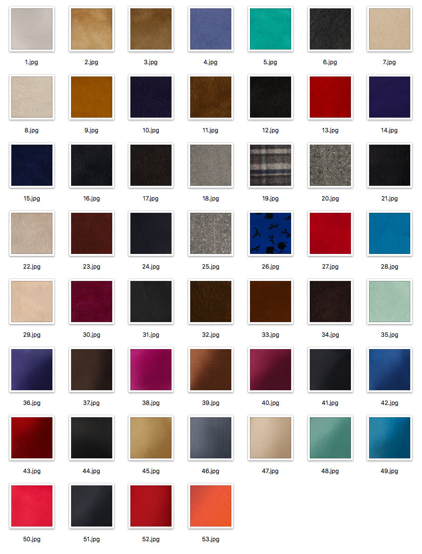
Meanwhile, fabric samples for all products arrive to the studio. Taking photographs and retouching.
Assembling mock-ups of internal pages.
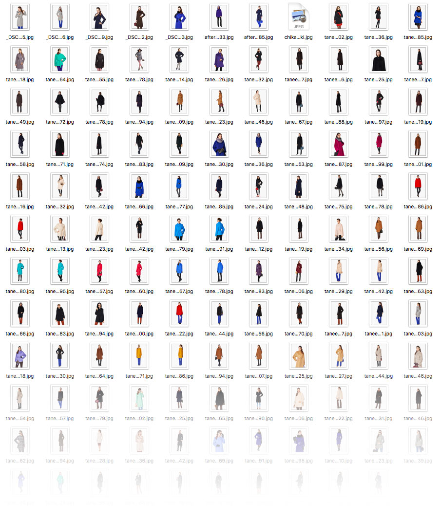
Equalizing backgrounds of all photos in the catalog.
Working on the facts.
Adding a preloader animation for use with a slow connection.

Polishing the dynamics of page scrolling and animation.
Launching the beta version and fixing bugs.
