Client: Our company is called Disinfection Department. We are also developing the website www.добролов.рф and have our professional Instagram account: dobrolov. We think we are the best rat control specialists in Moscow and are in top 5 for cockroaches. What makes us believe so is that we are often called to sites where no one had been able to eliminate rodents and other pests. We come, understand the problem and solve it. This happens every month. We guarantee our clients that the number of rodents and insects will decrease drastically in a month and in three months they will be gone completely. This is our standard! So, we take on the most difficult cases and solve all problems, this is how we earn our living. We promote a medical approach to work. We have sanitary doctors on our staff, our experts make a diagnosis and present a recommended “treatment.” It’s all going well, but we’re seriously lacking in the logo department. Preferences: our full name is faitly complex, Disinfection and Medical Entomology Department. It would be great to be able to fit it everywhere we need to (like uniform shoulder patches). Possible ideas for abbreviation: Disinfection Department or even Dis. Department if it comes to this. A slogan that we have in mind: The Elite Force Against Rats! Our USP: exterminating rats and cockroaches completely and with a guarantee by using a variety of methods. We need the logo and the corporate identity to demonstrate while working at a site, on uniforms, on promotional fliers. We would like to see a person on the logo since our main asset is the professionalism of our experts. We are a family business and have nothing against an aristocratic style or heraldry, approve humor, respect semantics and denounce minimalism.
First designer: Anything good here?
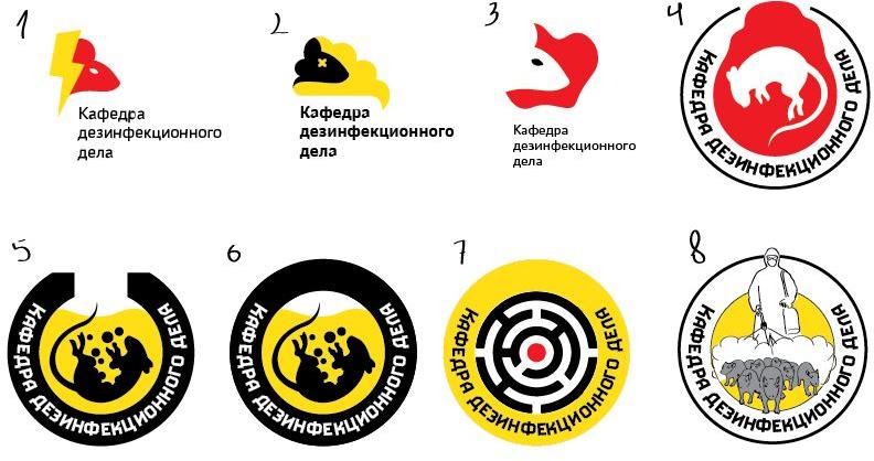
Art director: Not very convincing right now. And where are the cockroaches? Although I like the X from number 2.
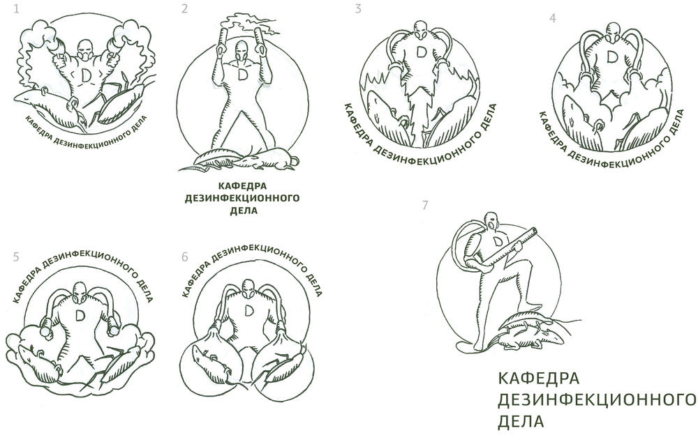
Second designer: What if we move towards heraldry, like in 1-3? We can blend a knight with an exterminator and a rat with a cockroach to create a collective image of a pest.
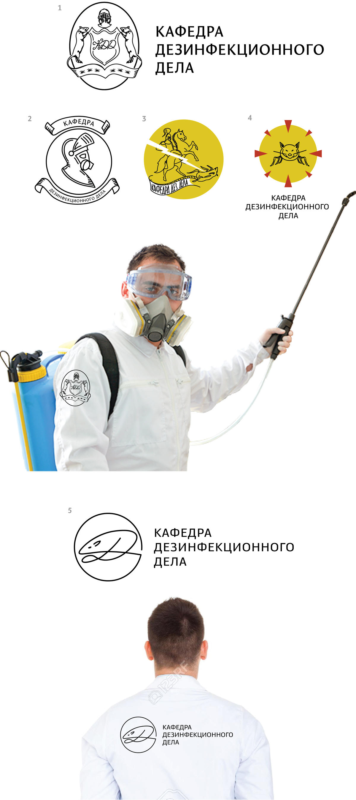
Art director: We can go with 3, only with a superagent who shoots from two guns at a cockroach and a rat simultaneously.
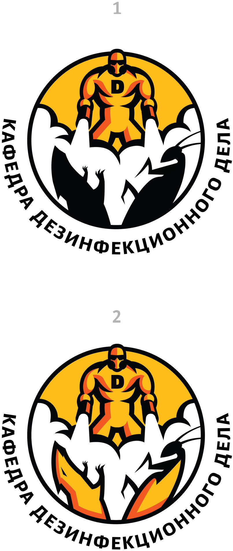
First designer: Another attempt.
Art director: There’s fun right now. What if we make a logo in the shape of a 16-ton stone slab that falls on a cockroach and a rat?
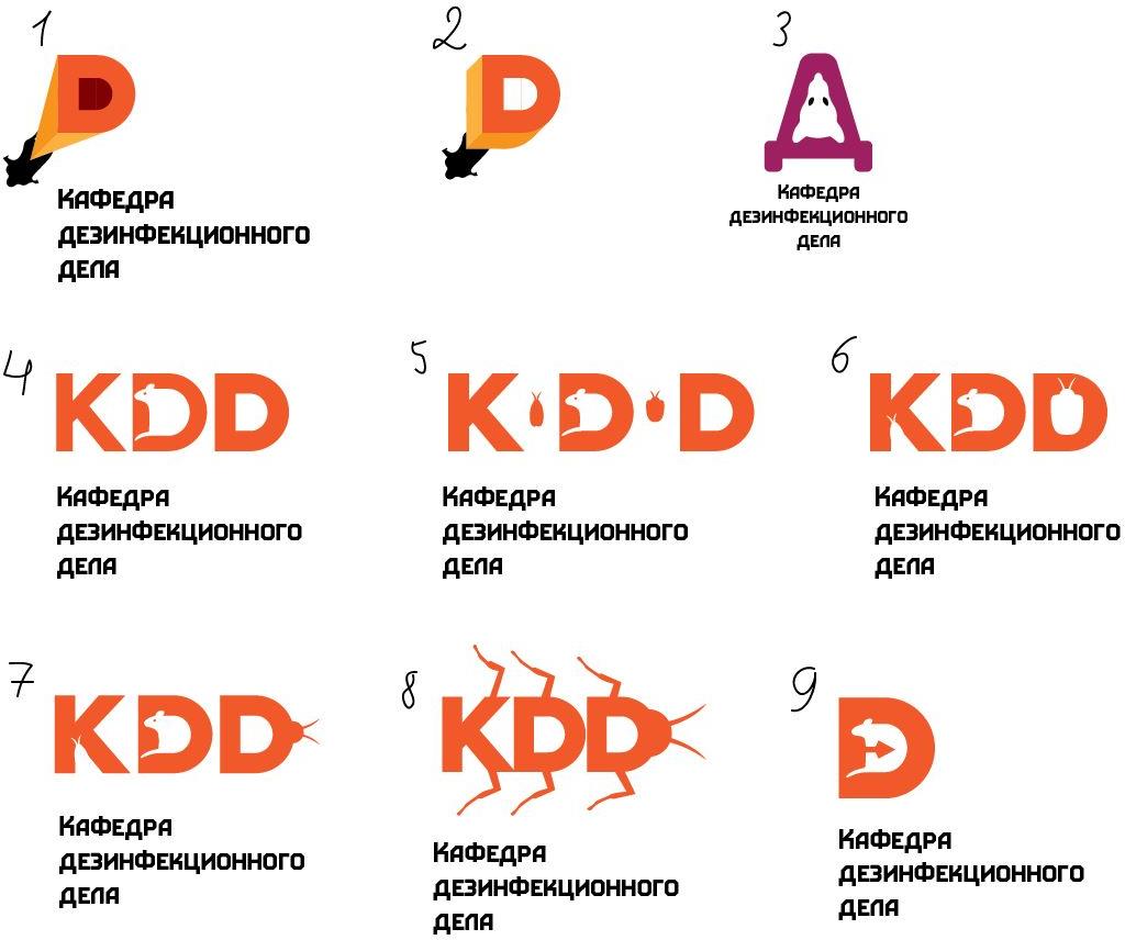
Second designer: I tried to introduce a firing agent.
Art director: Number 2 is warm.
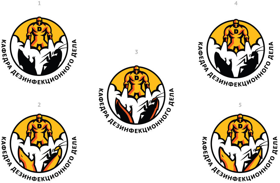
Second designer: I explored number 2 some more.
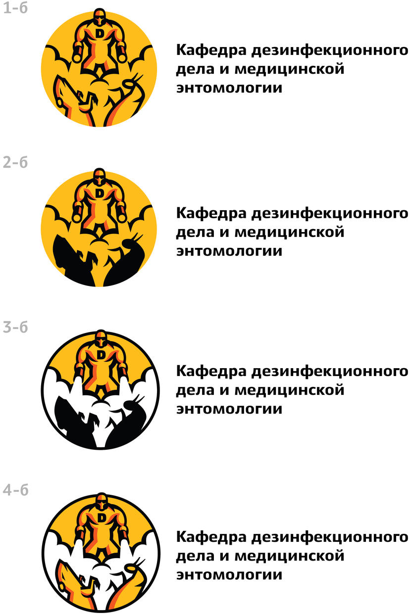
Art director: 4 is not bad.
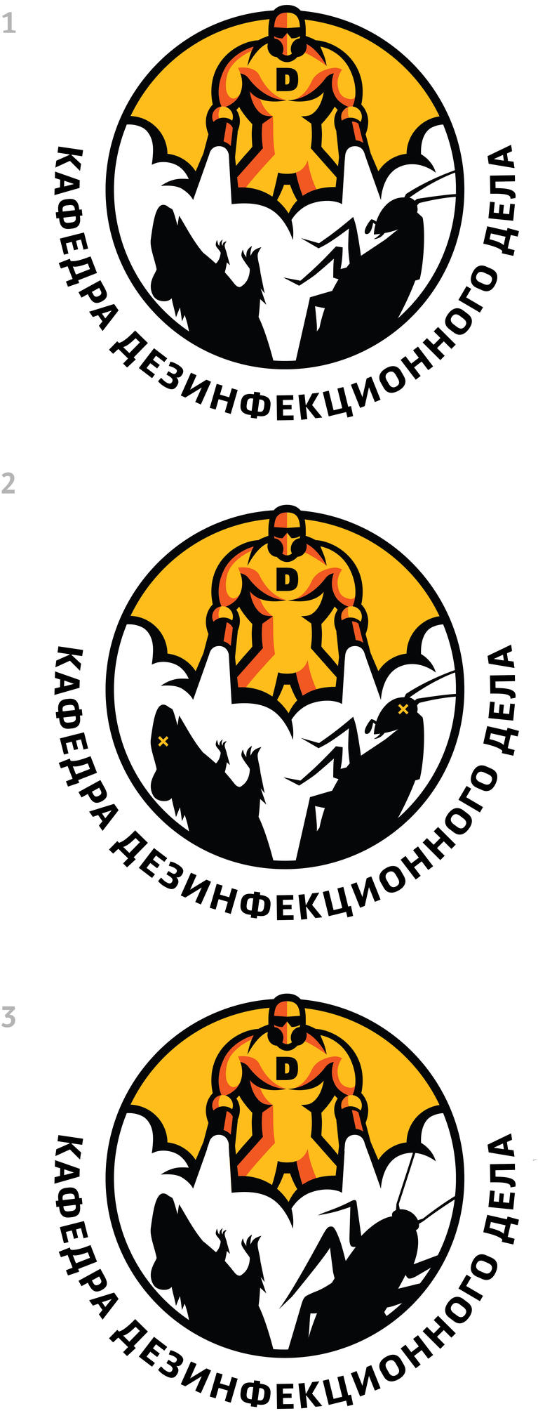
Second designer: I’ve drawn number 4. How do you like this approach?
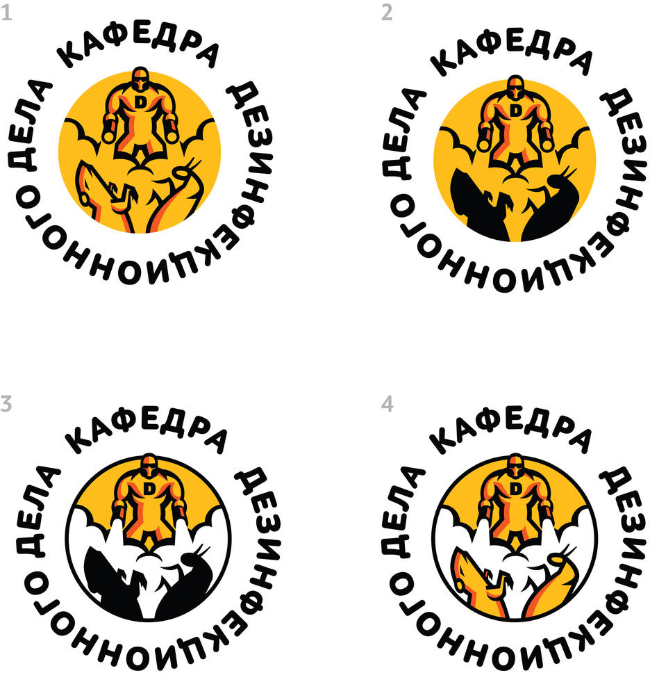
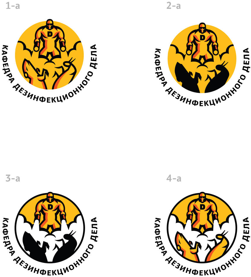
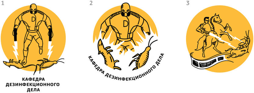
Art director: 3a is OK in terms of text placement. The smoke is too symmetrical. Plus, that thing in the center is excessive and looks like a codpiece. You need to check the anatomy of the animals. The cockroach in particular looks nothing like a cockroach.
Second designer: Here, I fixed all of that.
Art director: Google for a picture of a cockroach.
Second designer: Took another look at cockroaches and drawn the anatomy better. Zhgun also suggested to make the rat softer and the cockroach sharper, you can see it in numbers 4-5.
Art director: 4 is OK. But the rat looks like a dick and the cockroach like a mantis. You can also put XX on their eyes.
Second designer: I made another attempt at the anatomy. A cockroach seen from the side is really not going to be recognizable. Maybe, make it better by showing it from the top, like in 3?
Art director: 2 is better. Where in the world do you find cockroaches with such legs? 3 is more recognizable but the legs are still confusing.
Second designer: I went to the illustrators for an advice, we drew the cockroach from scratch.

Art director: 2 is OK.
Going over the graphics once more and sending files to the client.
