Client: I’m very excited about the chance to work with you! Our website is far from ideal and I’ve been wanting to improve it for a while. There’s a lot to do, but I thought it would be best to start with the logo and the corporate identity. We really have a mish-mash of things right now: we have a mask on the website instead of a logo, two cherries in the favicon and also a round logo that we got a freelancer to do for us, but that didn’t work too well when we replaced the mask with it (I can show it to you if you’d like). The picture used on our website konditermag.ru we found on the internet, we don’t even own it. I’ll explain why we chose it. You can read our name, Konditermag, in two ways: “mag” as short form of the Russian word магазин, a store, or as an abbreviation for “magic.” Creating modern cakes has a bit of magic to it, I thought a mask would work well to convey this air of mystery and would give some individuality to our website. We don’t make or decorate cakes, we sell materials, tools and ingredients, everything a baker might need. By the way, the official name of our company is OOO KonditerMag, or OOO KM for short, so you can also use these letters in the logo. You don’t necessarily have to use the word KonditerMag, you can just go with KM. I would prefer to keep the cherries and I really like the mask, I believe the customers have grown used to it. But how can we tie all these symbols together, and in a way that would be memorable and convey information about our business? Here are the RAL colors we like: 8011, 8015, 8025, 8028, 2012, 3012, 301.
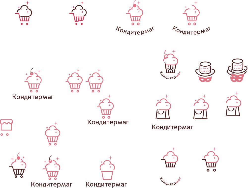
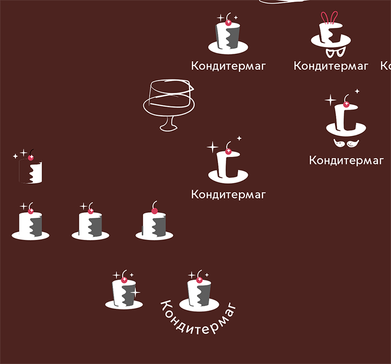
Drawing out the first ideas.
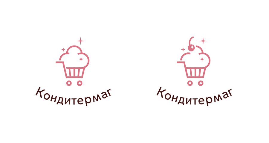
Choosing two of them.
Art director: Probably the first one, with the cart. The second one looks like a baker robber.
