Kulikovo Polye logo and visual identity

Overview   Process  

Task: to design a logo and visual identity for a historical military museum.

Kulikovo Polye is a military history museum and natural reserve. It organizes historical and archaeological searches; studies and preserves the legacy of The Battle of Kulikovo—one of the most prominent events in Russia’s history. The studio developed a logo and visual identity for the museum.

kulikovo pole logo main
The main logo


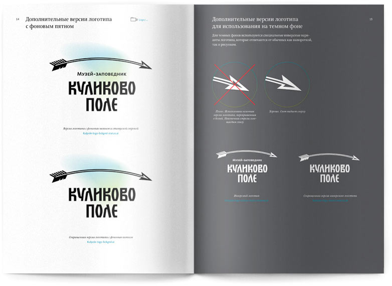
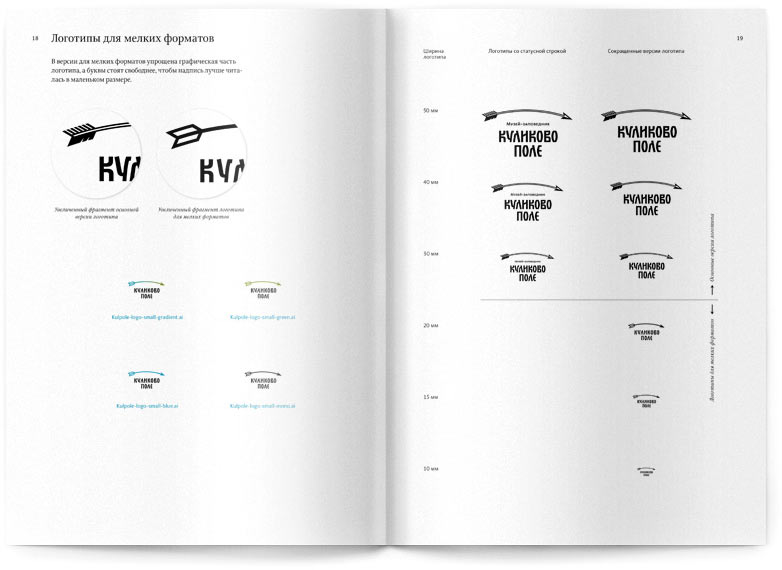
The flying curved arrow symbolizes the sun rising over the horizon on the day of the battle, the victory of Russian soldiers in the historically significant battle, and the courage of the museum as a modern organization optimistic about the future. Many versions of the logo were created for a variety of uses.

Release date: August 09 2013

Cast:

artistic director
art directors
secret advisor
designer
type designers
chief typesetter
editor
project managers
Lebedev studio would like to express gratitude to the director of the museum Vladimir Gritsenko, and the head of exposition department Maria Vorontsova for their assistance on the project, their patience, and understanding
kulikovo pole logo options
Formal version used in official documents and holiday version for special occasions

kulikovo pole logo bg
White version to be used on color backgrounds

kulikovo pole logo simple
Simplified logos for small format applications


The brand book covers all versions of the logo and their possible applications, and provides examples of the most suitable fonts and colors.

kulikovo pole bb 01
kulikovo pole bb 02
kulikovo pole bb 03
Visual identity guidelines


Despite its historical angle, the arrow symbol allows for a number of modern interpretations.

kulikovo pole things
The history is being written
kulikovo pole bag
The history goes on


kulikovo pole shirt
The history comes alive


kulikovo pole gold
The history adorns you

Order a design...