Client: We are a brand new company, we are developing software for selling event tickets. Any event tickets. There are five of us (three developers and two sales guys). None of us is older than 25, I’m turning 26 in a week :) Three out of five are founders. We’re doing the work ourselves. Our aim is to launch our own convenient, quick and stylish adaptable resource for selling theater/museum/park/ice rink/lecture/concert tickets (that despite huge competition in this sphere still doesn’t exist).
Why Lastick? It’s from “last ticket.” Why last? We’re coming into the market with a new idea: apart from regular tickets we’ll be selling “last hour” tickets with huge discounts. Just like on Broadway in New York. We don’t have a logo. No website and no app either. For now. We have a widget and a working platform that is already earning us money.
We don’t have a clear understanding of what we want but definitely know what we don’t. Each one of the competing services revolves around three ideas: ticket office, receipt, ticket stub. Just like their names: Kassir.ru, Ticketland, Bileter, Redkassa, etc.
With our name we wanted to move away from these associations leaving only a slight reference to tickets. The word Ticket in the name can only be seen in the English version of our name: lastick. We don’t know whether we should have an English or a Russian logo. Probably both. Lastick (pencil eraser in Russian) is something you need, something you use to correct mistakes, something you use often so it has to be convenient, light and bright. That’s what our logo should be like. I think the confusion, contradiction that arises when someone sees our name (why would an event ticket service be called Lastick) should work in our favor and create a memorable association.
Maybe an eraser needs to be connected to this idea somehow and its visualization should be used in the logo. That would be great but we’re unsure how we can do this.
As for the corporate identity, here’s what’s important for us. People start using ticket services by chance, when they are looking for the content they need, but they remain as customers only if they receive good service. In our identity we would like to see nice, beautiful tickers (mostly electronic), beautiful emails, beautiful playbills, and all of it in the same style.
Designer: Still, I want to reference tickets, erasing and ticket stub perforation.
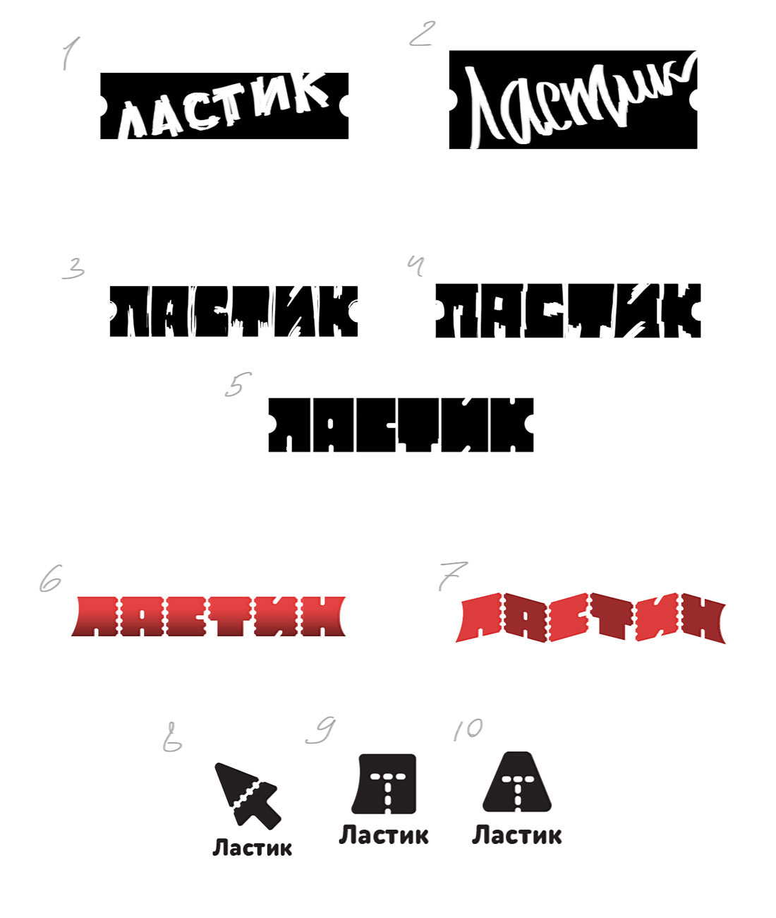
Art director: There’s a ticket here? Then screw it.
Designer: Announcing loudly that there’s only one ticket remaining.
Art director: 15 is all right.
Designer: Improved.
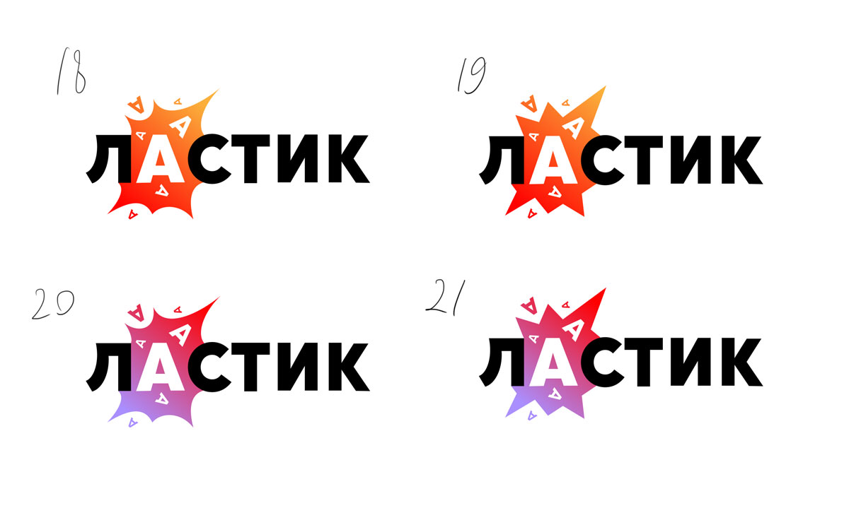
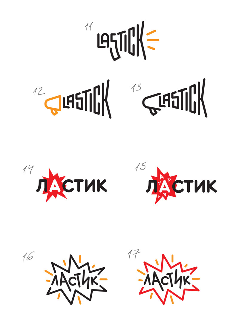
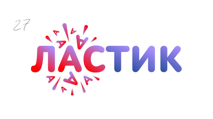
Art director: What if you write лас and тик in different colors?
Designer: Here it is.
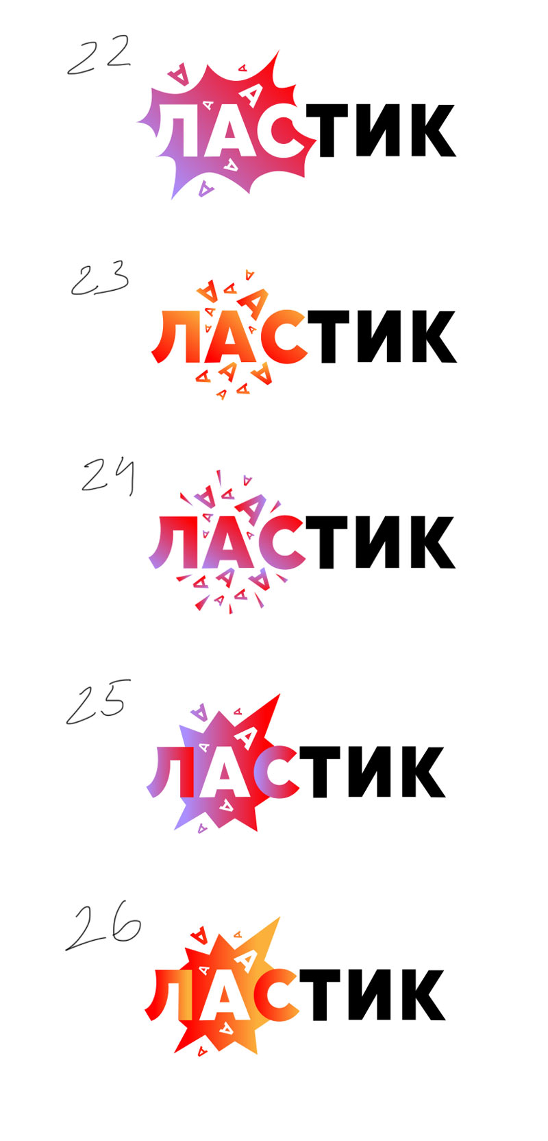
Art director: 24, just make sure the second color isn’t black.
Designer: I also wanted to make the shapes softer.
Art director: OK.
