|
Artemy Lebedev
§ 111. Multiplying by two as easy as beeping the hornFebruary 27, 2005 |
|
Any interface can be made twice as complex as it is. As a rule, it’s done in order to make it unambiguous, reliable and foolproof. |
|
Simplifying interfaces is easy (see the previous section): two A’s may be replaced with one. |
|
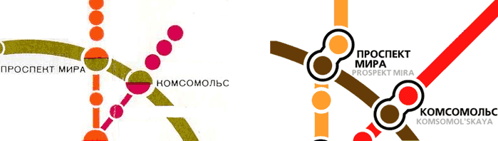
The simplest example of complication is replacing “A/B” with “A and B”. Say if there’s a change between two different stations, both called “Prospekt Mira”, then it’s better to display not one circle split in two by the colors of the crossing lines, but two circles with a transfer. |
|
Simplified fragments of the Moscow metro maps of early 1980s and late 1990s. See Metro schemes and maps |
|
Obiter dictum |
Whether something is to be made more complex or simpler is up to the designer and developer who are normally guided by reason in the beginning, and later on have to face the restrictions of budget or reality, or both. |
|
Our today’s examples will be not TV remote controls but road signs, for a change. |
|
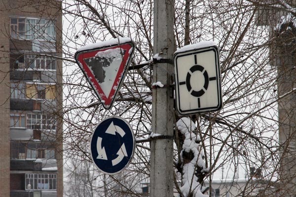
The signs hanging above the intersection with a roundabout traffic duplicate each other. On the left hand side from the signpost there are two signs: “Yield” and “Roundabout”. On the right there’s a sign with the scheme of primary and secondary traffic patterns (“Main Road Direction”). The circle has a priority, since its line is bolder than those of the four adjacent roads. |
|
Roundabout. Syktyvkar, 2004 |
|
Duplicate signs are required here for two reasons. Firstly, in Russia those who already circulate within the roundabout yield by default to those entering it (accordingly, one should provide a special warning if it’s not the case). Secondly, the sign on the right hand side from the signpost is apt to send most drivers into a stupor because it’s pretty rarely seen hanging like that. And then the deficiency of the production technology—stenciled print—makes the circle criss-crossed by the letter X look like four sectors. |
|
One may be tempted to ask, why are the two signs on the left not enough? Because the right hand sign contains additional visual information on the structure of the intersection: the driver sees clearly how many roads there are and how they project from the intersection. But this sign alone is not sufficient in terms of accurate perception and traffic safety. |
|
And here’s another example. |
|
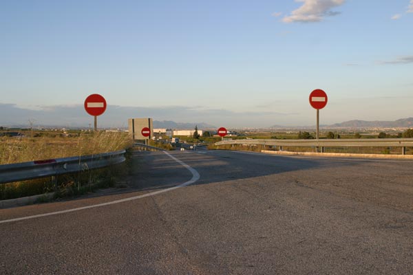
Never ever go down this road. Somewhere between Barcelona and Granada, Spain, 2004 |
|
Here the road is so invitingly convoluted that one can’t help feeling an urge to turn into it. But you’d better not, because you’ll find yourself riding in four oncoming lanes. This sort of an intersection is a mistake by developers. This mistake is rectified by the four “No Entry” signs that are expected to catch the eye of even the most unobservant driver. No matter where the driver cares to turn his head, he must see the prohibitory sign. Even if he was stretching and yawning at the entry to the road, he’ll be unable to miss the second pair of signs. |
|
Our third example of useful superfluousness is also the most unobtrusive one. |
|
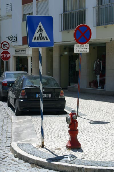
Posts and signs. Faro, Portugal, 2004 |
|
Every post is here painted the major colors of the sign it bears. Since colors on signs are never arbitrary, the useful area of color coding expands dramatically. Say if the post is painted white and blue, then the sign will have a prescriptive or an informative and indicatory function. Anyway, a striped signpost is noticeable from afar and unmistakably distinctive from, say, a post bearing a restaurant’s advertisement. |
|
Hence the rule: making things more complex, just as making them simpler, is a sophisticated method, which is to be used with care. |
|
|
|