|
Artemy Lebedev
§ 47. Pros and cons of intros. Part twoFebruary 10, 2000 |
They... everywhere found the towns barricaded, others almost deserted, and the inhabitants escaped and encamped in the fields, or scattered throughout the country...
A. Manzoni. The Betrothed
So he shut himself up in his castle, whose impregnable strength was such as defied a siege: here he sullenly waited the approach of Malcolm.
Charles and Mary Lamb. Tales from Shakespeare.
|
This time around, we will speak about the functionality and meaning of intros. |
|
Intros types may be broken down as follows:
|
|
It goes without saying that the primary function of an intro page (apart from its mission to inform and set the mood) is being an entrance to the website. The intro should look so as to make the entrance apparent. The vast majority of people who decide to rig up an intro page are unfortunately unaware of this. All elements of an ideal intro ought to be links to the main page. Sometimes graphic elements may be supplemented with text including the word “Enter.” This word must be a link, too. |
|
An intro featuring the encoding selection option is too bad. Firstly, most of today’s users have no idea about the difference between KOI and DOS. Secondly, you better not force a person to face a tricky choice long before he or she takes interest in something on the website. For the user, it’s far easier to press the “Back” button than pause and meditate on the dilemma. |
|
Housekeeping tip |
In the event you have a website with a flash intro, make sure the “Skip intro” link is added. The reason is the user is not always patient enough to watch animation and listen to music for several minutes, especially if he got fed up with the intro session last time (or can’t wait to get through it this time). If you are lucky enough to get a user revisit your site, let him live on without watching the intro at all. The main page must have a link to the intro just in case the person has come for it. Finally, you better write a plug-in auto-detector. |
|
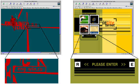
Below are two examples of an ill-conceived entrance: |
 |
|
In the example on the left the user has to solve a riddle of what point in the intro (the size of a screen) has to be clicked: either the word “eng” incomprehensible for the native English speaker, or the newly-coined “win.ru” that also poses a challenge for most of experienced web surfers. It all gets still worse in the example on the right hand side. The phrase “Please Enter” is not a link at all. Good evening, and welcome to the “Who Wants to Be a Millionaire” quiz show. A milestone question that will guarantee you your first $1,000 is which of these expressions most accurately reflects your feelings: “What the heck?”, “Who the hell?”, “Why on earth?” or “Where the fuck?”. All right, in thirty seconds of mental anguish a smart kid guesses the answer that seems anything but apparent: “R” is for the Russian version, “E”—the English one. The remaining elements of the right hand side intro are links to accomplished projects that don’t let you get inside. |
|
A special punishment is due to web builders that post the “Enter here” sign in a shady nook of an intro largely dedicated to the issues of selecting the right browser, resolution, news blocks etc. |
|
Three-day torture on the rack is a fitting homage to those who see no need to post a link to a page with site sections. These people have an intro that does its own job of whisking the visitor off to the main page after a period long enough, in these folks’ view, to let the user scrutinize the picture. |
|
Hence the rule: the user should always have a chance to click the “Enter” link without having to wait till he is transferred automatically or the flash clip plays out. |
|
What are we having for dessert? A website made by people who deserve the extreme penalty (the old version of the Volen sport resort website). |
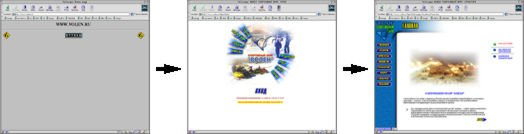 |
|
The first thing you see on the page is two diggers—on the right and left hand sides—that mean the page is under construction. This page automatically (if it works) transfers the poor user to the second page—the one with an intro. The intro has all carefully drawn site sections arranged in a circle. But they won’t lead you to the sections themselves: their links are similar to the one from the word “Enter” that’s under the intro. Only this time you will get to the main page, where you can click the section name to go to the location you want. |
|
|
|