|
Artemy Lebedev
§ 92. Be preparedJuly 3, 2002 |
|
When developing design for a nuclear power plant, an airline, a travel agency, a taxi company and any other enterprise with activities entailing higher-than-usual danger, you have to think about what may happen in the future, including tragic events. |
|
Before the tragedy takes places, a graphic solution capable to give rise to misgivings may be a cause for irony. A tragedy that has happened is a cause for a post factum negative interpretation. We will not consider in detail the cases when say any picture of the World Trade Center formerly located in New York is no longer viewed as just two huge skyscrapers. Innocent is the designer who made a construction company advertisement that was released on the front cover of the “Obustroistvo & remont” weekly just days before the shocking event. |
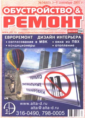 “Only original planning” |
“Obustroistvo & remont”(“Maintenance & Repairs”), Alta-D Group |
|
Coincidences of this kind are of interest to people with a mystical frame of mind. But we will talk about negative images that exist regardless of any particular event (which may influence the interpretation afterwards). |
|
On January 1, 2001 Swiss Air Navigation Services Limited changed its name for Skyguide, merged civil and military air traffic controls and created a new logo: |
 The two near-tangent dotted lines are meant to represent the character S |
|
The logo seems to be the best way of exemplifying a situation that must be avoided by an airline operator. |
CNN: Many feared dead in midair crash |
|
On July 1, 2002 at 11:26 p.m. local time two jets—passenger jetliner Tu-154 of Bashkirian Airlines and the cargo plane Boeing-757 of DHL—crashed into each other in the German sky. The two jets’ flight was controlled by the Swiss Skyguide. |
DHL was named after the first letters in the names of its founders—Dalsey, Hillblom and Lynn |
|
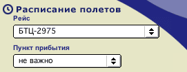
The Bashkirian Airlines website’s main page features a flight search form. The default value in each of the drop lists available is “doesn’t matter”, which, in my view, is an example of a way too free-wheeling style for an airline. If you pick something in the “flight” field, you will see the following: |
 |
|
If jet debris are scattered for 20 miles around, it’s one of the cases when the point of destination “doesn’t matter”. |
|
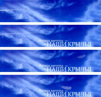
In early 2001 Ural Airlines launched a flash clip at its website, which I thought was well worth saving. In the clip an Il-86 jet is swooshing away through cirrus clouds. Several seconds afterwards the slogan “Your dreams are our wings” emerges. Another couple of seconds elapse before a small feather comes hovering onto the slogan from the point in the sky where the plane has disappeared. |
 |
|
Associations with a bird sucked into a turbine probably made the company change the intro in 2002 for a more neutral one that better incarnates the idea of a smooth flight (although a small feather was replaced with a big one). |
 |
|
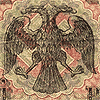
Of course, no one can foresee what happens tomorrow. When in 1917 the Russian government issued a 250-ruble banknote with a two-headed eagle against a swastika, nobody could possibly envisage that by the middle of the 20th century it would look bizarre. |
 |
|
But a designer should avoid as far as he can anything that’s open to misconstruction. To do it, you don’t have to wait until airplanes collide. |
|
|
|