Logo and corporate identity for the Manufactura outlet center

Overview   Process  

Task: to develop a logo and a corporate identity for an outlet center.

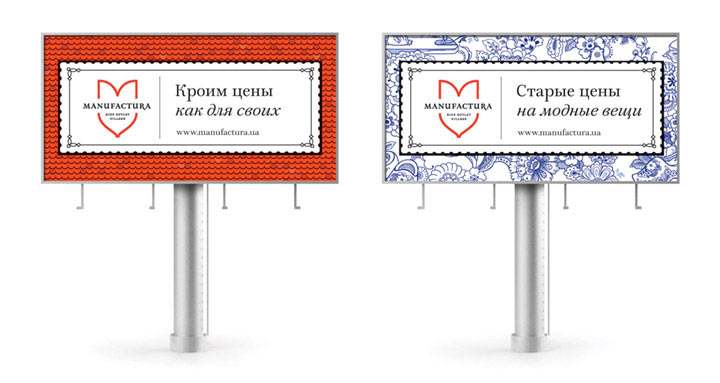
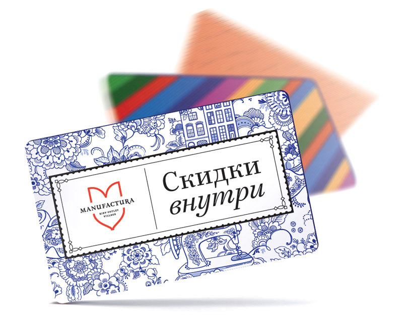
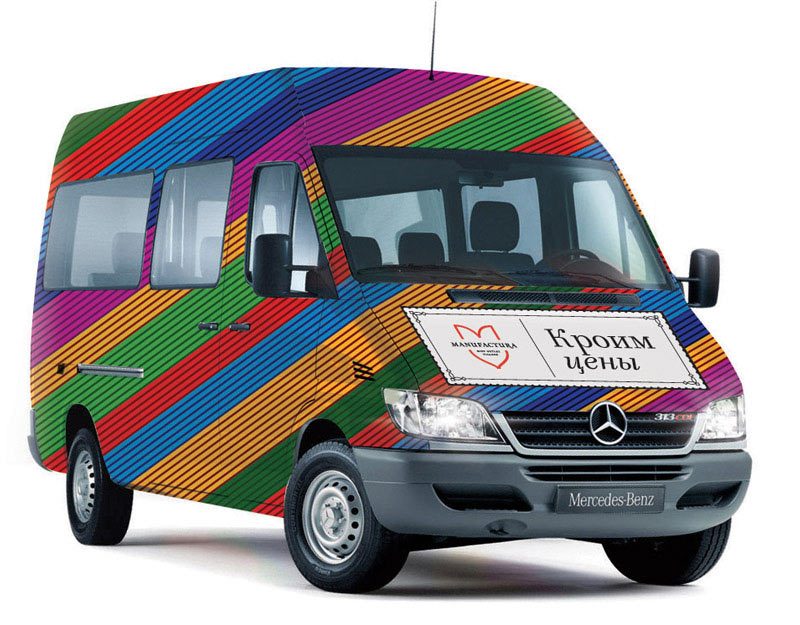
Manufactura is the first outlet center in Ukraine designed as a traditional Dutch town with narrow streets, brick houses, tiled roofs and a front gate. A logo and a corporate identity for the town were created at the studio.

manufactura logo main
The logo is a combination of a tulip and the letter M—a bright symbol of the Netherlands and the first letter of the center’s name


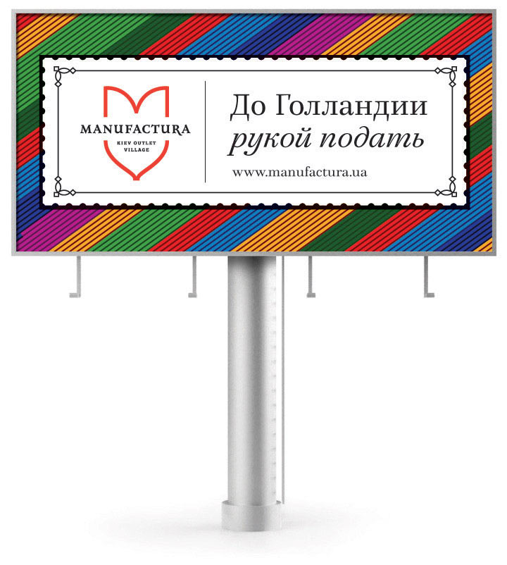
The Dutch theme is supported by corporate patterns which are used in the logo design or on their own. Two styles of the studio’s Mirta typeface are used as the corporate typeface of Manufactura. Rules for the use of the logo, the pattern and the face, as well as recommendations on creating advertising materials, signs and navigation boards are given in the brand book.

Release date: September 09 2013

Cast:

art director
designers
type designer
illustrator
editor
project managers
The studio wishes to thank Olga Zhelikhovskaya and Olga Troyan for their help with the project
manufactura bb 01
Opening of the brand book with instructions on creating a filled version of the logo

manufactura bb 02
Opening with the logo filled with the corporate Delftware pattern

manufactura bb 03
Opening with rules on typesetting advertising materials
manufactura bb 04
manufactura bb 05
Billboards

manufactura bb 06
Discount cards
manufactura bb 07
We are going the same way

Order a design...