Client: We are Massfilm studio. We’re from Novosibirsk. Right now there’s only two of us but we know how to shoot, edit, think and ultimately create beautiful things for good people. We are making videos, corporate films, commercials and are always trying to go beyond our own projects and do something we haven’t done before. You can see our works at our website at www.massfilmprod.ru.
We need a minimalist modular logo. It most definitely can’t have camera icons, TV sets or any other traditional TV attributes.
We deal with communications and production but our main specialization is time-sensitive content. We are providing event coverage, preparing reports and content for social networks during an event at a quality level. Right now we are expanding our service range to include immediate photo and stage support and creating a unified service offering. This will be called Mass Agency and will have three branches: Film, Photo, Stage. So the only thing we would ask you to keep in mind is that we need a single pattern and a modular logo so we can interchange the words Agency, Film, Photo, Stage while keeping the Mass base.
Starting to work.
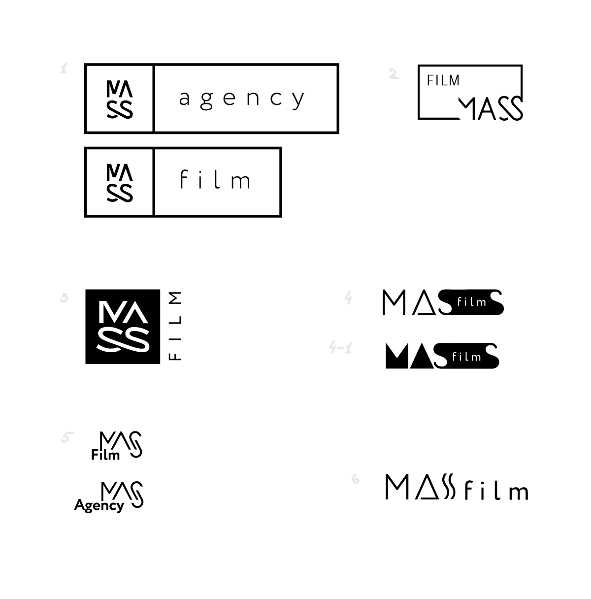
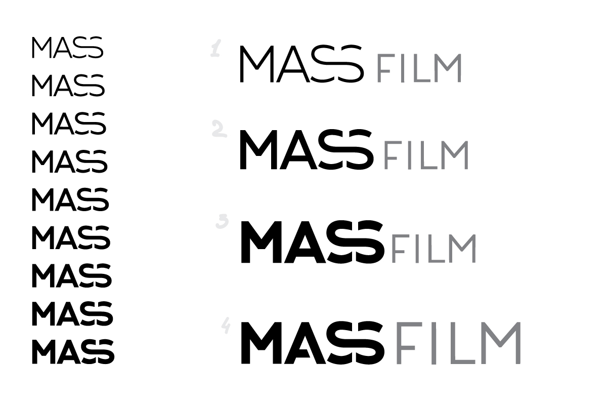
Art director: The SS in number 2 looks good. But overall you seem to be drawn towards IVASS which is a problem.
Designer: Another attempt.
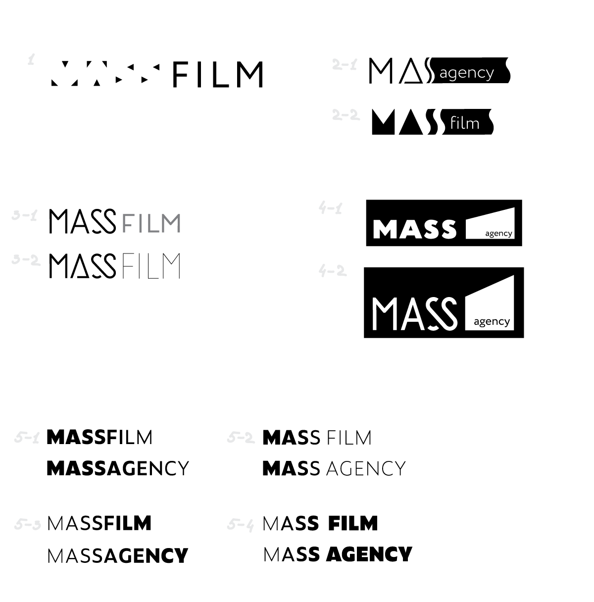
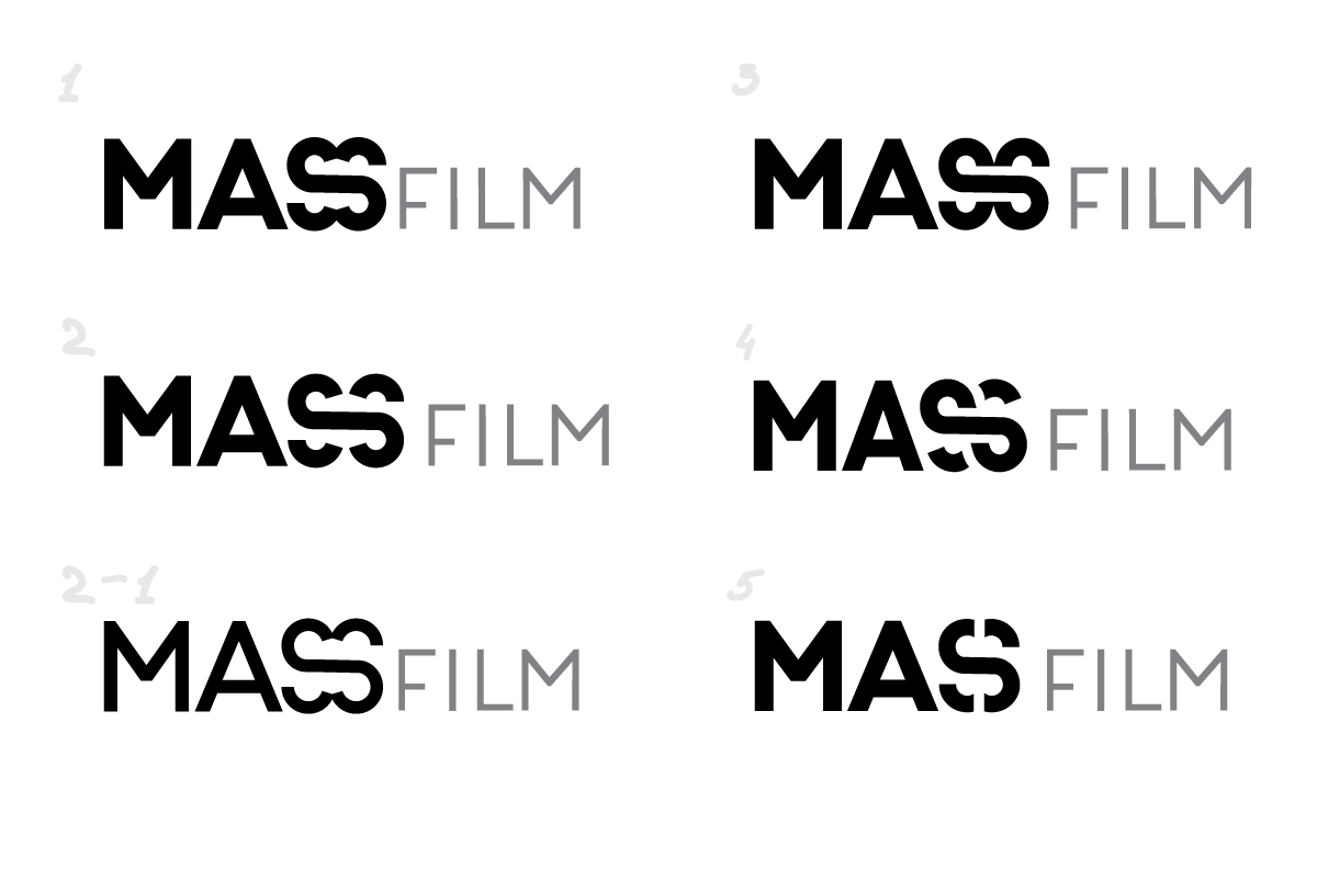
Art director: 3–1 is nice. Too bad it has a coat hanger which has nothing to do with the client.
Designer: I’m trying to get rid of the coat hanger, right now the most interesting ideas are these. Any of them worthy of further exploration, you think?
Art director: Number 1 looks promising.
Art director: 1 is OK but doesn’t look coherent right now.
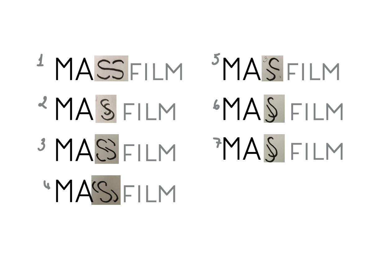
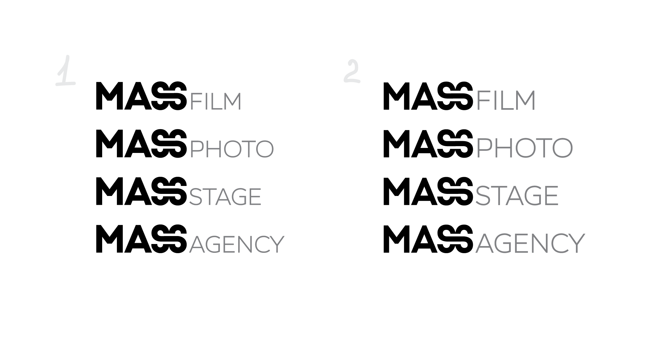
Designer: I tried combining everything together, asked the type designer for help.
Art director: Try number 3 with the SS ligature looking more like the Command icon.
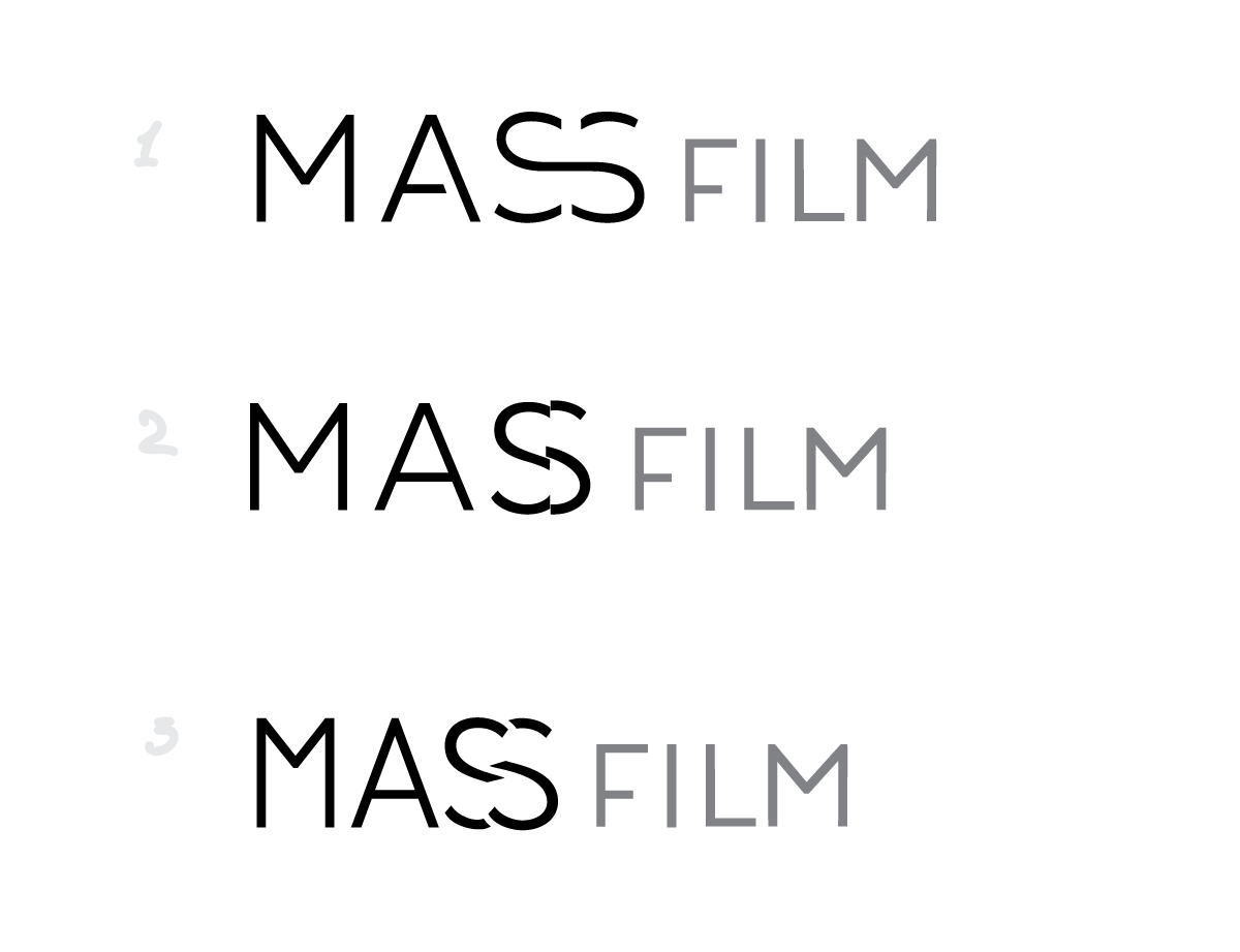
Art director: We’ll go with number 3. And create logos for each of the client’s branches.
Designer: I like the shape of SS better in 1 but it looks torn away from MA. Number 2 looks more wholesome I think.
Art director: Make MA more narrow.
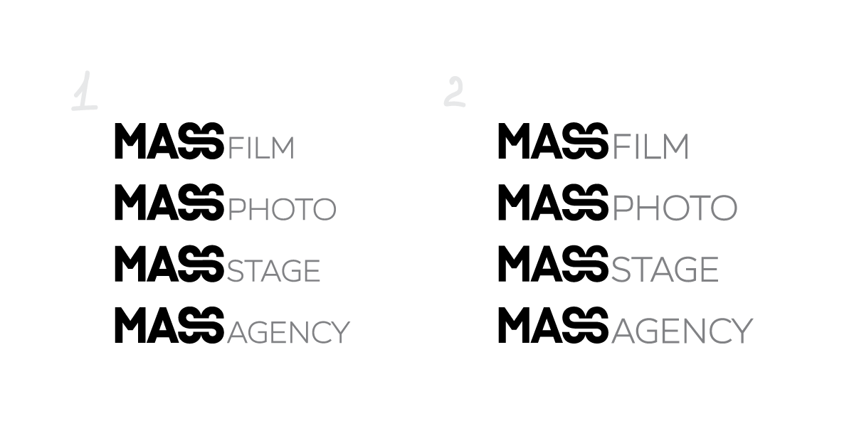
Art director: Now you need to work with the part on the right. I would suggest light narrow letters of the same height.
Designer: Do you think they look mechanically compressed?
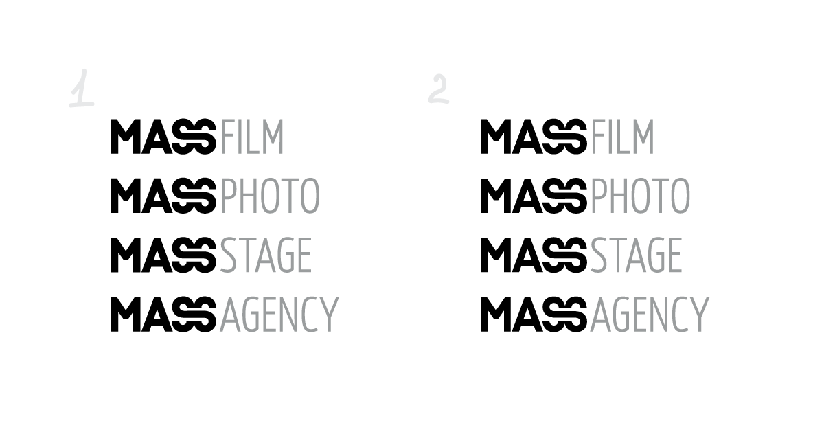
Art director: No, not at all. Now let’s decide on the colors.
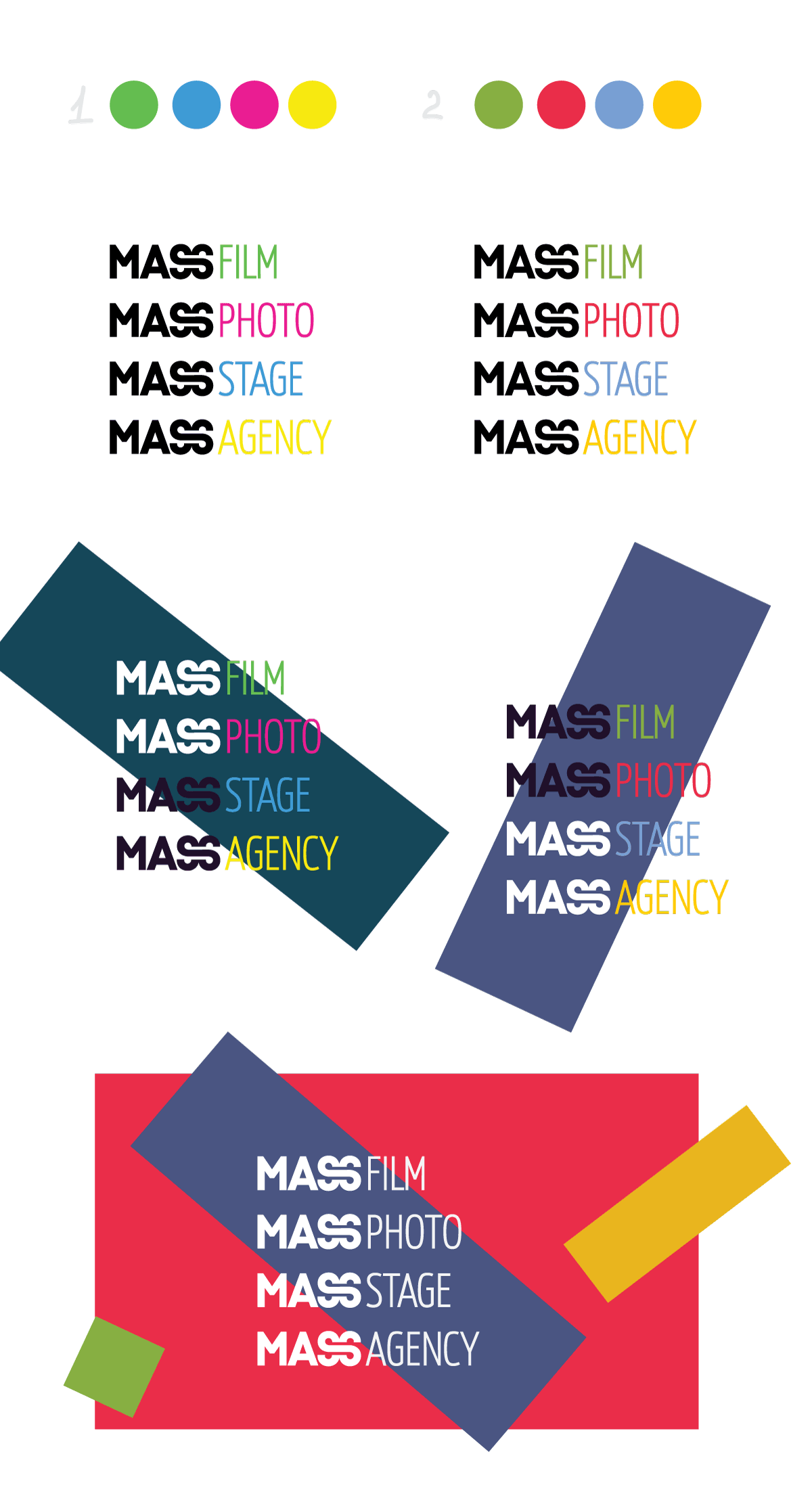
Art director: 2 is OK.
