Client: Hi! I’m teaching web designers to create cool websites and design interfaces. The goal of getting the education is to find work, work remotely, travel more, become a better professional and close gaps in your education. The website of the main course is at: maximsoldatkin.com/designer
Preferences for the logo:
1. I want it to be visually cool and bright.
2. I want it to carry some benefit to the students.
I could get a freelancer to design the logo (and I tried) but they would produce some boring image that I would impose on them. And I’m not a professional in that area. I want it to be bold and memorable. I want people to understand that this is the best web design school in Russia where their dreams and goals will come true. That we will help them and lead them towards a result. That there is no empty talk here, only concentrated information presented in a clear, concise and simple language.
What I had for ideas:
1. A metaphor of a ticket: as a ticket to enter a profession and also a plane ticket to go on a trip. What I like about it: the concept can be further developed and supported with copyright and photos in email messages and social networks. Shortcomings: immediately makes us look like a ticket purchasing website.
2. A coat of arms, similar to Tinkoff, Business Molodost, Barbanel (beautiful but excessively detailed and doesn’t match the style of my company, only used it as a reference). What I like about it: heredity, doesn’t look like any of the competitors, hints at serious universities. Shortcomings: can look antiquated which is not what I need.
Starting to work.
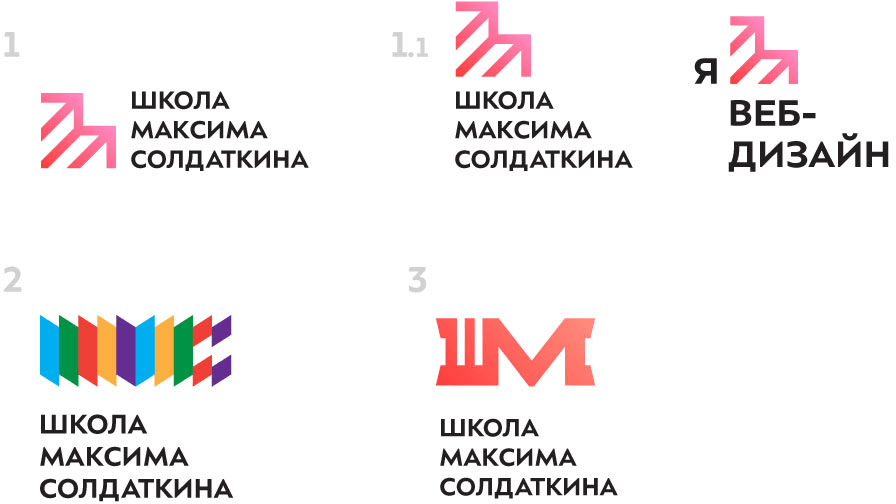
Art director: 2 is OK.
Designer: More variations.
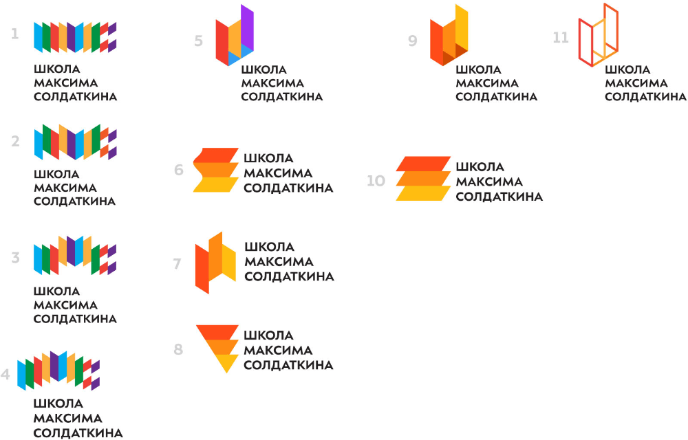
Art director: 2 and it’s a go.
Designer: Tema, I think we need to add the words “web design” to the caption. What do you think? Also, how about the favicon?
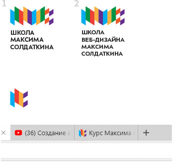
Art director: The words are OK. The favicon is OK.
