Navigation stands for Mega in Khimki
|
By the time the new Mega mall opened in Khimki at the outskirts of Moscow, Art. Lebedev Studio developed the design of navigation stands. The stands feature the layout of the megamall and the full directory of stores located in it. The stands are installed at major “crossroads” where visitors decide where they should go next. 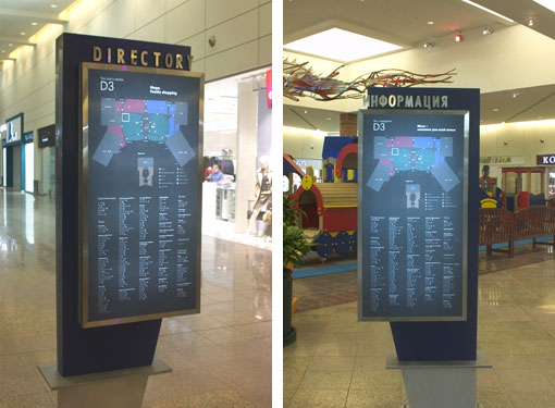 Russian text on the one side, English—on the other. We didn’t make the metal frames and pillars
 The customer wanted the square of the stands to be reduced by nearly 60% compared to the stands currently in use in the other Mega mall. Nevertheless, we succeeded in placing the same volume of information on the stands and improving the text readability. 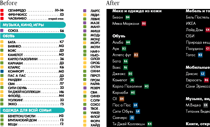 For comparison, see a fragment of the former stand on the left hand side
The names of the stores are now printed in small and capital letters, the leading was increased. The color code was compactly combined with the number of the square. The coordinates of a store were put closer to its name, which makes the dotted line redundant, while text columns become separated more distinctly. |
Release date: December 17 2004 Cast: artistic director
art director and designer
Artem Gorbunov
make-up
Sergey Fedorov
editor
Katerina Andreeva
managers
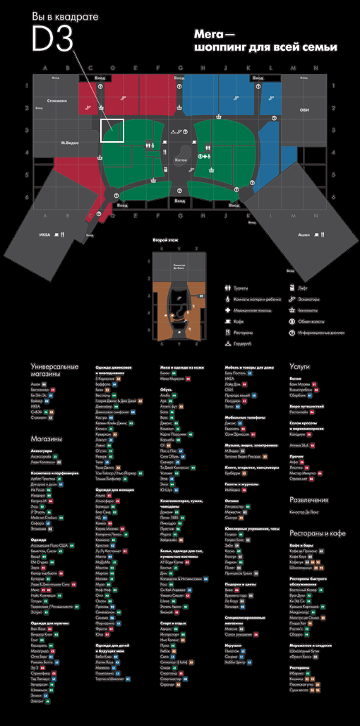
Andrey Dyakov
Natalya Lipkina Art. Lebedev Studio would like to thank Roger Johansson for his aid in project implementation 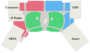 A simplified color code was proposed for the megamall layout: green—the central zone, red and blue—left and right zones. Large hypermarkets don’t have their own colors  On the layout there’s the indication of the sector the visitor is currently standing in. The number of the square, bold frame and the leader line are visible from afar and rivet the viewer’s attention to the layout data. Pinpointing one’s whereabouts is easy even on the move |
