The making of the Moscow Metro logo
Overview Process
Story by Konstantin Konovalov:
Every time I was going down to ride the Metro, I was perplexed by the number of different Metro logos in use. I couldn’t understand why there wasn’t a single emblem that would be used across all media. One day I decided to take my camera and go for a ride on the Metro photographing logos on all posters, information kiosks, maps I came across. Back at home I converted all these logos to vector format to make it easy to compare and analyze them.
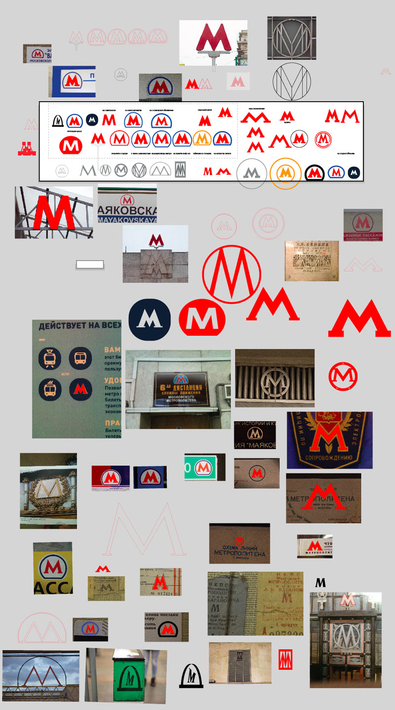
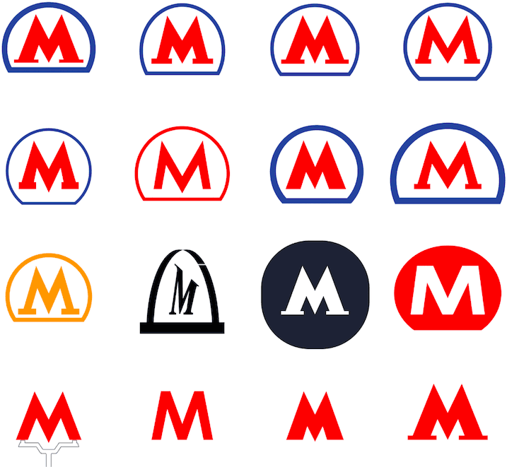
As much as I tried, I couldn’t find any logic behind this variety, it seemed that each logo was created independently of others. In order to understand which design is the correct one and what proportions it should have, I decided to refer to history. I visited newspaper archives, searched for anything related to the opening of the Metro, looked at pictures of the first stations unveiled in 1935 and visited the Moscow Metro Museum. I then used all the accumulated information to write a LiveJournal post about what the Metro logo should really look like today. I picked out the most used shapes, compared them and made some conclusions: http://ckonovalov.livejournal.com/99653.html.
Artemy Lebedev became interested in this post and sent me a cut-out from a 1934 newspaper which mentioned an open contest for a Metro logo: http://tema.livejournal.com/1383454.html.
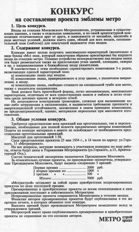
I really wanted to find the results of this contest and continued my research. A while later I was offered to become a consultant on the Art. Lebedev Studio project for the new Metro logo. That’s when all the information I have accumulated through my research became truly helpful. Below is a brief history of the logo.
History
The Moscow Metro opened its doors for passengers in May 1935. The task of creating a logo which would primarily be used to mark station entrances was set a year before the opening. The Metro administration suggested future passengers to develop a logo themselves by announcing a contest in a newspaper. But the results were disappointing: the committee rejected all 97 submissions. Here is a note about the contest in the Vechernyaya Moskva newspaper of July 14, 1934:
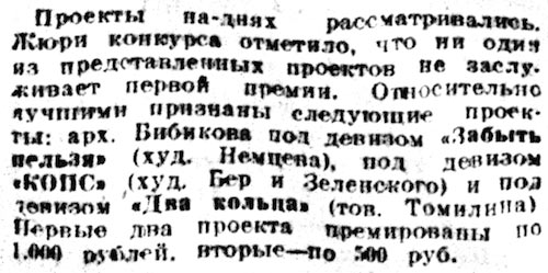
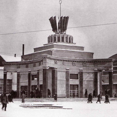
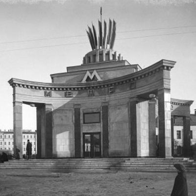
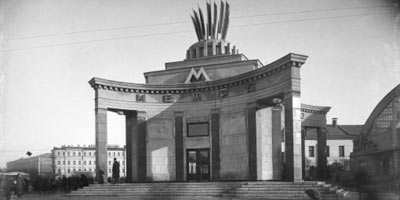
It was then decided that the emblem should instead be created by the Metro administration. The task was given to the same architects who designed the first stations. According to surviving documents, the presumed author of the logo is architect I. Taranov who together with his wife N. Bykova was working on the appearance of Sokolniki station. Taranov was also involved in creating projects for ten more stations and even develop a design for a two-level station. However, while the work on the new logo was under way, there had to be a way to mark station entrances. They were quickly marked by makeshift “Metro” text signs with the text written in different styles and sizes. The design of some station entrances already included this text. When the logo was finally finished and the technology of night-time illumination tested, the new emblems were installed along the old text signs which were also illuminated.
 |
 |
Entrance to Arbatskaya station, January 1935 |
Entrance to Arbatskaya station, May 1935 |
As the logo was designed after the stations were completed, the design of the stations allowed to space for the emblem. On some stations installing such a large letter was outright impossible, so it was narrowed down instead of scaling down, which would have been a more logical solution. This was the first step in the long way to the problem of the variety of the logos.
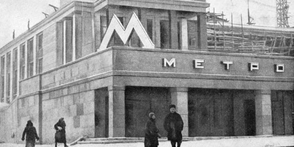
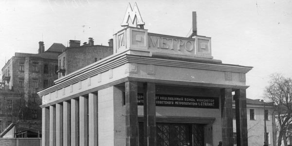
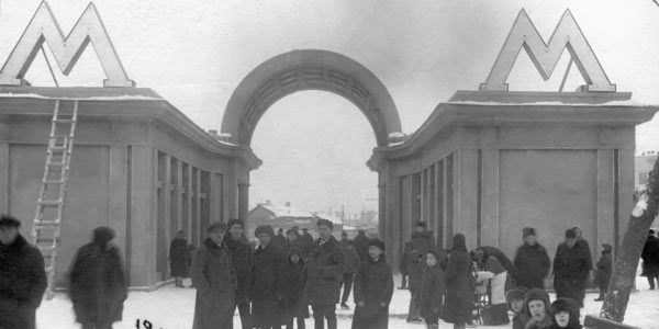
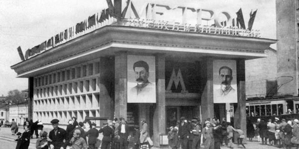
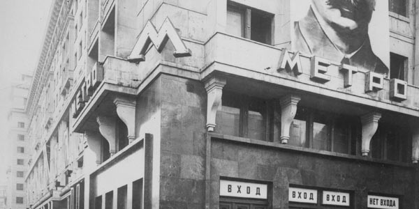
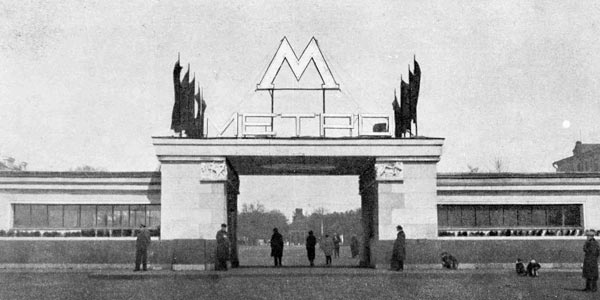
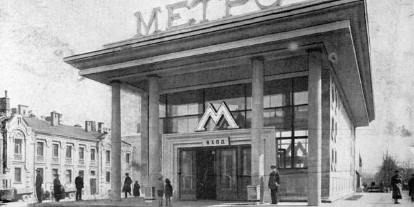
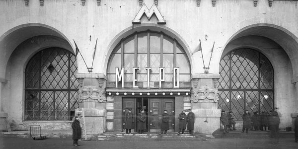
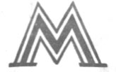
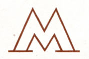
These pictures clearly show that letters were installed after the construction of station entrances was already finished: on some photographs it doesn’t look natural and apparently corrupts the architect’s vision of the building façade. Throughout almost all of the Metro history the street emblem was entirely independent from the logo that was employed on paper. According to the surviving data, this version of the letter was created by S. Kravets who designed Dvorets Sovetov station and was one of the prominent architects of Metroproekt. The idea remained the same—a red letter M with serifs—but the proportions were different.
 |
 |
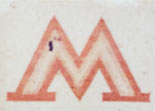 |
Emblem from one of the posters for the Yest Metro! movie |
Emblem from the cover of the book Architecture of Moscow Metro |
Emblem from the Metro use guide |
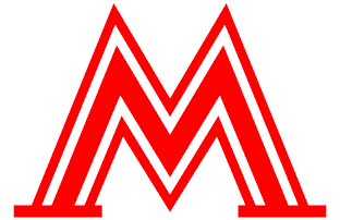
The first entrance letters were illuminated by neon at night. Neon tubing highlighted internal contours of the letter which was depicted in printed versions of the logo. In the 1930s the letter was often drawn with these outlines, yet their number and designs were always different. This negligence played a cruel joke with the logo. Let’s have a look at the letter from the poster for the Yest Metro! movie which came out in 1935. This letter is made up of several letters, just like a matryoshka doll.
 |
 |
 |
The letter from the movie poster |
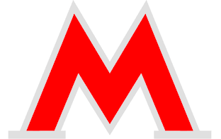
The letter made by the second contour |
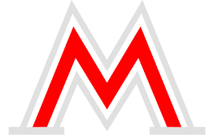
The letter made by the third contour |
This is a really good example of how different versions of the same letter are born. If we see the outside contour as an inking, the proportions of the letter change. This becomes especially important when the letter is printed in two colors, red and black, like in the example below. Here is a letter of appreciation given to comrade Krugly for his work on construction of the Metro:
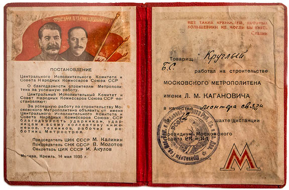
This way the red letter simply loses its serifs. The visual rendering of the logo was not established by the time the Metro opened. This allowed the proportions of the letter to constantly change due to a number of reasons, one of which is given above. The first illuminated letters at station entrances quickly began to malfunction. They were replaced by new ones, but their production was not centralized: managers of Metro stations independently ordered their production at different companies.
 |
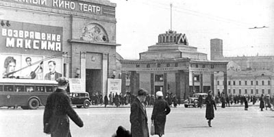 |
Entrance to Arbatskaya station, circa 1935 |
Entrance to Arbatskaya station, circa 1938. A number of letters around the entrance was replaced by one letter on top overlooking Arbatskaya ploshchad |
 |
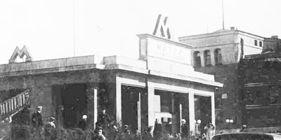 |
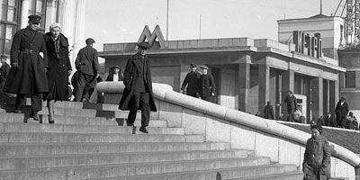
Entrance to Komsomolskaya station, circa 1935 |
Entrance to Komsomolskaya station, circa 1937. The Metro sign was replaced by a plate which read “Kaganovich Moscow Metropolitan.” The emblem was also replaced by a version with thick serifs |
The majority of the new emblems got thicker serifs that at night were emphasized by double lines of neon tubing. Two types of neon illumination from the 1930s:
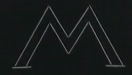 |
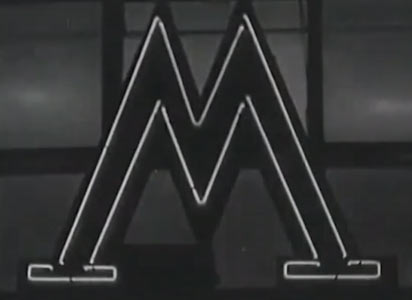 |
The letter used in print also received more pronounced serifs and was printed this way on tickets and tokens up until the mid-1960s. Metro tickets from the 1940s:
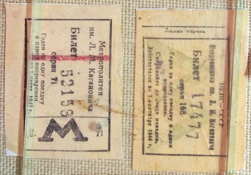
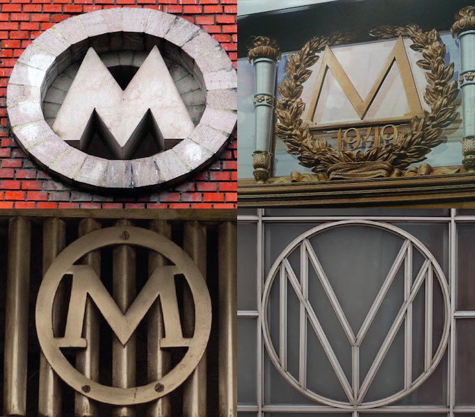
While developing new stations, architects included the logo in the design of the façade, but used arbitrary shapes and proportions of the letter.
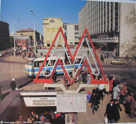
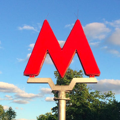
The next milestone in the history of the logo was in the 1960s when the letter started to lose its serifs, both in street signs and in print. In the same years the attitude towards the Metro changed as well: above-ground entrances stopped being a mandatory part of a proper station and entrances to some stations were built into underground pedestrian tunnels. In these cases, stelas with illuminated letters which had no serifs were installed near entrances to such tunnels. This is the image that survived to the present day, apart from an updated illumination technology. It is for this reason that the existing street logo has no serifs.
 |
 |
Logo in front of the entrance to Pushkinskaya and Gorkovskaya stations, 1970s |
Logo in front of the entrance to Kitay-Gorod station, 2014 |
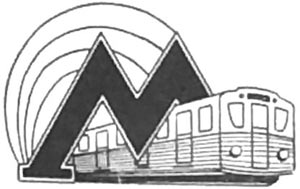
By the end of the 1970s the serifs returned, this time together with a tunnel-shaped outline which was previously often used in the design of Metro-related documents.
 |
 |
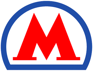 |
Illustration from a book on Metro safety procedures, 1935 |
Illustration from a Metro booklet, 1950s—1970s |
Emblem approved at the end of the 1970s |
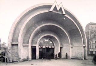
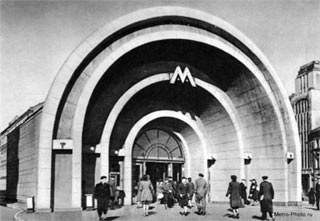
Since its inception, the proportions of the letter were quite flexible. With the introduction of the tunnel-shaped semicircle the variation increased even more: nobody knew the exact proportions, yet now there were many other organizations providing equipment for the Metro who had to use the letter. It was often drawn as a simple M in a semicircle. However, the tunnel outline never made it to street stands and station entrances. It’s interesting to see the evolution of the emblem in a single place. That’s how the entrance to Krasnye Vorota station looked at different times.
 |
 |
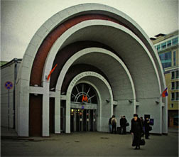 |
Krasnye Vorota station entrance, 1935 |
Krasnye Vorota station entrance, 1960 |
Krasnye Vorota station entrance, 2000 |
The “Metro” text was also removed from some of the stations, something that is difficult to explain with the only possible reason being that old letters might have been worn out by the elements.
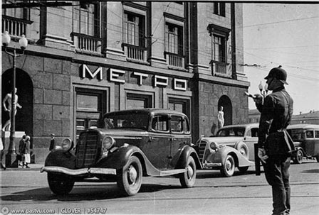 |
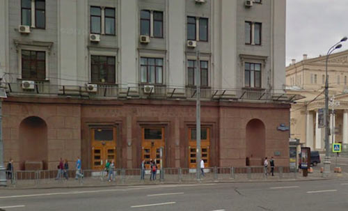 |
Okhotny Riad station entrance, 1935 |
Okhotny Riad station entrance, 2014, Google Street View |
In 2013 the Moscow Department of Transport decided to stop using the tunnel-shaped outline and instead starting to place the letter into what looked like a semicircle but really wasn’t. The tunnel-shaped semicircle however still remained on the back of Troika fare cards. Here is a Ediniy card and the back of a Troika card (2013):
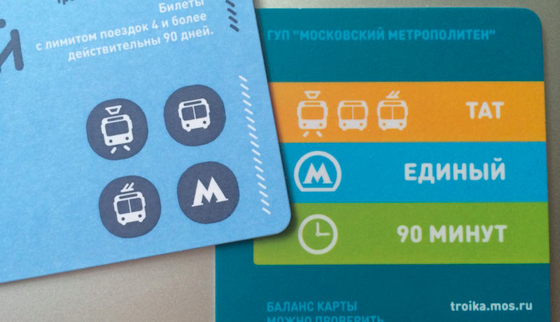
Throughout its history the logo has been replaced numerous times which, however, was barely noticed by the residents due to abundance of different designs already in place. But one thing always remained the same: the red letter M.
This historical overview brings us to one idea: the logo has to remain the same, it has to be the old letter M. What it needs though is to be standardized, which would ensure that the emblem is recognizable by foreigners, which would make it one of the definitive symbols of the city, just like London Underground. Which would give our Metro a unified and recognizable style. Which would make sure that the symbol on a map matches the symbol on a station entrance. Soviet architects including those who created the original emblem were routinely sent to London and Paris to adopt foreign experience of underground construction. It is entirely possible that the authors of our logo were inspired by the Paris logo which at the time looked like a red letter M with thick serifs which was inscribed in the shape similar to the London Underground logo. Here are the emblems of Paris, London and Moscow metros in the 1930s:

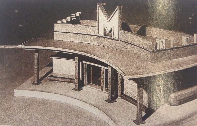
Of course, it’s only a guess. But the only way to explain the prominent serifs of the letter is that it was created by architects, not artists. That’s how they emphasized the constructive distinctiveness of the letter. In any case, the serifs are an important part of the logo which needs to be maintained (in contrast to the semicircle we discussed before which is obviously a transient element and can be easily discarded). Some of station entrance models from the 1930s feature a letter M that is somewhat similar to the one we have today. Maybe, the architects simply chose to improve this symbol. It’s hard to say for sure.
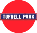
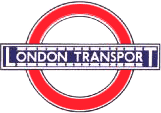
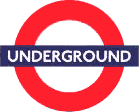
Some may say: so, you’ve done all this research, you’ve found out the shape of the original logo, let’s just use it and be done with it. Of course, this overview gave us an understanding of how the logo was conceived, how it evolved in different time periods and what were its main features. But it doesn’t mean we need to restore the 1935 symbol. After all, already by that time there were several logos in existence, as we discussed before. If we look at London, its London Underground logo hasn’t always been what it is today, it has been carefully updated while maintaining its most important features.
 |
 |
 |
 |
 |
The first version of the London Underground station logo, 1908 |
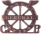
The uniform badge worn by employees of the London General Omnibus Company which merged with the Underground Electric Railways Company of London in 1910 |
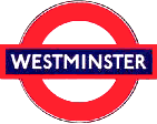
The station name sign by Edward Johnson, 1921 |
The updated London Transport sign, 1933 |
Redesign, the new logo was called Roundel-1972 and was used for all transportation in the city, 1980s |
And this is exactly the task we have before us: to carefully update the Moscow Metro logo, return to its historic image while maintaining its visibility, to create a unified image that will not be changed year after year under the influence of transient design trends.
The practical part
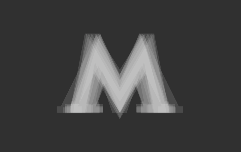
Our historical overview made it clear that we don’t need to replace the letter, we just need to carefully standardize it. We can try to imagine what the logo looks like in the minds of Moscow residents by combining all the existing shapes together. It looks something like this:
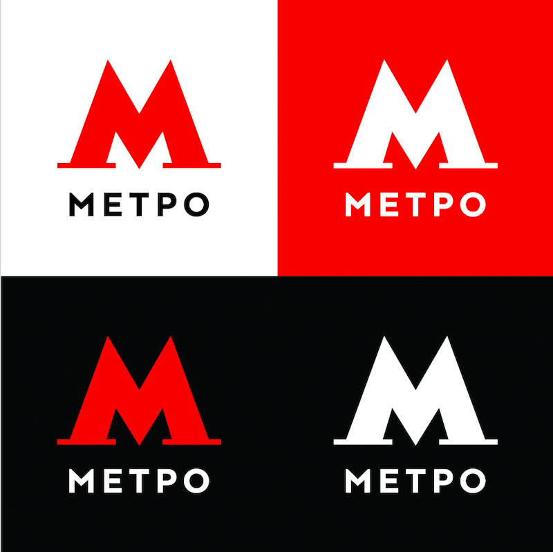
First I was simply consulting Yegor and Ludwig, I told them about the history of the logo, how it evolved and why. But ultimately it just so happened that I was the one to work on the design. By this time, Yegor has already created his version of the letter M whose thin pronounced serifs were just begging to be enlarged. Also, if an illuminated version of the logo were to be produced, it would be difficult to illuminate such thin elements. Though the “Metro” text was happily approved by everybody. One question remained however: wouldn’t foreigners read it as “Metpo” instead? But we decided they will probably get used to it quite soon. In fact, it will even help them to remember that Russian P sounds like R. But combining the logo with the text is definitely a good idea. We just need to make sure the distance between the image and the text is maintained when the logo is reproduced.
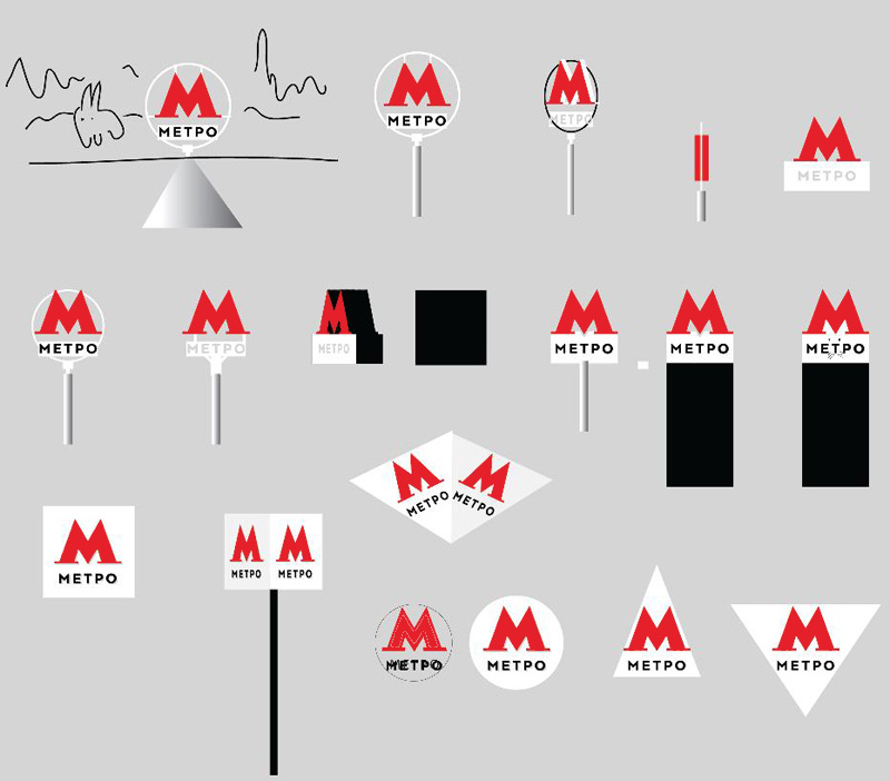
Now we start to think about the placement of the logo with the “Metro” text. But achieve nothing, apart from understanding that the shape of the M requires it to be placed on some sort of surface, which means it has to stand on something, not be suspended. Also, Yegor figured out how to turn the bottom part of the logo into cat ears.
All right, it’s settled that slim serifs don’t look good on the letter, besides, we never saw them used in our historical overview. We try to draw a new alternative. A couple of sketches later we realize that it’s important to be precise with the angles and create a slight convergence of the two seemingly parallel lines. It would allow us to get rid of the odd visual effect when after looking at the M with parallel serifs they start to look asymmetric. Interestingly enough, there were many asymmetric letters in our overview, for example on Ediniy or 90-Minute tickets.
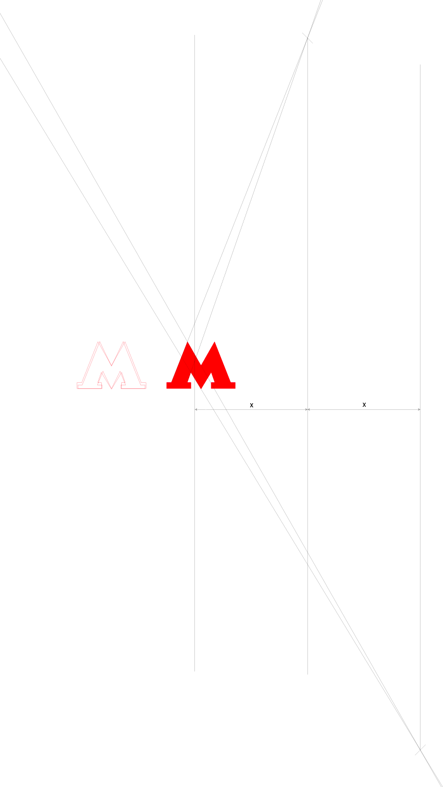
Having decided on this, we start to move the serifs and after a while find the best position for them.
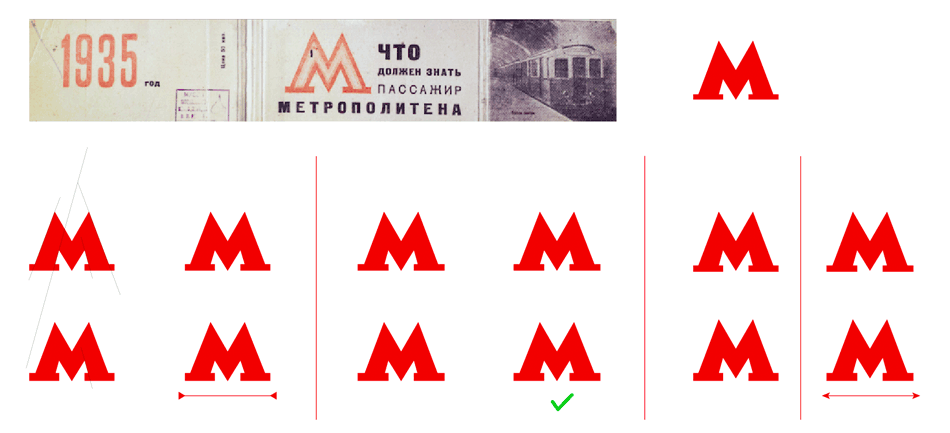
Slightly tuning the letter. Looks OK now.

Now we try to draw neon tubing in the 1930s style. Such a letter could be used for festive occasions, such as the Metro anniversary. Thinking how we can attach the “Metro” text to this letter. After all, it’s better than writing “Lenin Moscow Metropolitan” all the time.
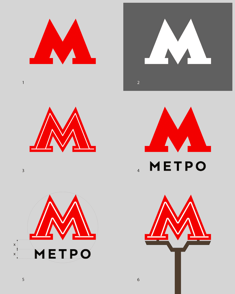
The art director suggests to make the festive logo the main one (Number 3). It would make it easier to replace the existing logos simply because hardly anybody will notice the change in proportions, but everyone will see the new inside contour. Trying to fantasize about the entrance stand, this time keeping in mind that the letter must stand on something.

Ultimately, we settle on what looks like the stand in use today, simply because everyone is already used to it, though we don’t abandon our efforts to give it a smoother shape. Also, serifs are not used on the stands today, which makes the letter look nice on a stand that is more narrow than the letter itself. However, as we already know from history, the letter with serifs must stand on something, which means the stand has to be as wide as the letter. Like this:
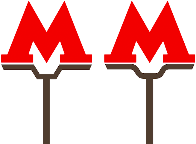
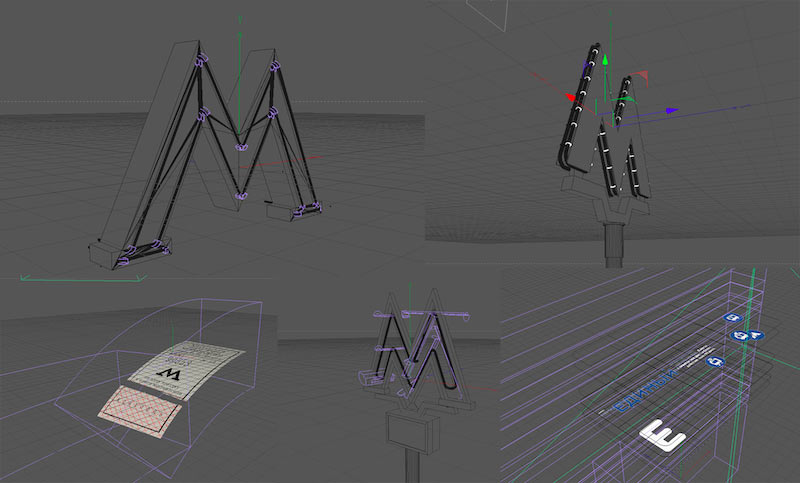
Based on this sketch we try to create a 3D model with neon illumination, the way it looked when the Metro just opened.
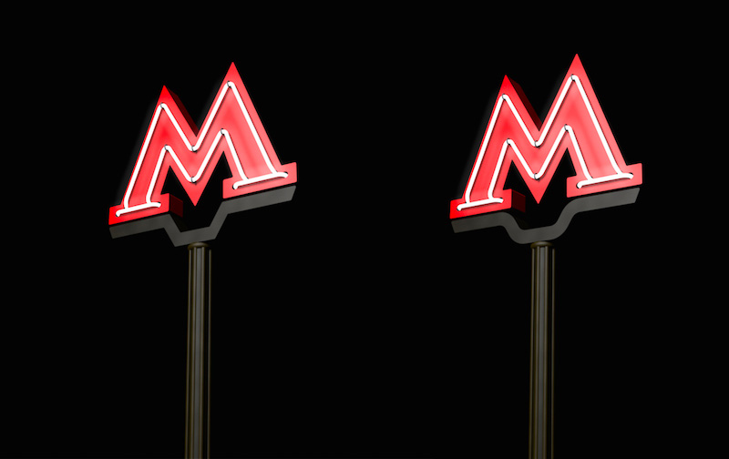
The art director likes the result and suggests to advise the Department of Transport and the Metro Administration to illuminate the letter on all historic stations (for example, on all stations of the first stage of construction) which would draw attention to the history of the city. As for the rest of the stations, they can be decorated with letters in anti-vandal light boxes that are cheaper to produce.
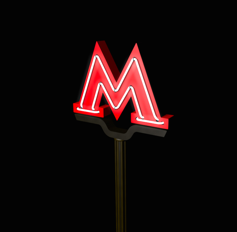
Rendering such a letter with the contour that we like so much.
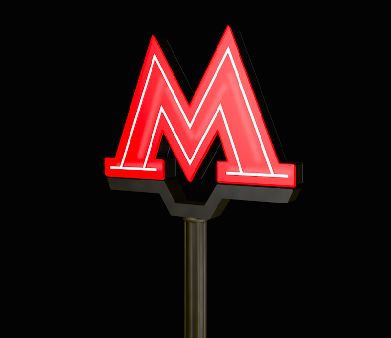
Checking out how a neon-illuminated letter would look on Teatralnaya at daytime.
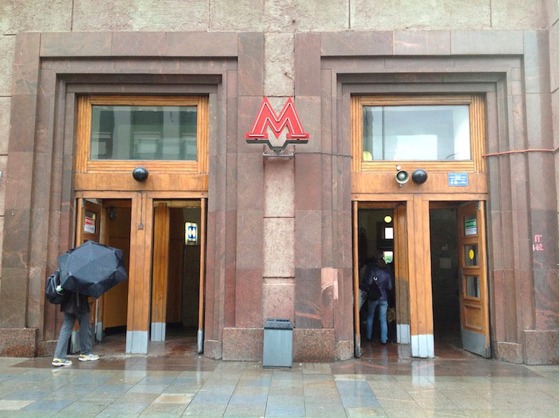
Preparing a presentations with examples of the logo in use.
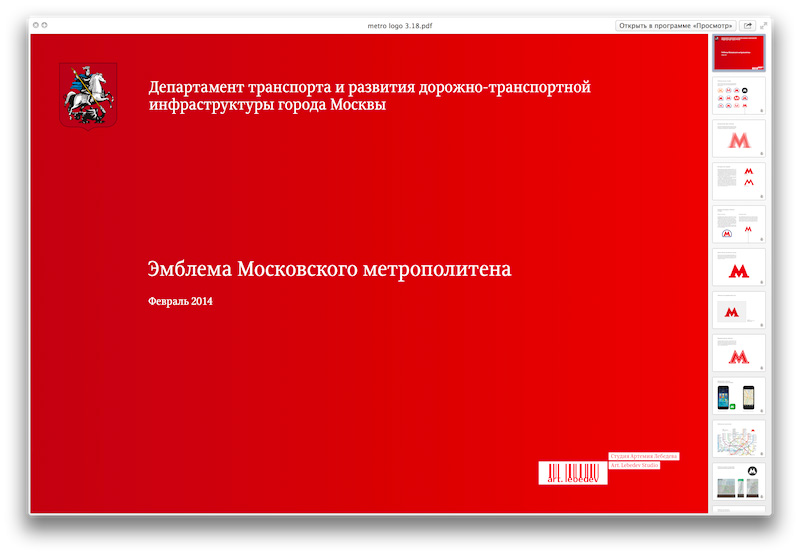
A decision is made to abandon the inner outline and the “Metro” text in the main version. All that is remaining is the symbol itself. We also need to develop a lighter version of the logo for specific needs of the Metro Administration and the Department of Transport. This version has to have better legibility in smaller formats, such as city maps. Using the same principles, we turn our bold letter into a regular one.

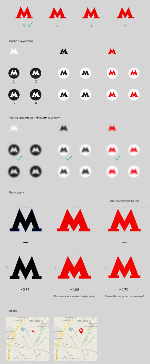
Even before the official announcement we start using the new logo in studio city projects, such as Metro floor navigation.
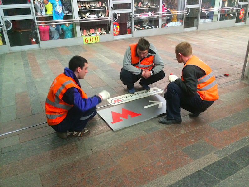
Once again, we realize that the letter looks like it has never changed. Creating a video to show the evolution of the logo.

Going through all the collected materials and extracting all possible variants of the letter M, arranging them chronologically, drawing and morphing. To make sure the video doesn’t look a bunch of logos morphing into each other, adding a dynamic timeline and inserts with logo animation on Metro entrances and tickets. Creating 3D models for those inserts and rendering them in a cartoon style so that they don’t look odd in a sequence of flat animation.
That’s it. The video is ready and the logo was changed for the best.
Before and after:
