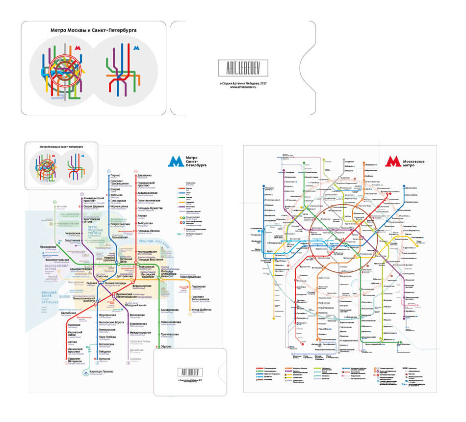
Realizing that it won’t be difficult to print both maps on two sides of a folding sheet of paper. What’s going to be difficult though is to decide what to have on the cover. Since it’s much more lightweight, the Saint Petersburg map will provide the space for the covers. But we can’t simply show the logos of the two Metro systems, it would be too confusing.
Trying various universal neutral drawings.

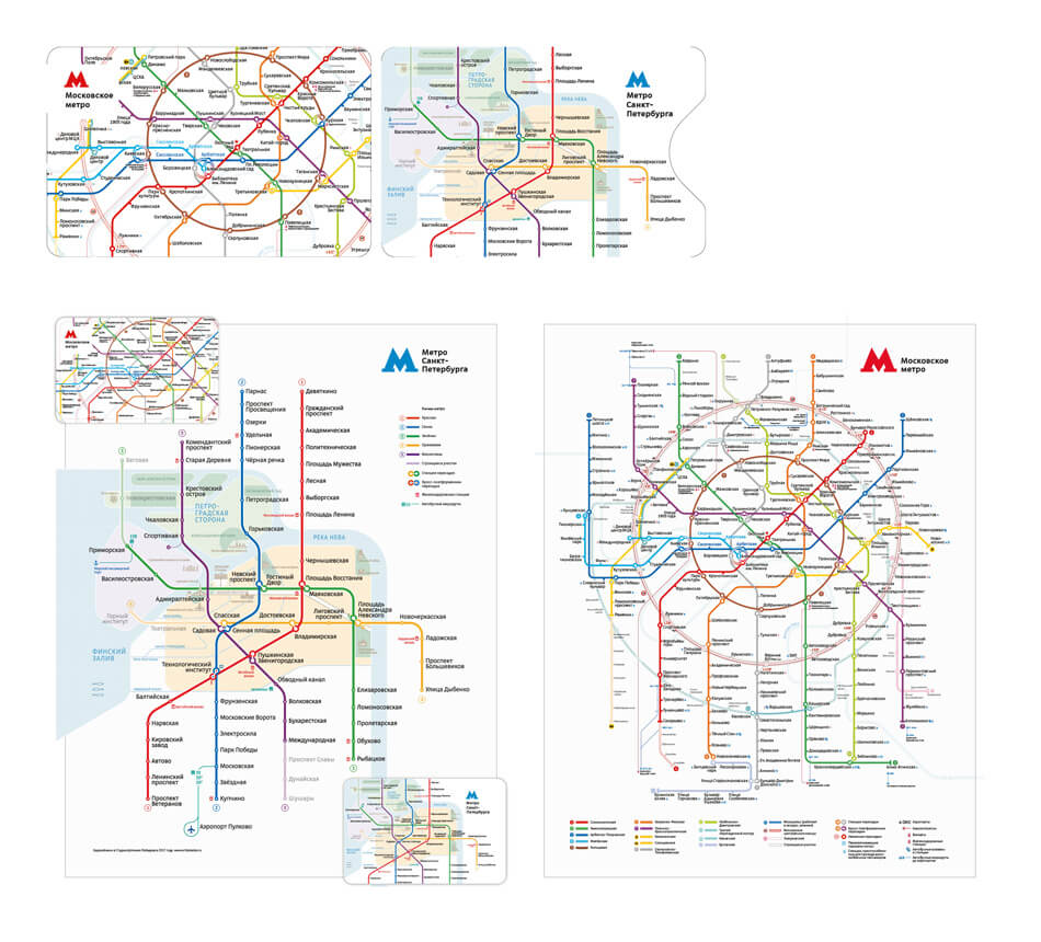
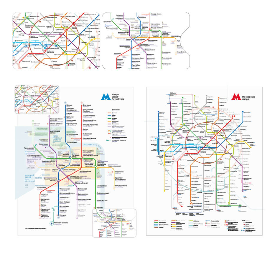
No. The art director suggests to put microversions of each map on the cover. Something like this?
No. We need to show fragments of the maps with the most popular stations in the center that can be used without unfolding the entire map. The microversions are helpful because the format is sufficient for a quick check.
We also need logos of the Metro systems on each version. Potentially, on colored bars.
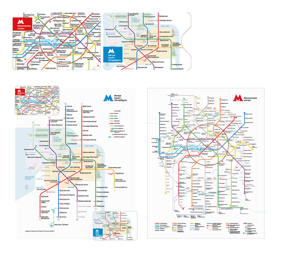
No, it’s better without the bars.