 |
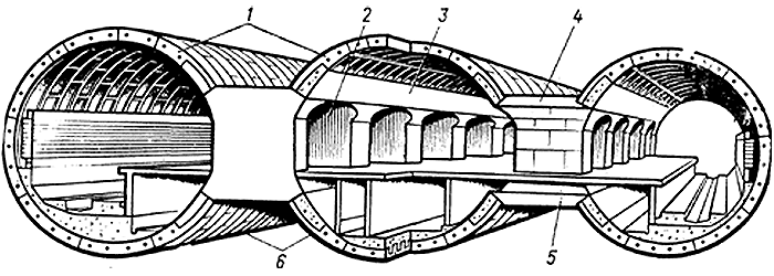
 We had to design a new logo for the company that had been in business for 70 years. It had to suit tastes of Metrogiprotrans architects and reflect the company’s specialty, i.e. underground transport construction. It came to be this original sign representing a perspective view of tunnel archs forming letter m. |
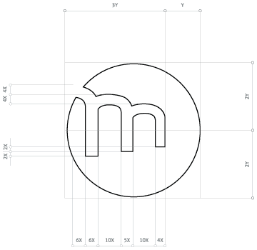 Logo proportions and rules
|
Artemy Lebedev
|

Order a design...