Client: Our startup is an automated legal consulting system. It’s difficult for the average person to understand all the legal terms: collateral estoppel, vindication, restitution, delictual obligation, etc. Our mission is to make sure every person can know their rights and use the laws to properly defend themselves. We need both a Latin and a Cyrillic logo. We would strongly prefer for the logo to look serious since we are planning to operate in a very conservative sector. We think using Lady Justice, the scales of justice or a gavel in the logo would be too vulgar. You could potentially consider an Ionic column but we’re not too sure about that either. The main idea is for this to be laconic, schematic and light. Of course, it’s up to you: the logo may not contain any legal attributes at all! We don’t want any references to robots. The main points are minimalism and strictness.
Logos that we like from the standpoint of colors and typefaces as well as icons:
1. Air France (the typeface is great!).
2. American Airlines (the new one).
We also quite like the FedEx logo. The subtle arrow is very clever and tasteful though we aren’t the biggest fans of their color scheme. We also like the type and the color of the Qatar Airways logo. We would also like to see a minimalist, laconic logo with a strict typeface and a pleasant but serious color scheme.
First designer: I tried a few concepts and then chose one per category and added colour, what do you think?
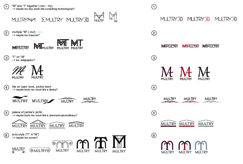
Art director: A bit raw right now. In number 6, the second one from the left is OK.
Second designer: Maybe something out of this?
Art director: Nope.
First designer: What about this?
Art director: It has to be a logo for a legal consultant robot. Is that it?
First designer: Ok, more serious then.
The third designer joins in.
Art director: Nope.
Third designer: Documents, robots, forms.
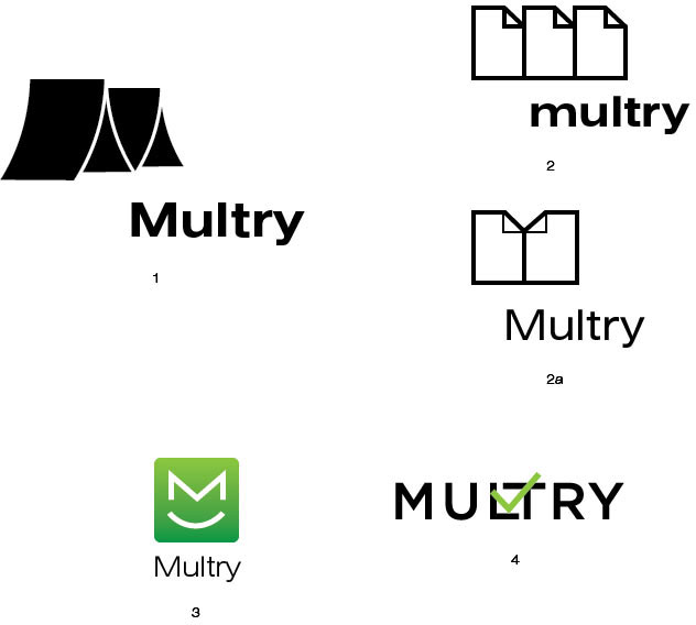
Art director: 1 is like Timor. 2a is a shirt. The cat in 3 is nice, too bad it won’t work. In 4 I see no value for our portfolio.
The first designer prepares more variants.
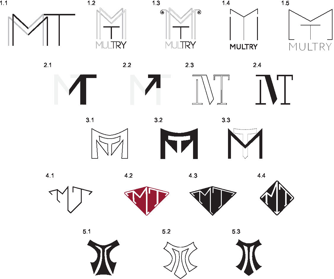
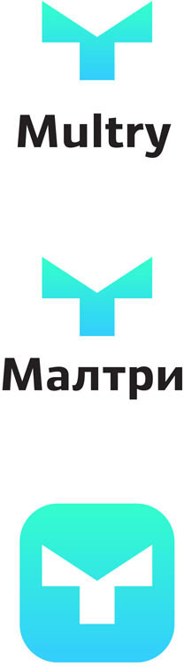
Third designer: M + T + robot face.
Art director: Yes, this is good. Just change the color.
The art director chooses the second design.
Third designer: I made the shape more square.
Third designer: m vs M.
Art director: It reads ITI, it doesn’t work.
Deciding to go back to the previous design.
The type designer writes the text.
Art director: OK, prepare the announcement.
