The making of the Optimus Popularis booth design
Overview Process
The first approach.
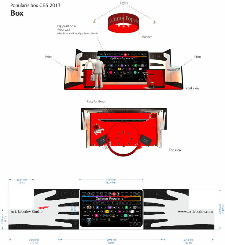
Designer: The project manager requested a booth to present the keyboard.
Art director: Use regular icons, without embellishments. They need to clearly communicate the buttons’ ability to display anything at all, with the focus on alphabets.
The designer goes back to thinking.
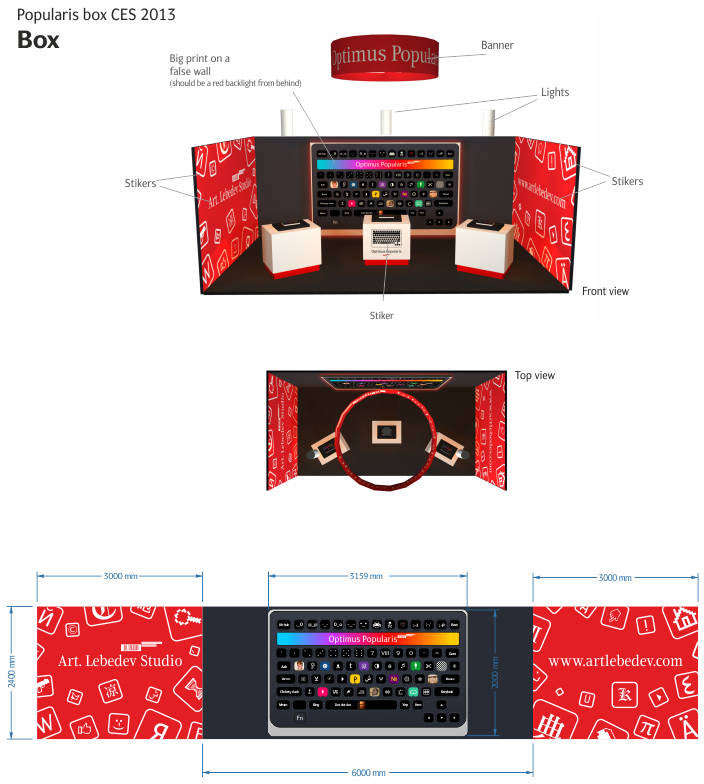
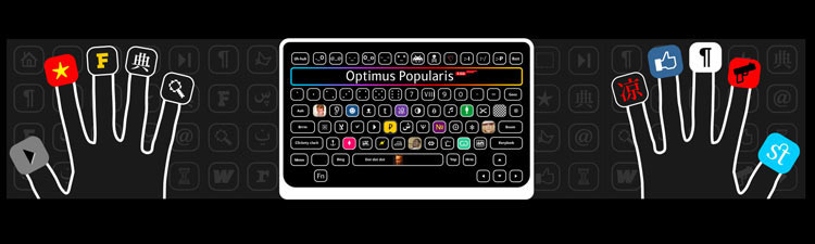
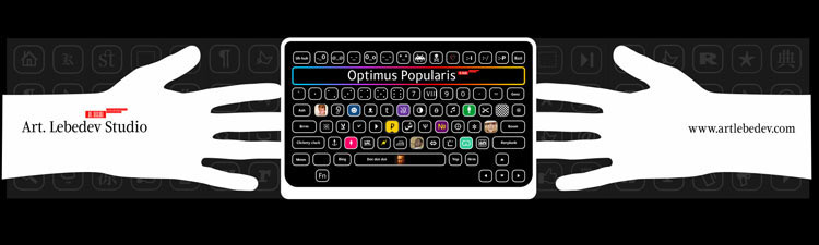
All of a sudden, a new art director steps in bringing two ideas to the table. First, to place outlined hands with fingertips carrying different symbols on the side walls. The symbols might be illuminated to create an illusion of them glowing through the skin. Other symbols can be scattered around the hands as well; make them “off” (for example, by only outlining them.)
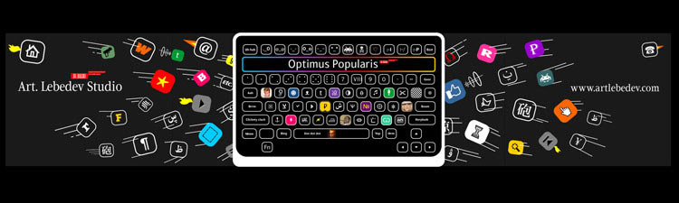
Option B: The back of the keyboard features a few, let’s say six, symbols changing through two-three pictograms (facilitated by the stereo-vario technology). Less active (outlined?) symbols can meanwhile “fly” from the keyboard outward horizontally.
Both options require the keyboard on the back wall, red floor, and black walls.
Designer: Here, I tried to put it together. “Grabby Hands” sounds like an interesting variant.
Choosing the “Grabby Hands.”
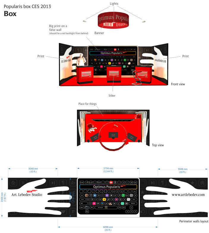
Reducing the number of podiums.
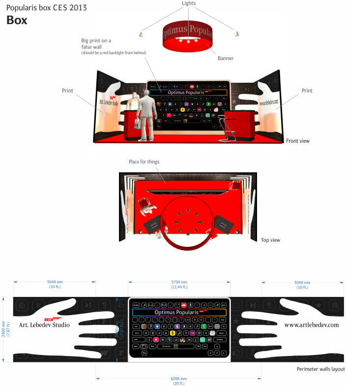
A timely message comes from New York, informing us that the walls can’t be tall all around.
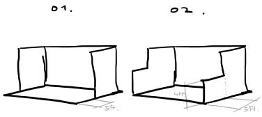
Redoing the walls.