The making of the packaging for Sweet Words chocolate
Overview Process
Ozersky Souvenir chocolate factory approaches us with another task. We need to put the factory’s signature product—chocolate cubes—in a new box. We’ve already had plain chocolate cubes. Chocolate for children is also covered. Now it’s time to address teenagers and youth. The overall direction remains the same: to present the chocolate in a way that will allow it to become a small, pleasant and unpretentious souvenir. Also, it shouldn’t be odd to buy a pack for yourself to enjoy over tea. Or carry it in your bag to lift the mood from time to time.
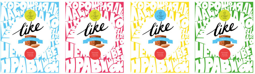
The client already has a preliminary name for the chocolate. It’s (don’t faint here) “Like.” After some eye rolling, sighing and whining we reconcile with “Like.” After all, there was a time when this word did not summon the thumb demon—maybe we’ll be able to use proper context to calm it down.
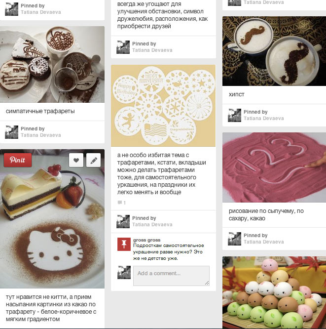
It’s time to start looking for a concept. Assembling a mood board to give us a good impulse. Once again, we realize that chocolate packaging design is a true vanity fair for graphic designers. Something like chairs for industrial designers. Or scotch tape. Fountains of creativity. Gulfs of imagination. Wonders of wit. Fireworks of graphic skills.
For a while we compete in who rerepins first (here’s the thing: if you say “repins,” someone will surely joke about Ilya Repin the artist).
As we go, trends start to appear, such as “back to the future,” “a good luck letter,” “sexy minimalism,” patterns, handmade, silly jokes, lettering, “smart constructive solution of the packaging,” “someone made of chocolate.”

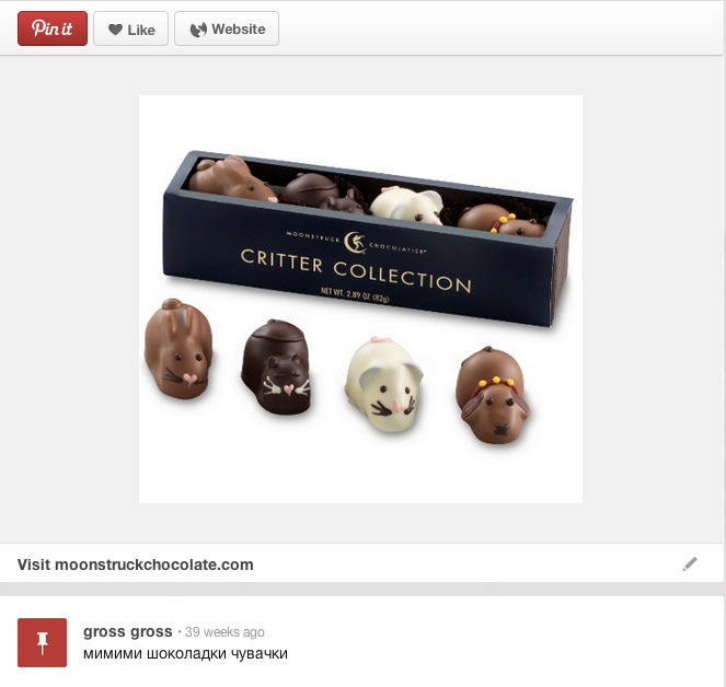
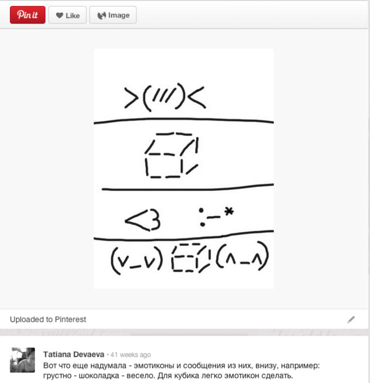
We also grab all the graphic devices that are dear to our hearts: coffee stencils, gold printing over a drawing, kawaii.
Coffee stencils don’t seem to work, but kawaii looks like a really interesting topic that’s popular with the youth. And besides, it hasn’t been developed by the mass market yet. And this despite the fact that anyone, literally anyone—young or not—loses his or her mind at the sight of Asian packaging, starts to squeal “mimimi” and reaches for the wallet.
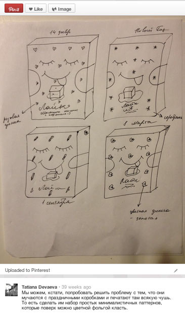
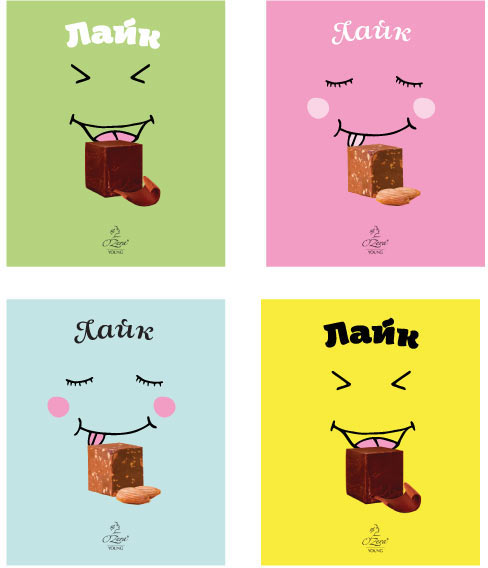
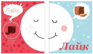
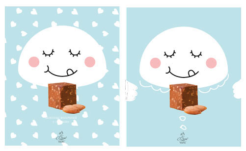
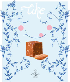
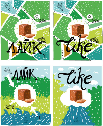
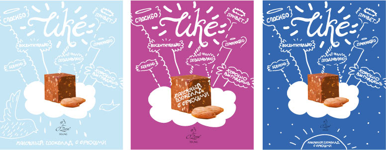
Looking at kawaii from different angles. Replacing “Like.”
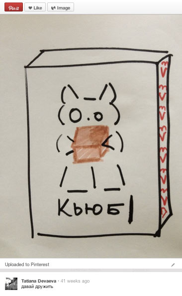
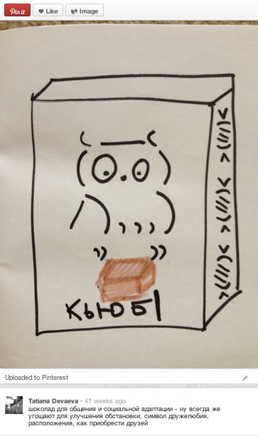
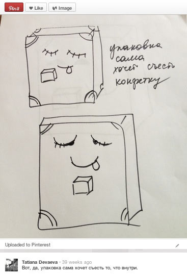
Arriving at an image of a cute small box that shuts its eyes with pleasure while it eats the chocolate it has inside (also a trendy move in food packaging design).
Thinking about the future.
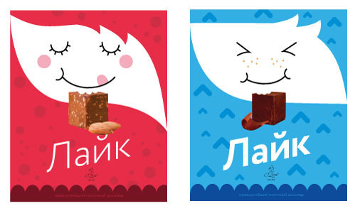
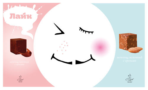
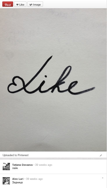
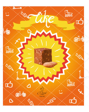
Yep, that’s a like. Will surely be shown to the client. Meanwhile working on the “how stuff works” idea. Chocolate means pleasure, let’s look at its physics and chemistry.
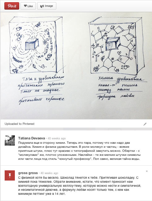
The concept evokes doubts as it looks snobbish and apparently inedible which is usually the territory of premium brands, definitely not youth-oriented ones. But overall we like it, we see that it has substance and can be realized. We’ll show it to the client, too.
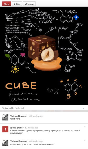
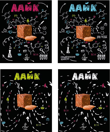
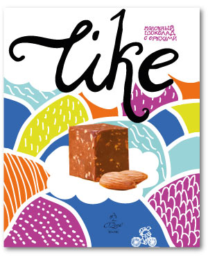
Demonstrating the chemistry and the kawaii ideas. The client understandably doesn’t like either of them. Kawaii looks foreign and too niche, the chemistry is too dull and misses the target audience. The client asks us to focus on warm feelings, communication, friendship, love, happiness and to show all this through candy, much like Lindt has done it. The only problem is, we can’t make another Lindt.
The project manager makes helpful remarks.
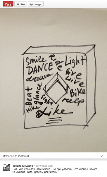
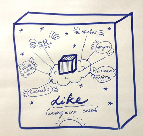
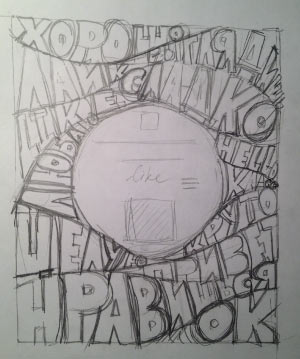
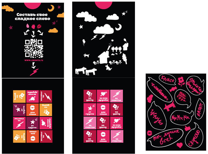
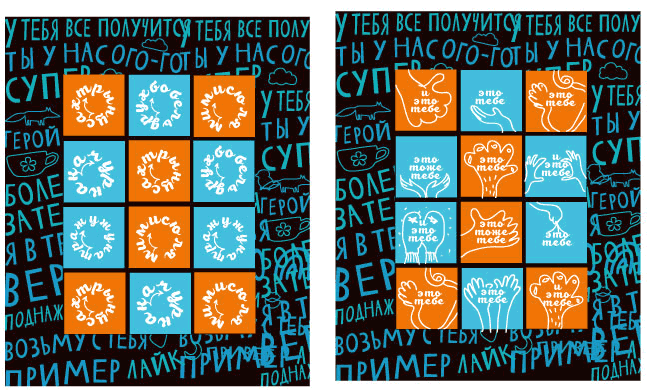
Thinking about building communication around “Like,” trying out interactivity and communication in packaging.
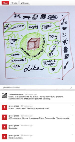
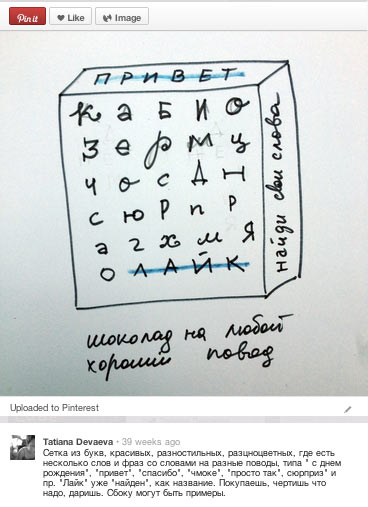
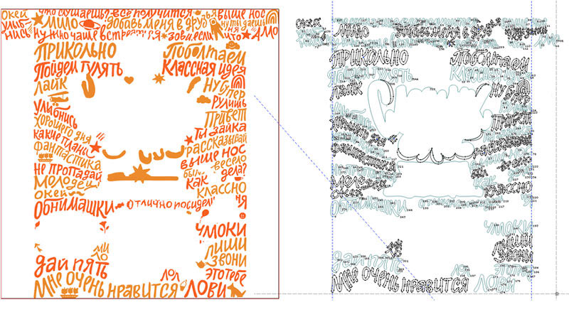
The last idea looks fun and promising. There is a letter grid on the box so that some words or phrases like “hi,” “for you,” “surprise,” “happy birthday” can be crossed out. The name “Like” is already marked. You buy it, you strike out a line and you present it. There are different sets of words and some Easter eggs thrown in as well.
We spend some time gathering nice pictures with examples of letters of different styles used together (and there are millions). But we come to understand that the idea doesn’t quite cut it. It’s too complex or something. What if somebody just doesn’t want to play the game—they’ll have to go without chocolate?
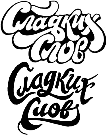
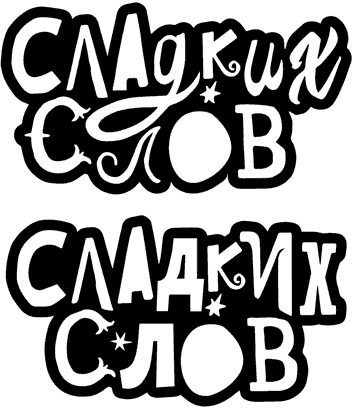
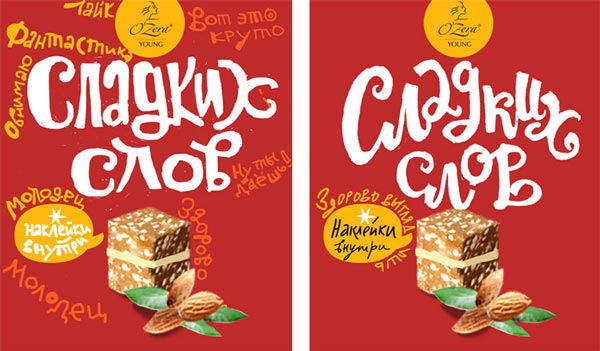
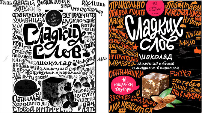
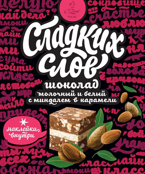
By this time we get hit by another idea—a word play. "Sweet dreams"—"Sweet words." Is it a slogan or what?
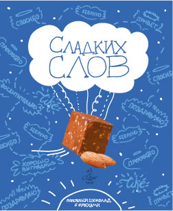
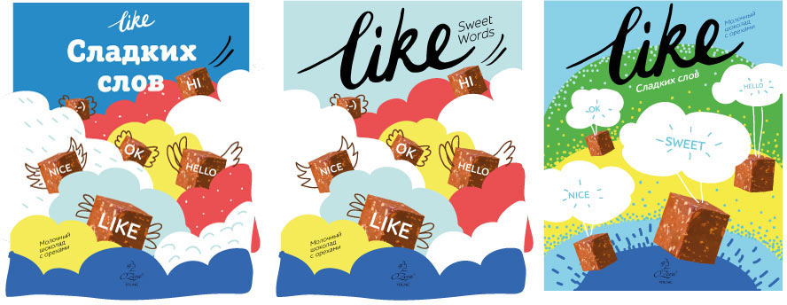
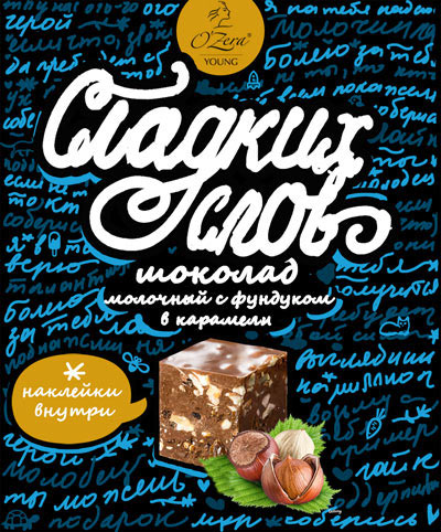
The art director has a good feeling about this, and he’s right: the client immediately forgets about “Like.” “Sweet Words” gets promoted to a name. “Like” bids us farewell and we can’t say we’re sorry. The art director makes a decision to cover the boxes with psychedelic text waves, ether of sweet words. Something like this:
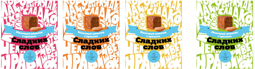
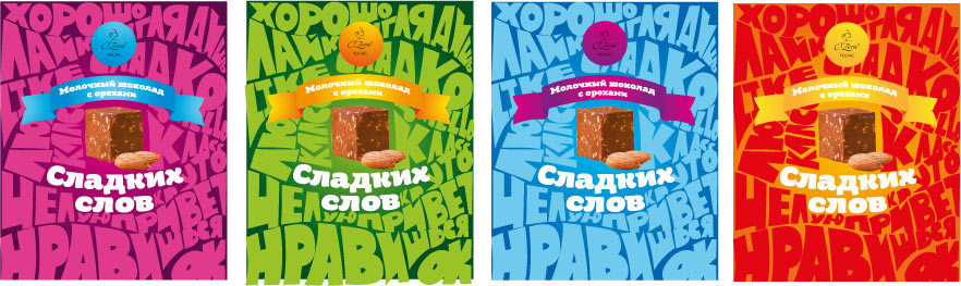
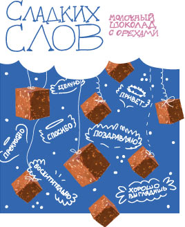
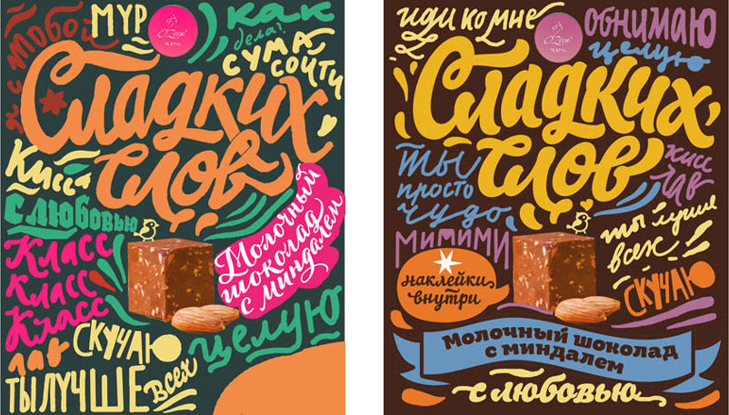
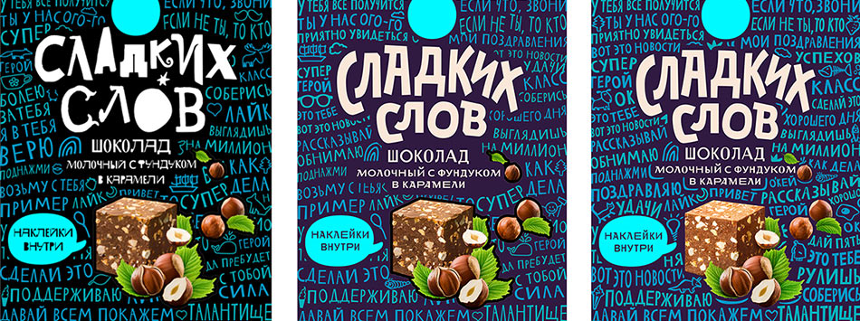
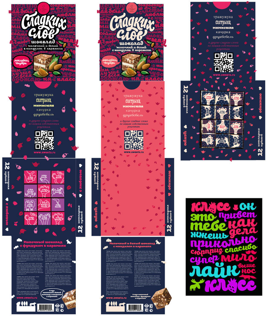
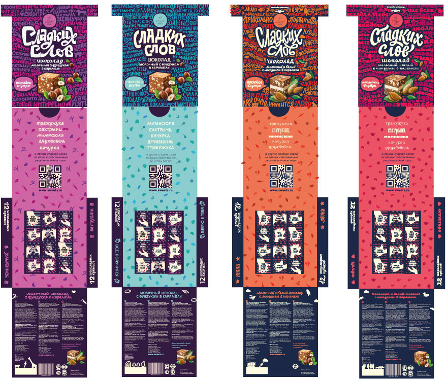
We start to develop and grow the concept. We need four boxes, each with a specific emotion, to cover all occasions. A deeply romantic one. One about friendship. About overall benevolence. And one for nice and tender occasions without sexual innuendo. Making up lists of sweet, sweetish, sugary, luscious, caloric, appetizing, tempting words. The designer and the type designers get down to business.
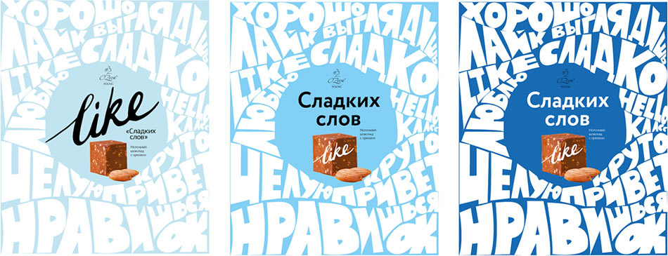
Trying to estimate how the background and the chocolate itself could look on the packaging. Starting with the test box, the romantic one.
Working through the text.
Starting to polish the background.
Good. Now the next box.
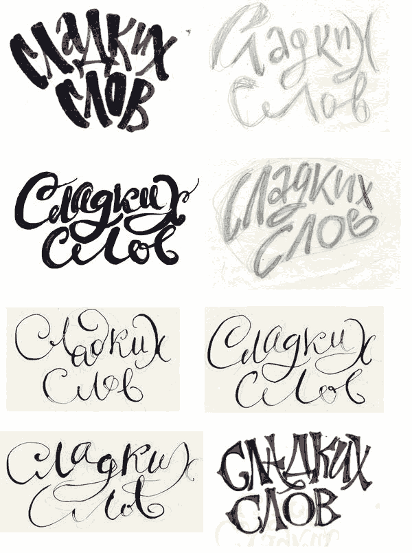
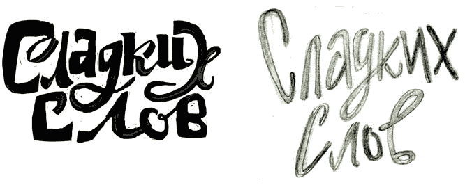
Art director: It comes out as fancifully paunchy with an air of Ukrainian scalp locks.
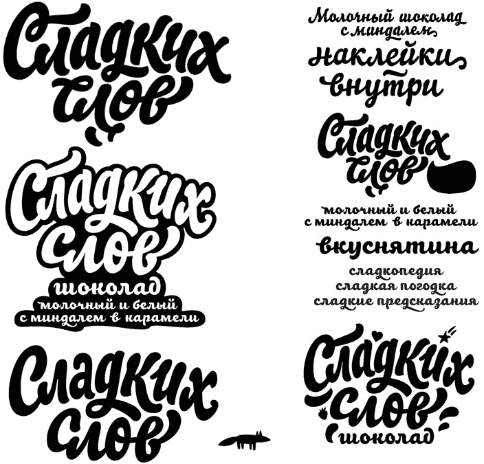
Type designer: Maybe like this?
Art director: I don’t like it.
Type designer: Or like this?
Art director: OK.
Getting the letters into shape.
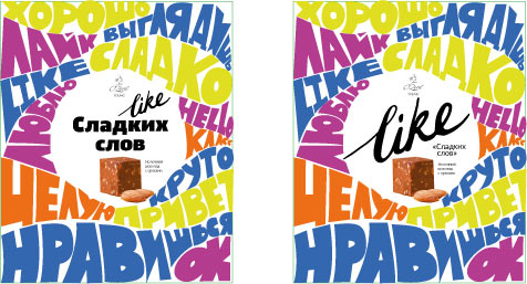
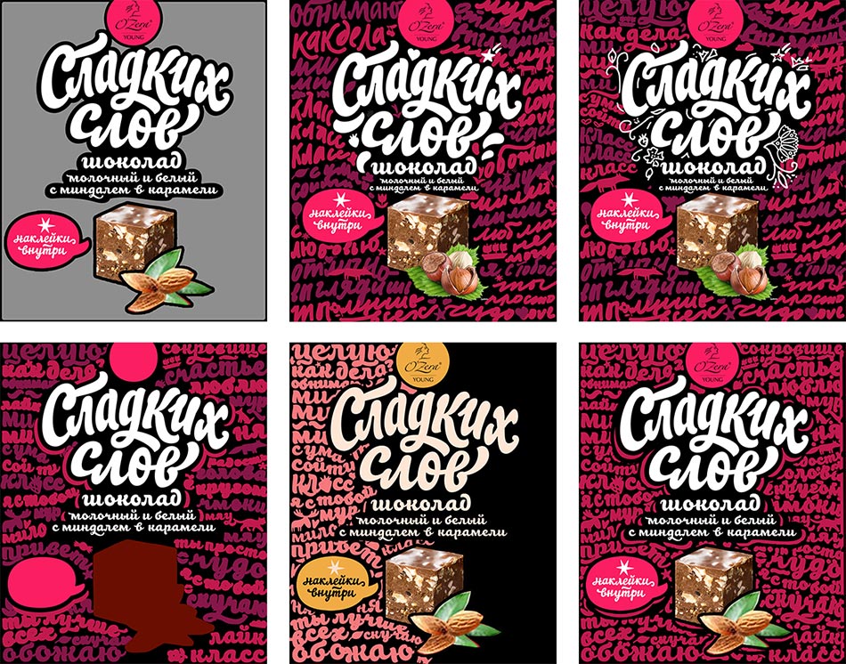
Filling the background with suitable phrases, polishing every single letter, pushing the “Hipsterize Colors” button.
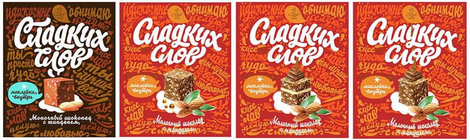
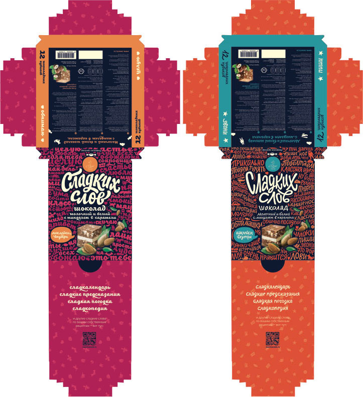
Meanwhile, the other type designer is working on the other two boxes. The art director asks to make something unusual, something he’s never seen before.
Ultimately he picks the draft codenamed “sausages” and another totally odd one.
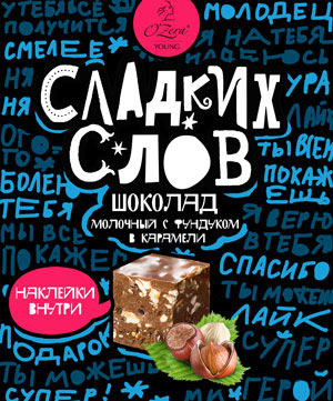
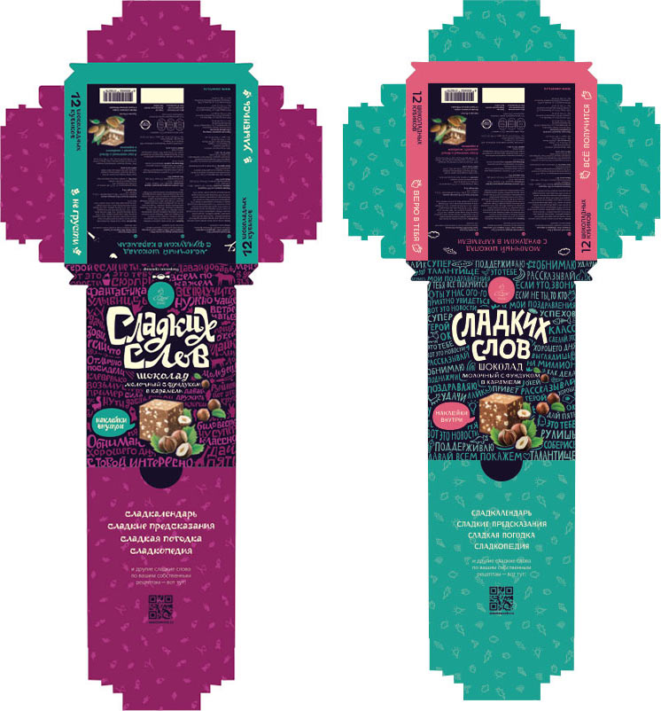
The name is combined with the rest of the elements, the box is covered with words.

Working on the outline of the main text, writing and drawing, writing and drawing.

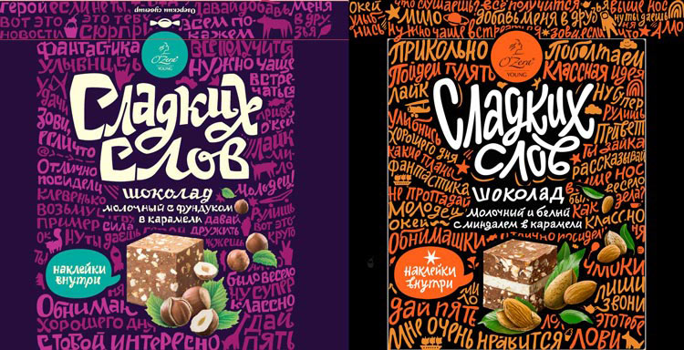
We decide to make background words in two similar colors to make them look vivid, but not too bright at the same time.
Making the final touches.
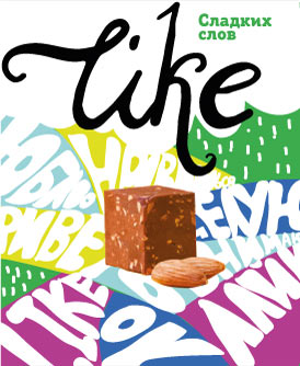
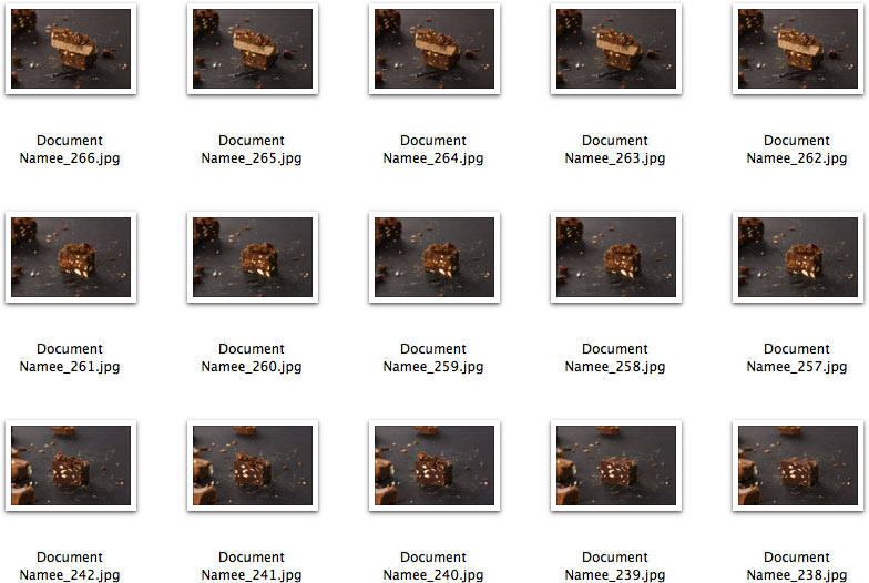
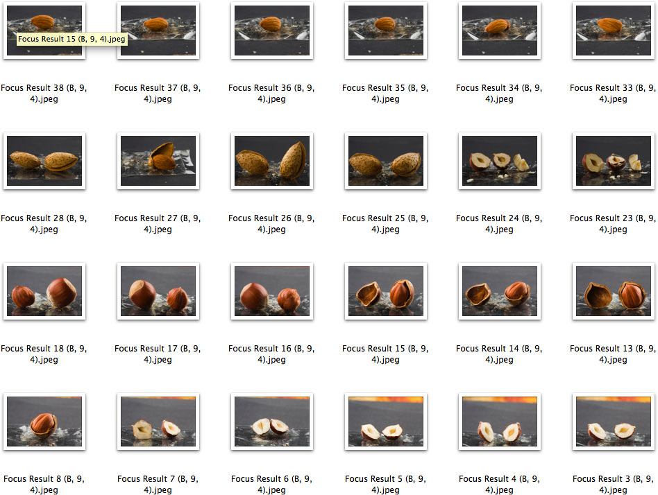
At the same time, the photographer is tasked with making photos of the chocolate. The pictures have to look natural and mouthwatering. For each piece we make 5–7 macro photographs gradually moving the focus point. Then these photos are combined in Helicon Focus to get a picture of a piece that is sharp end to end. This solves the problem of small depth of field in macro photography.
Now we have a bunch of very sharp-looking chocolate pieces.
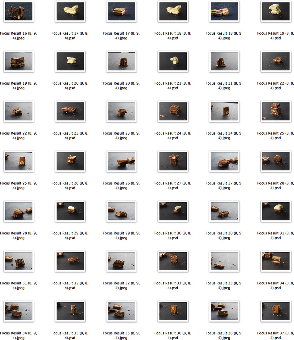
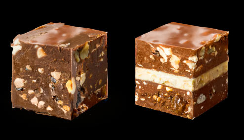
It is much easier to build a nice cube out of parts.
We do the same with nuts.
Creating ikebanas out of cubes and nuts.
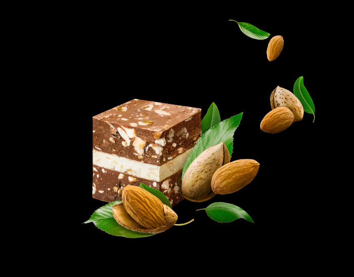
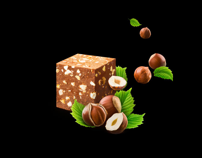
Done.
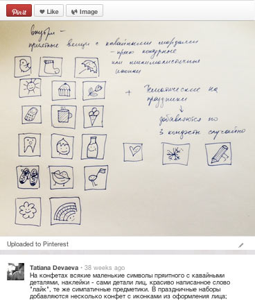
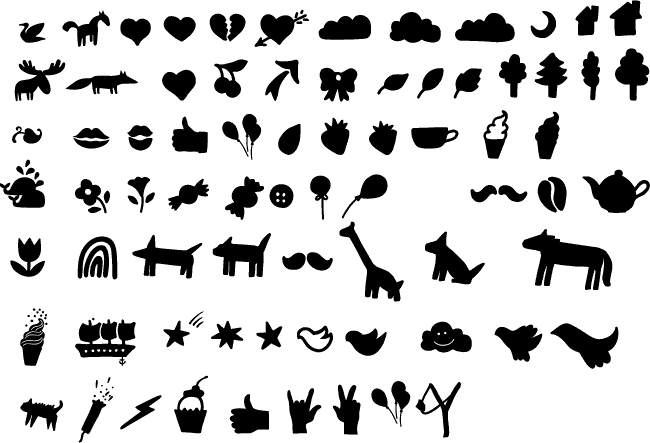
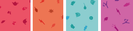
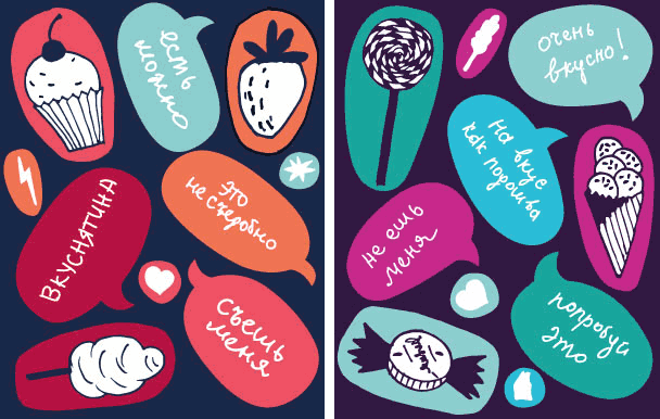
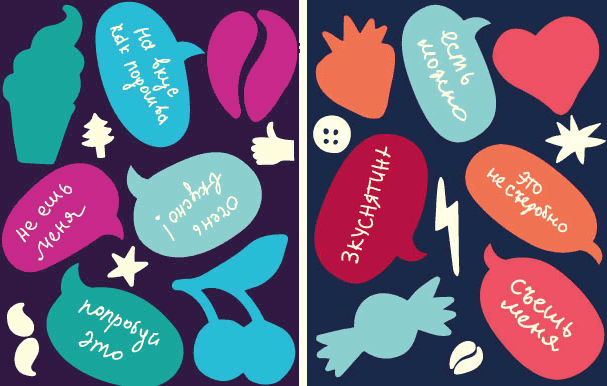
The space between the words on the box is filled with small and fun-looking picture-symbols.
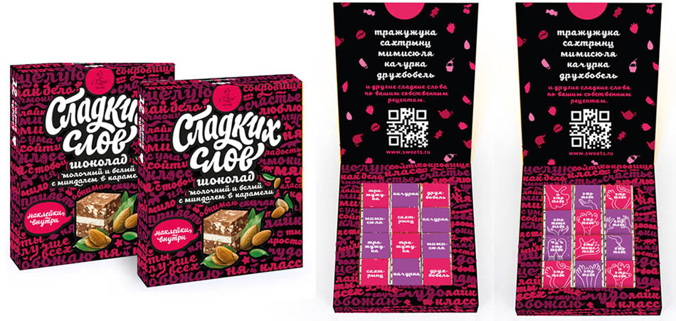
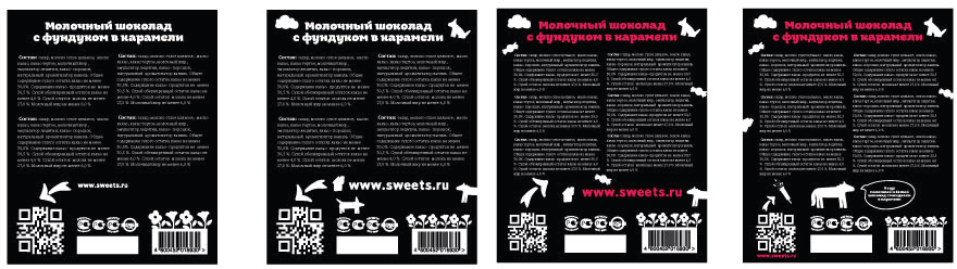
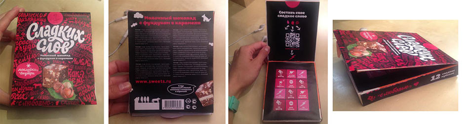
Now, when everybody is starting to think the work is over, it’s time to man up and face the fact that boxes have inner and back sides which also require our attention. Not to mention wrappings for individual candy pieces. And stickers which we decide to put in the box the same way we did with chocolate for children.
As we go, we glue a whole bunch of boxes to test out design ideas.
Giving the boxes to the editors for proofreading.
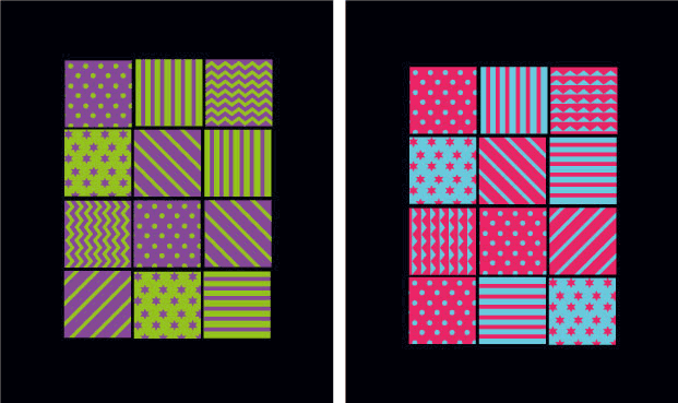
Creating a pattern for inside decoration.
Assembling and showing to the client.
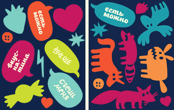
Thinking about stickers.
The designer is still not happy about the slightly dusty and dull colors. Making the combinations more fresh and vivid, polishing a whole lot of various little things, proofreading and correcting all the texts again, preparing mock-ups.
Changing sticker colors.
At the very last moment it turns out that the back side of the box which has already been proofread and typeset needs to contain a large text block. The typesetter heroically accomplishes the task.
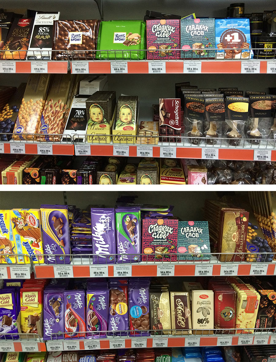
All that’s left is to see how the packaging looks on the shelves. It looks good.