Client: The logo and the identity will be developed for Oxysulphan Blue Sodium Salt medical product. Right now it is undergoing clinical studies. The product was designed for intraoperational visualization of lymph nodes. When removing a tumor, it is important for the surgeon to also remove sentinel lymph nodes which may contain cancer cells.
The product itself is a deep blue solution that comes in a 5 ml bottle. Each package will contain five bottles. The logo and identity will be used on product packaging as well as on other demonstration materials.
We would like to see a laconic and memorable logo and identity. The logo should make use of or reference the color blue. Since we want to devote considerable efforts to introducing the product in the future, the logo and identity will be used on a variety of materials: packaging, marking, guidelines, clinical protocols, advertising materials, registration dossiers, etc.
Designer: It’s a blue period for me.
Art director: Looks like a crystal meth lollipop.
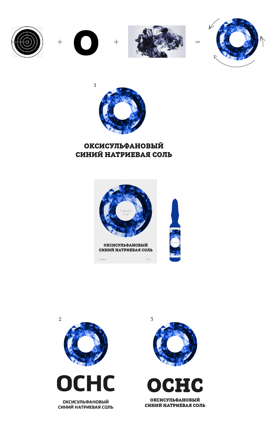
Designer: A tree or a tree branch as a representation of blood vessels. Blue fruit are the stained lymph nodes.
Art director: Autumn. Why do we need autumn?
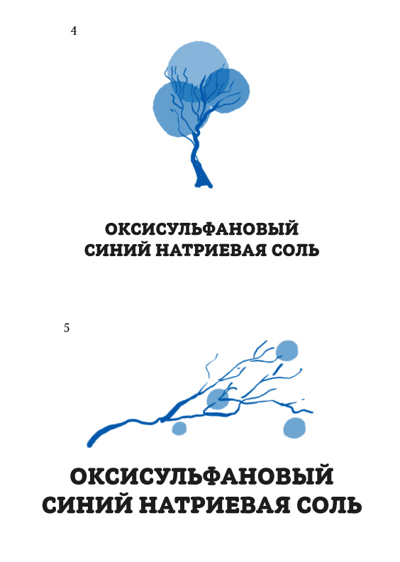
Designer: Can draw it in watercolor, too.
Art director: A great logo for a retirement home.
Designer: More thoughts.
Art director: Something like 19, but without the drop. Do you maybe want to talk to the client to discuss the name? Is it “Oxysulphan Blue” or “Blue Salt?” I don’t understand.
Designer: Yeah, I’ll double check. I need their contact details. From what I understand, it’s like Brilliant Green, a water or alcohol-based dye. Our Oxysulphan Blue is also a dye based on a salt solution.
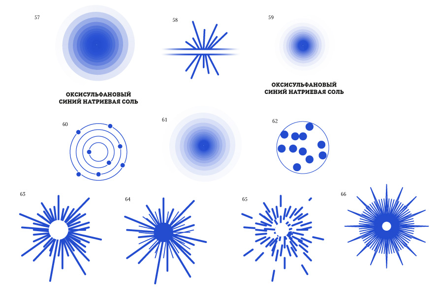
More circles.
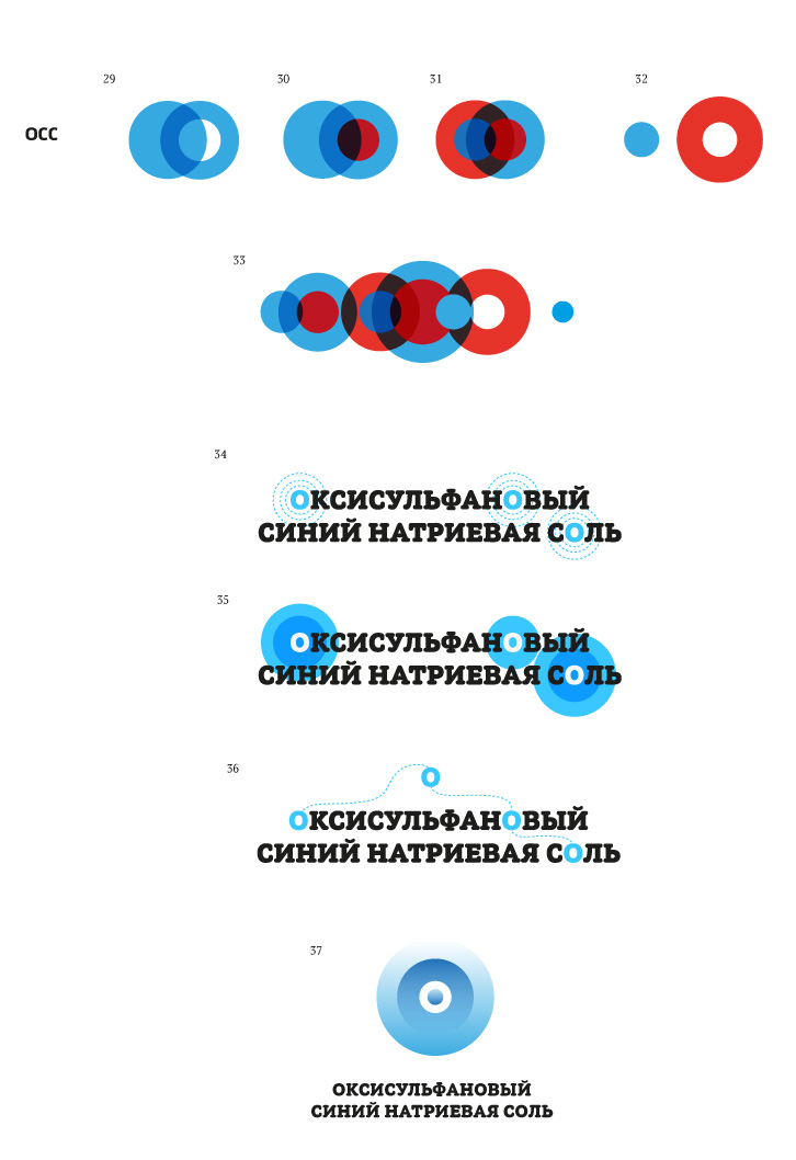
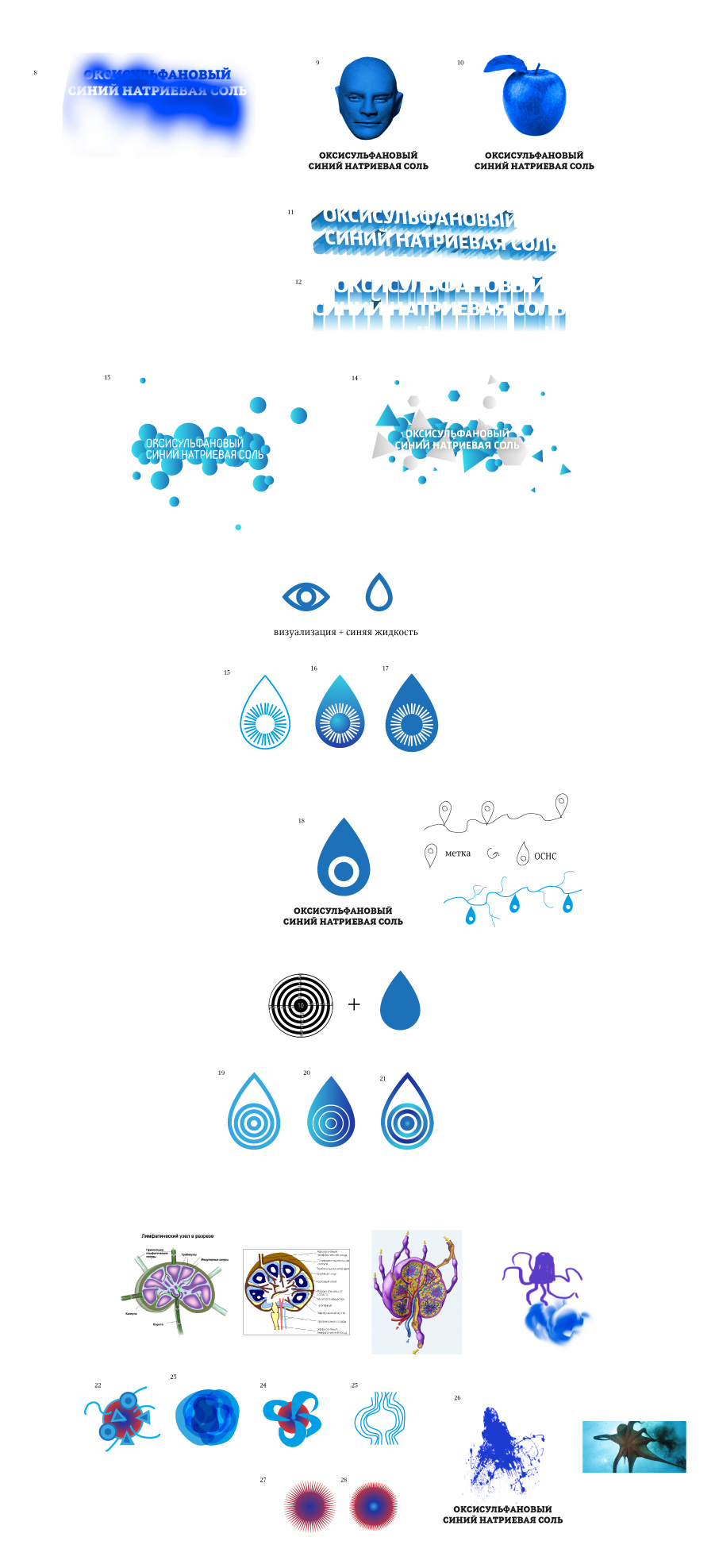
The emphasis is on the color blue. A certain degree of abstraction would work best here. Contrast is also important, since contrasting lymph nodes is the primary task of the product. I see colors blue and white. OC works well in our opinion. CC brings up bad analogies, while OCCHC is too complex. There should be no salt crystals in the design. It’s a product that is introduced into blood and tissue, crystals can be lethally dangerous so we specifically control that the solution is true.
Art director: I still don’t understand, can we just call it Oxysulphan Blue?
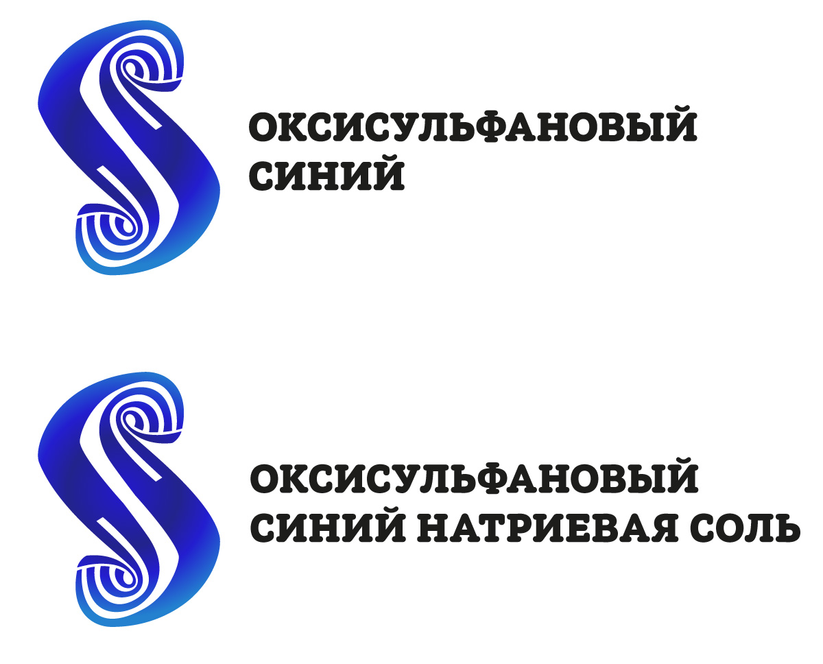
Client: It is permissible in the design. In all further documents, manuals, etc. we will use the full form including the name of the main ingredient.
Art director: So let’s just write it the same way in the logo.
Client: The substance itself has been in existence for a while as the E131 food color (patented blue). The solution itself is rich blue in color.
Designer:
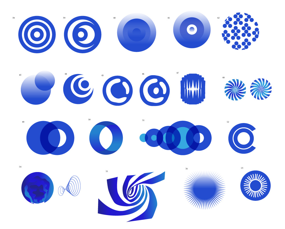
Art director: 55 and 56 are OK. The color in 55 is good.
Designer: Is it better to draw the spiral with chaotic rays (75) or streamline them (76)? If we round it up in a circle, it looks like a lollipop again (77).
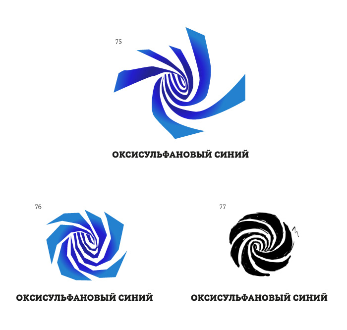
Art director: What if you twist them into something resembling the letter C?
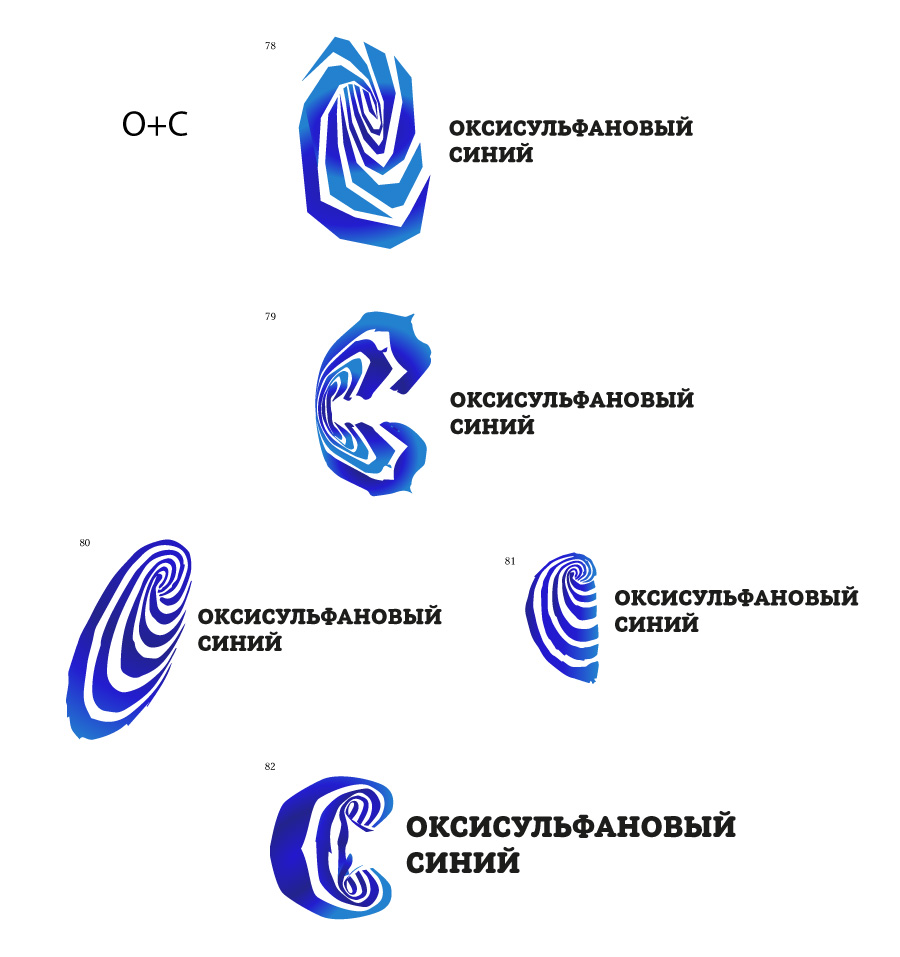
Art director: Let’s try 81–82 in Latin script.
Designer: Why Latin though? Because Sulphate?
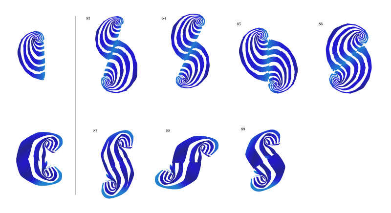
Art director: Because Siniy (Russian for blue). 89 is OK.
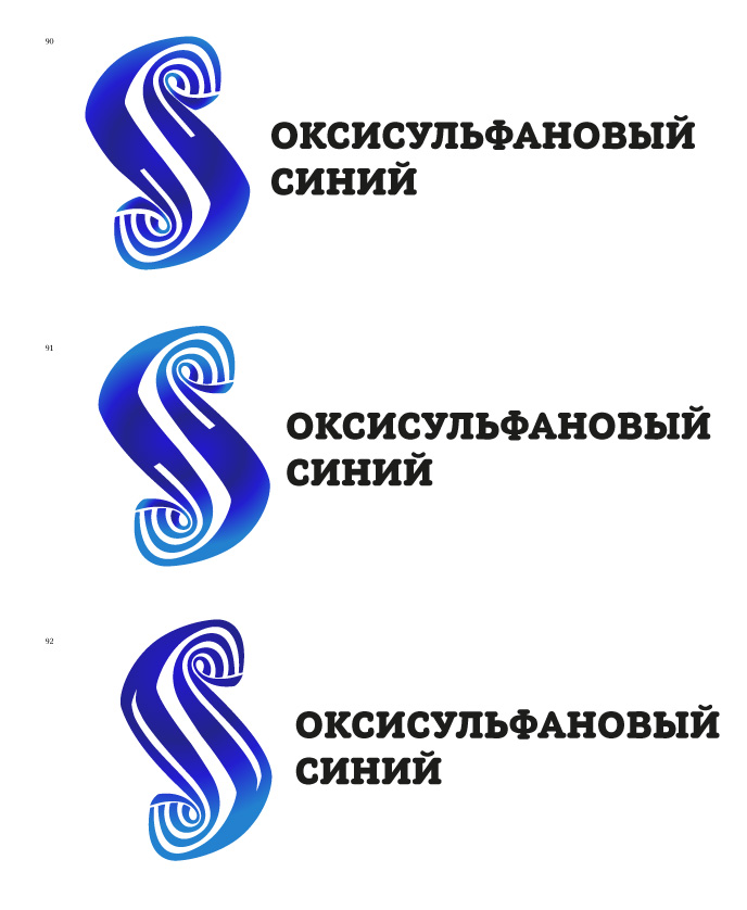
Art director: 91 is OK.
Designer: The primary and the additional versions.
Art director: OK.
Art director: What if you make the 66 more chaotic and bent?
Designer: Something like this?
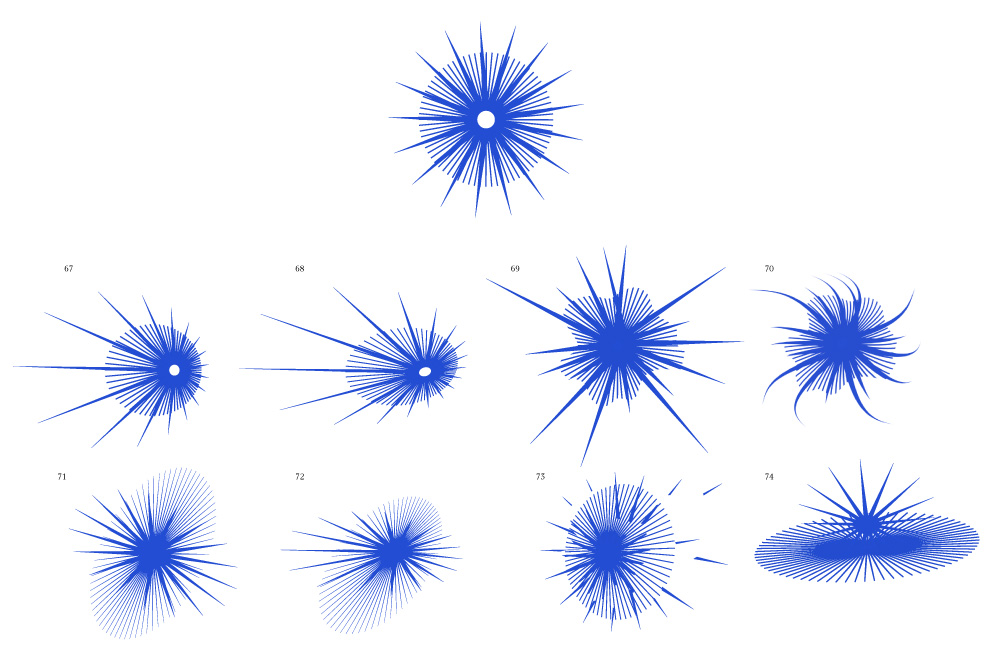
Art director: Yes, like in 73.
Designer: Packaging.
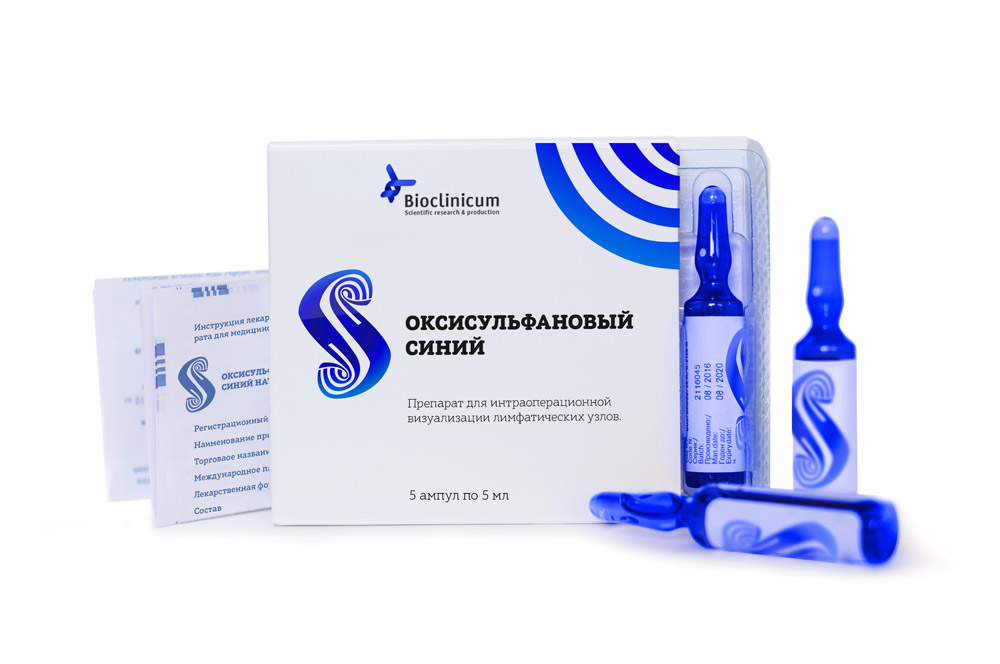
Art director: Good.
