Paralect is a bold, driven, creative team from Minsk that helps entrepreneurs from all over the world create, launch and support complex information projects and use them to make money. For eight years the company has operated without an identity or advertising, relying on clients to tell each other about Paralect over the phone. The situation was finally addressed at the studio and now the developers have a logo and an identity to go with it.
The guys from Paralect are serious IT professionals who are also very enthusiastic and cheerful. The new identity fully matches the nature of the company.


The logo is made of three parts. The first is one of the six signature shapes that radiate with activity and can be colored in any of the six corporate colors. The second part is the polished name of the company. The third is the descriptor that emphasizes that launching projects is what Paralect is all about.

A special expressive version of the logo uses three colored shapes together to make the logo even brighter.
The six shapes from the logo plus nine additional ones serve as elements of the corporate identity. The shapes can be combined in different ways to brand documents, business cards, notepads, pens, website pages and everything else.


Paralect employees believe that work should be interesting and pleasant and the office beautiful and comfortable. Colored shapes perfectly cope with this task when used to decorate office interior.

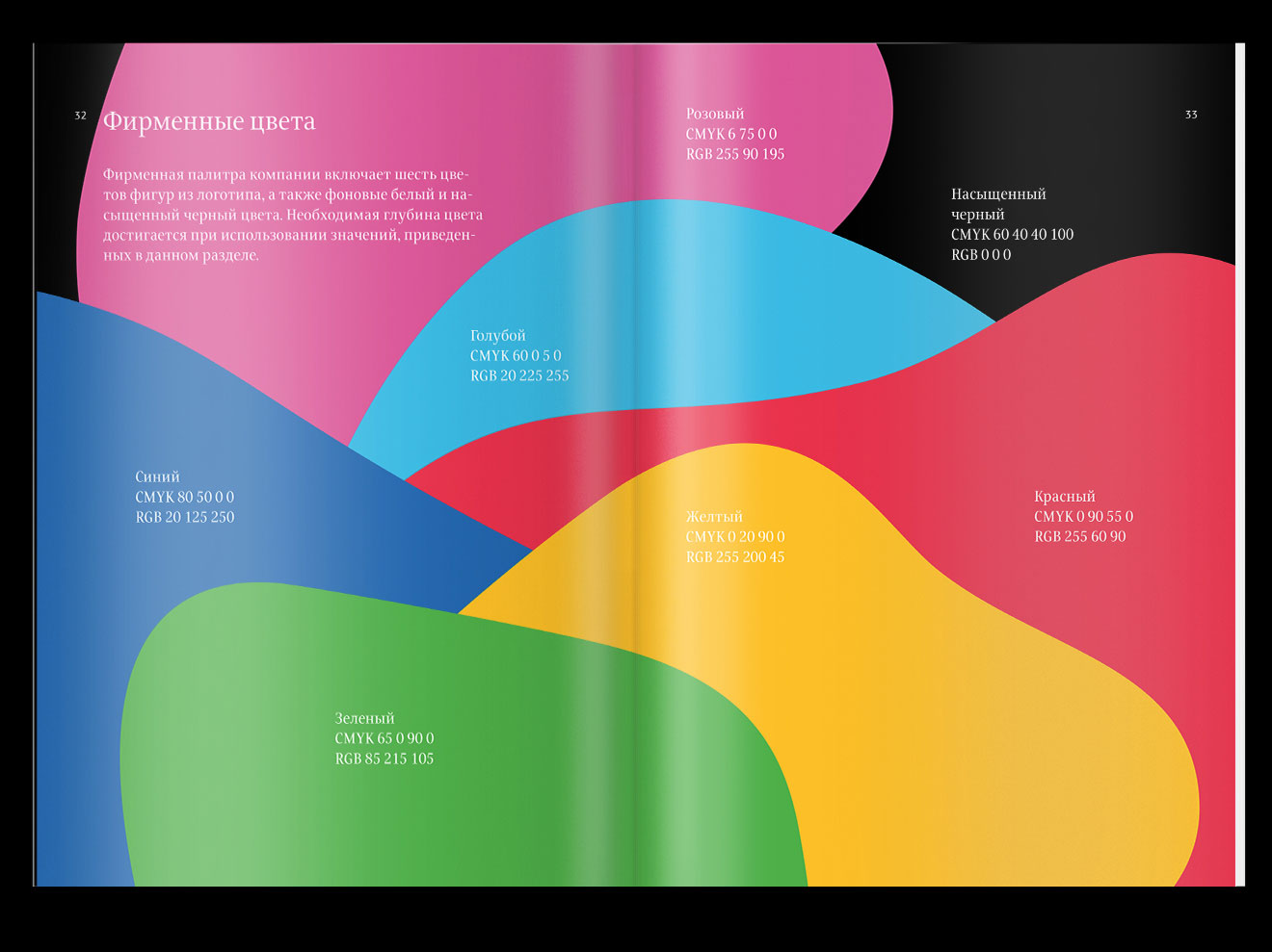
Rules for the use of the logo, colored shapes, typefaces and colors are laid out in the guide.
art director
designer
- Egor Kosolapov
typesetters
- Regina Krupnova
- Elizaveta Alpatova
type designer
- Taisiya Lushenko
project manager
- Galina Volynets
