Client: Privezite online store (website at www.privezite.com) sells photo and video equipment from Japan. The store’s main features are:
—our prices which are lower than the market average since we are located in Vladivostok, close to Japan which allows us to cut down transportation costs;
—our product range which includes rare products that can be purchased only in Japan (discontinued or not yet selling in Russia);
—our small team of professional photographers who very attentively work with every client.
The purpose of the style and the logo is to let clients know that we work with photo and video equipment and that we are professionals in these areas and can find everything and beyond for them. Maybe it would be worthwhile to emphasize our unique location which is close to Japan. We often carry expensive equipment for an upfront payment, but not every client is ready for this scheme so we need the style to also instill confidence.
The logo will be used on our website, employee t-shirts, business cards, branded tape, badges and souvenirs that we give to each client.
We would very much prefer to avoid using an image of a camera in the logo since we believe this to be in bad taste, but if you think otherwise, we give you a blank check.
Designer: Something like this comes to mind.
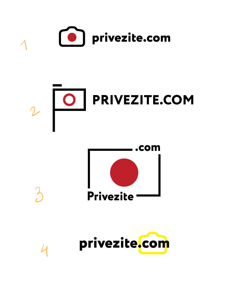
Designer: We can also use the Japanese Imperial flag but something tells me we probably shouldn’t.

Art director: Be bold and original.
Designer: I have these two.
Art director: Vasya, number 1 looks too much like it’s for a batteries store. As for number 2, you can try exploring this direction, but let me remind you again: we need cool, reckless logos.
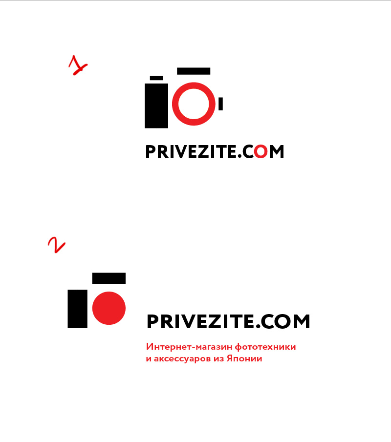
Designer: Here’s a couple more and one of the previous ones.
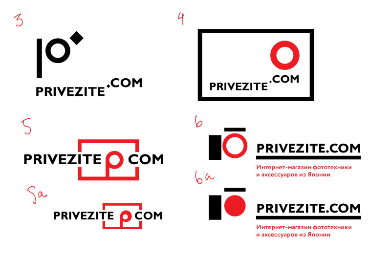
Art director: Number 4 looks like it’s straight from Tschichold. Number 3 has a nice hint that it’s also the letter P, you can develop it a bit more. In number 5 you could put the letter P in the center, like the lens of a camera that you can order from Japan (it won’t be a point and shoot, would it?). Designer: Which ones should I try on media?


Art director: Let’s try to put the O in 5c in isometric projection so that it sticks out. But the base of the lens should be red, like the flag and the tube should be transparent (optics). The typeface probably shouldn’t overlap the symbol so much.
Designer: I’m struggling with the isometric projection. Here, I also had an idea to include a location tag, since they deliver all over Russia. 13 is pretty cool, I think.
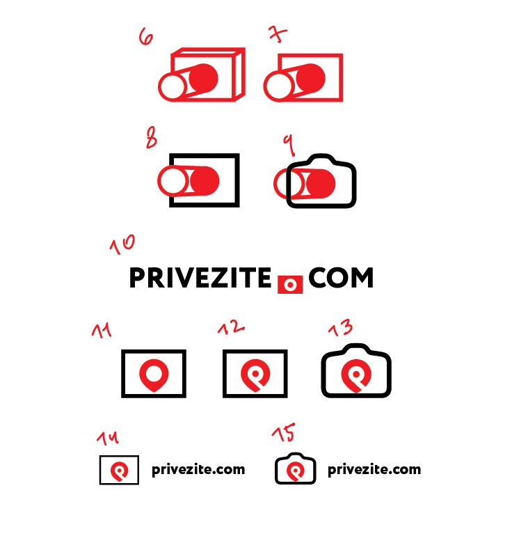
Art director: 7. But why is it pointing left? As for the location tag, it reminds me of Beats headphones.
Designer: Sure, we can have it pointing to the right, but now I think it looks like a dick. We can remove the P from the location tag. How about number 19? It’s got focusing, the P and the flag in it.
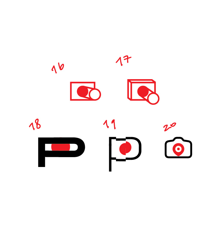
Art director: Let’s develop number 16.
Designer: I like the bottom ones (number 25 most of all), they have the P, too. The top ones look bad.
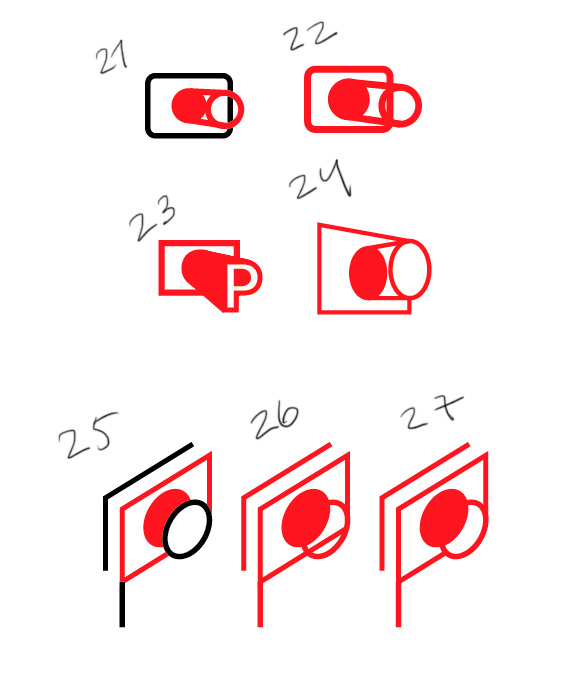
Art director: Try to combine 24 and 25. Also, you don’t need a stick on the flag.
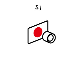
Designer: Here’s what I’m getting. I like the 31.
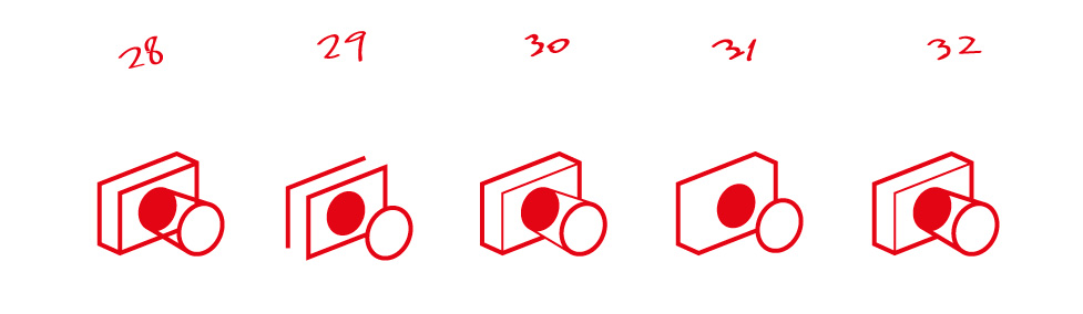
Art director: Why is the lens expanding?
Designer: 34 and 35 look better than the rest.
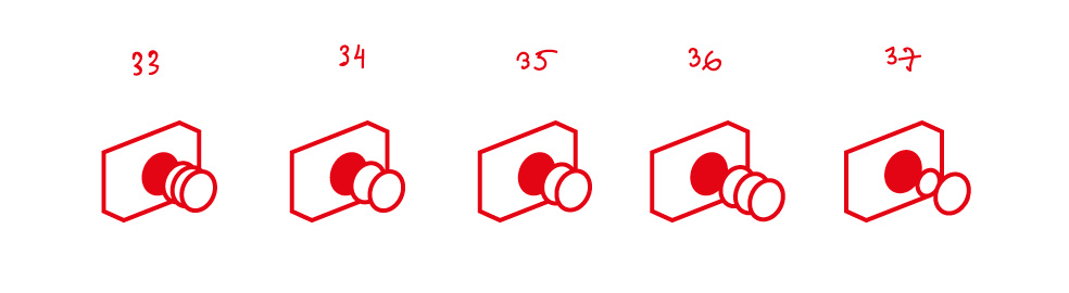
Art director: Go back to 25 and draw the lens as a solid cylinder with a black outline.
Designer: I tried different combinations of outline and fill.
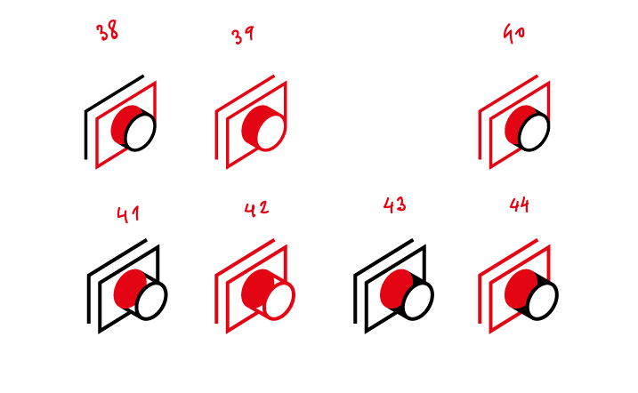
Art director: The flag of Japan remains as it is. Then you attach the lens to it. At a distance. Like you had before with separate circles.
Designer: Like this?
Art director: Thank goodness, yes! Now you can remove the rear squiggle so it doesn’t look like money. Also, make the circle a bit smaller, otherwise it obscures the flag.
Designer: I would also go back to the old angle, it looks better this way (especially without the squiggle).
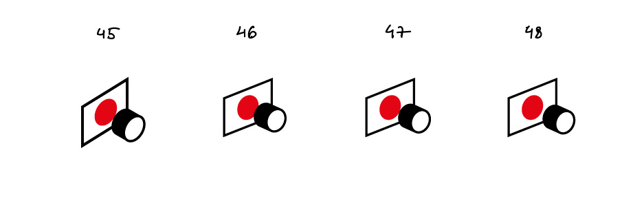
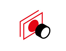
Art director: 48 is OK. But now the lens looks like sushi, so I suggest you bring back the lenses inside. You can make them of different size, like they do on lens diagrams.
Designer: Maybe like this? We can round the corners a bit so it doesn’t look too sharp.
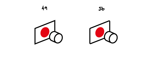
Designer: Or even like this and show the lens from the front, not inside.
Art director: This is fine too, just make sure you round the corners by hand.
