Making of Quto.Ru
Overview Process
Creating navigation design and the header; choosing style, picking photographs. Deciding whether the header should feature a girl.
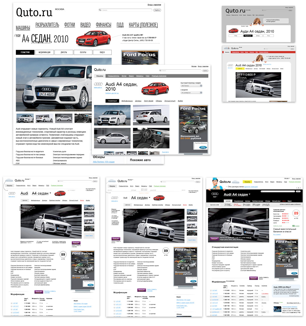
The logo idea had been nailed—a car under a sheet—and the image took its place on the page to be finished later. At that stage the draft included pictures, banners and icons borrowed from somewhere, not yet important. Trying out the first car page layout. Drafting the news and specifications, the viewer and the search field; finding a spot for a social network button and a role for the talking character in the header.
Some of the sections had been carrying temporary names at that point, some buttons weren’t settled, the viewer had horizontally arranged previews—many things were to change and move later on.
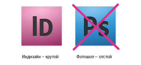
To create websites like this we use InDesign, not Photoshop, which is meant for photo editing.
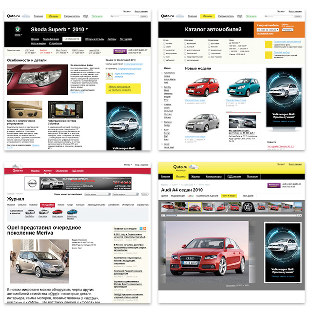
Progress underway, parts of the page already looking finished, the rest of the blocks still drafted—just like in actual construction.
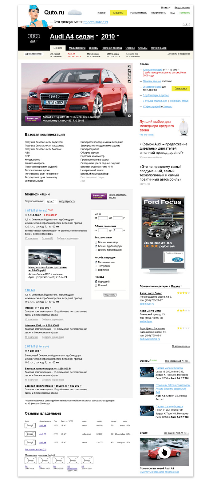
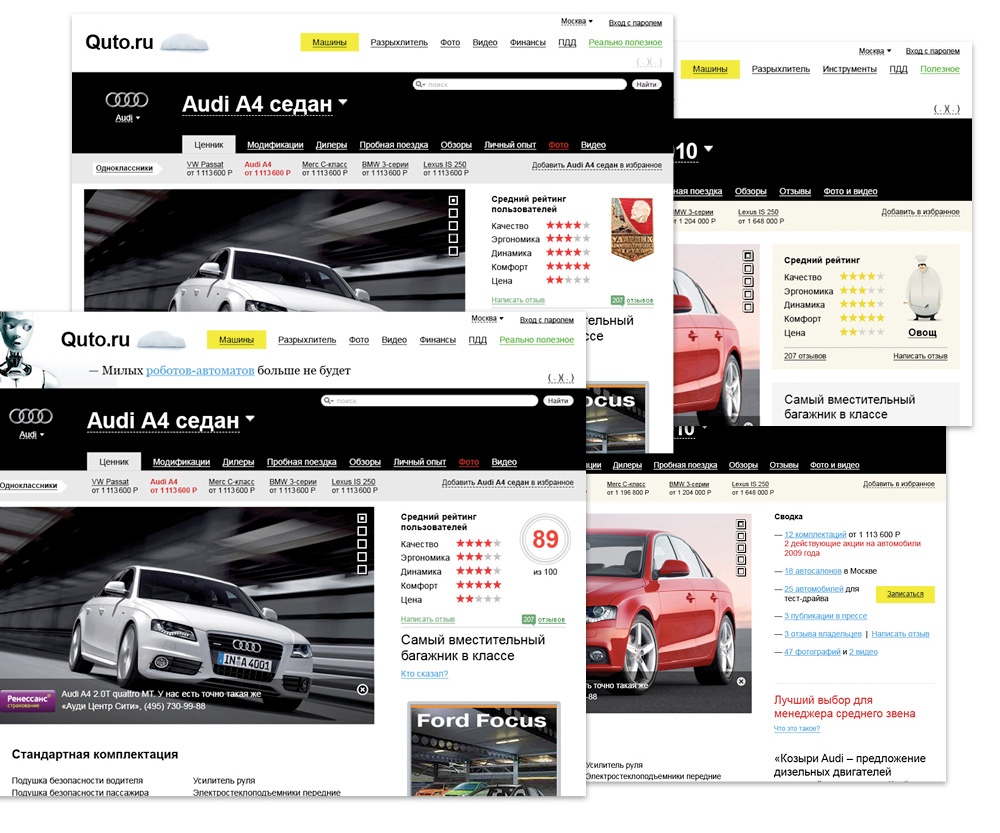
The yellow header seemed the nicest and eventually made it into the final design. By the time, the logo had been completed.
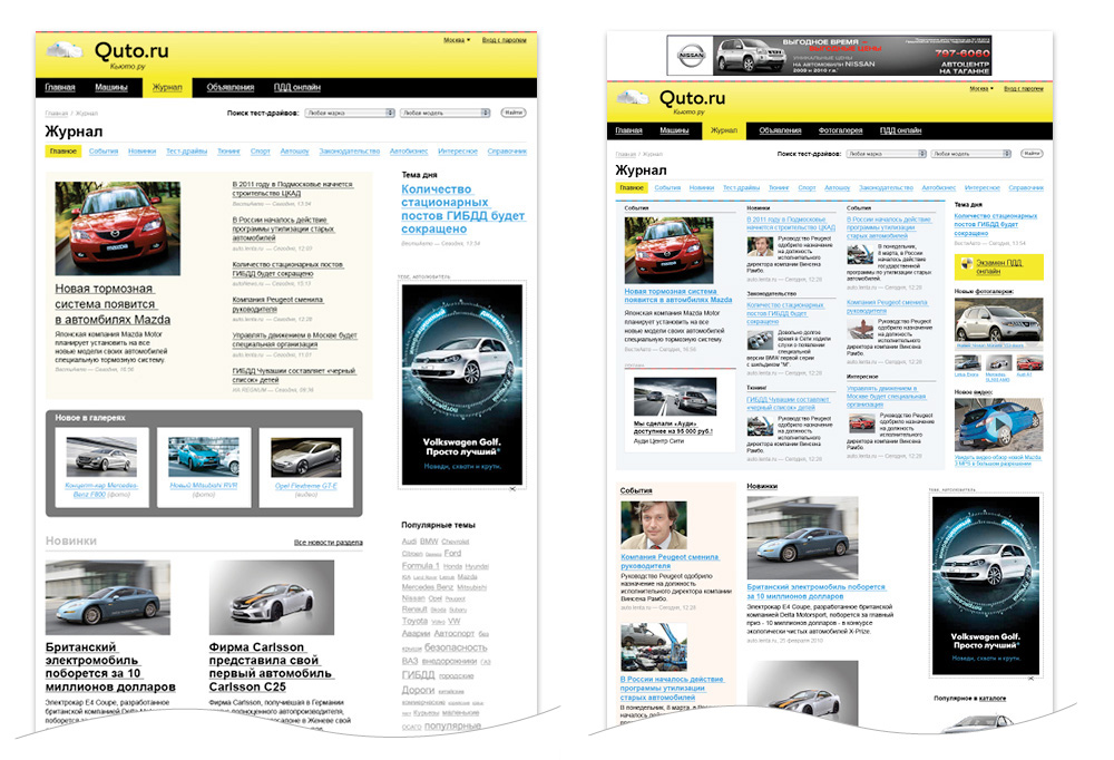
Somewhat loose and incoherent at first, the online magazine soon grew solid and cool.
The icons arrived.
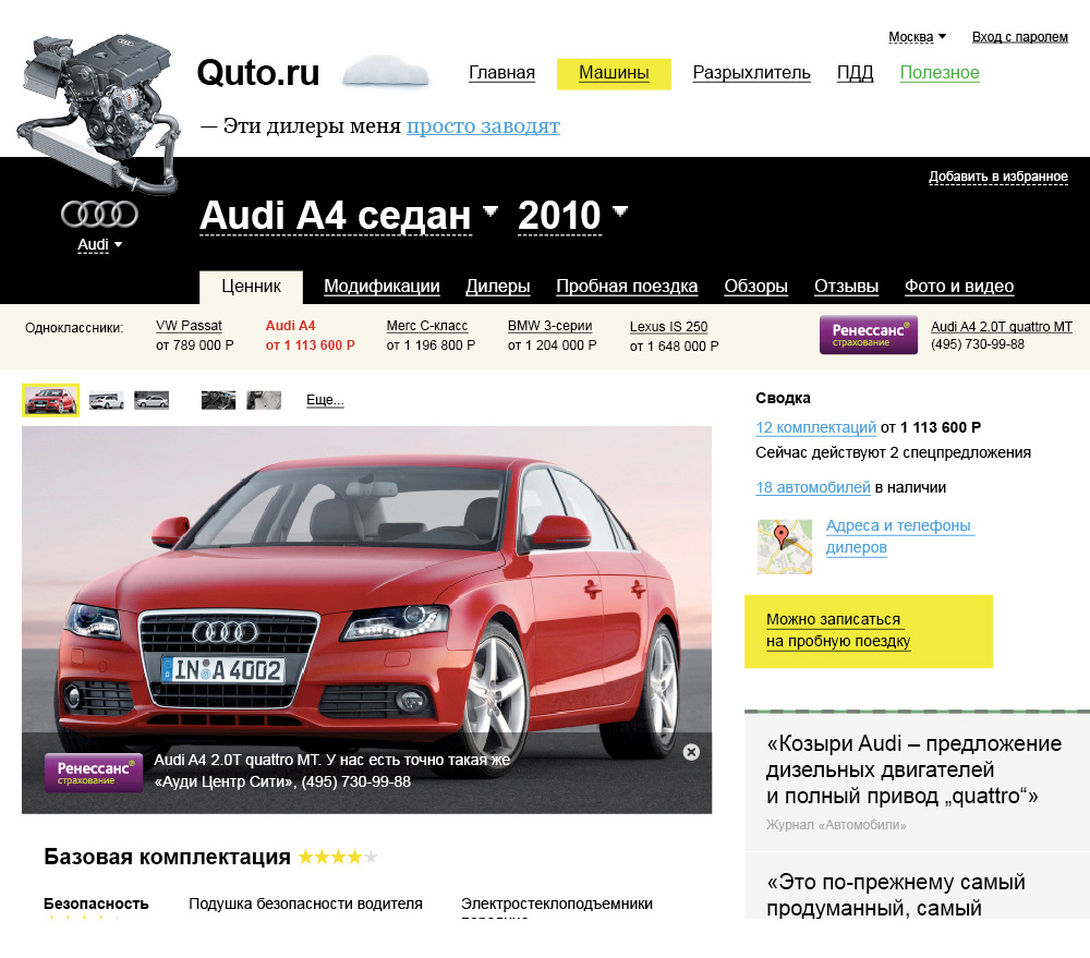
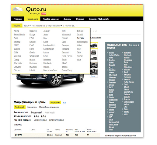
Switching between brands, models or modifications was made easy with the bar found on every page, as well as the All Brands drop-down list.
Added dashed dividers, and voilà.
