Client: We are called Recsquare (recsquare.ru). Right now we are expanding, previously we were engaged in production of media projects, video clips, etc. Now we produce music content, music that we sell to private and corporate clients around the world. The service will be called Recsquare Music. I would like to reflect in the logo the fact that we record audio and that we are based in Moscow (I think it should be obvious that the name Recsquare is similar to Red Square). It has to be some sort of an interesting type solution or a combination of a text and a graphic object.
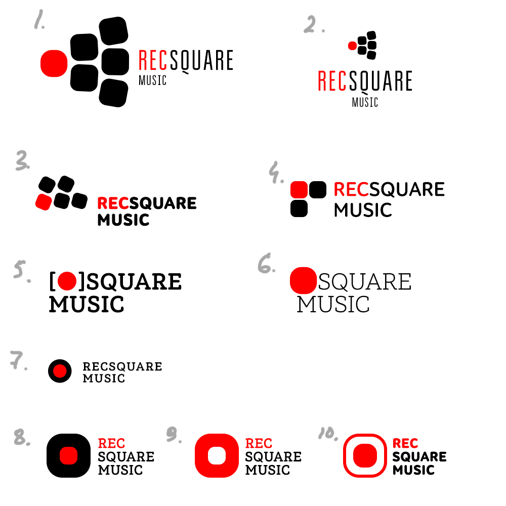
First designer: Here are my thoughts on the matter.
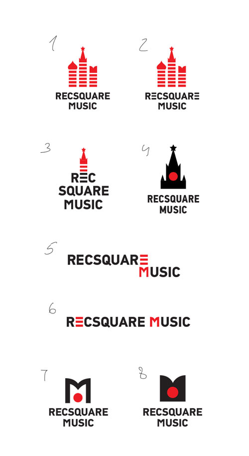
Art director: Nothing interesting here.
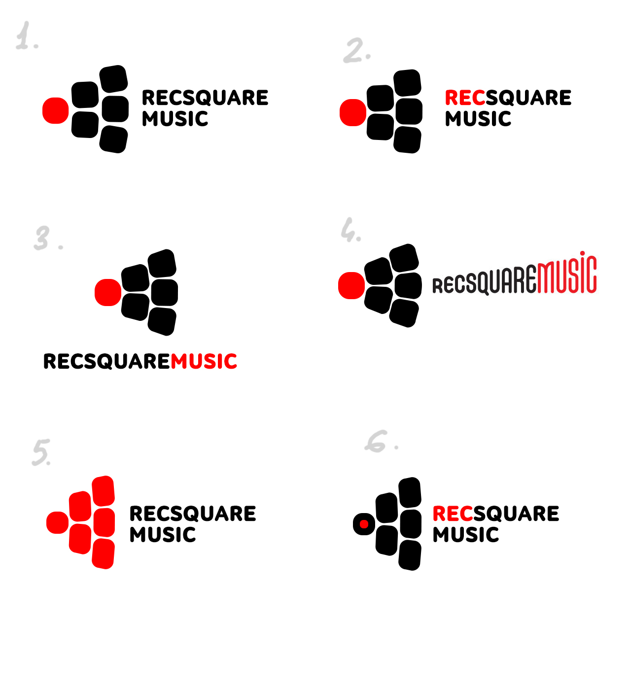
First designer: Moscow as an equalizer, oscillogram and volume.
Art director: Try a red circle in place of the stars. It also is a symbol for recording.
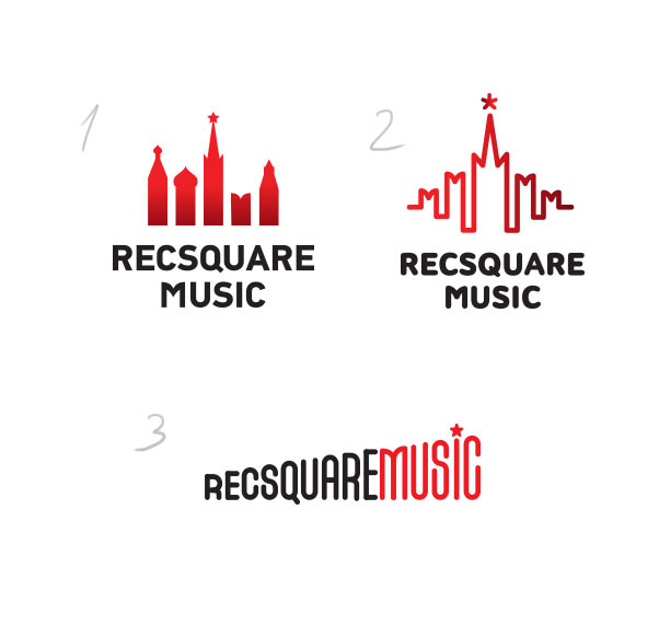
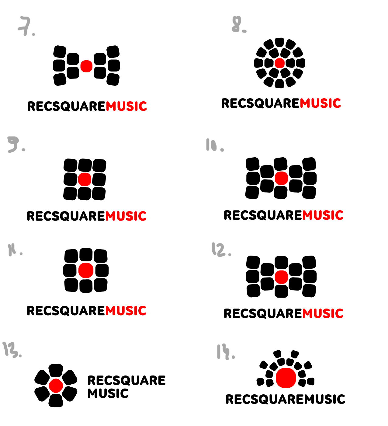
First designer: I tried it in place of the stars and the clock.
Art director: The one with the Spasskaya Tower is secondary. Go with the number 3 from the previous batch.
First designer: In this case we will reference Moscow through the letter M and recording through the red circle.
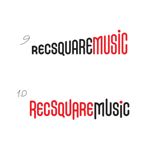
Art director: Number 9 is OK.
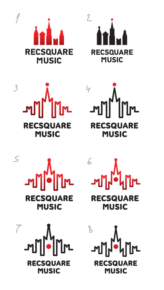
Second designer: I decided that a square can bee seen as pebble stones and the circle might not necessarily be a circle. Something like this.
Art director: Number 1 looks interesting, let’s try to develop it.
Second designer: Tried to work on shape and density here.
Art director: What if we play with the cobbles some more? Make the cobbled area larger and put the red dot in the middle of it?
Second designer: To be honest, that’s what I started with, but then I got scared and threw this one out.
Art director: No, these look like sushi.
The art director asks the first designer to go back to one of the previous designs and work on it more.
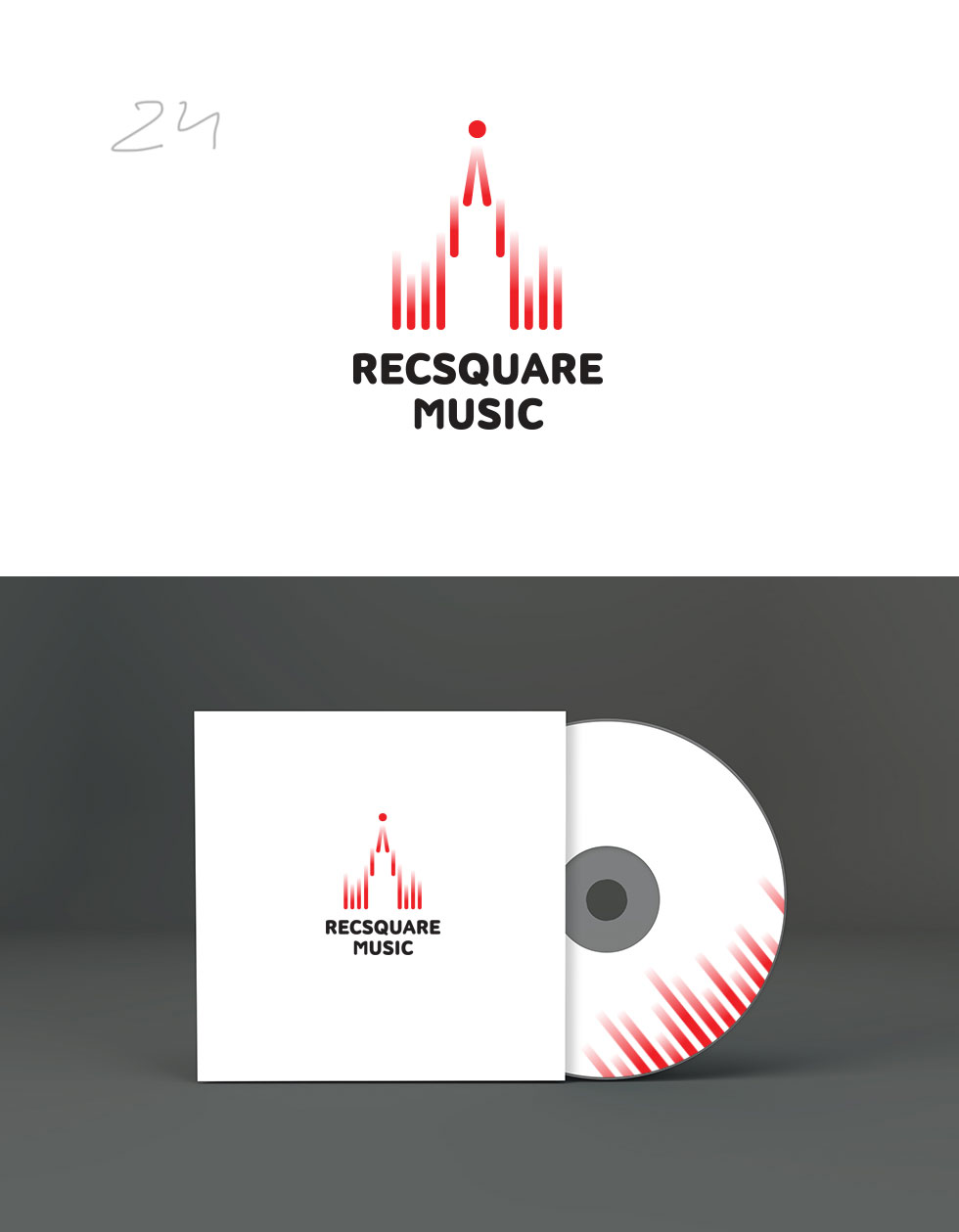
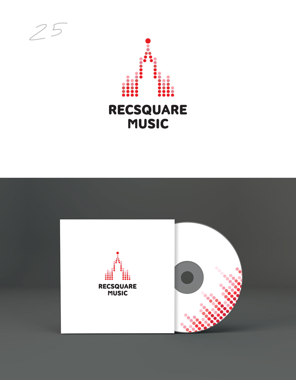
First designer: Here are my efforts. I like the equalizer wall.
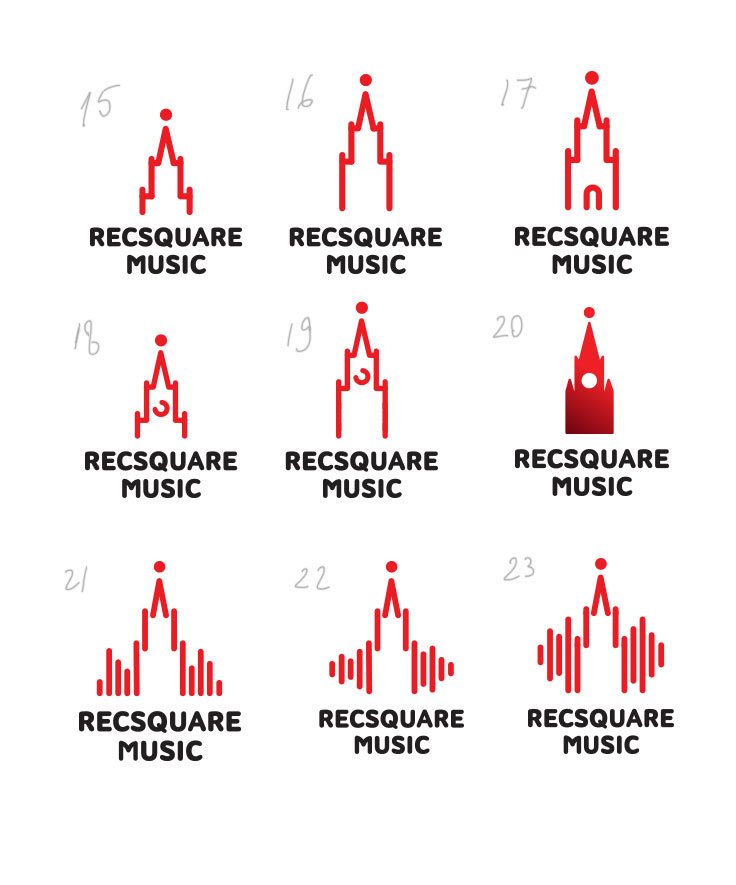
Art director: 21 is not bad. It’s important not to repeat the 1980 Olympic Games logo.
First designer: What about this?
Art director: Everything is OK except for the Л at the top. Try it as a single stick instead. Or in the shape of an М.
First designer: Here it is as a stick.
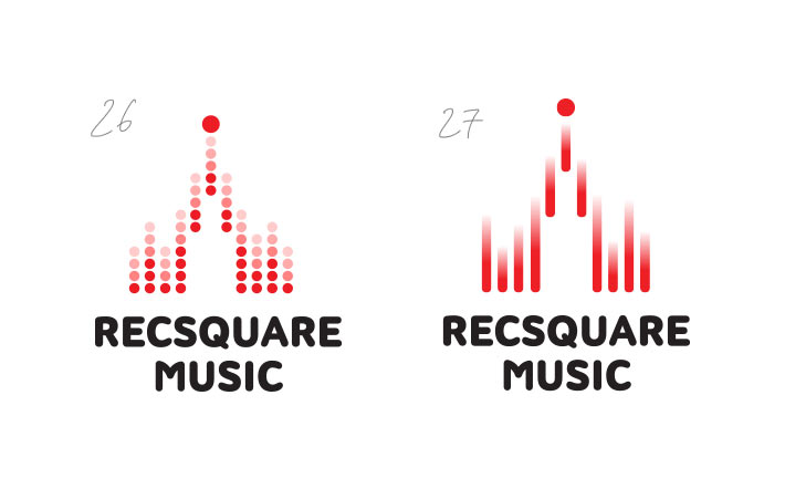
Art director: It needs less of 1980 Olympic Games in it.
First designer: The similarity to the Olympic logo is due to its triangular shape. I tried to move away from it.
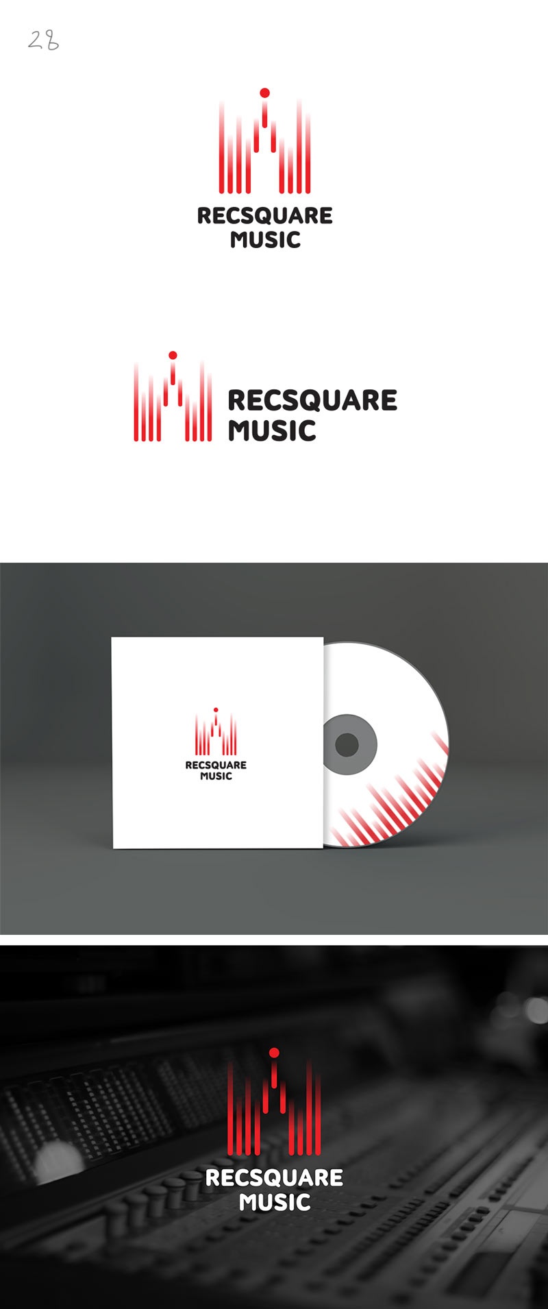
Art director: OK, prepare the announcement.
