The making of the cover design for Your Children Are Not Your Children by Pavel Erzyaikin
Overview Process
Coming up with an idea for the cover, drawing a sketch.
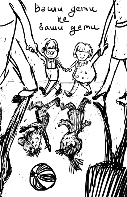
The theme of children appears well developed here, so the client approves the sketch instantly. Starting to draw the illustration.
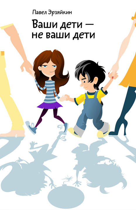
Trying another approach.
Art director: There has to be more insanity in the reflection, to make it evident that the shadows are going nuts, while the children look calm.
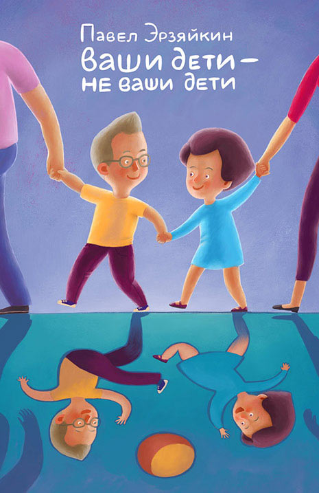
Choosing the second option. Continuing to draw, working on the characters and the background.
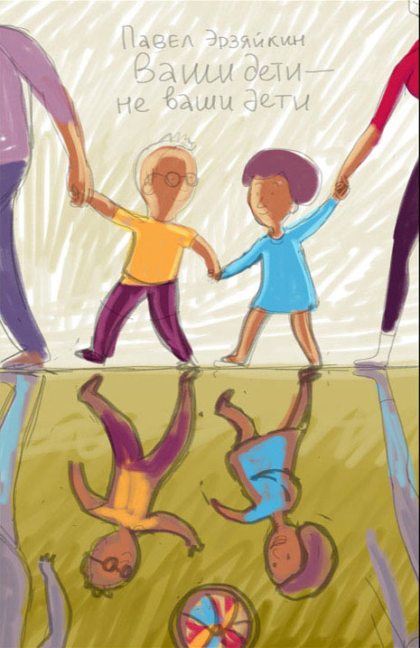
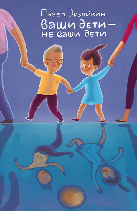
Client: On the sketch you had children, but here on the illustration they have adult faces. Also, the background needs to be brighter and lighter.
Making the children younger and the background lighter.
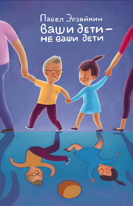
Art director: Still, they look like little adults.
Art director: You can still make the faces look younger.
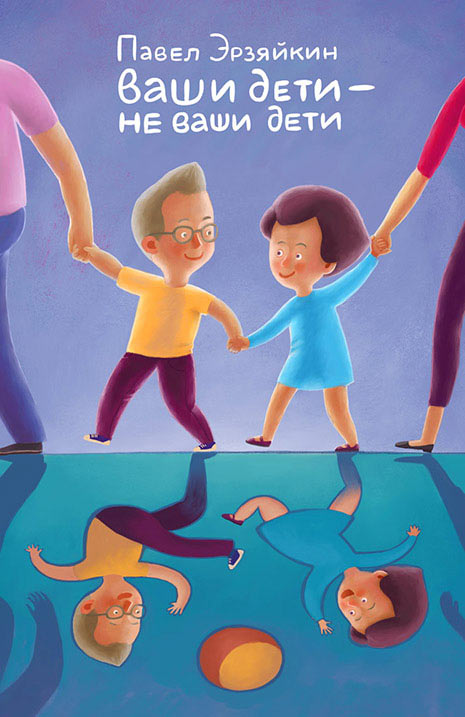
Art director: The boy I can believe, but the girl looks like she’s 50.
Art director: They also have adult haircuts.

Showing to the client.
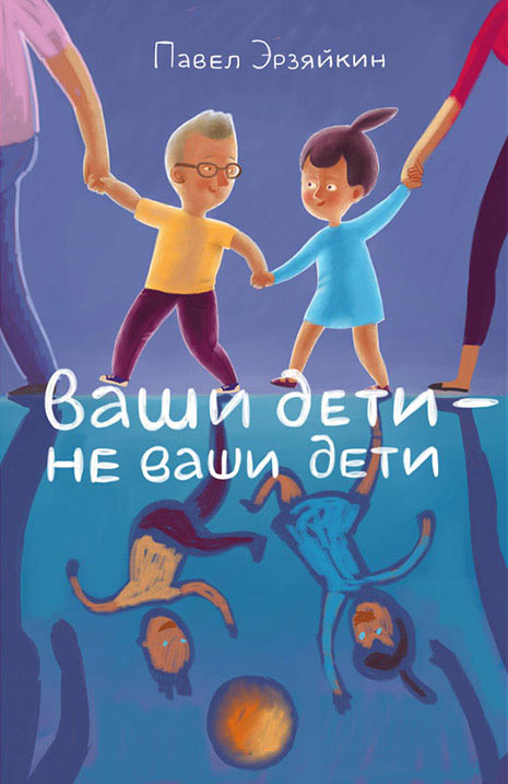
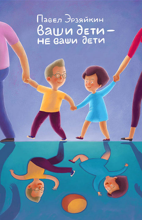
Client: There is definitely an improvement in the mood, but the background is still too dark. Maybe, try another color? The illustration has to be brighter, lighter and more cheerful.
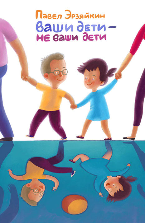
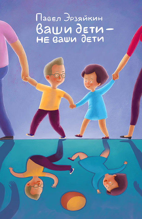
The client takes time to consider and ultimately chooses the one with the colored background. Typesetting the cover.

Making final touches, adding polish to the ball.
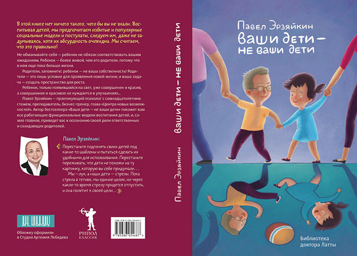
Preparing the files for printing.
