Client: We’re not a club for children but an engineering school, we’re not about fun but about education. No Legos, pure electronics. Students learn electronics, how to solder and create 3D models, how to work with CNC milling machines, 3D printers, use various software, but most importantly they learn how to program microcontrollers of various levels up to industrial using languages such as C++, Python, etc. The age of students is 10+, we only work with the most talented as others can’t keep up. We’ve been operating for two years using the name Robo-labs, www.robo-labs.ru, now decided to rebrand, or more precisely, to brand under the name Robocoding (our new webstites are at www.robocoding.ru and www.робокодинг.рф).
Branding goals:
—to sell educational materials: we have accumulated lots of materials, problems, lab and practical exercises that we’ve written ourselves (our students are already showing their progress: they win in design contests including the Sirius All-Russian Competition);
—promote robotics and engineering education: right now this area is only getting up on its feet;
—to grow into a network of schools.
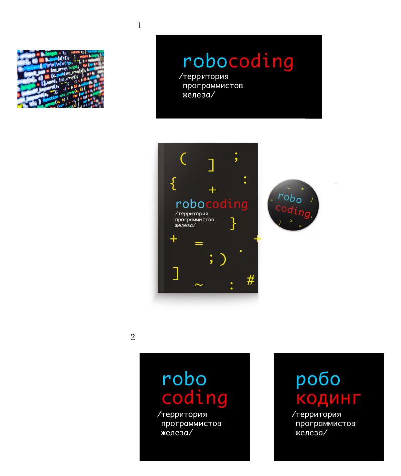
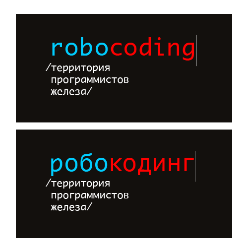
The logo should say Robocoding, we would also like to have a subtitle saying “Hardware programmers’ territory” if you can find a way to do it nicely. Associations with robot programming and microcontroller programming. The logo should not be childish, yet be bright and memorable. It should work for designing textbooks, educational materials, t-shirts and PCB engraving. The colors are up to the studio. The target audience are highly intellectual young people aged 10–16. To make sure we can promote robotics among high school students it would be great to be able to use the logo on a pin.
Designer: Monaco system typeface is used in coding. Symbols as the corporate pattern.
Art director: Not bad.
Designer: Russian and English versions.
Art director: Yep.
