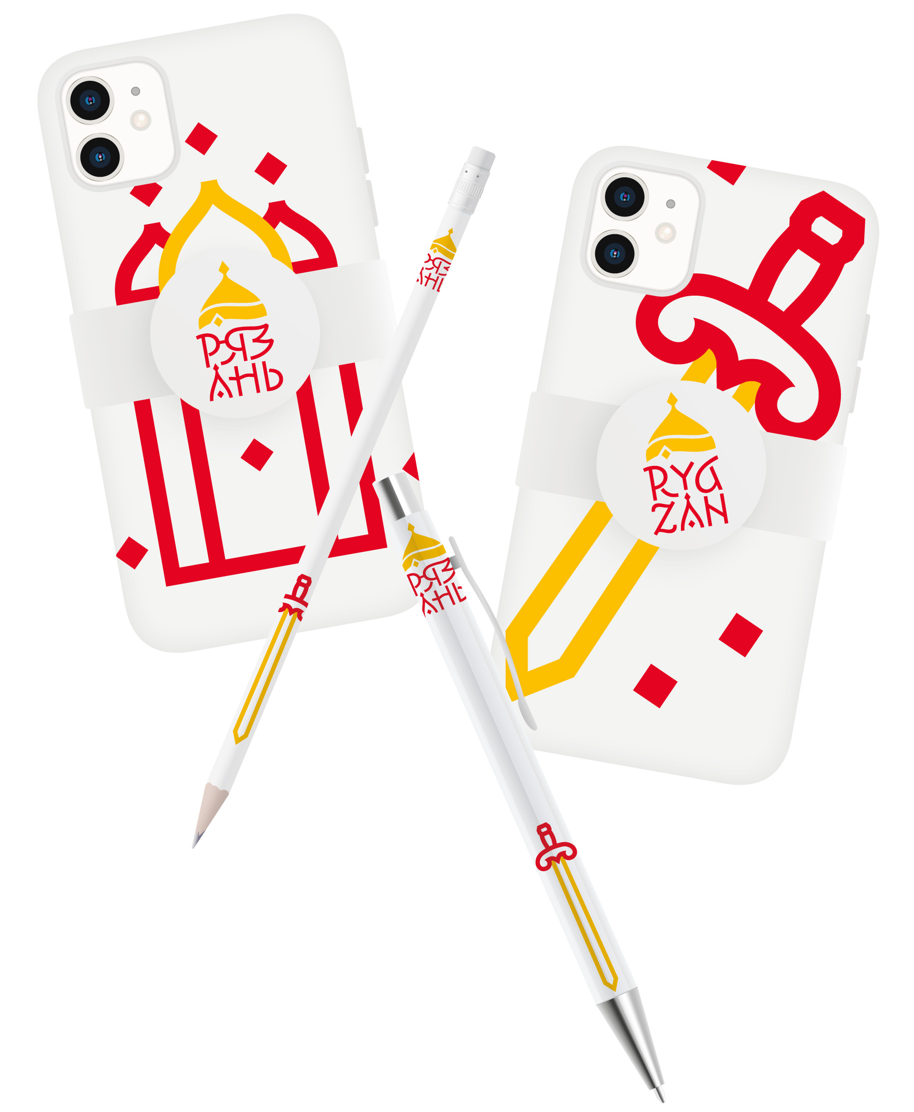
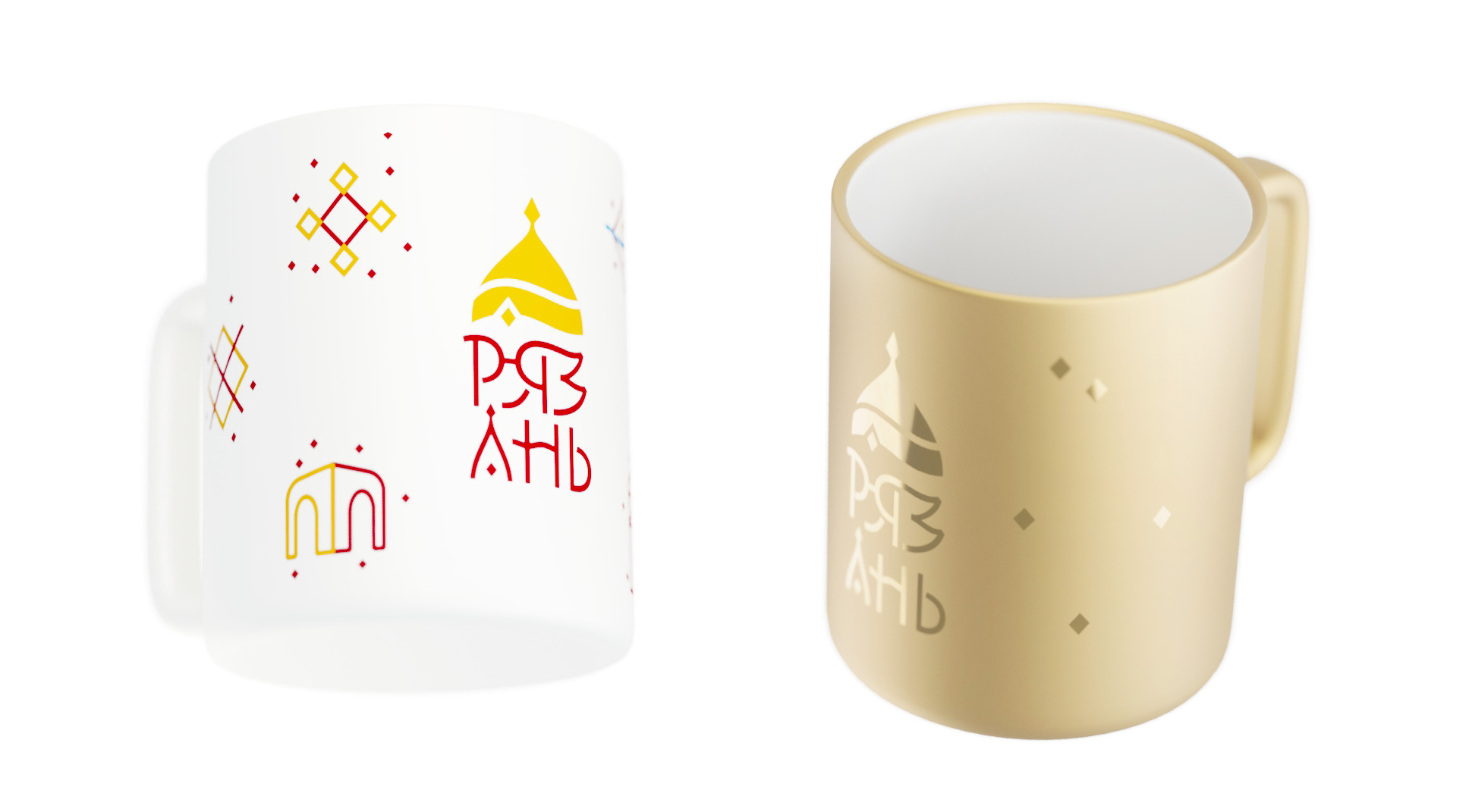
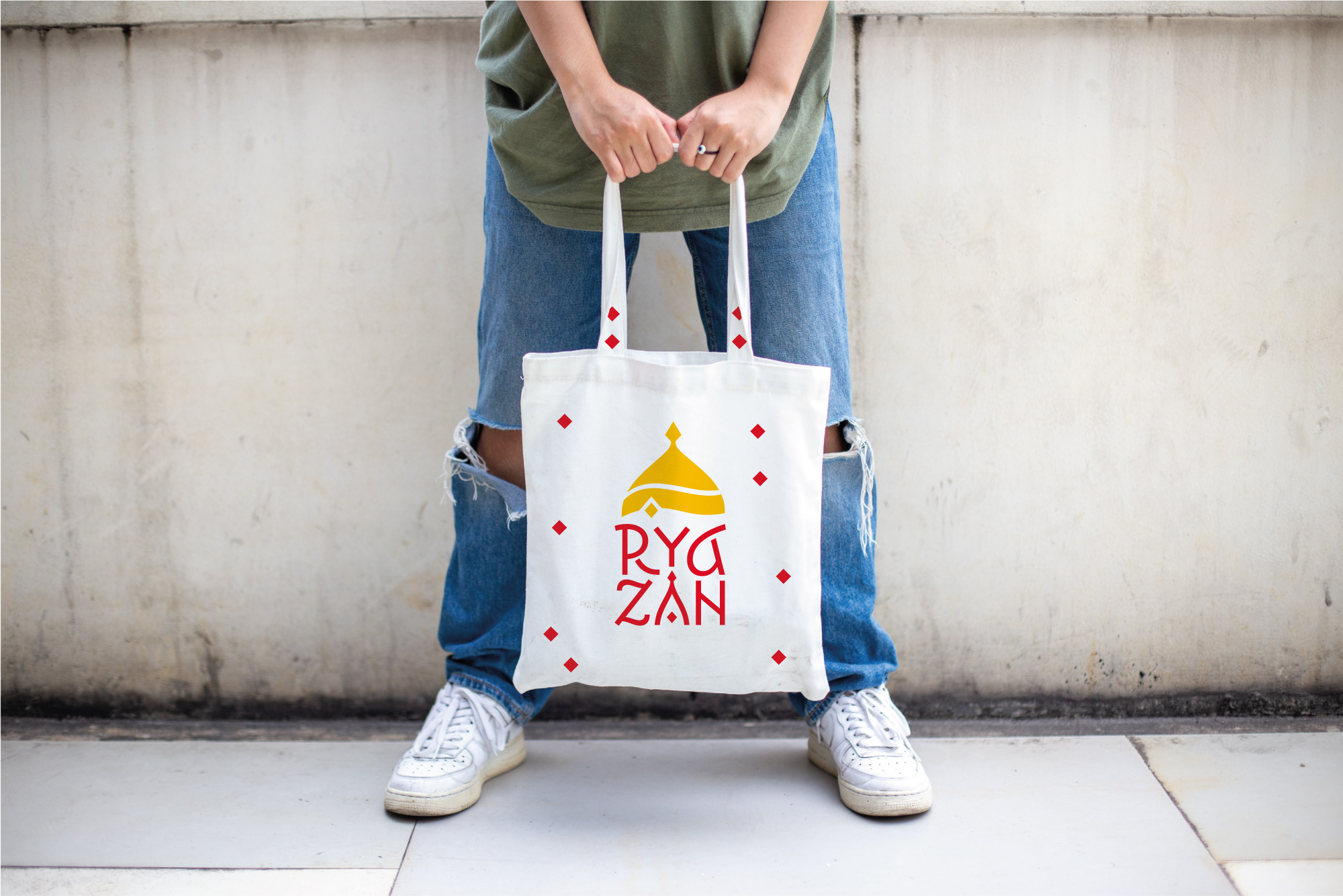
Ryazan identity
Ryazan is an old Russian town on the Oka river with a rich history and plenty of opportunities for cultural, economic and tourist development. It has its own Kremlin, old merchant mansions and traditional wooden buildings. The city regularly hosts all kinds of gastronomic and artisan festivals. To help the town organically combine its traditions with progressive economic ideas for development, a logo and an identity for Ryazan were designed in the studio.
The symbol inherited the Monomakh Cap from the city’s coat of arms and borrowed the colors from its flag. The letters Р and Я under the cap combine into a welcoming face of a knyaz. The letter Н hides a reference to the Oka river. The elegant lettering resembles woodcarving, and the overall dynamic of the graphics makes the logo airy and light.
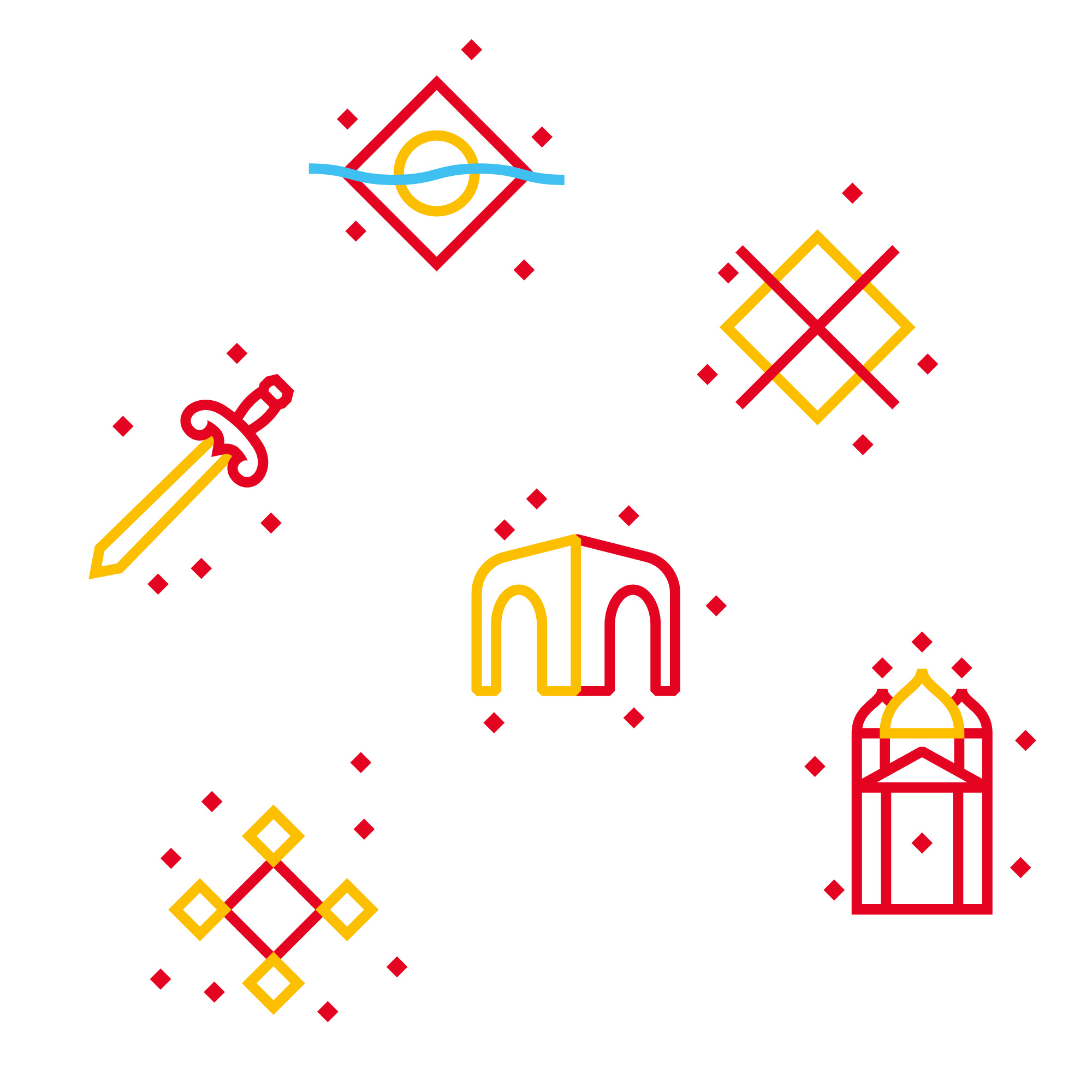
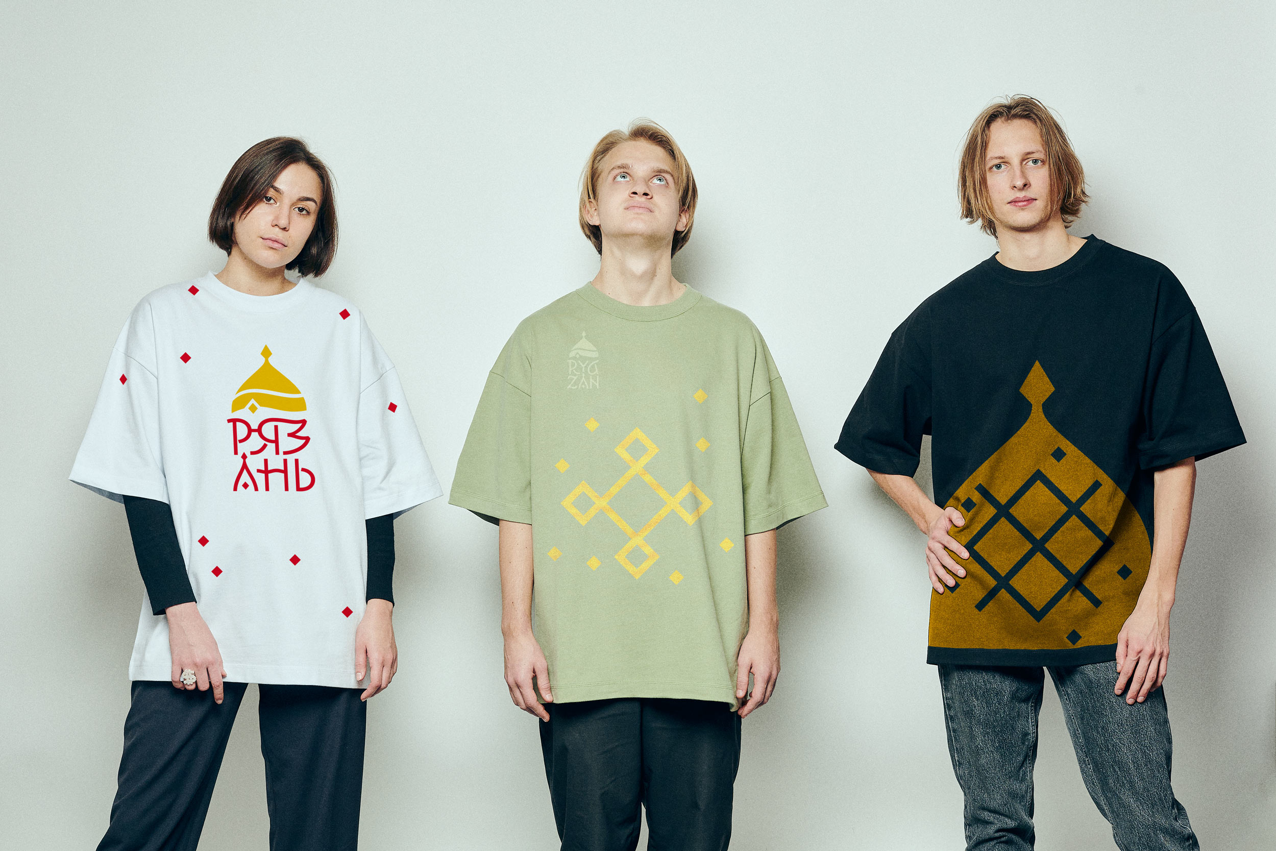
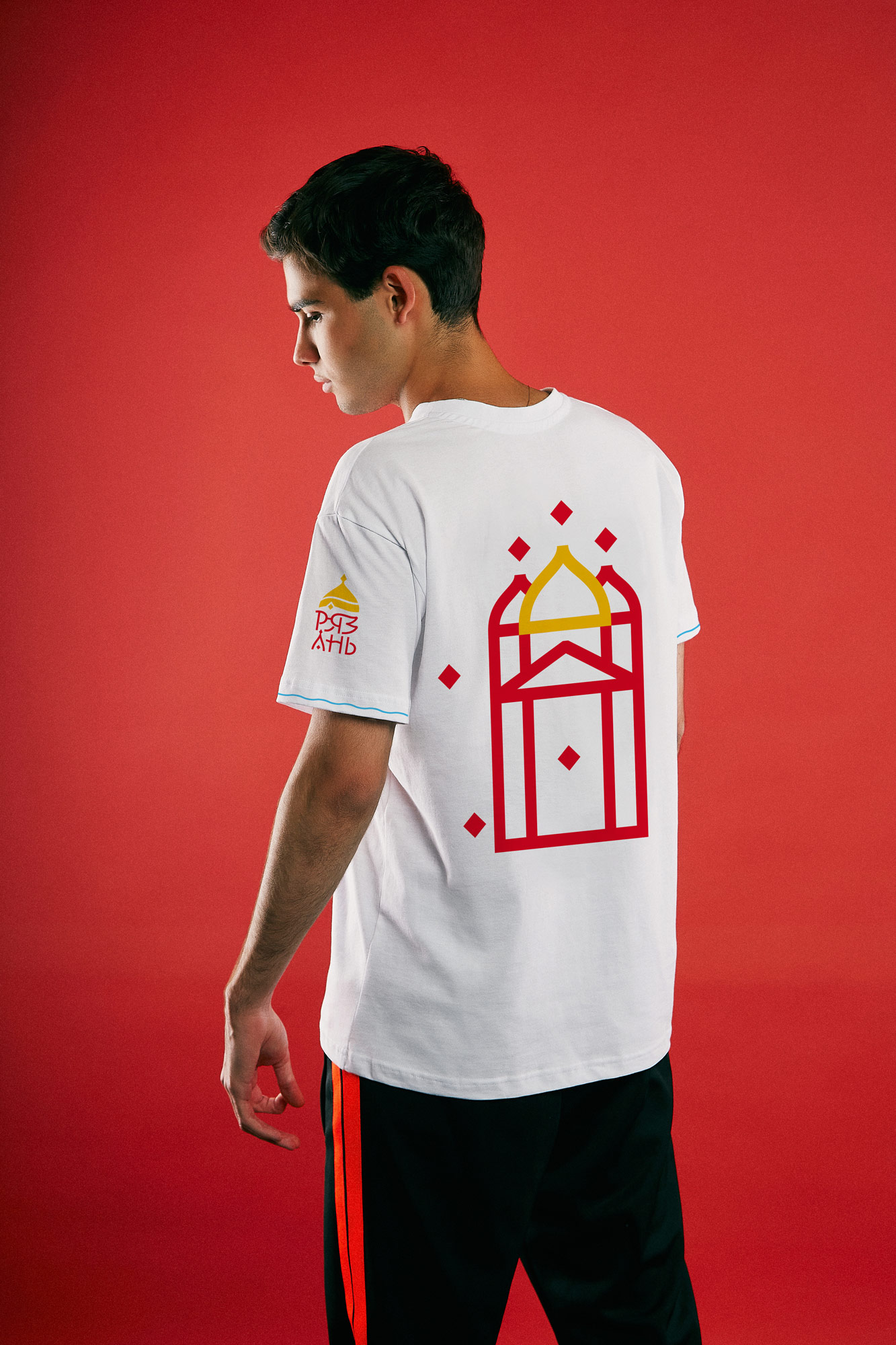
The set of pictograms includes both official symbols and soulful Ryazan-themed motifs: a sword—a bright fragment of the city’s old coat of arms, carved wooden lintels, recognized pieces of the town’s architecture and the beauty of the surrounding nature.