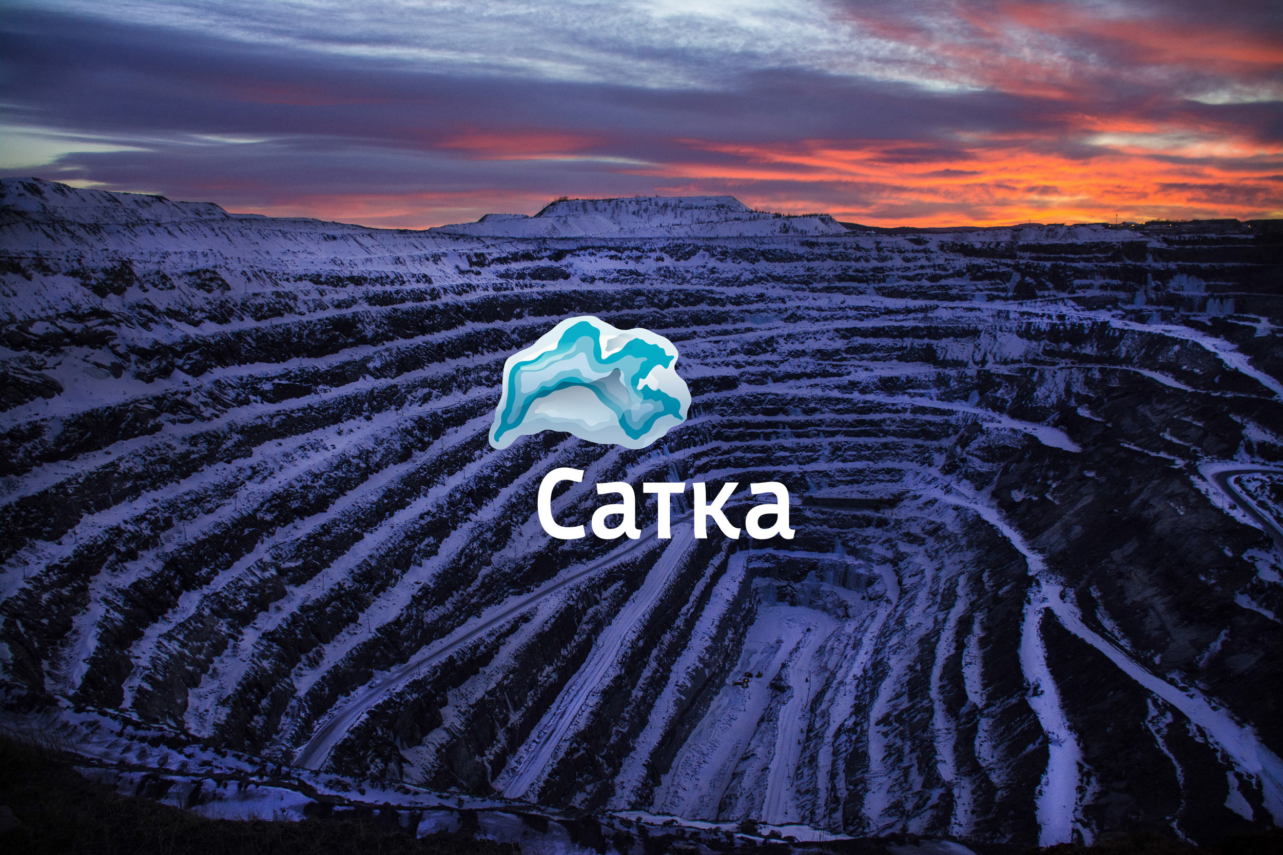
Satka is a city in Chelyabinsk Oblast located near the boundary between Europe and Asia in an area rich in natural deposits. Production of iron, pig iron and military instruments has been developed in Satka since the 18th century, while the 19th century saw the discovery of the deposits of magnesite, a blue-colored fire-resistant stone used in smelting of metals. The historical center of metalworking and blacksmithing, today Satka attracts artisans, reenactors and bikers. Its picturesque natural and archaeological complexes are visited by hundreds of thousands of tourists every year. To help maintain the popularity of Satka, a corporate identity for the city was created at the studio.
|
The shape of the stone can be easily changed
|
Two versions of the monochrome logo were developed, one for printing on paper or vinyl film, the other for applying on complex surfaces such as stone or fabric
|
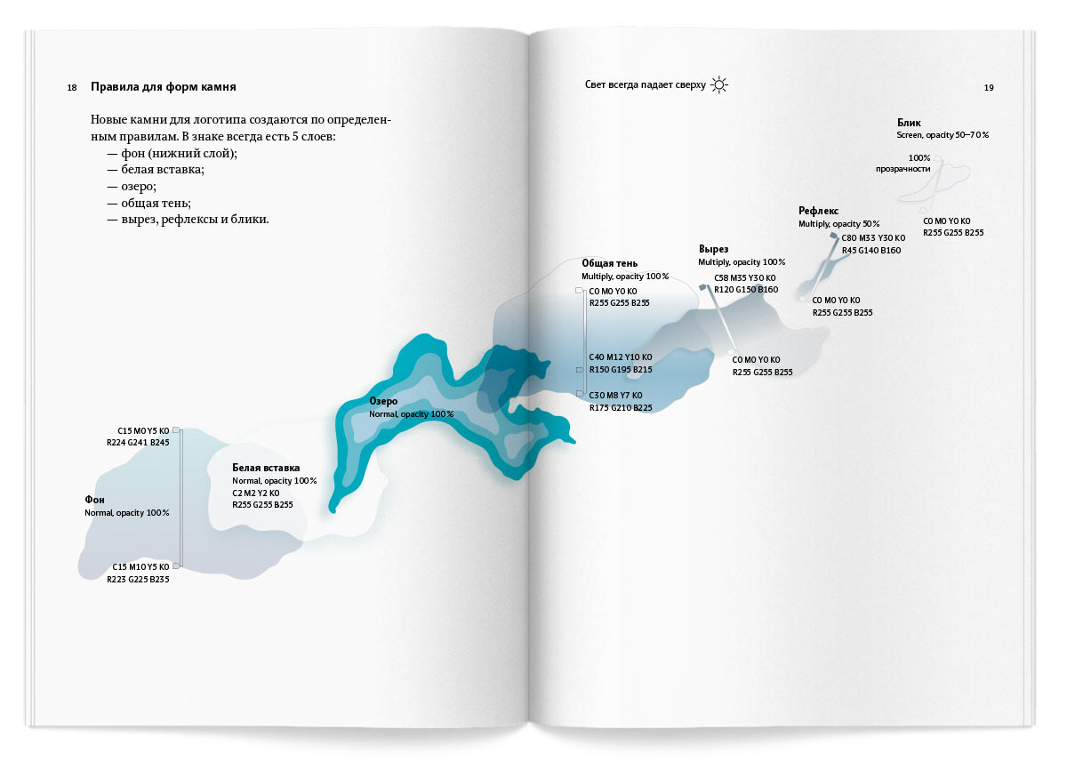
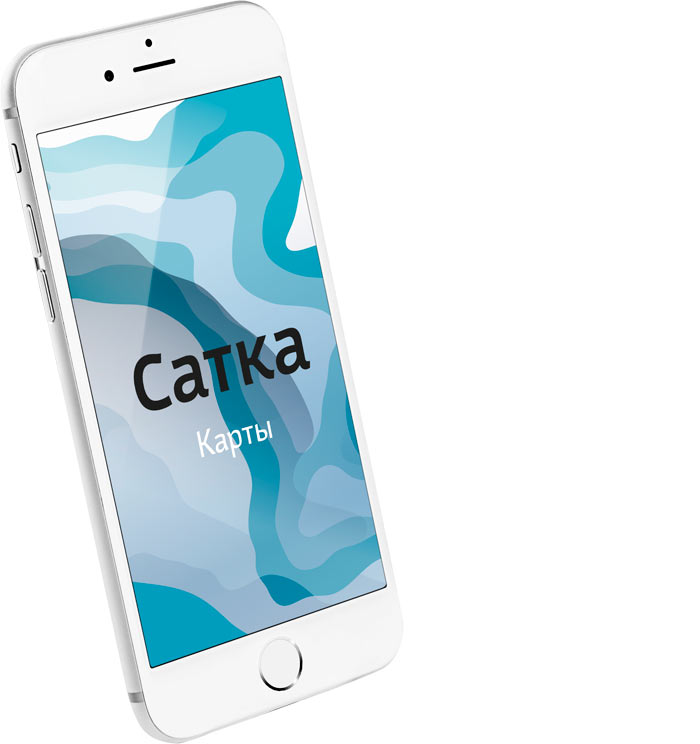
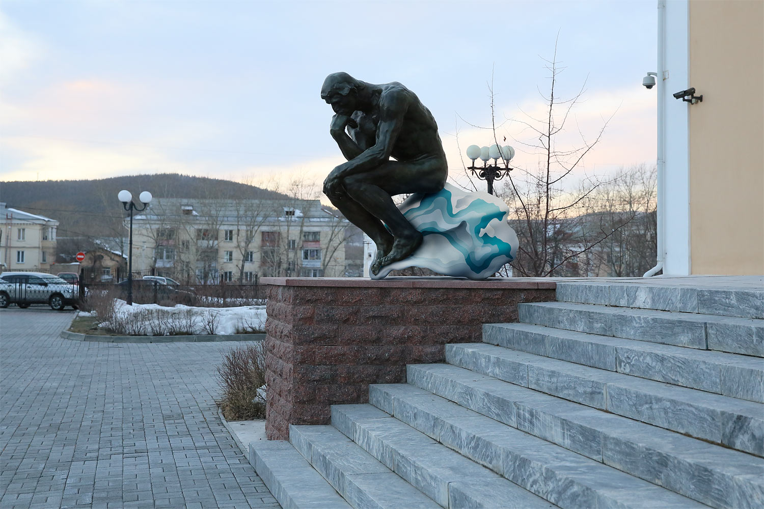
The logo is based on the outlines of Zyuratkul alpine lake carved in magnesite. The main elements of the style are lines and shapes of corporate colors, blue-gray and turquoise. The graphic elements are used in design of various media and and look well both on light and dark backgrounds.

Rules for the use of the logo, corporate colors, typefaces and graphic elements are given in a detailed guide.