Smena fitness centers corporate identity

Overview   Process  

Task: to design a corporate identity for a chain of fitness centers.

Smena is a chain of fitness centers which stands for being approachable and affordable for everyone. In our studio we’ve prepared a corporate identity and a logo for the company.


smena identity logo
An I-beam muscled into a C-shape is a solid core for the corporate identity

Release date: April 28 2012

Cast:

artistic director
art director
designers
illustrator
type designer
typesetter
secret advisor
editors
photograper
project manager
smena identity logo black
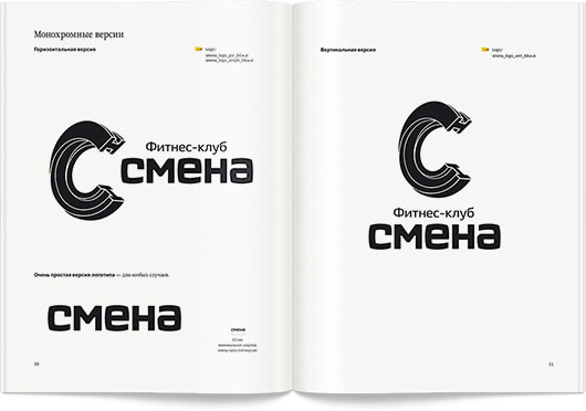
The horizontal and vertical versions of the black and white logo

smena identity cards and cups
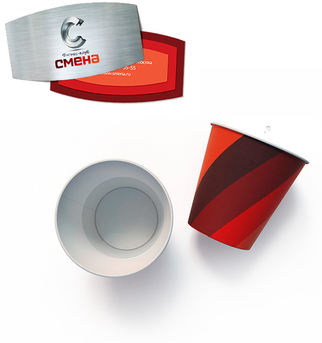
Smena’s defined and ripped business card is a strong statement
A glass of water between sessions is a bliss

smena identity bench
Cool cooling down

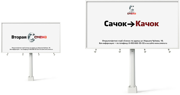
Smena’s outdoor advertising.

smena identity billboards

The main chart mapping different club zones, a brief description for each, class details and targeted results.

smena identity navigation
Any first-timer can work out the structure and schedule of the athletic club

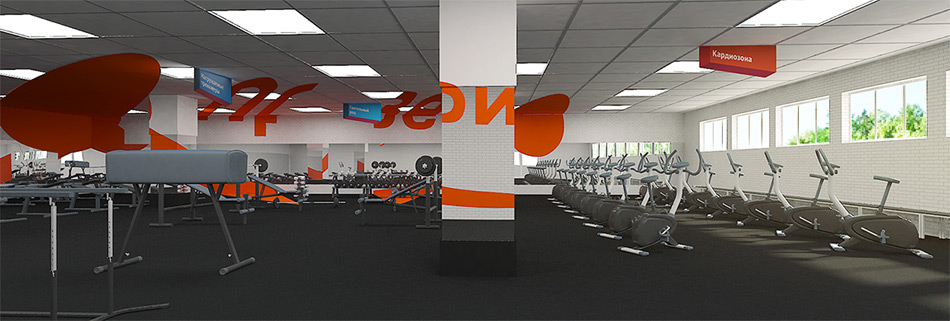
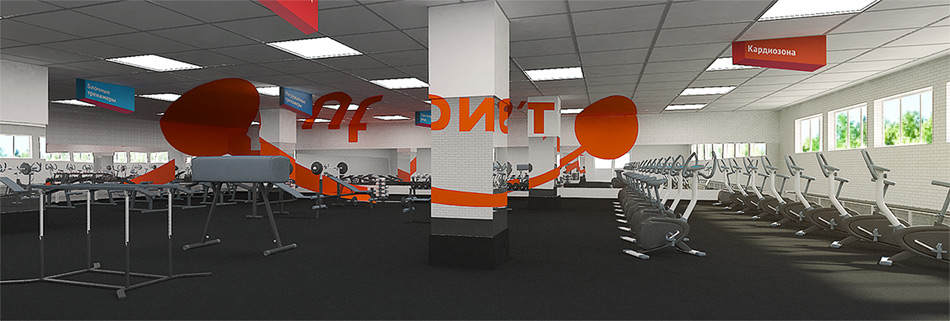
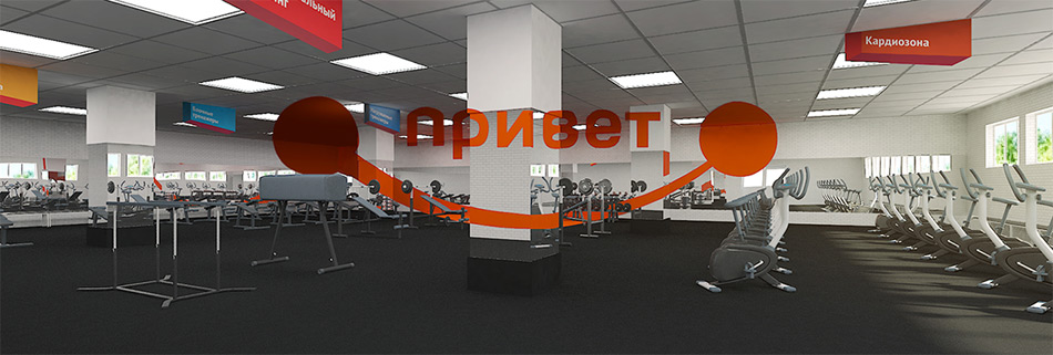
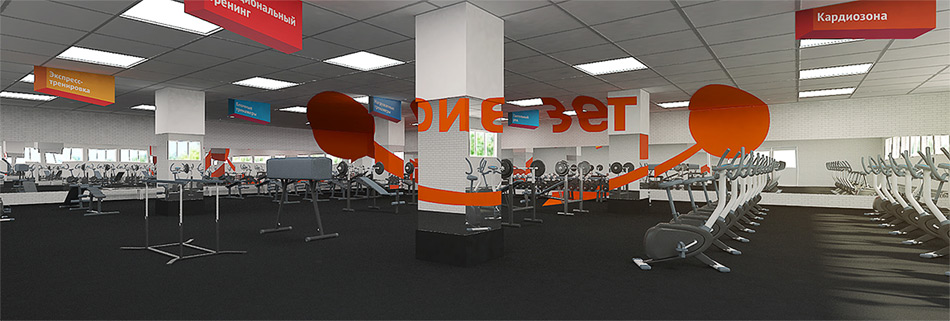
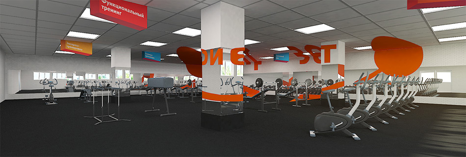
An optical illusion greets visitors at the door and sets the mood for a positive workout

For even easier navigation inside the center, all doors are marked with special pictograms.

smena identity pictograms
smena identity timetable
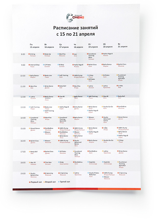
The schedule leaves no room for guessing on what is when

smena identity signage
The sign at the entrance sets the tone
Corporate balloons are quite uplifting
smena identity air balloon

Order a design...