Looking a the requirements and immediately deciding to create a cost calculator.
The art director approves the approach. Trying to play with the style.
Feeling the need for darker backgrounds to help banners stand out.
The art director asks to add more life and visually support the calculator.
Right now everything looks generic. Live backgrounds have been used forever, the hand holding is outdated too, even though it is a good match for the idea. Digging deeper.
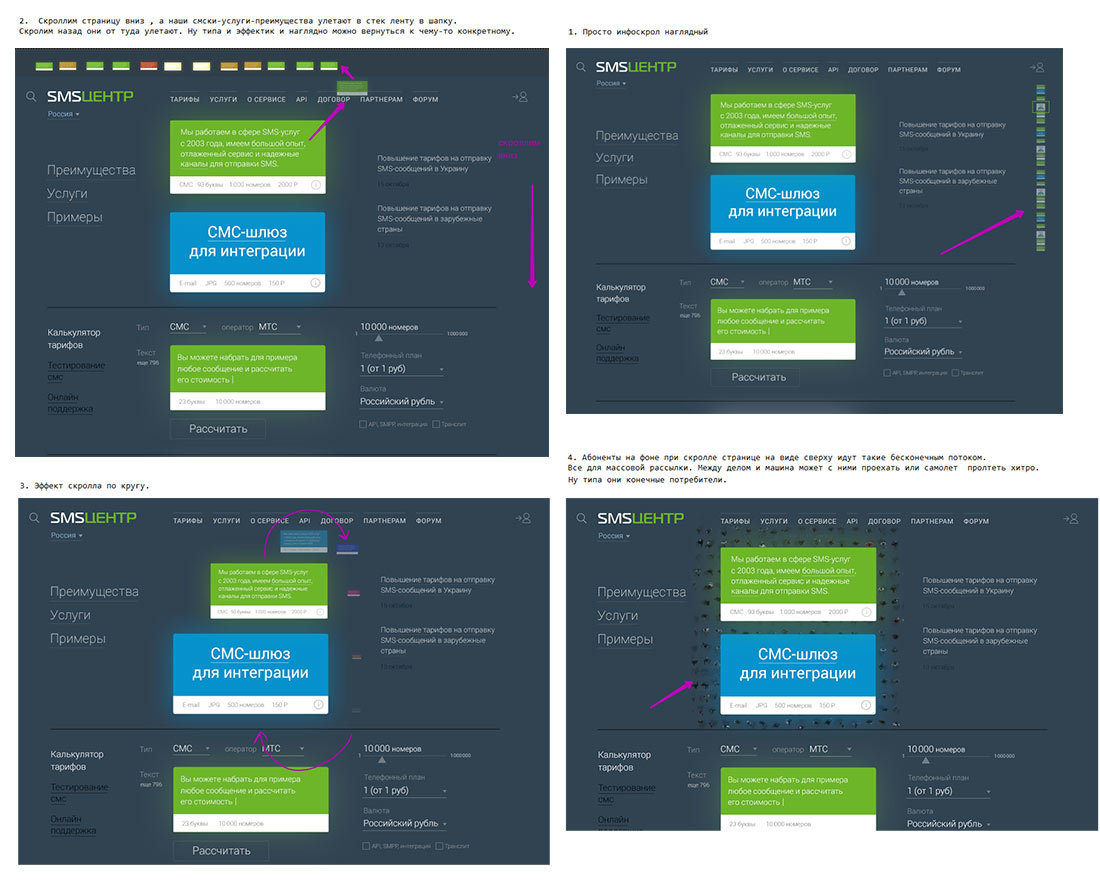
The art director suggests to explore the idea with people in the background reacting to the calculator. Testing the idea and the internal pages at the same time.
Preparing a detailed description of functionality for the presentation.
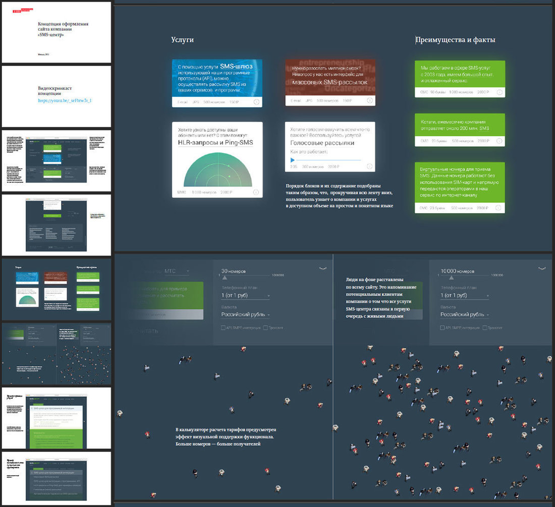
Assembling a complete screencast based on the prototype and showing to the client.
The client does not approve the concept. It appears to lack the company’s image and the main page should be centered around presenting the service rather than calculating the price.
Moving on.
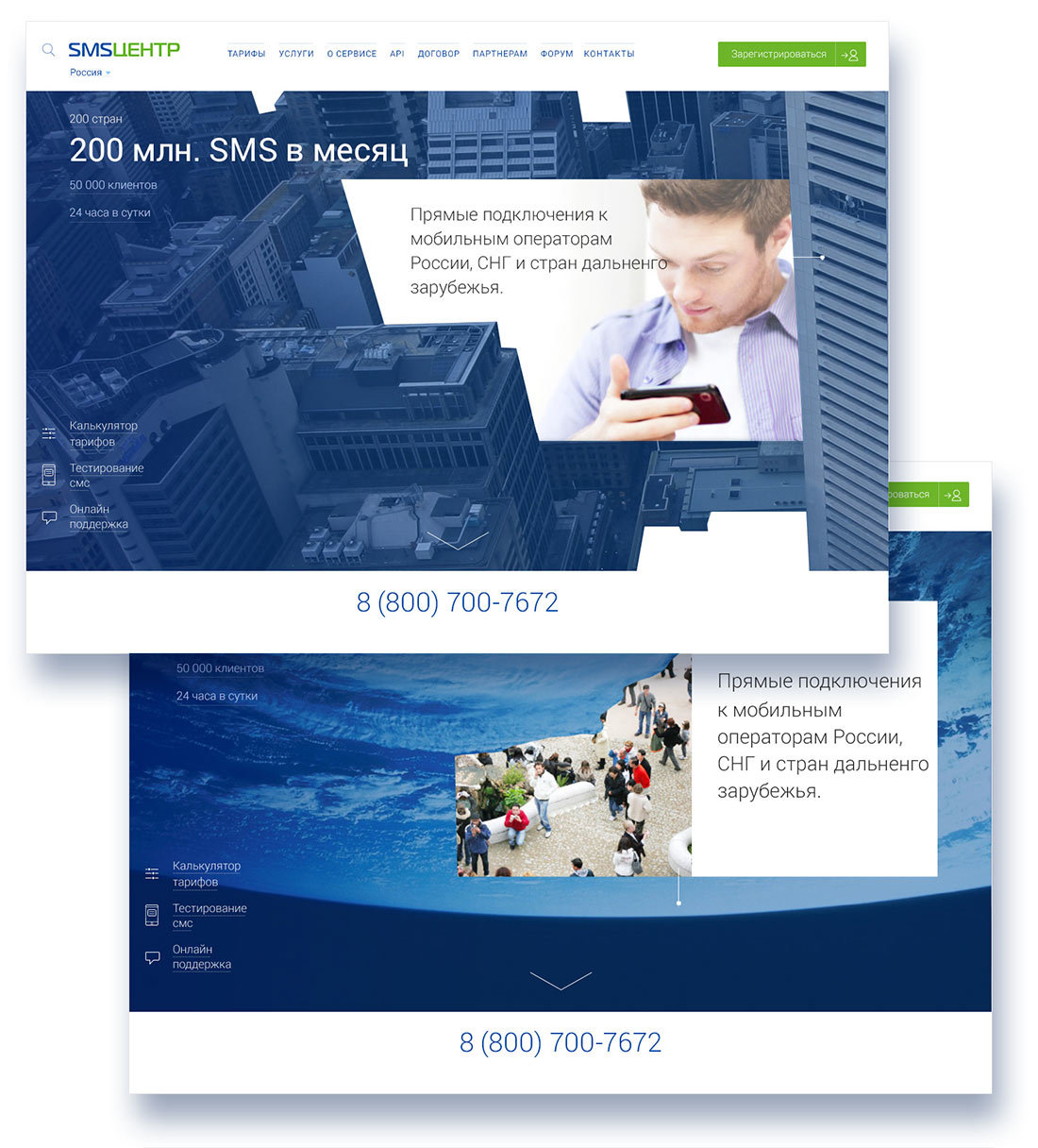
It’s a miss. But playing with statistics is an option. We get an idea to make a transition from pixelized images into reality.
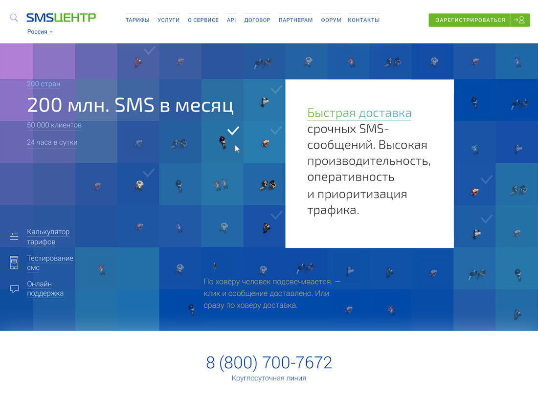
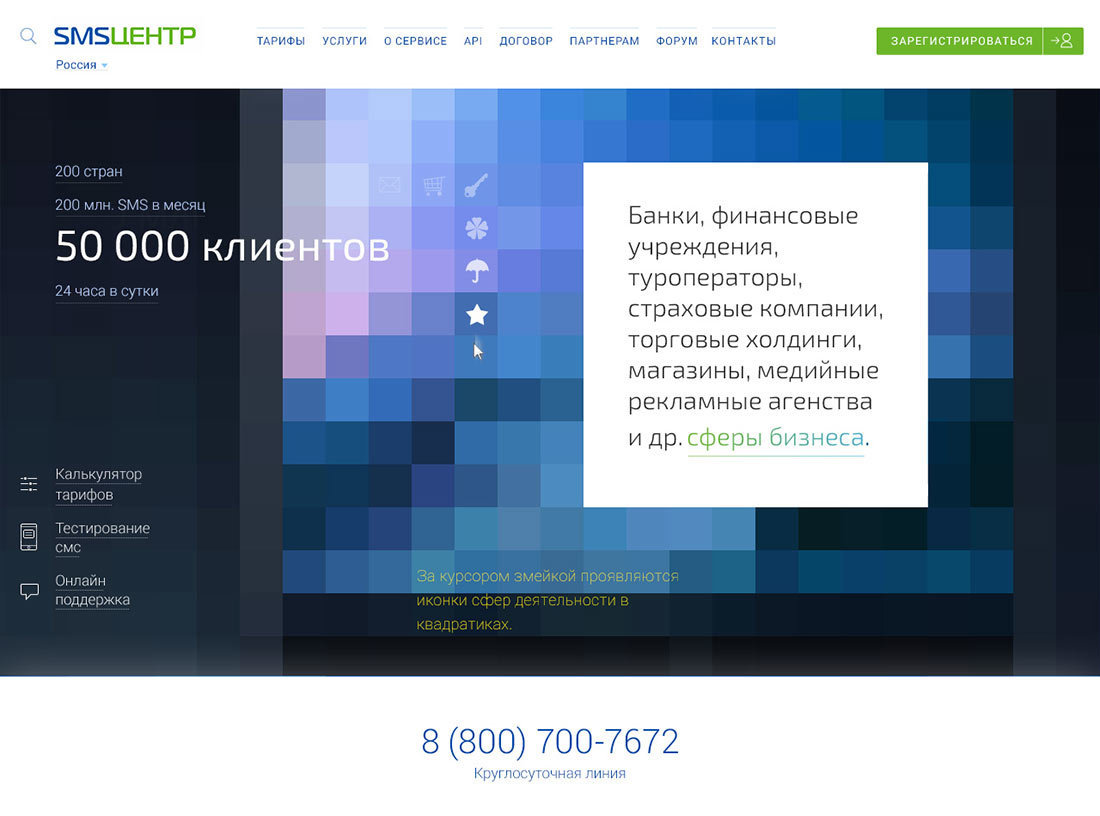
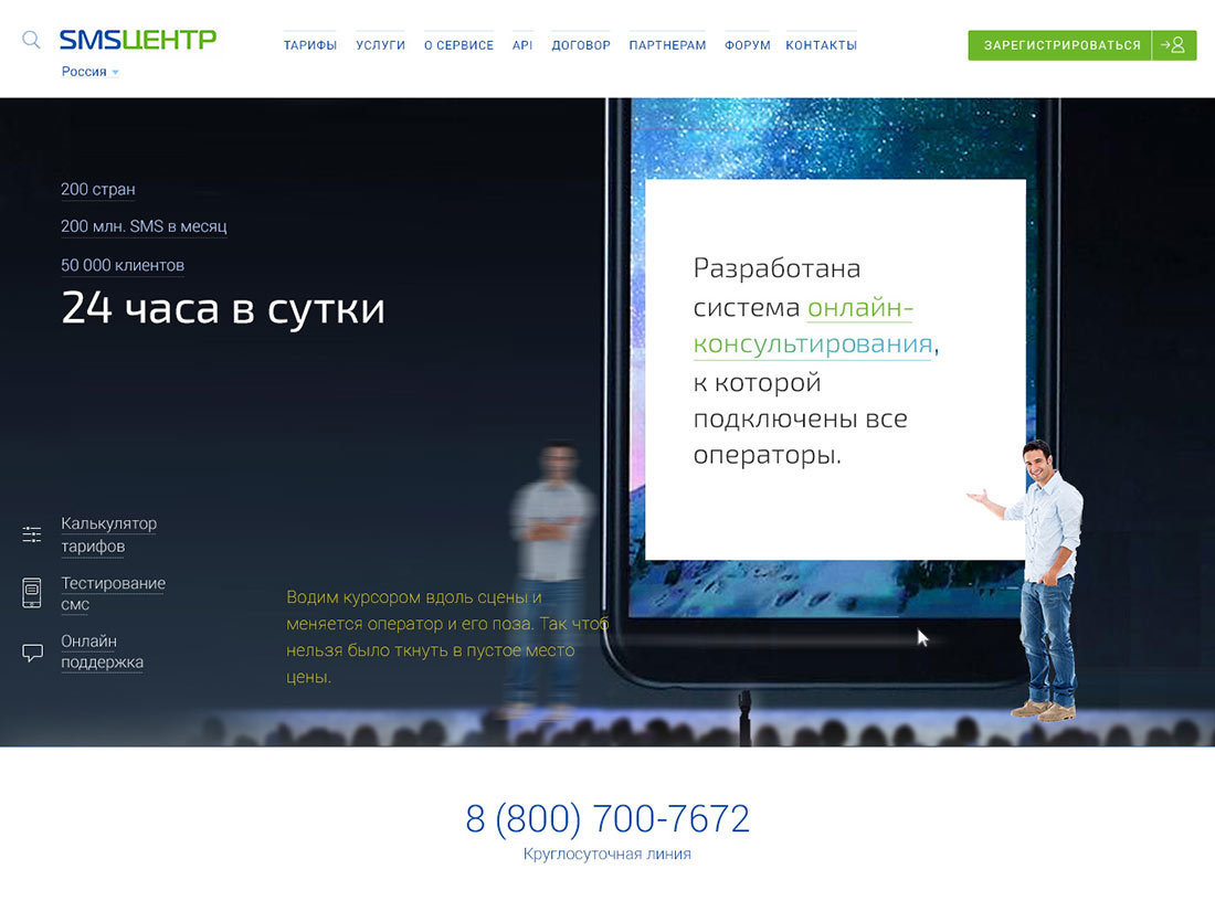
The art director approves but asks to move away from the Apple presentation and make sure the stories presented are closer to the text.
Coming to a conclusion that the illustrative portion is too intrusive right now and we need to make an emphasis on text that would set the right mood.
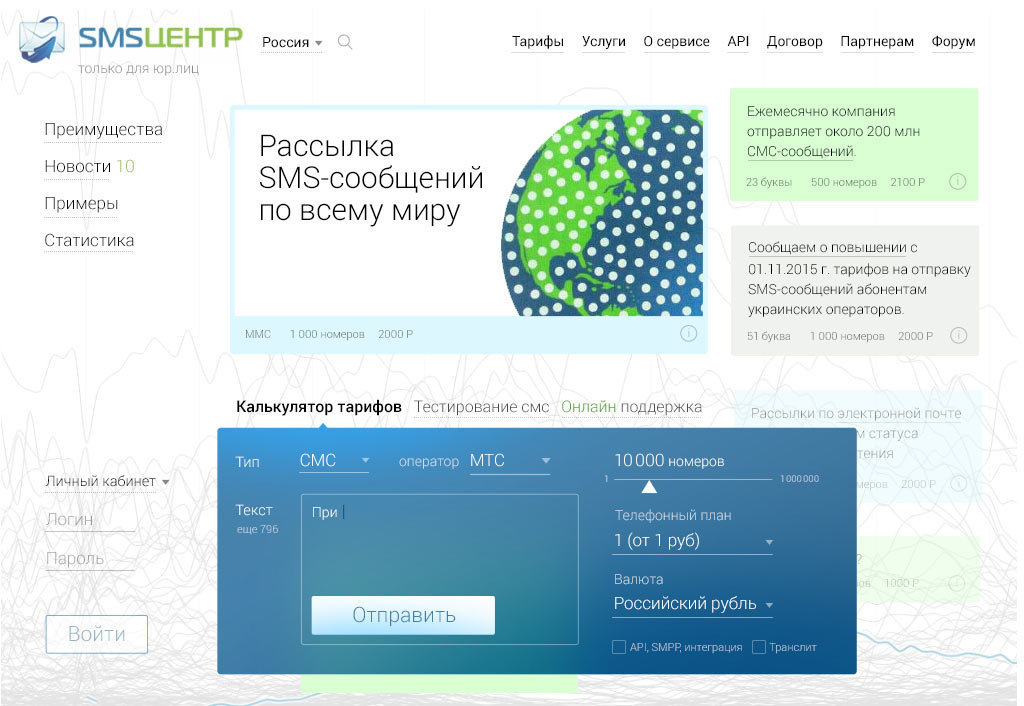
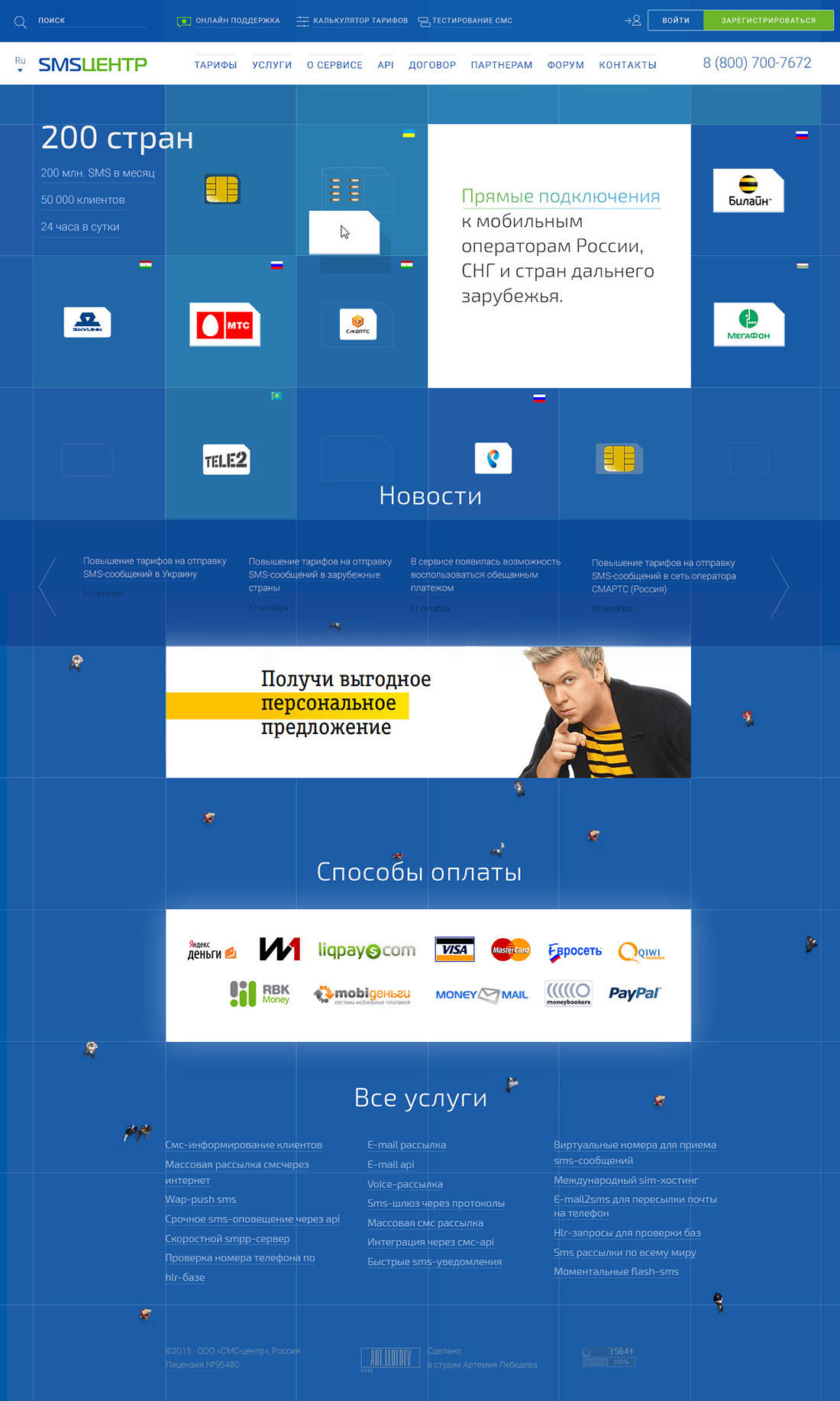
Cleaning up the mock-ups, bringing back the calculator from the previous attempt.
To ensure creative diversity, giving the same task to a different designer. He explores the subject area, looks at previous concepts and the client’s and art director’s feedback.
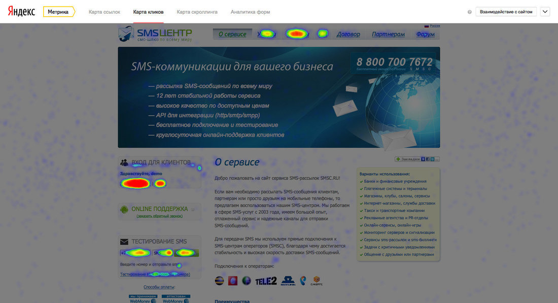
Looking at the click heatmap and carefully exploring analytics of the client website. Half of the visitors are existing clients who head directly to their personal account page. It’s important not to make life difficult for them in the new version.
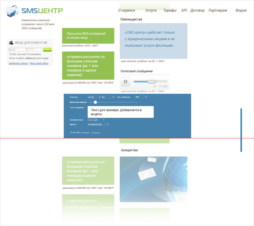
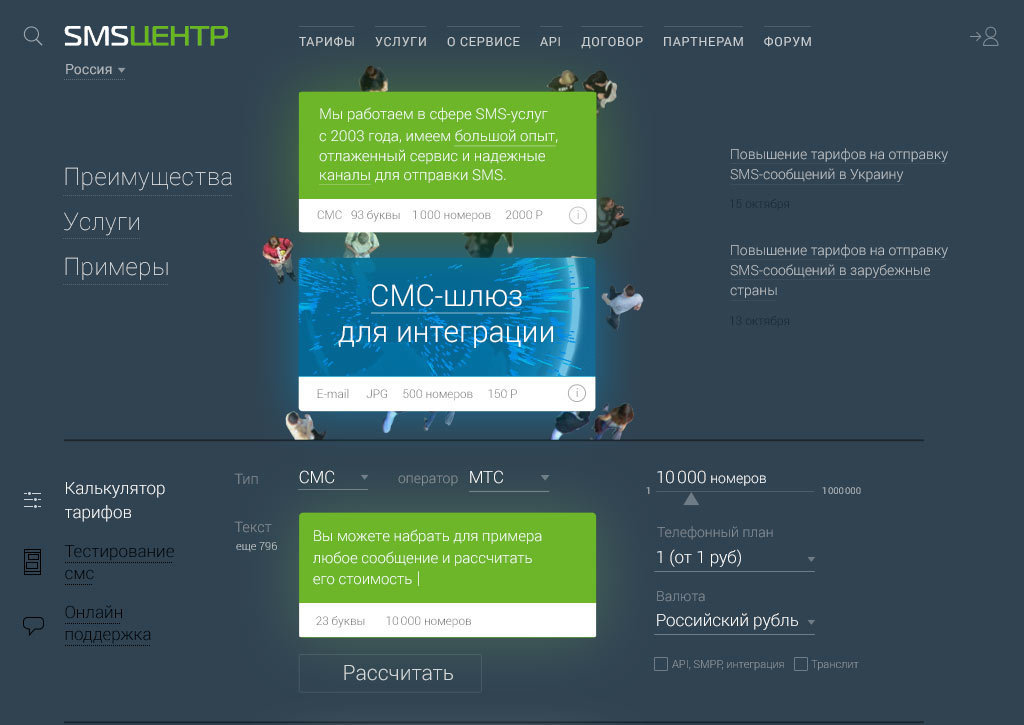
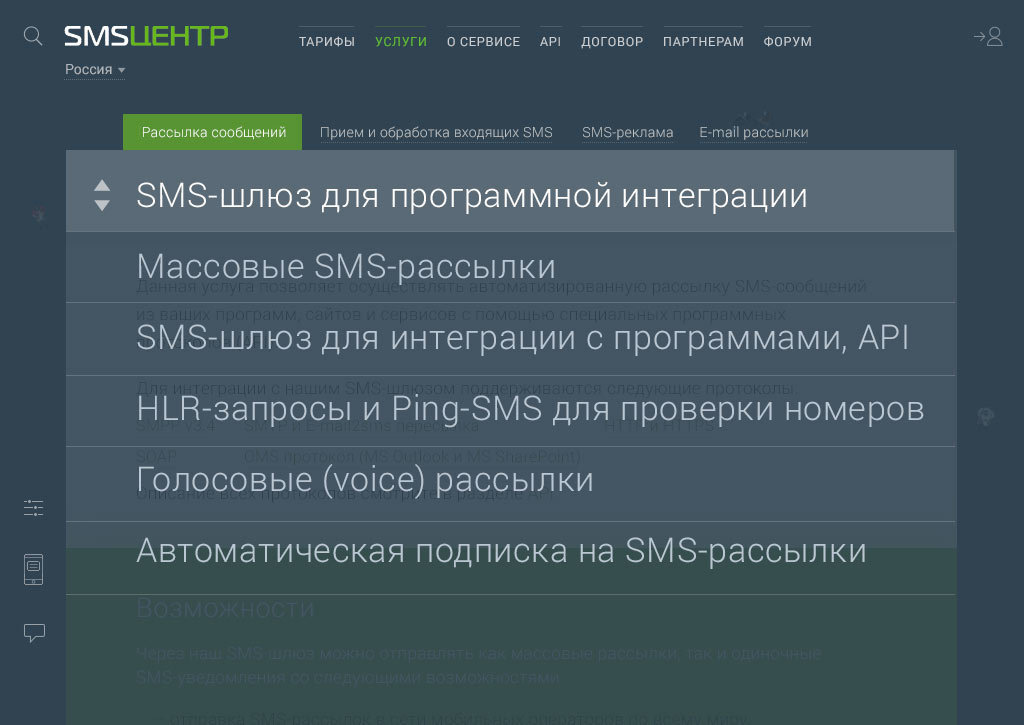
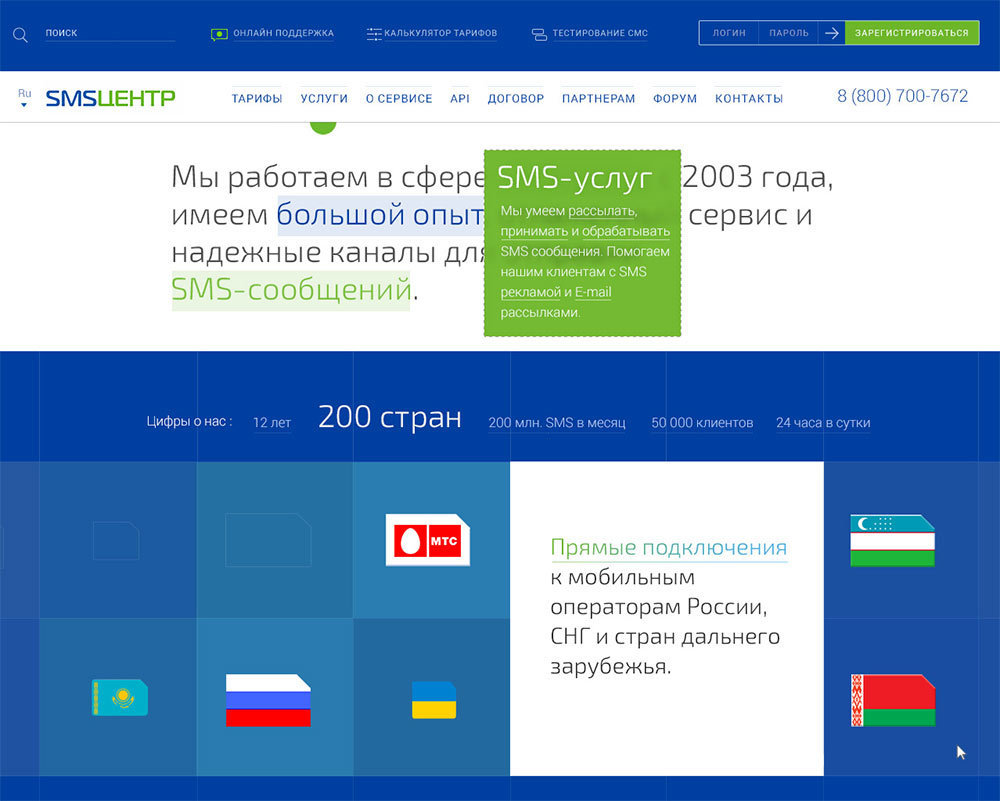
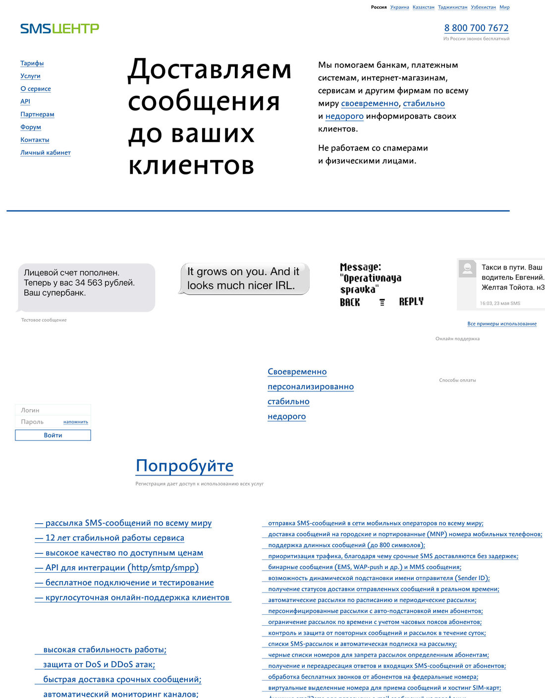
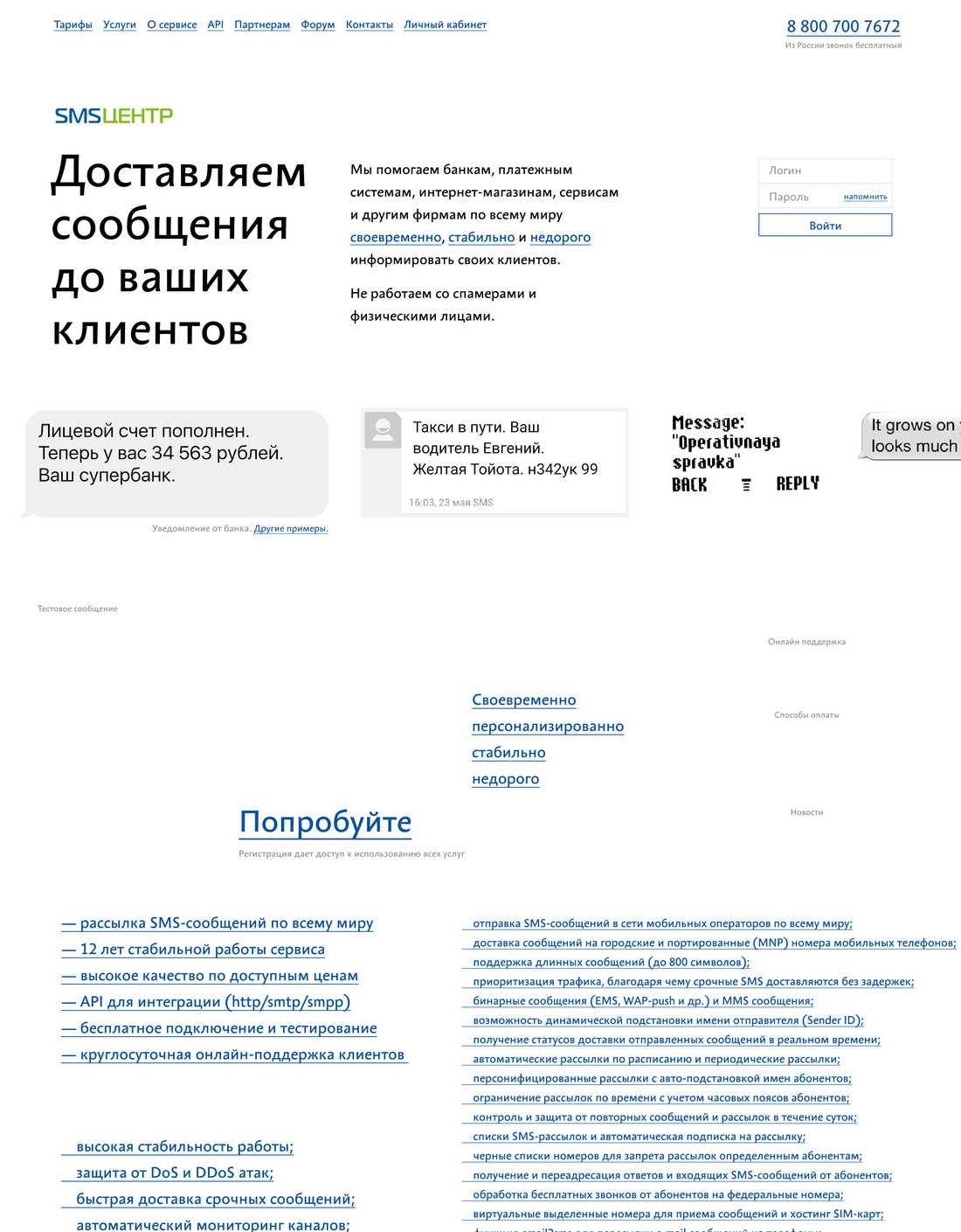
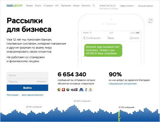
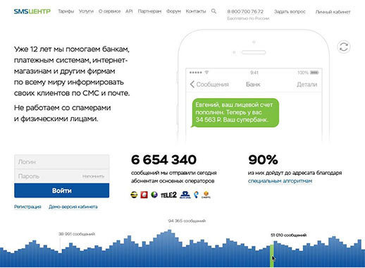
Planning to create a clean, neat and direct design that would introduce the client and their services without any fancy metaphors. To evaluate the material, placing all required elements on one page: the introductory block, login form, text message sending form, descriptions of services and advantages.
The main page shouldn’t be too dry, so we add some emotions: real examples of text messages displayed on different devices from an old Nokia to the trendy iOS. By using these “live” messages we can show the variety of situations where the client’s services can come in handy: different people, different phones, different messages.
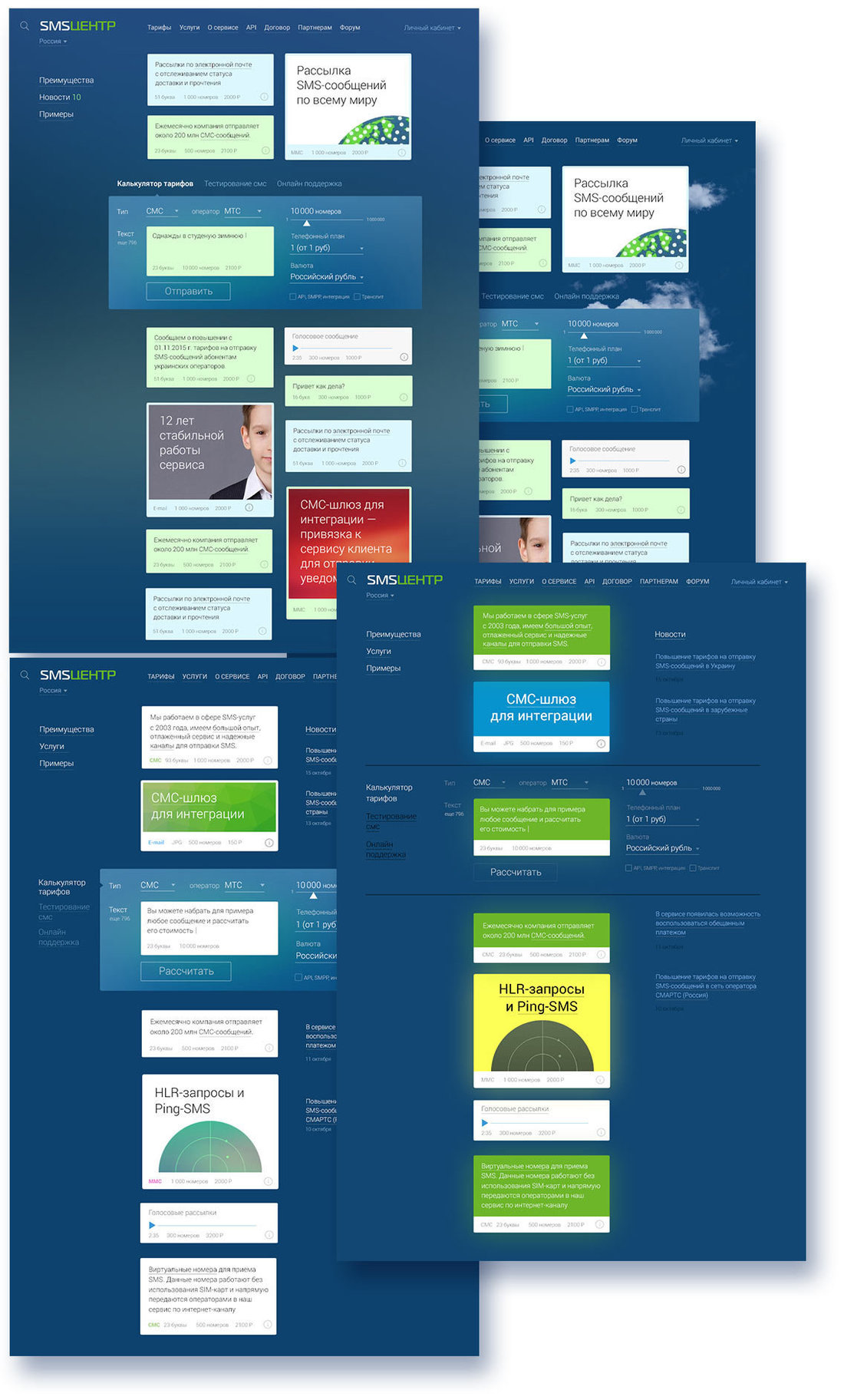
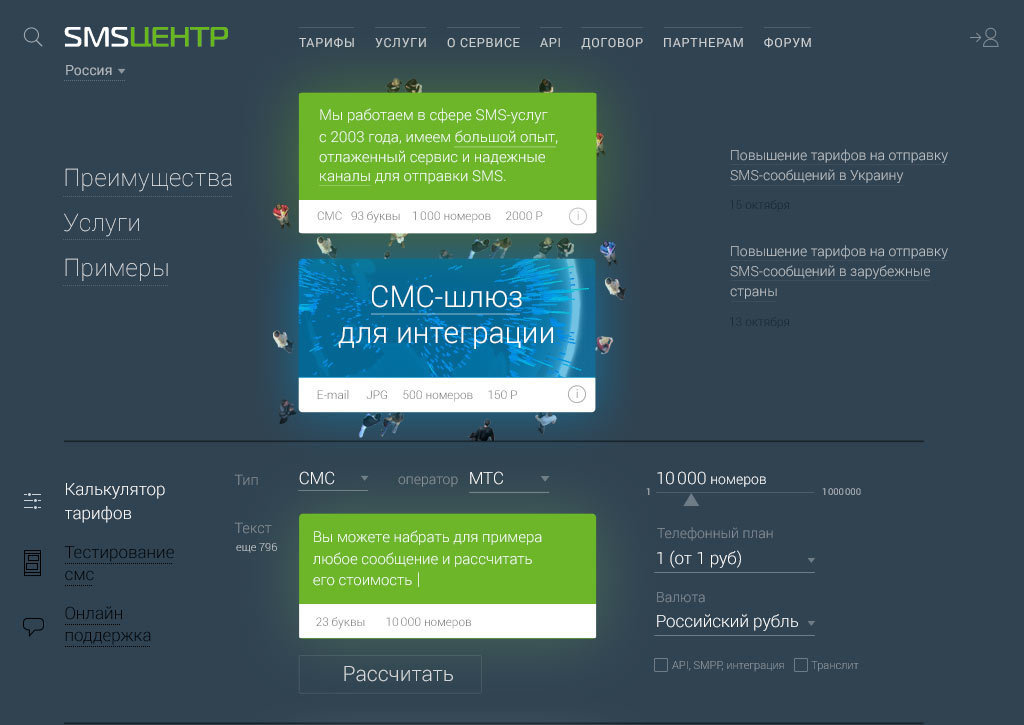
Mixing up the blocks, trying to find an arrangement that works.
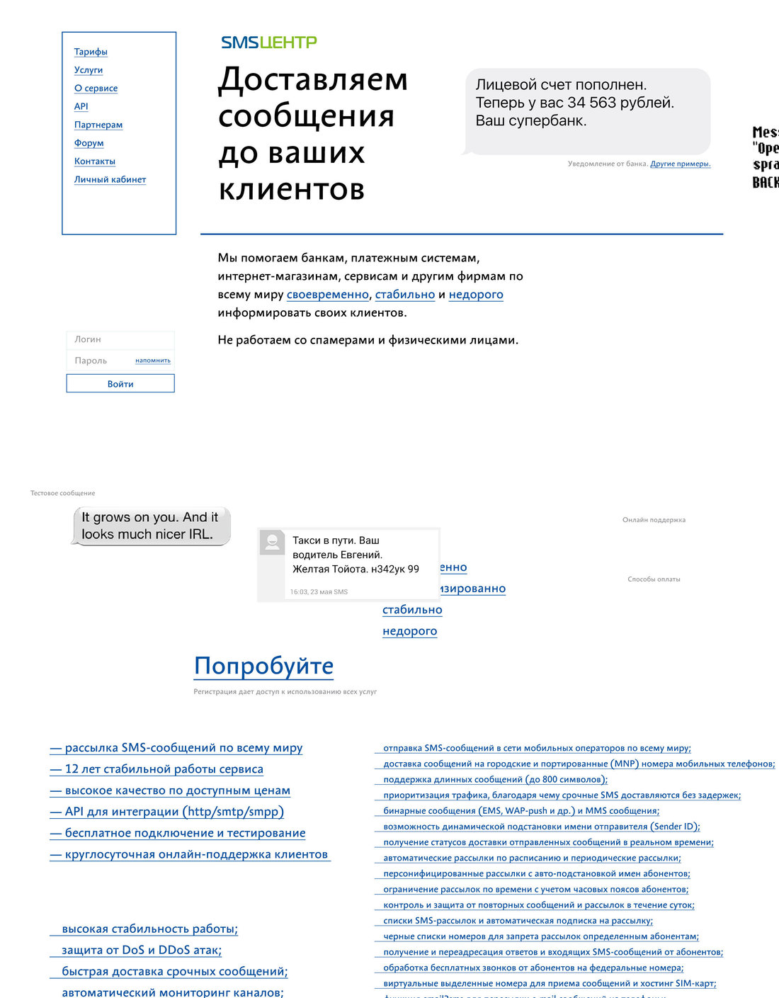
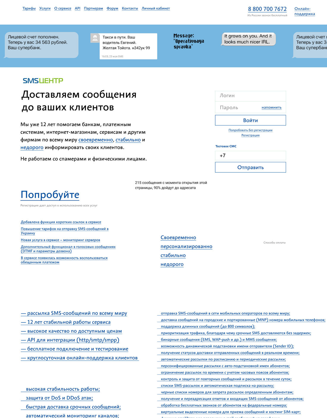
After getting a feel for things, making another attempt.
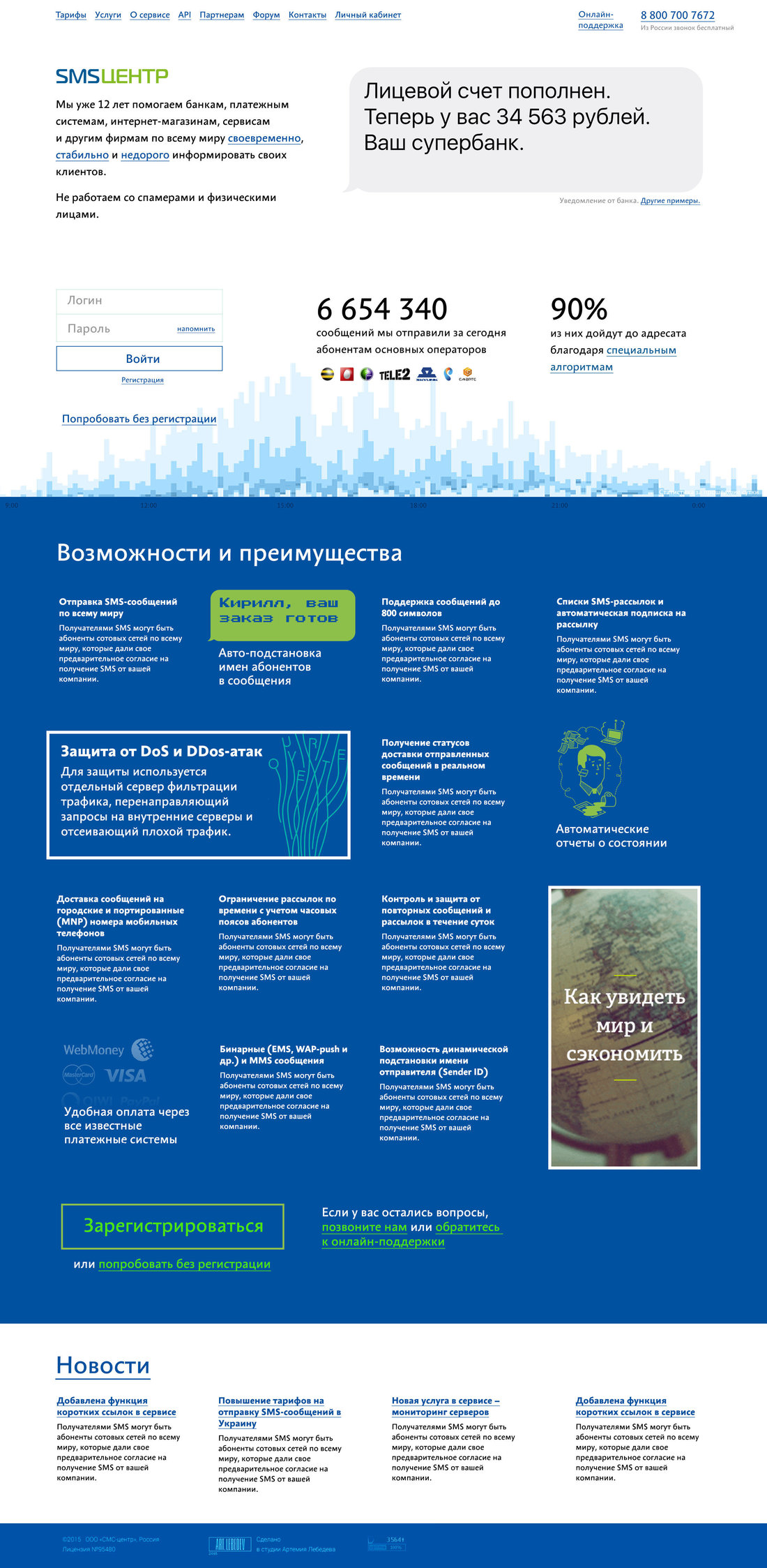
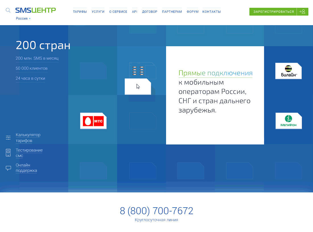
Also emphasizing the company’s size and scale of operations using statistics and a real-time graph. Making sure a large login form remains at its old place.
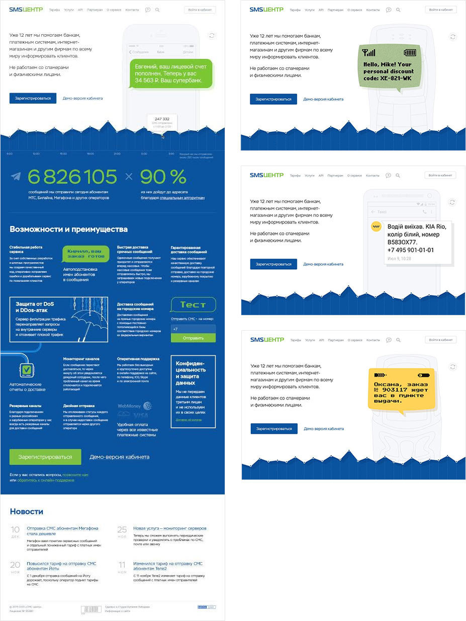
Often offering a specific service is a competitive advantage in its own right, which is why we combine services and advantages into one block. To make the large list less boring, breaking up the block layout grid with various accents.
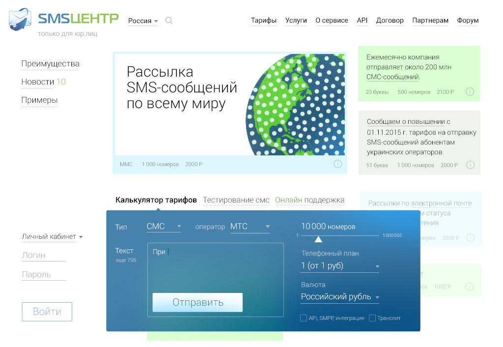
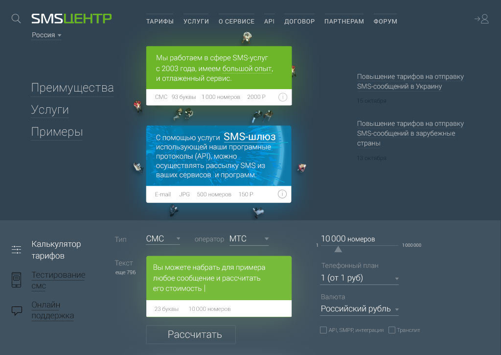
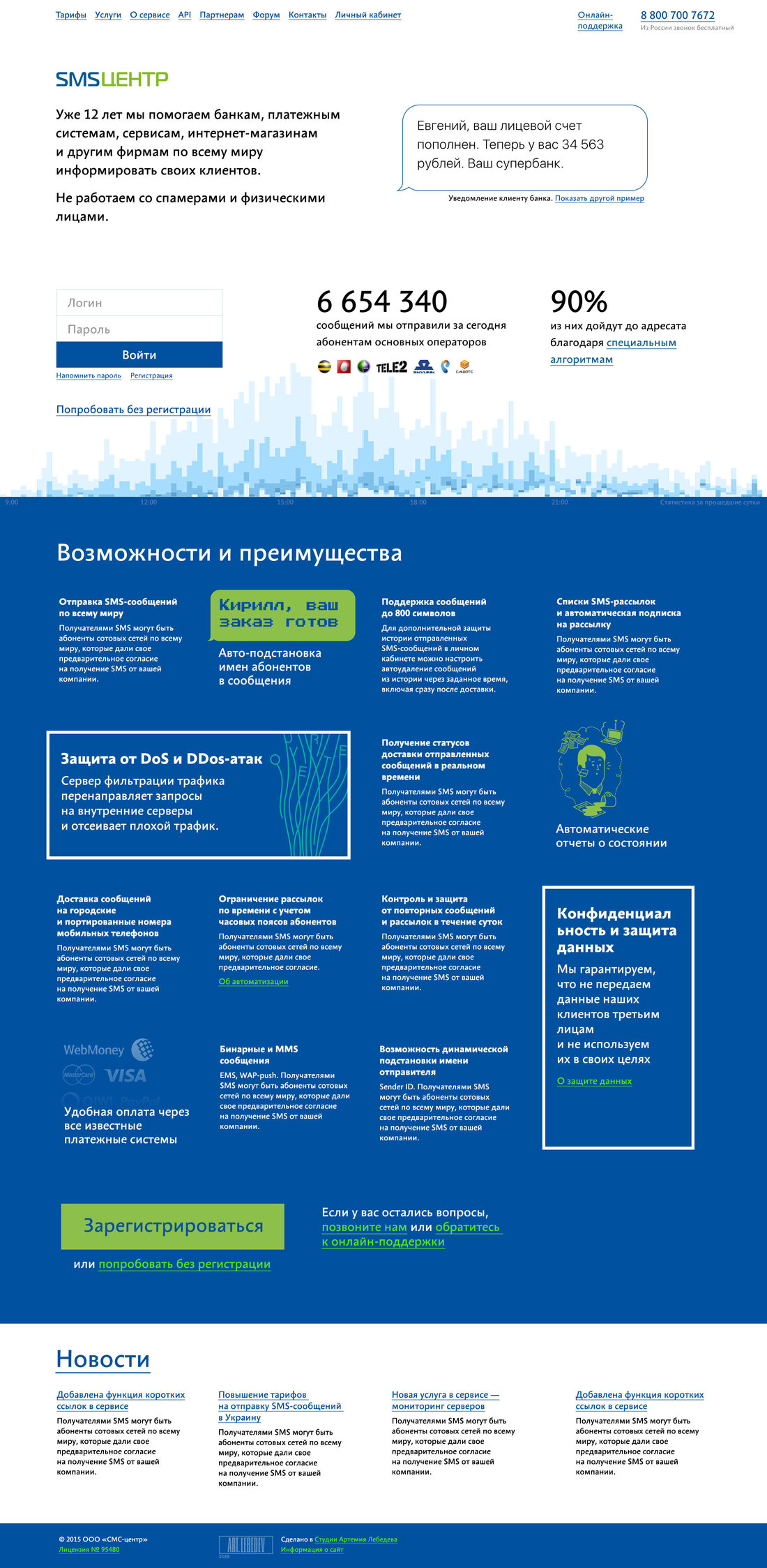
The art director approves the design but advises to change a couple of things. The message on the main screen dominates over the introduction, making the message type size smaller and keeping just its outline.
Putting together a presentation and showing both designs to the client. They approve the second concept. Inviting another designer to help develop it.
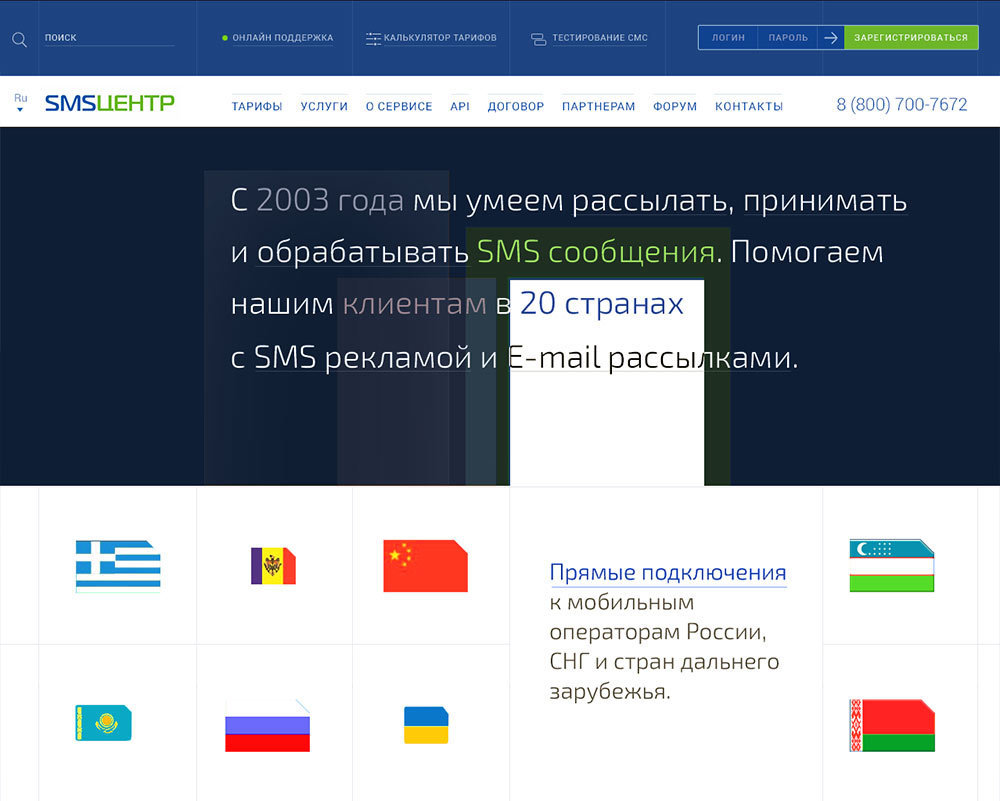
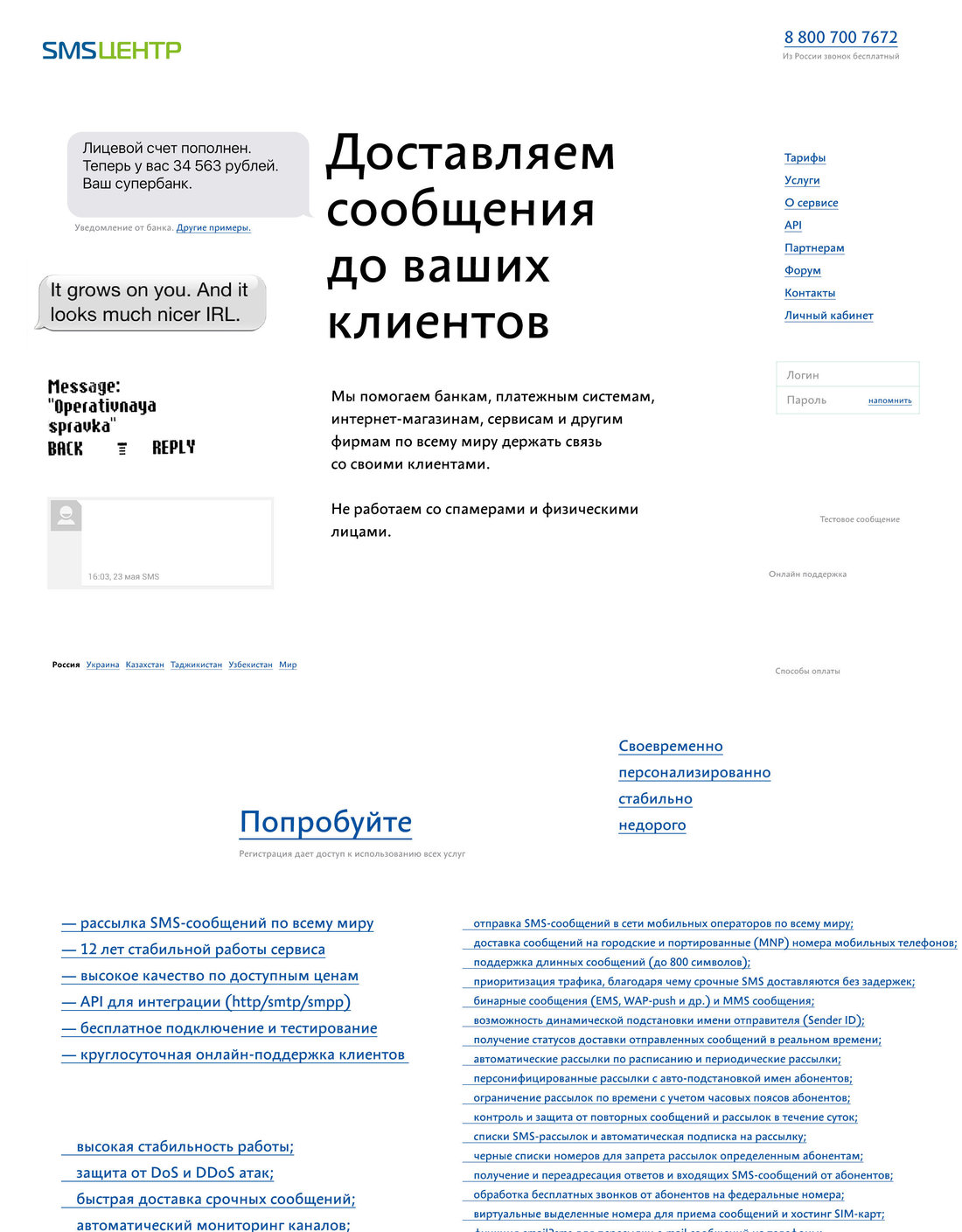
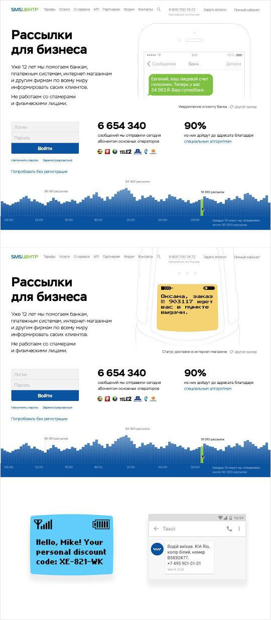
Working on the main page, remembering it’s not the only one on the website. Trying to show the variety of devices and messages using speech bubbles and typefaces without showing actual phones.
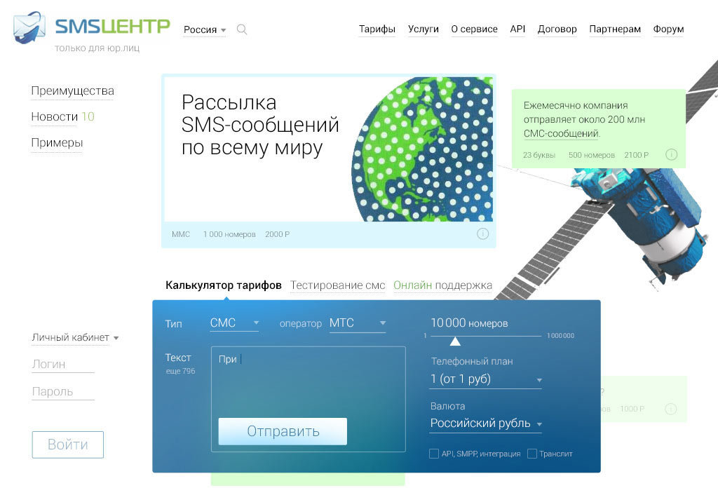
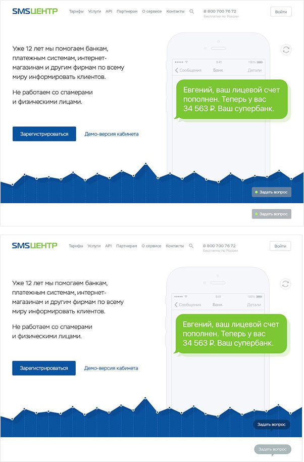
The main page becomes too joyful and fails to convey the initial idea. Drawing the phones.
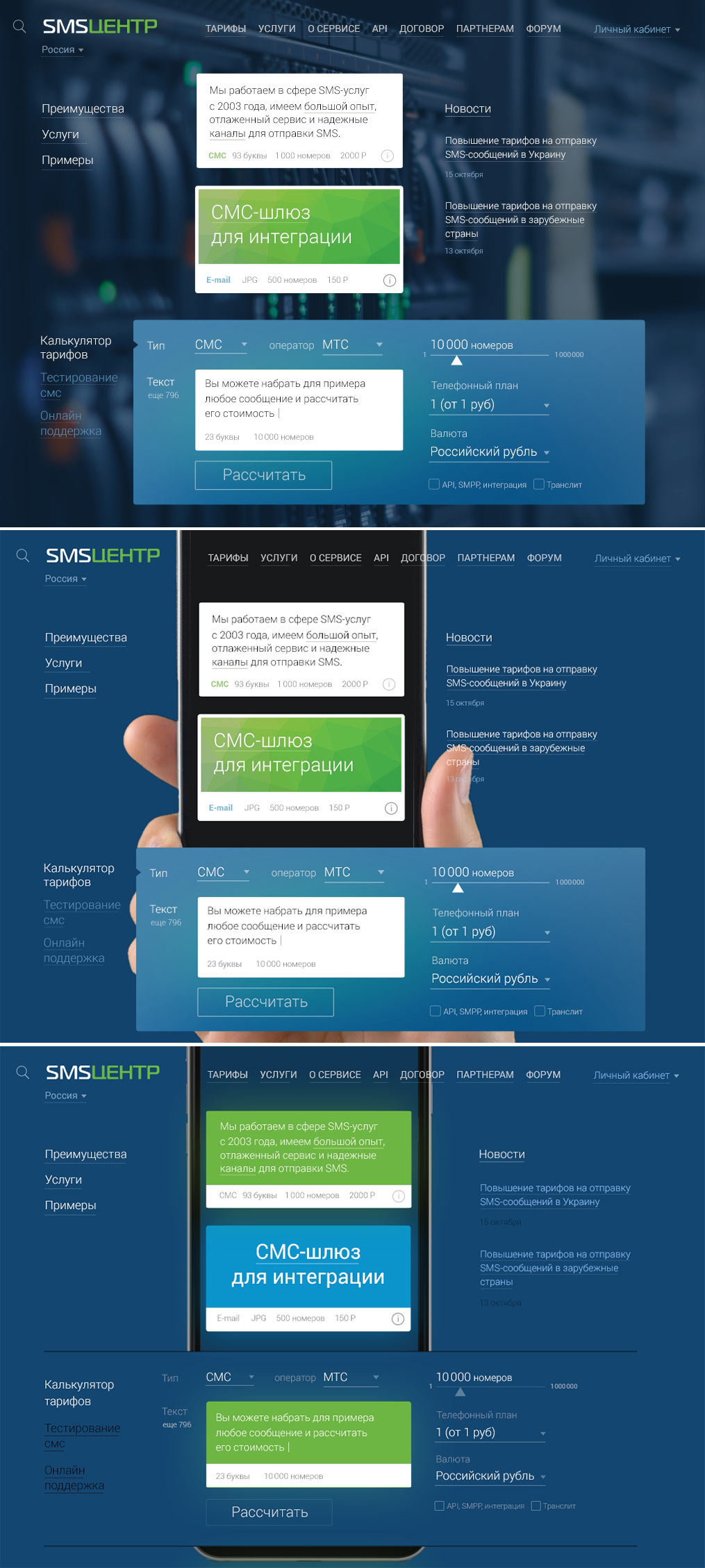
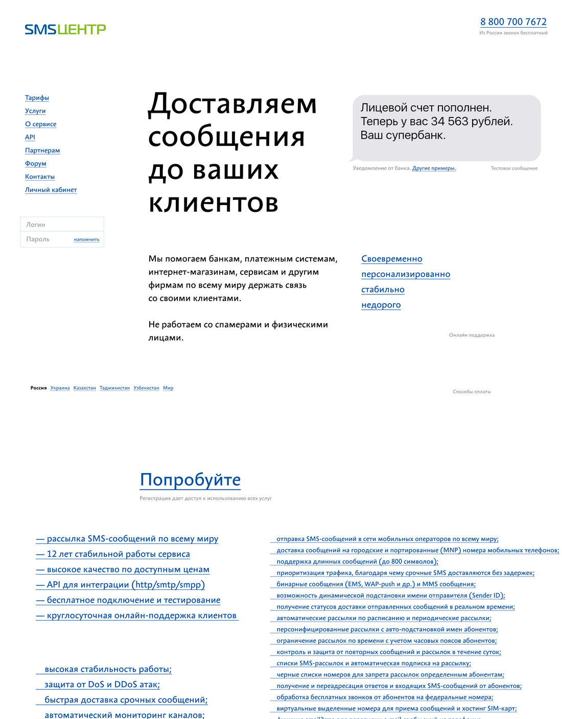
The heading is too formal, there is now noise above the phone, the login form could be simpler. Putting the header away for now and starting to work on other issues. Easily dropping captions duplicating the contents of the pictures. Making the login form simpler.
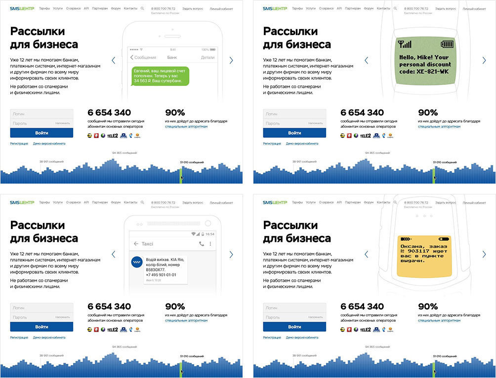
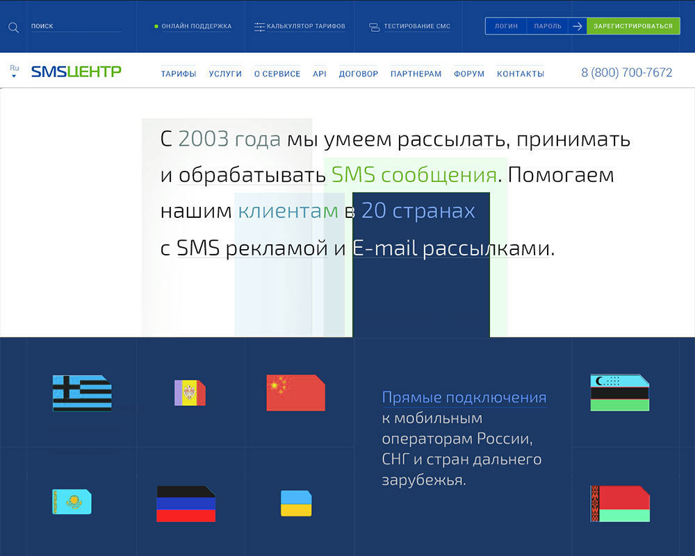
Replacing blue directional arrows switching phone pictures with one gray refresh button, it’s much more laconic this way.
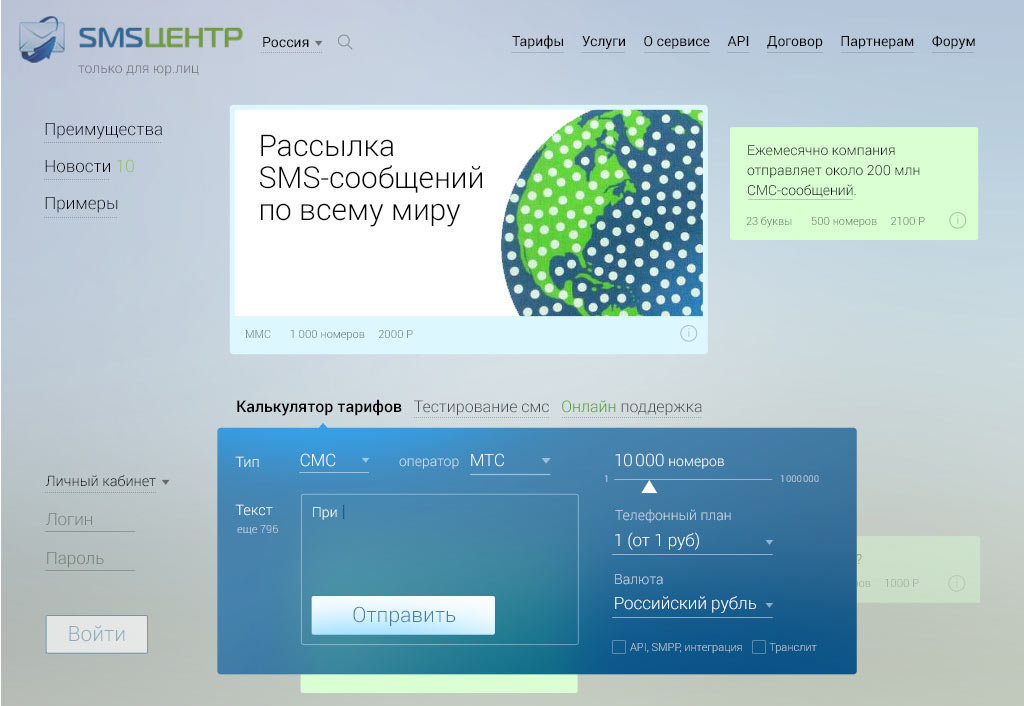
Solving the problem of the header by deleting it altogether.
Taking a look at the entire screen and realizing it looks heavy and bland. Moving the statistics further down, hiding the login form under a button, separating text message bubbles from phones to make sure they can be rearranged easily, toning the phones slightly. Then turning off our internal infographic snob and replacing the detailed 15-minute diagram with a less detailed dynamic graph that only provides hourly updates.
It worked: the art director approves the mock-up.
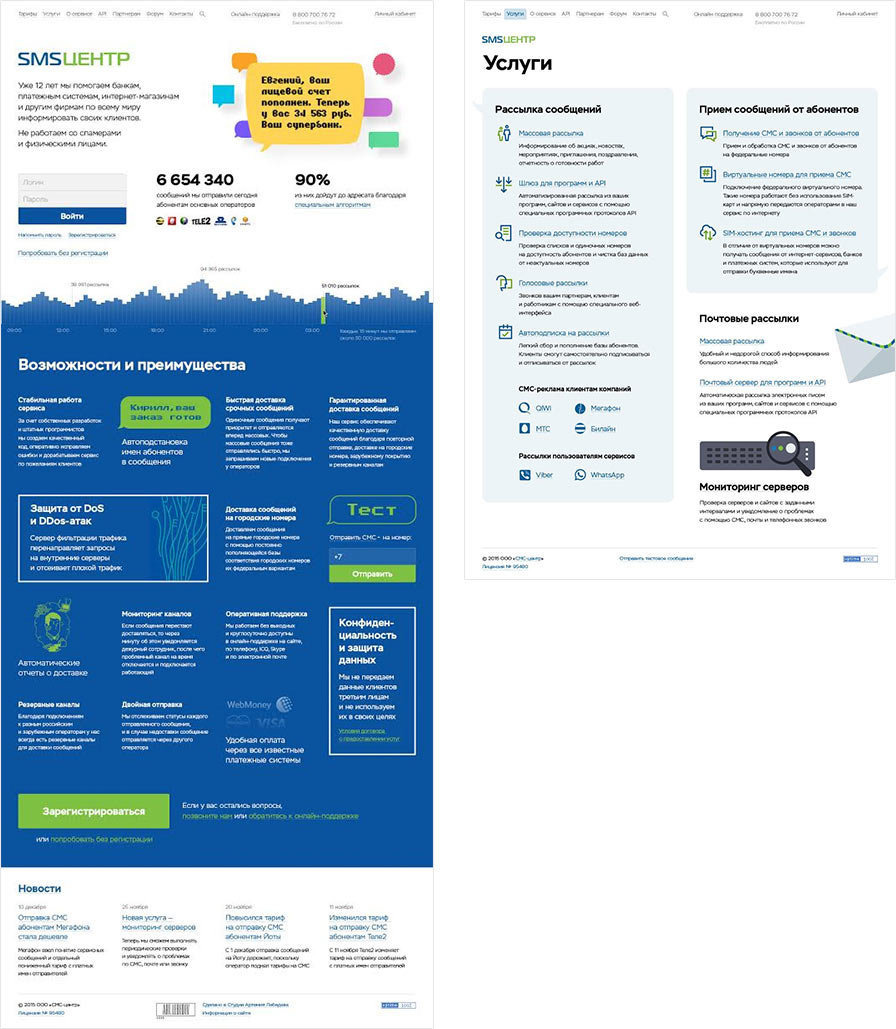
Receiving feedback from the client. We need a button for online support.
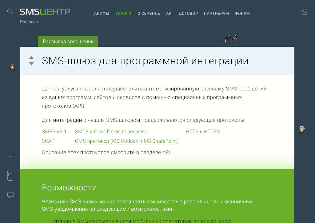
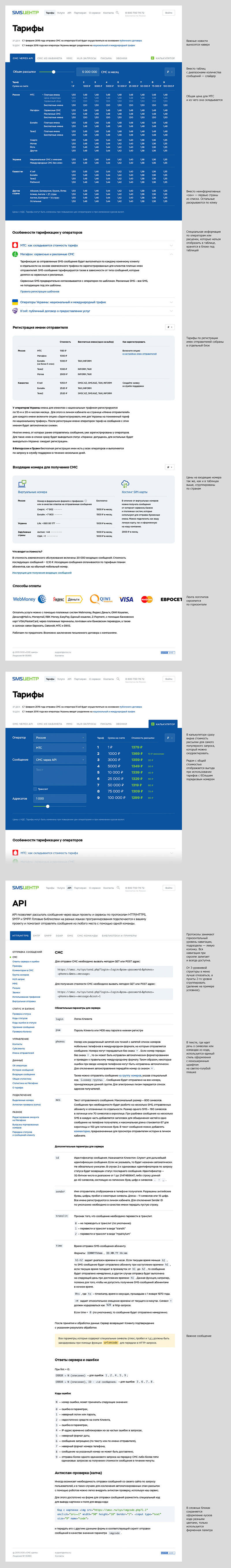
Deciding not to use a green indicator in the second design and sitting down to draw pages for pricing and API information.
It’s difficult to see the difference between plans and understand whose account the money is on. Adding a hover hint and improving the heading.
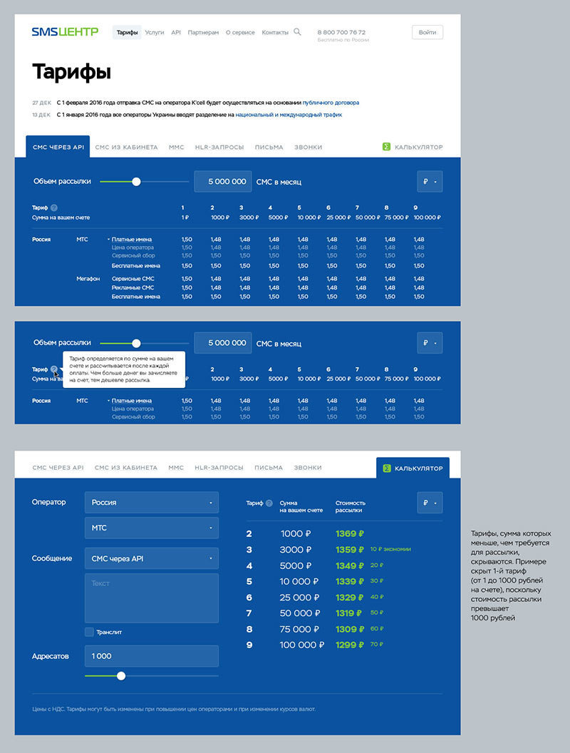
Approved. Assembling a lorem ipsum page.
Writing the project manager a text message that everything’s ready.
