Sokolov website and mobile app
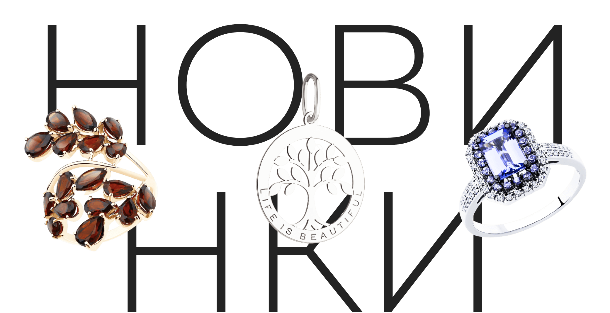
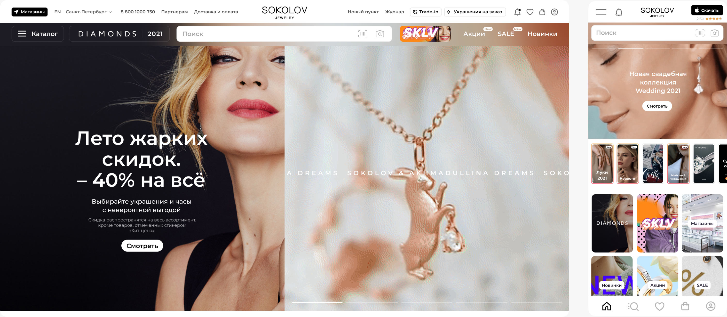
Twenty-eight years ago Alexey and Elena Sokolov opened a small family workshop where they started creating original jewelry. Now there are over a hundred stores under the Sokolov brand, including in Switzerland and Germany. An online store for the company that attracts attention from all sides was designed in the studio.
Thanks to the completely redesigned structure, up to thirteen controls can be freely placed on one screen. They don’t interfere with each other, but work cohesively toward a common goal: increasing the number of orders.
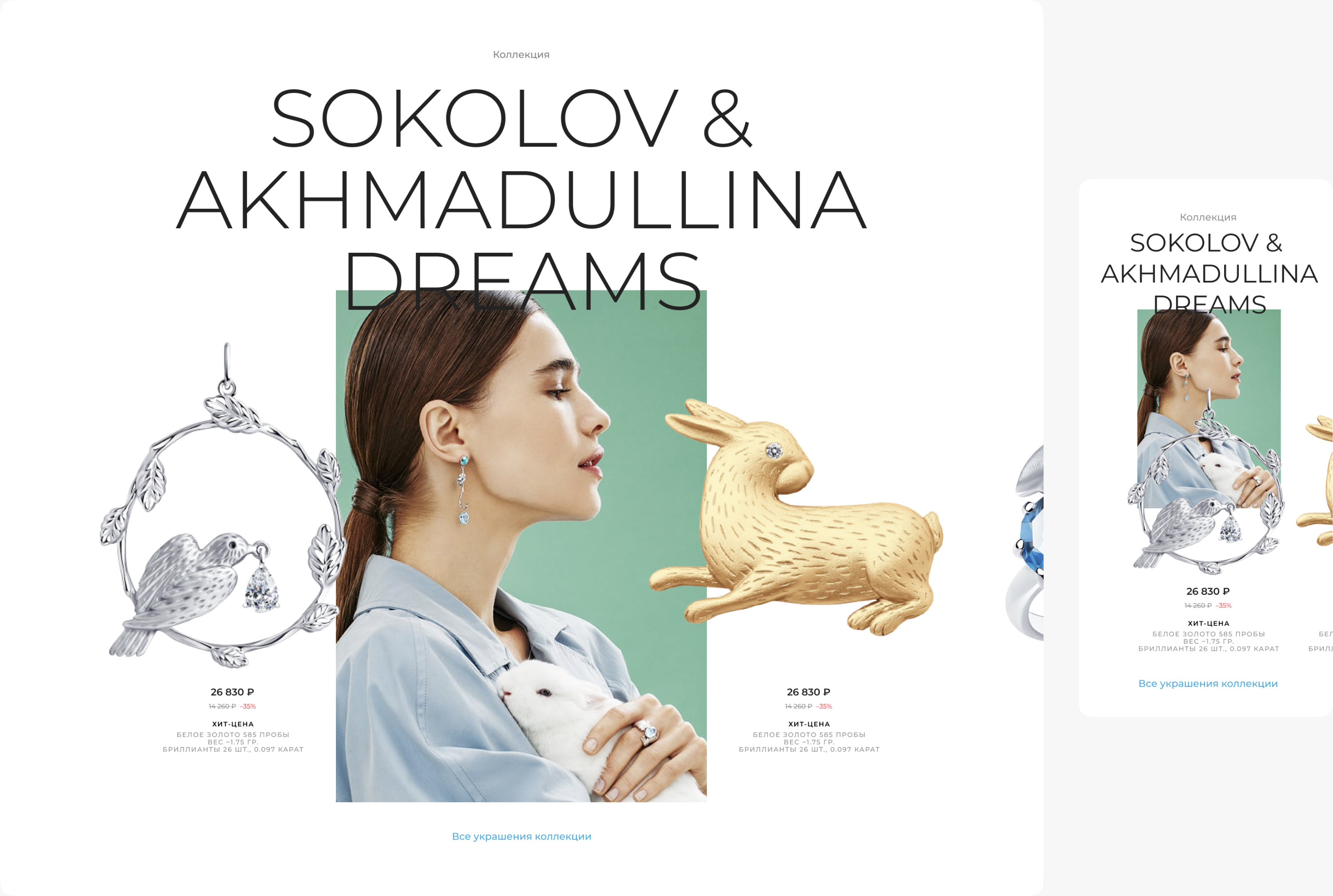
Items from different collections are effortlessly combined with advertising images and put on the most unpredictable backgrounds.
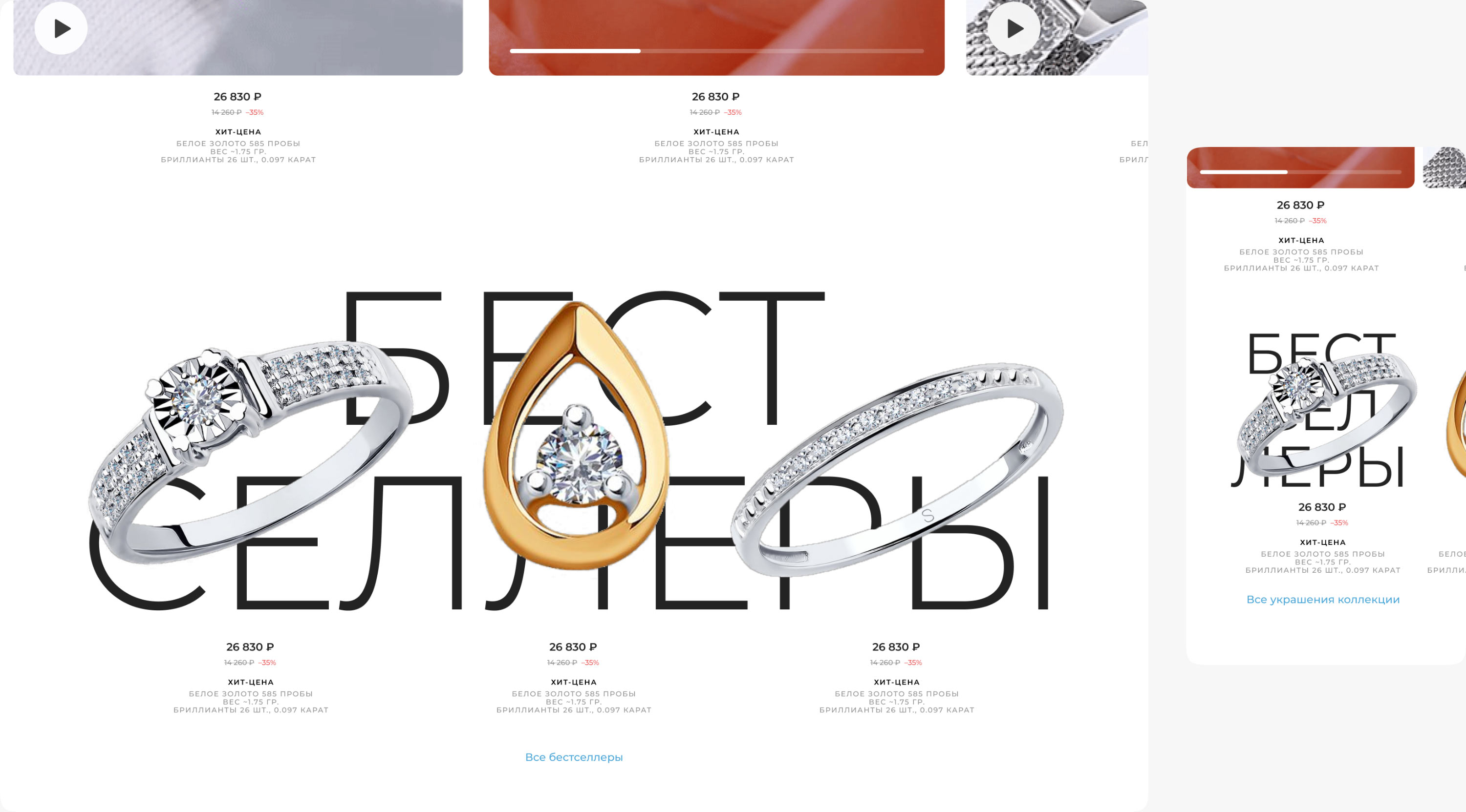
Each section has a background with a unique typeface. This helps visitors instantly recognize categories and allows administrators to easily add new elements.
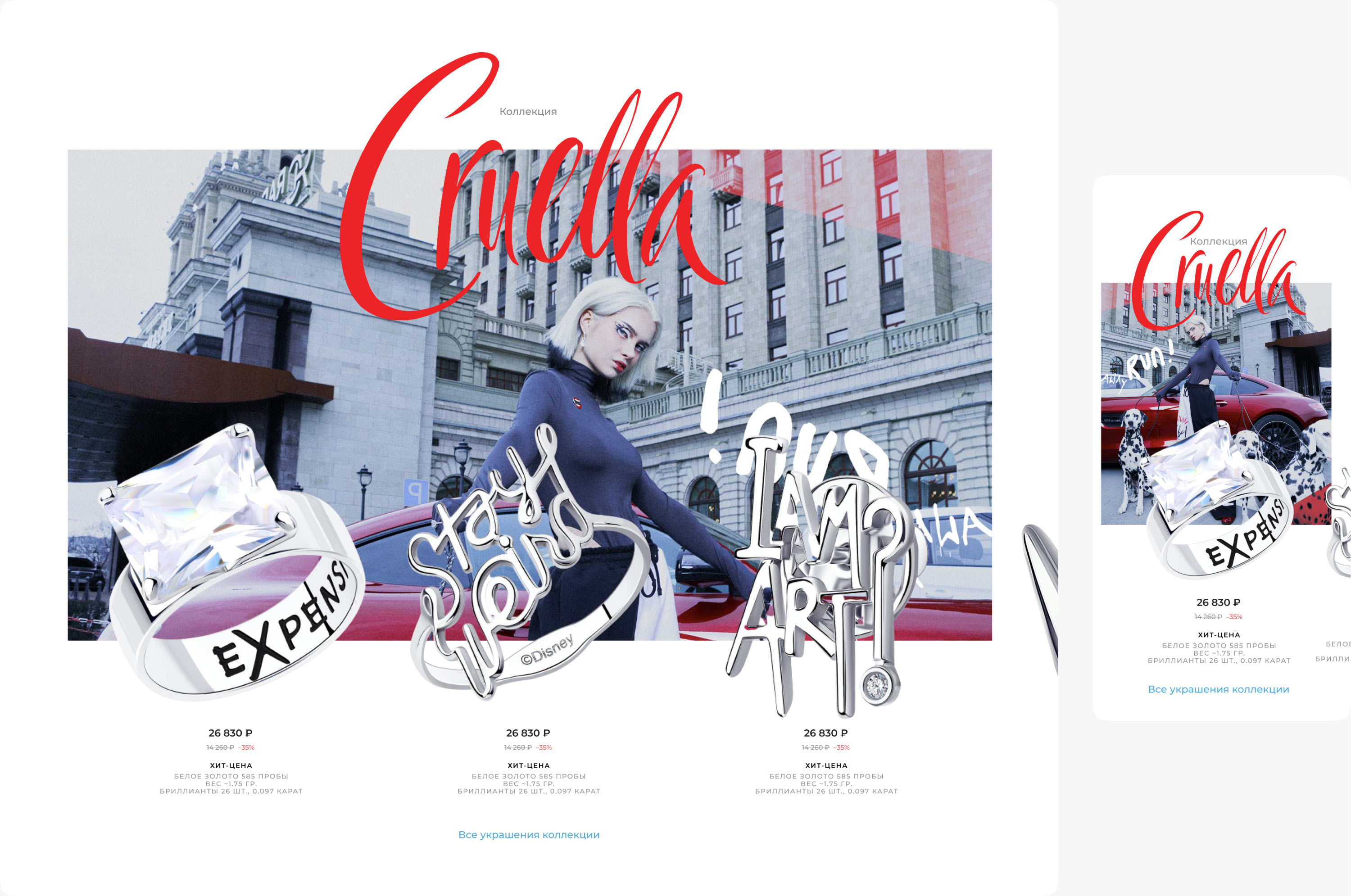
When describing joint projects with other brands, the Sokolov logo is used as much as possible. This is also where wonderful color backgrounds are used.
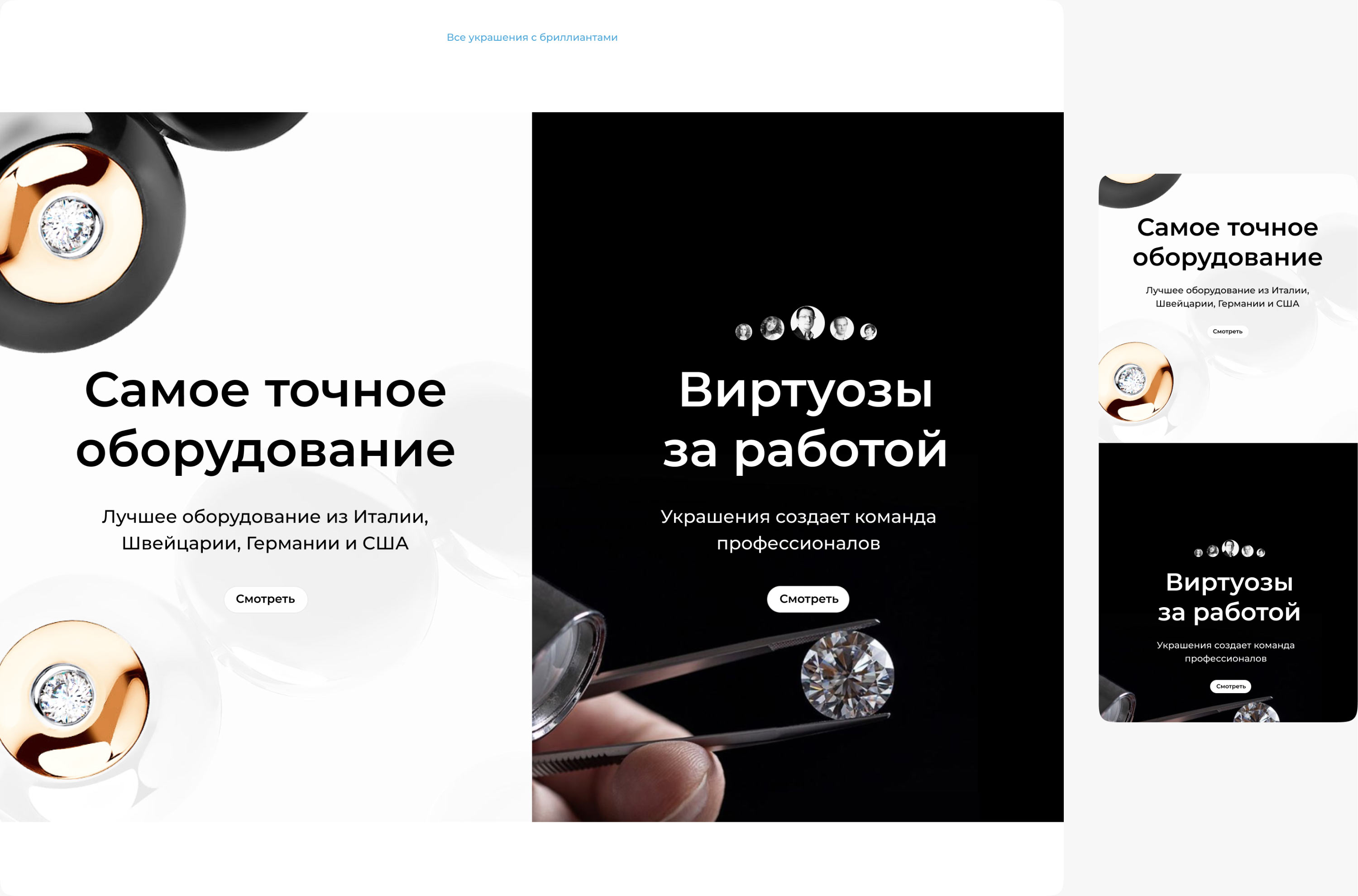
Promo materials are presented easily and unobtrusively, encouraging to learn all the details about each piece of jewelry and eventually place an order.
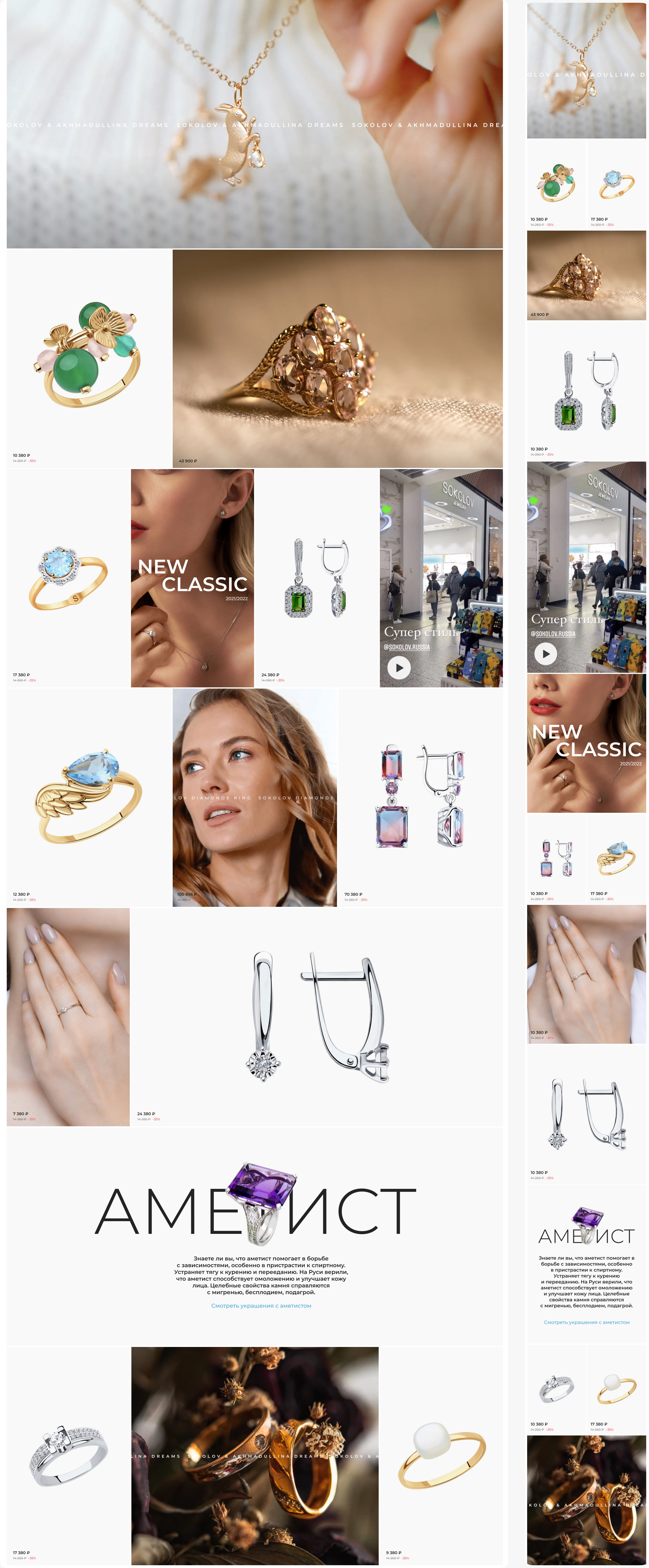
The bottom part of each page is dedicated to a continuous content feed. Even if the visitor hasn’t made the decision to place an order, they can always enjoy the endless beauty.
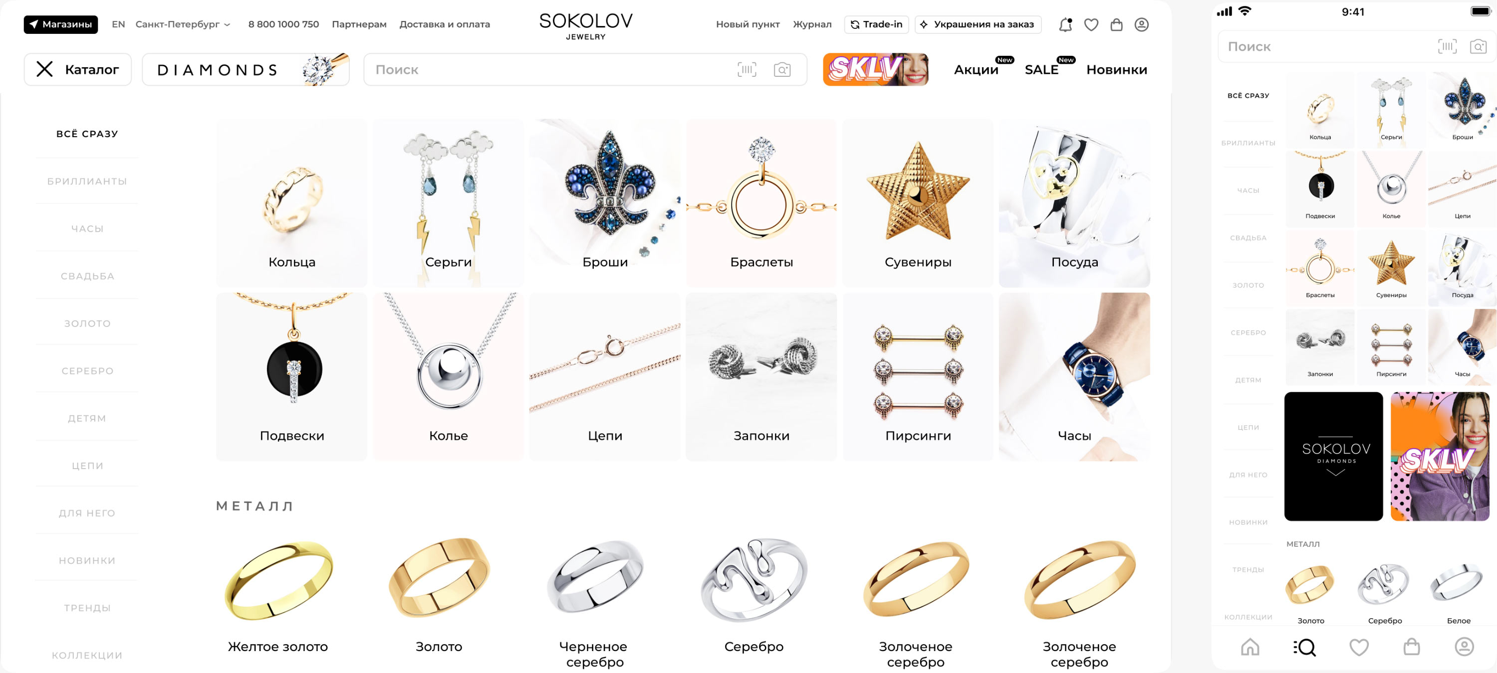
In the catalog, we were able to visually separate navigation elements and product category identifiers. Working with the storefront became even more convenient.
Opening the main page of the catalog, the first thing the visitors see are bright photos. Then, the main details about each item. Filters help choose the right product, and a variety of tools allow to display the content the way the viewer wants.
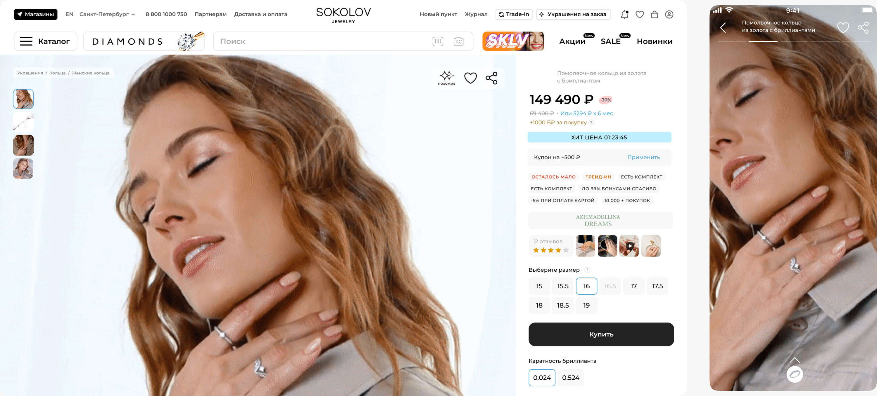
The maximum amount of space on the pages is naturally devoted to jewelry. But all the main benefits of future purchases are also perfectly placed on the screen, guiding the user’s attention. When viewing on mobile screens, premium jewelry items get covers that are rendered as stories.
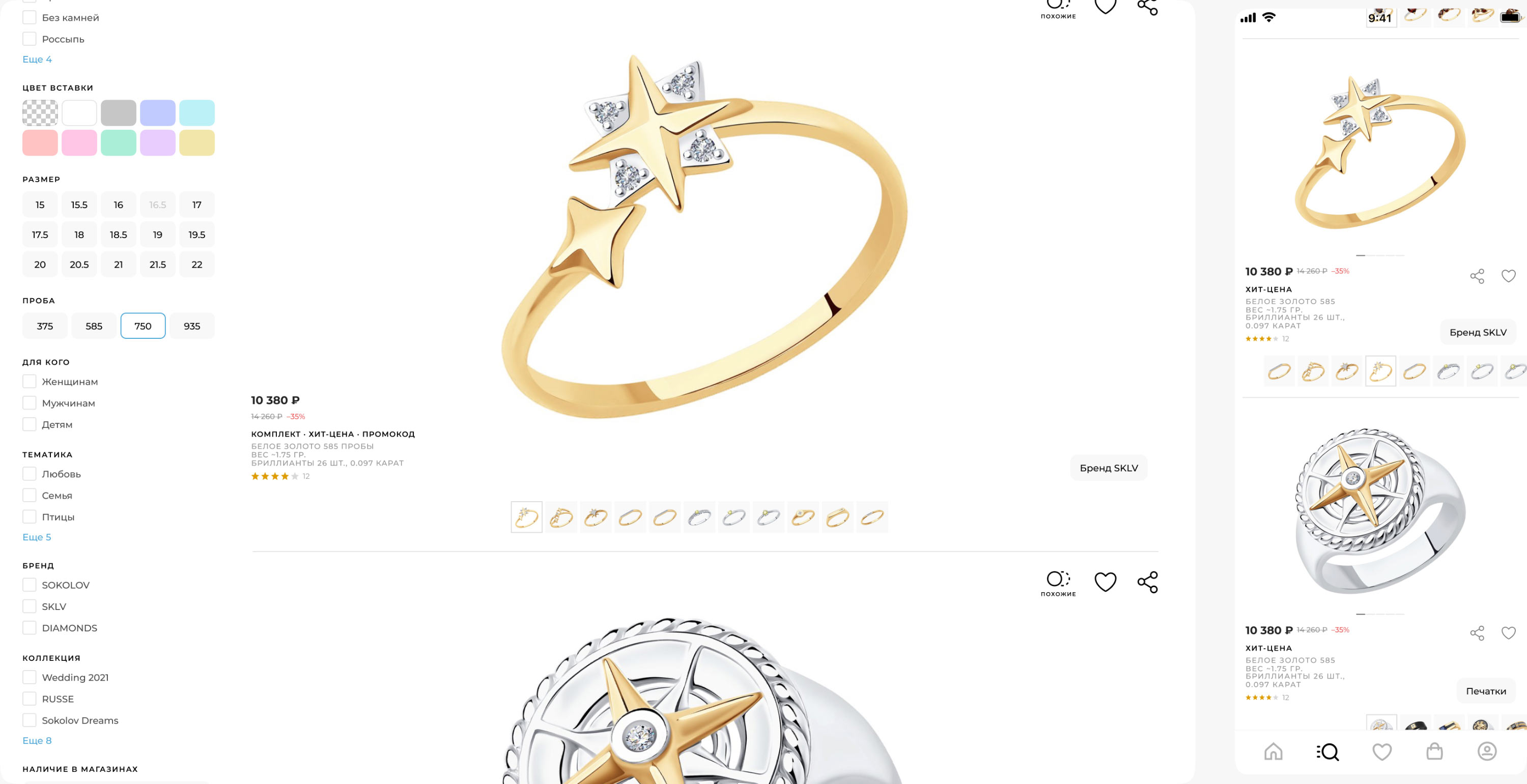
The catalog can also be viewed in alternative modes: with micropreviews and detailed images. Products are grouped by common characteristics: material, purpose, collection, production technique, etc.
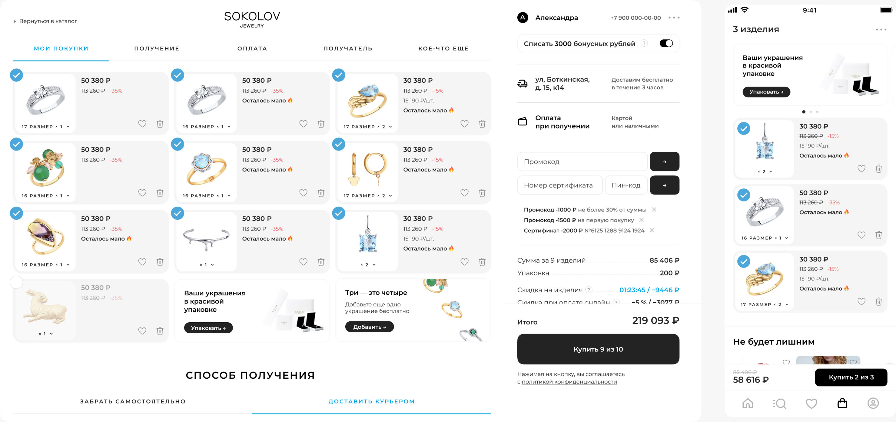
When placing an order, the sequence of actions is equally clear in both desktop and mobile versions, promo codes, discounts and bonuses are always available for use and the main button is located in the most prominent place.
art director
designers
- Ivan Tikhomirov
- Vladislav Priluchniy
- Bogdan Yukin
- Yana Alenina
- Maksim Fatfullin