Client: Aim of the logo: we plan for it to remain where it is now, on the www.takebus.ru website. It has to allow people (ordinary people who take buses) to understand within 0,1 seconds (or slightly more if they had a pint after work) that we deal with intercity buses, tickets and (last of all) schedules and that we are not a train station)))
Aim of the identity: to create an understanding of what we do, which is selling intercity bus tickets by combining carriers, bus terminals and integrators. Since the website design will follow the identity, the style will be seen by hundreds of thousands (millions, if we’re lucky) ordinary people who need to buy a ticket to go home or work in a different city—that’s our main audience.
We like the tutu.ru and onetwotrip.ru websites, they care about their conversion rates.
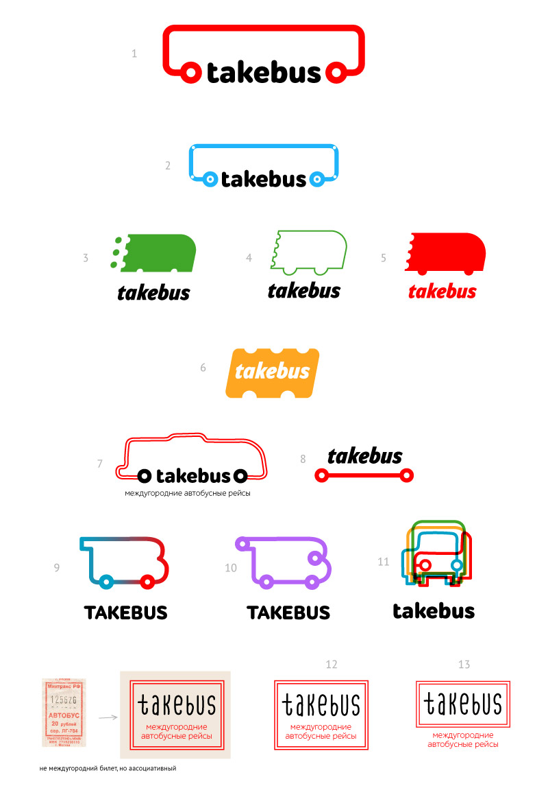
Designer: Here it is with tickets and buses.
Art director: I’d go with number 9. What if we make it a bit longer?
Designer:
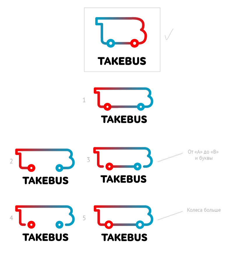
Art director: What if you place the wheels the other way around, at the start and the end of the complex line, like in number 3 and keep a straight line between them that doesn’t touch either wheel?
Designer: The bulging forehead makes it look like an RV, I pushed it in a bit.
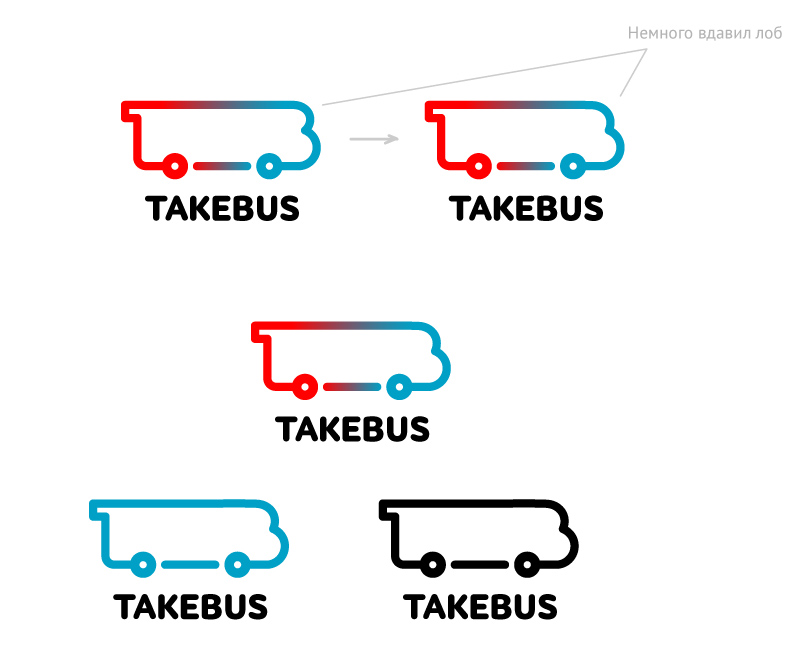
Designer: Also added an external outline.
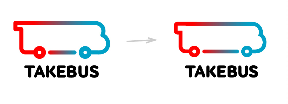
Art director: That’s it, it’s done.
