Getting the task and starting to work.
Making the first approach and showing to the art director.
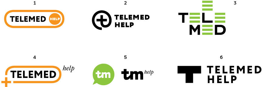
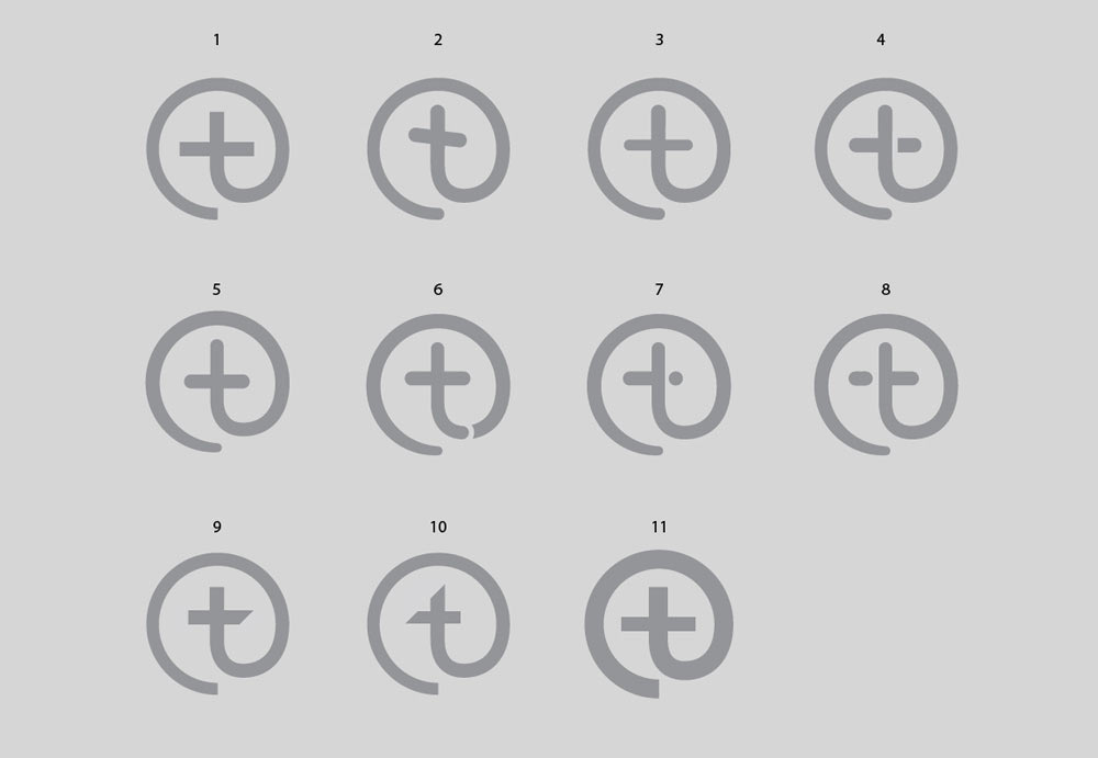
Art director: Let’s try out our ideas right on the advertising page of other companies. The second one is good, but the text is wobbly. Also, when arranged like this it looks like a grave cross. Number six might be promising too. Partial medicine, lol. And let’s try to generate a couple more without any references to healthcare at all.
Searching for ideas without references.
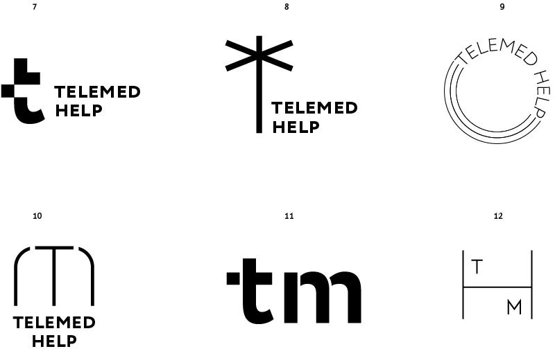
Art director: Well, no.
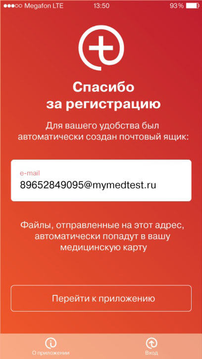
Putting the logo on the registration page.
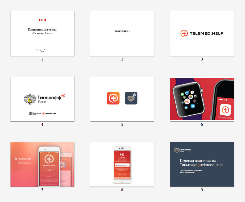
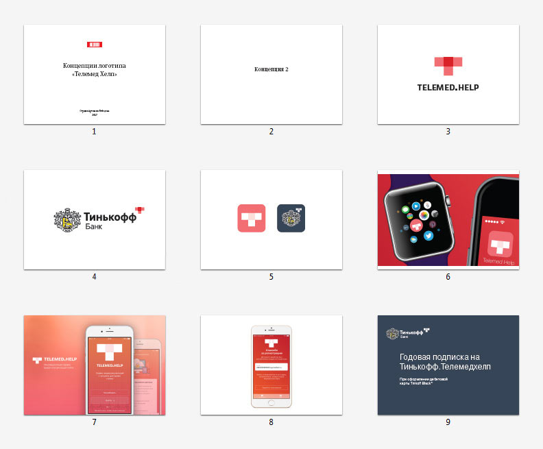
Preparing presentations for the two designs.
Receiving another promising design from the second designer, demonstrating it as well.
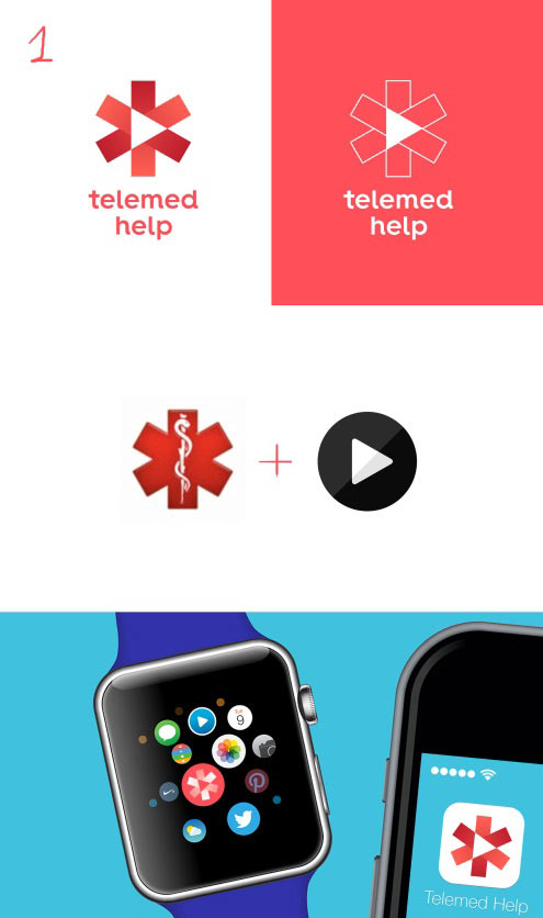
The client finds the first and third ideas interesting, but they both need improvement: in the first one the cross looks like it belongs on a grave in the third one the triangle looks out of place, illogical, while the symbol itself is too typical for healthcare. We need to move away from such references.
Working on the cross.
The art director asks to generate more abstract alternatives.

Drawing out the chosen ones.
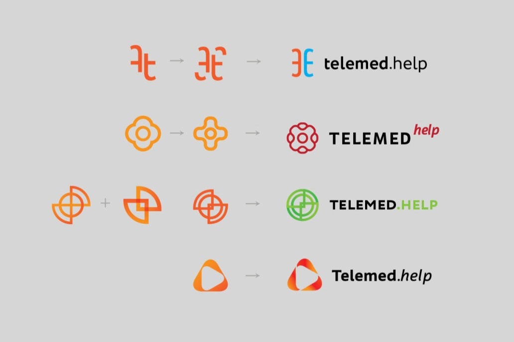
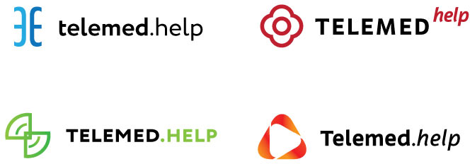
Working on the details.
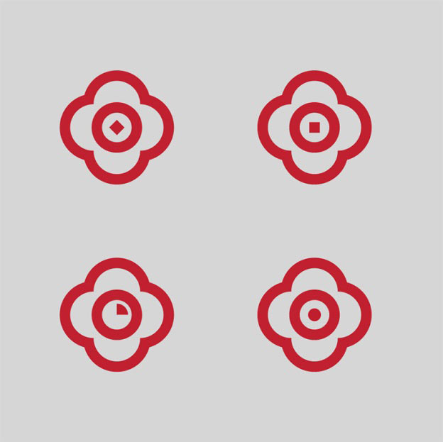

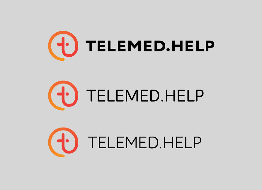
A third designer joins in.
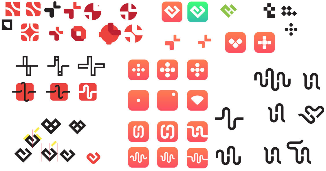
Choosing two options.
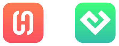
Bringing four versions to the client, one modified and three new.
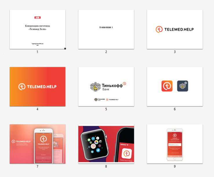
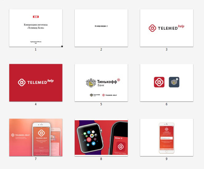
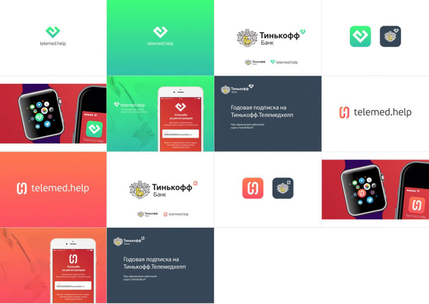
The client likes the one with the letter H.
However, they have some suggestions: the letter H is barely legible, it needs to be made more evident for example by using a different background or adding volume. The logo needs to reflect the service’s primary function: connecting patients and doctors.
Elaborating, trying a number of variations.
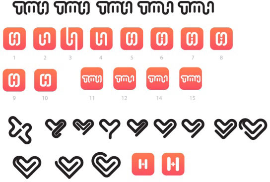
No. All these hearts and ligature simply don’t work.
Showing designs for the chosen direction.
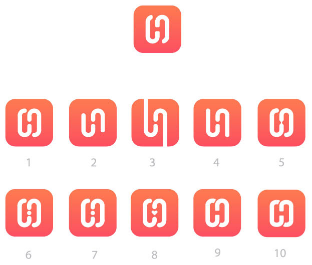
It looks like now the symbol has moved too far from the service. The client asks to keep on searching. Trying.
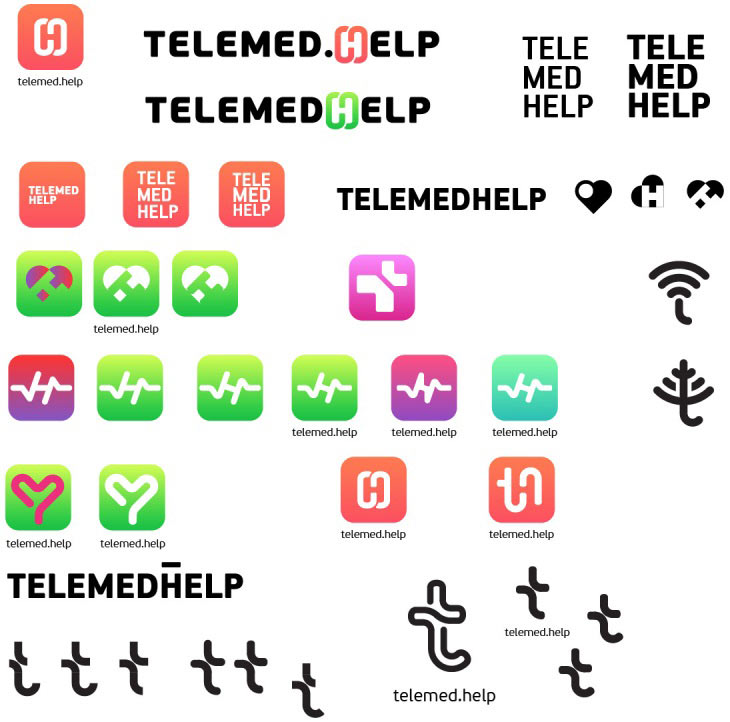
Showing again.
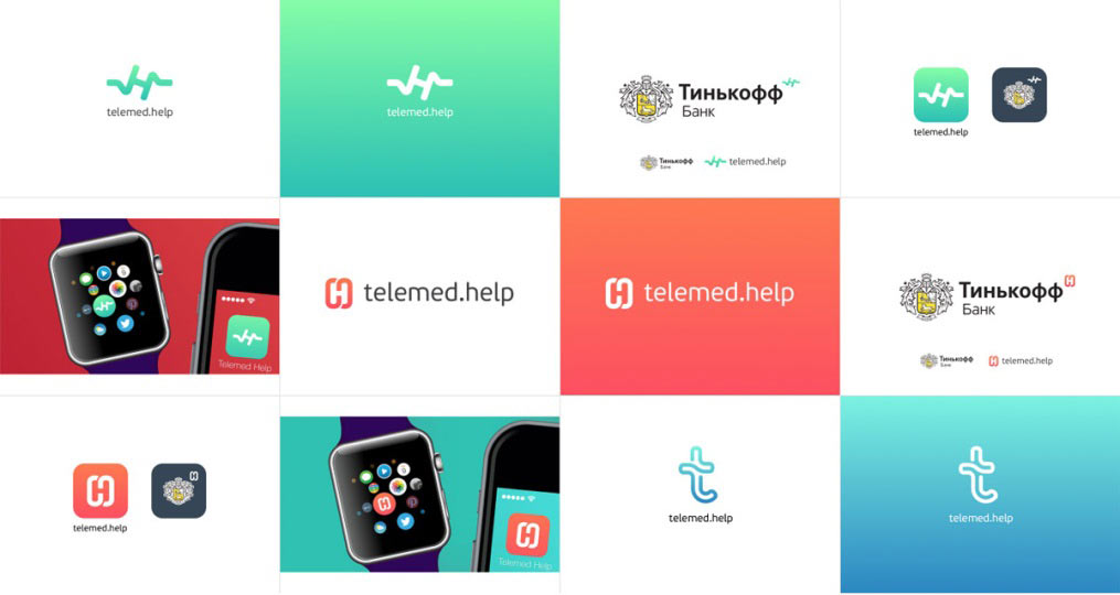
The client wants the icon to better reflect the idea of the service.
Revealing the ideas of the second designer.
Project manager: How about this?
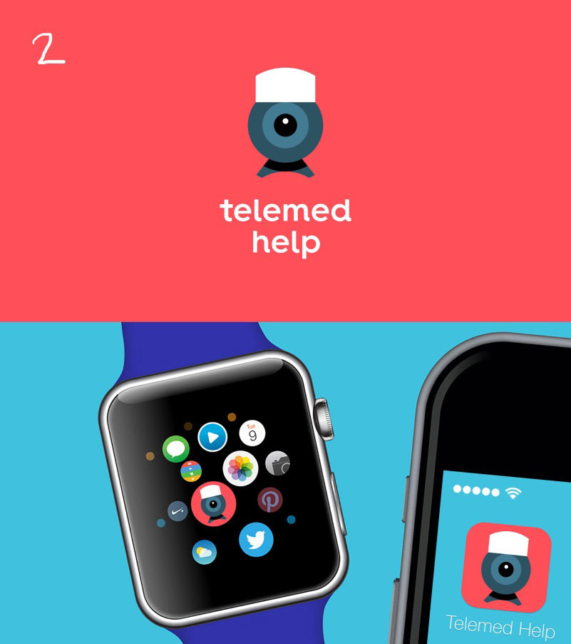
Or this? This makes the idea abundantly clear.
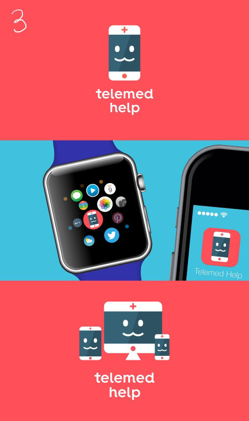
Client: No, let’s go back to the counterform of the letter H. You just need to make it more visible, not everyone can notice it as it is. Or maybe you just need to write the service’s name right in the icon to make it absolutely clear.
Finalizing the chosen direction.
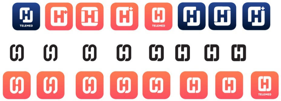
Sending to the type designer for the final polish.
Trying other letters. The first design is more calm thanks to the straight strokes, the second one is slightly more upbeat.
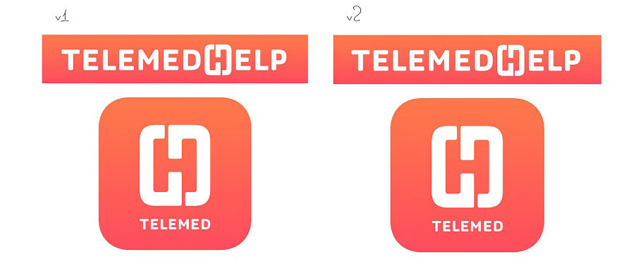
The art director goes with the calm one. Fixing the outline and changing the sidebearings.
We need to create two versions, one for doctors and one for patients.
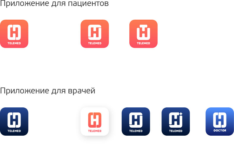
The client chooses the differentiation with the bright blue color.
Another issue: iPhone and Android have different technical requirements for icons.
Studying guidelines and making one final push. Also enhancing the gradient.
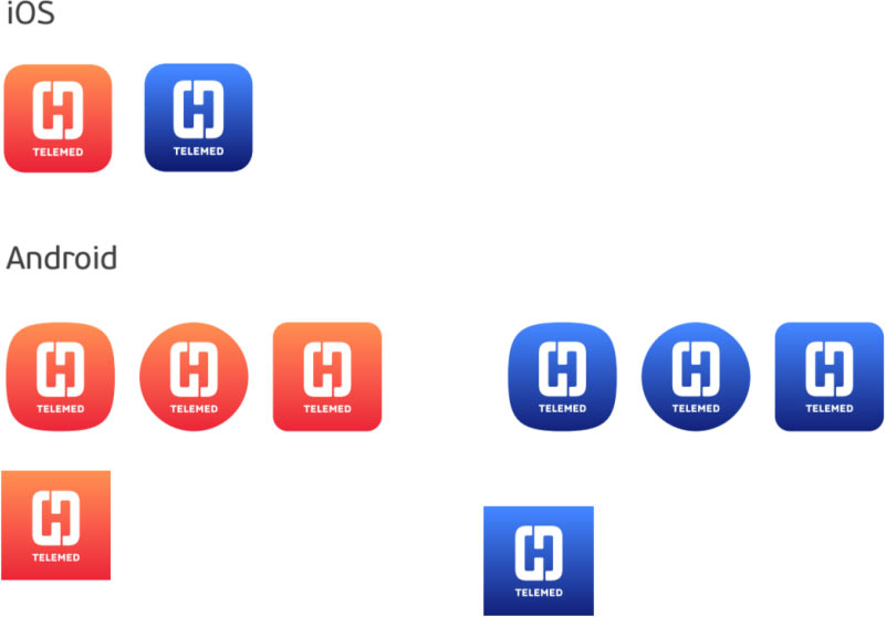
Beauty!