
|
Sergei Chikuyonok
JPEG optimization. Part 2 June 6, 2005 |
|
On the Internet I’ve read some articles on JPEG optimization in which they try to go further than Quality and Progressive and speak about an important issue of color. However, all the recommendations here are typical—have less colors and more blur. Lets see what can be done about colors to save smaller size files.
The size of JPEG file depends much on YCbCr model that stores the image. It is similar to the HSV model familiar to most designers which has three components: hue, saturation and value. The most informative and the most important to a human eye is the later, that is why optimizers tend to compress color channels keeping the value high. Photoshop has Lab color mode which can help the optimizer do a better job.
Lets take as an example the Sweetheart microwave oven that you met in Part One. There is a fine net on the door which can serve a perfect sample for color optimization. After simple compression at 55 quality the file weighs in at 64.39 Kb.
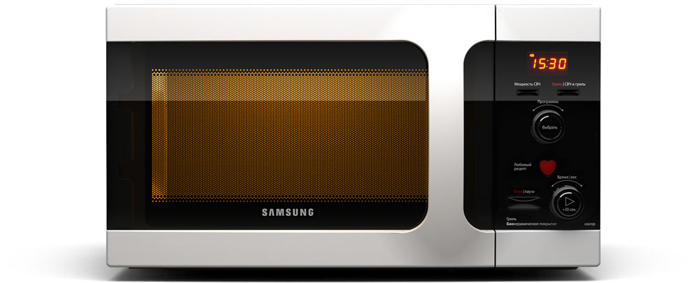
990×405, Quality: 55 (Photoshop), 64,39 Kb
(Click to view larger image)
Open the original with Photoshop and turn on Lab Color mode: Image → Mode → Lab Color.
|
Housekeeping tip |
Lab Mode is close to HSV and YCbCr, but is not the same. The lightness channel contains information about the image lightness, the a channel shows how much red or green there is, and the b channel deals with blue and yellow. Despite these differences, this mode enables to get rid of redundant color information. |
|
Switch to the Channels palette and look at the a and b channels. We can clearly see the texture of the net, and there appear to be three blocks of different lightness.
Anticipating things, I can tell you that what we are going to do will cause color changes, so it would be a good idea to keep an original copy before your eyes.
We aim to level these blocks gradually in different color channels.
|
Housekeeping tip |
Perhaps, you are wondering why I chose to optimize this particular area. It’s all simple. This area is made up of alternate black and orange pixels. Black means zero lightness, and this information is stored in the Lightness channel. So, if I make this area orange, I won’t lose anything because the channel will specify which pixels are to be dark. And the difference between black and dark orange will not be noticeable on such fine texture. |
|
Switch to the a channel, select each block separately and apply a Median filter (Filter → Noise → Median). Radius should be set as small as possible (until the texture disappears), so as not to distort the glare too much. I got 4 for the first block, 2 for the second and 4 for the third. At this point the door looks like this:

(Click to view larger image)
Saturation is down and we need to fix this. To see all color changes instantly, lets duplicate the currently active window: Window → Arrange → New Window for name of document. In the new window click on the Lab channel to see the image. As a result, your working space should look similar to this:
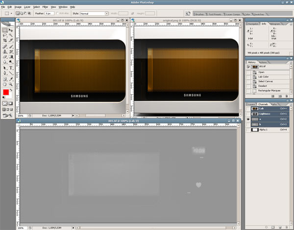
the duplicate on the left,
and workplace at the bottom
Select all three blocks of the a channel in the workplace and call the Levels window (Ctrl+L or Image → Adjustments → Levels). Move the middle slider to the left so that the color of the oven’s inside in the duplicate copy matches that of the original (I got 1.08).
Perform the same actions for the b channel and see how it looks:

(Click to view larger image)
I managed to cut 5 Kb down on the file size in 30 seconds without losing in quality.
I’d like to add that this technique is not universal and is only good for images with fine high-contrast texture (for example, small dark text on a light background). You won’t gain much with bold textures, and low-contrast objects will get significantly hued the color of background.
|
|
2 |
|
