While playing with letters as part of the Letter Every Day project, we are visited by an image of a character where the cursive letter in inscribed into the uppercase one. A letter inside a letter, both drawn in a single stroke.
In the course of everyday typographic exercises the idea gets lost, but one day, after going through the Instagram feed, we come across it again. We get the idea to try to draw other letters in the same style.
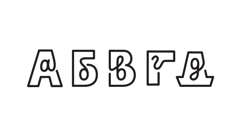
Looks pretty cool. Why not try it on the rest of the letters? It’s a good exercise for the brain, plus in the end we’ll get a new typeface. Starting to work, eagerly anticipating overloading the brain by trying to invent the solution for the letter Щ.
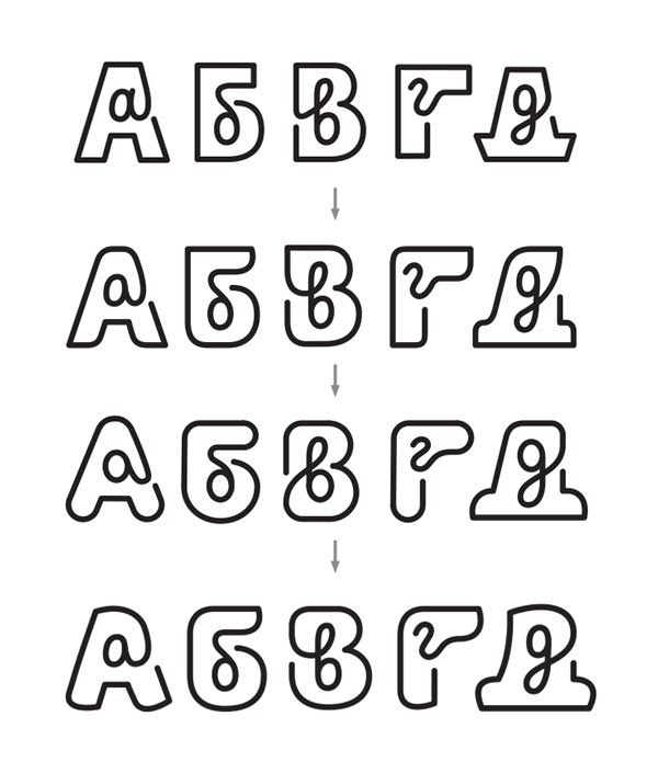
We start by fine-tuning the typeface character. The external outline that makes the uppercase letter will define the first impression of the typeface, so we’ll concentrate on that first. The rough edgy shape of the capital creates too strong of a contrast with the smoothness of the script letter, so we start by trying to soften some of the angles and then by rounding the endings. The result looks better, but we still don’t like the straight geometry, we want to add more life. Getting inspired by Malina and Sauna typefaces and drawing new endings that seem better fitting.
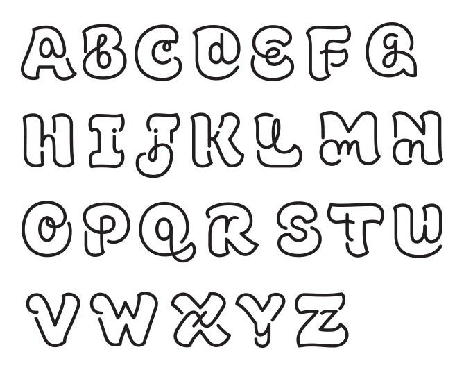
Having defined the character, we can start the most interesting part, working on each individual letter. Drawing the entire alphabet without paying too much attention to proportions and spending a lot of time on each letter trying to weave an organic capital-cursive motif.
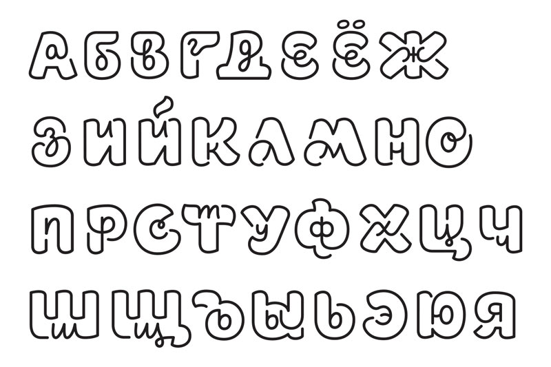
The first glance at the result makes it obvious that while some of the cursive letters were inscribed nicely, others look forced. Plus, the letter Ч has something indecent hanging out.
Starting to work on improvements.
We like the letters Ш and Щ the least. The thick horizontal strokes that were widened to fit the cursive letters make the glyphs gain reverse contrast and stand out among other characters. Trying to solve the problem.
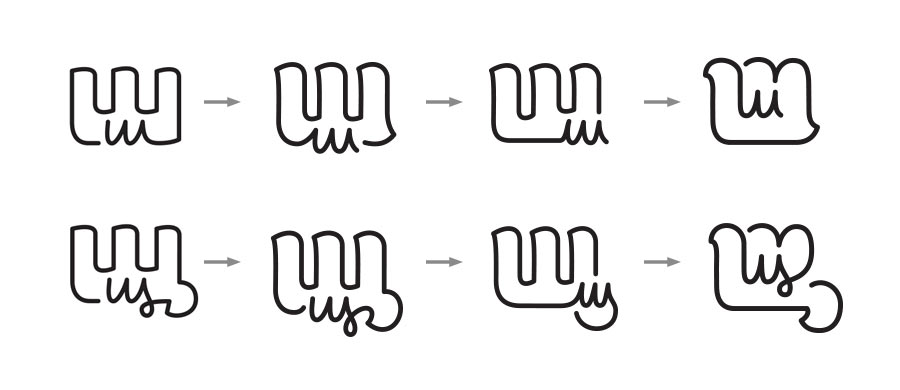
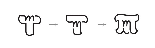
The result looks good: the letters have become more compact without sacrificing readability and now have density similar to that of other letters. Applying the same logic to the letter Т by making it three-part to ensure the cursive shape does not look squeezed into the capital.
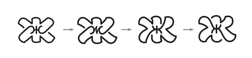
Making the outer contour of the Ж lighter by rhyming it with Ш and Щ and trying a different shape of the cursive letter inside.
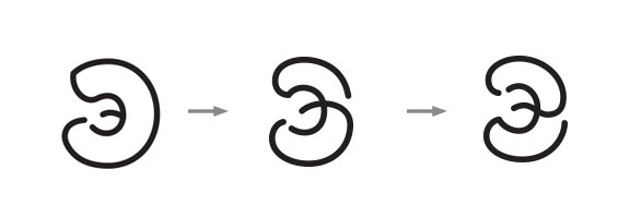
The Э stands out by not having any crossings inside the capital. Fixing.
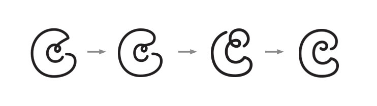
The С also doesn’t have any crossings, but after a number of futile efforts to fix this we decide to go with an alternative solution. To make sure the letter doesn’t stand out among others, doesn’t look too simple and the cursive is better readable, we slightly bend the ending of the lowercase letter.
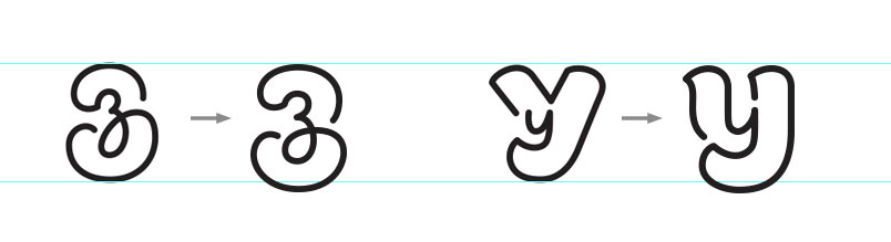
The З and the У seem squeezed in. Deciding to let them hang down from the line, plus rearranging the У.
The cursive Д looks too formal inside the capital. Changing its shape by drawing it with an upper stem. Adding legs to the larger shape as the letter looks incomplete without them.
Drawing the Latin character set.
And starting with the improvements.
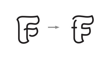
Inside F is a rough intersection of lines that cuts the letter in two parts. Fixing.
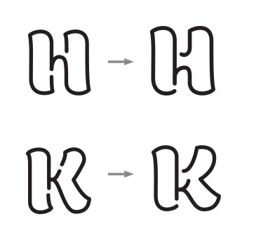
The H and K’s waists are too thin and there are no intersections inside. Improving.
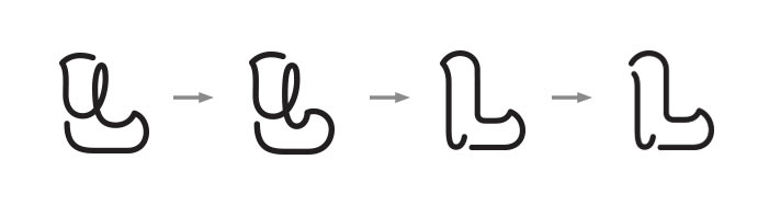
Spending a lot of time on the L, trying to connect the cursive letter with the capital by a line, but ultimately going with an alternative.
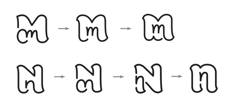
The M and N stick out with their external outlines that break in the bottom.
Improving the M using the same principle we used for Ш, Щ and Т.
Choosing an alternative for the N: making the external outline look similar to the shape of the cursive.
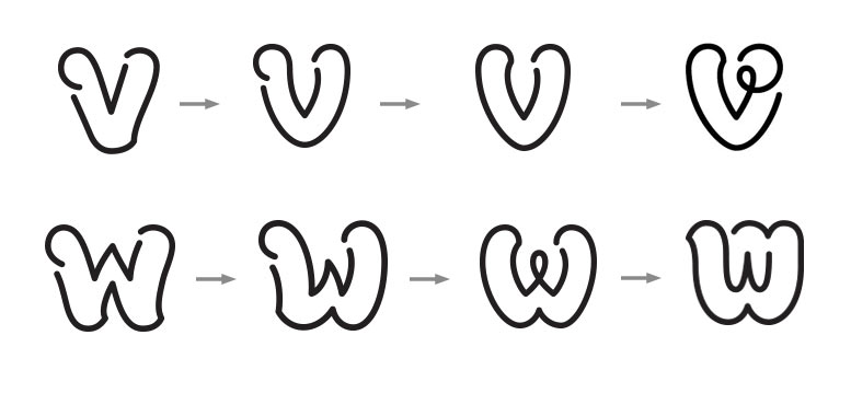
Using the logic of the Cyrillic М for the W and improving the V based on the shape of the rest of the characters.
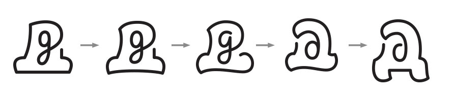
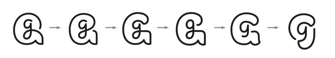
Going back to the G several times trying to improve it. At the end, letting it hang down from the line which finally makes the letter work.
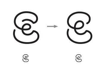
Simplifying the E since otherwise its center portion becomes too dense when rendered in smaller size.
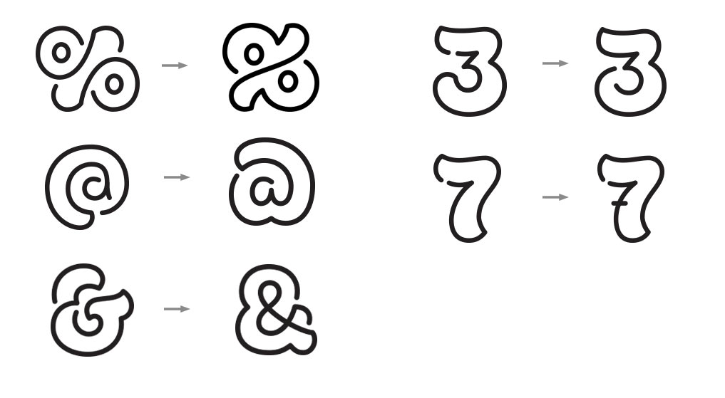
Finalizing some of the numbers and characters.
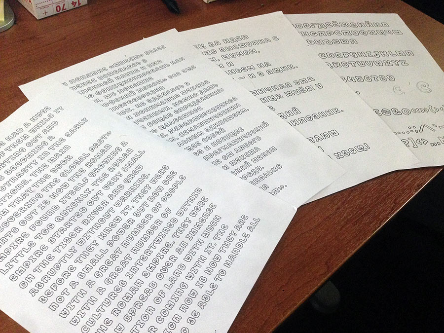
Working on kerning and printing out the entire character set to check its density and uniformity.