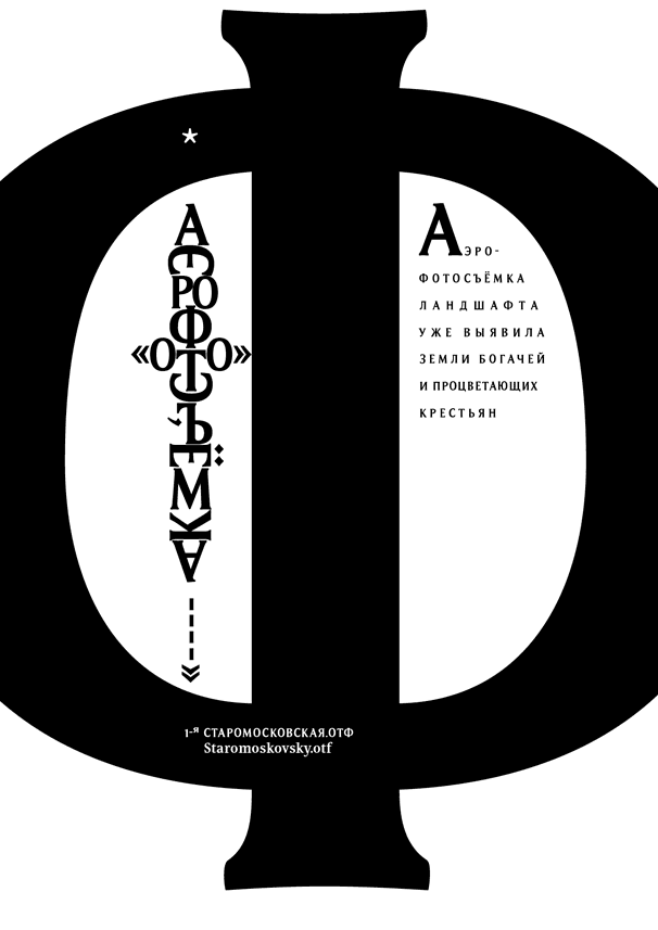
The making of the Staromoskovsky typeface
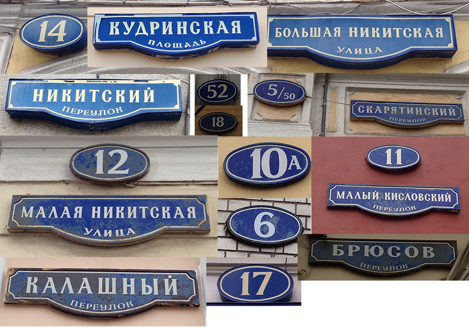
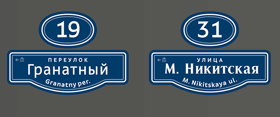
The art director suggests we have a look at old Moscow street name plates.

Going out and studying. Finding the styles we need.
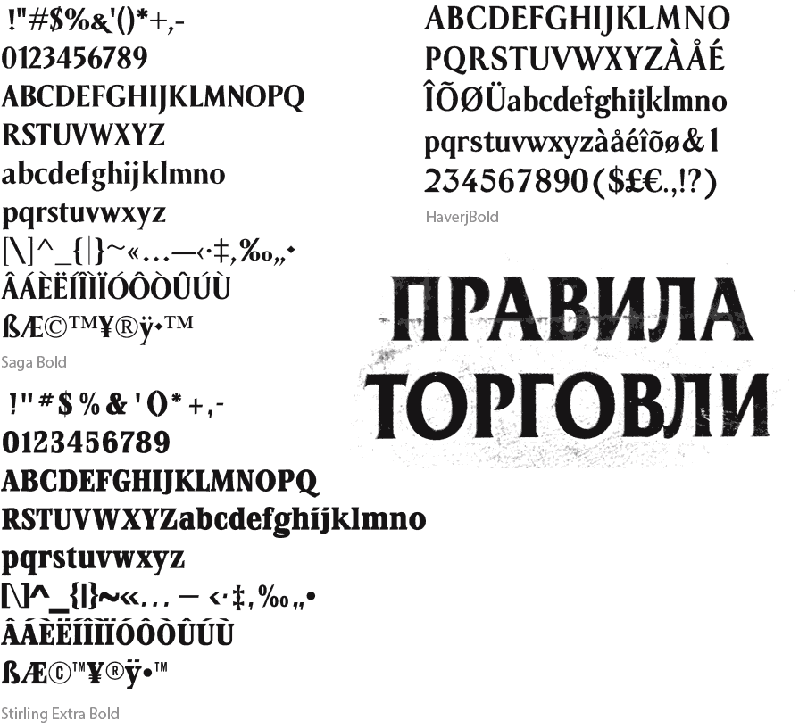
Looking for stylistically similar typefaces. Examining character shapes.
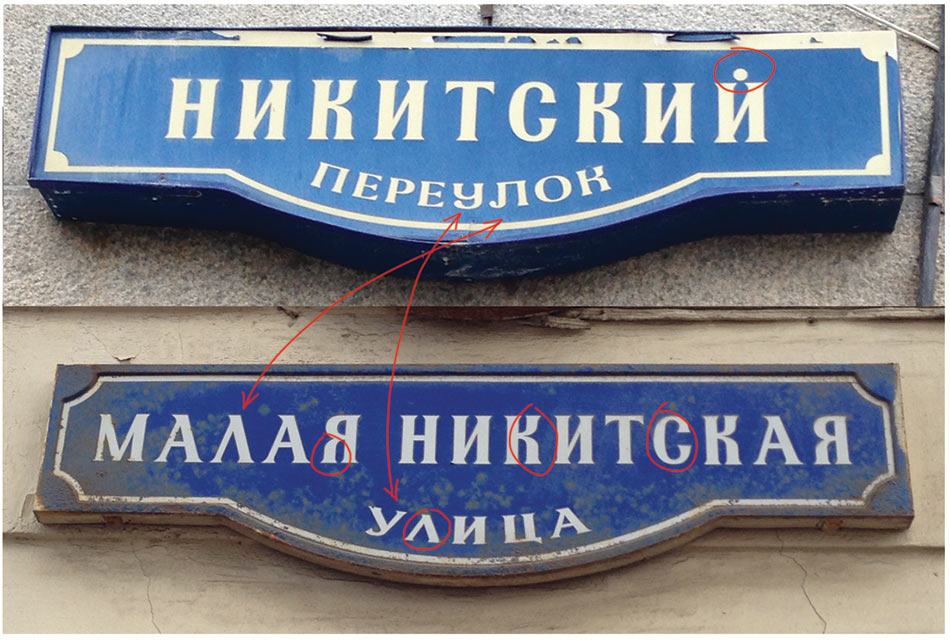
It turns out, the plates use typefaces that are similar in style, yet are different. It’s enough to compare just a couple of characters to see that. Artifacts such as dots instead of breve above the letter И are also present. There is also a sense of continuity in the shape of half-uncial letters. Having the last look at all the reference images for inspiration and putting them away.
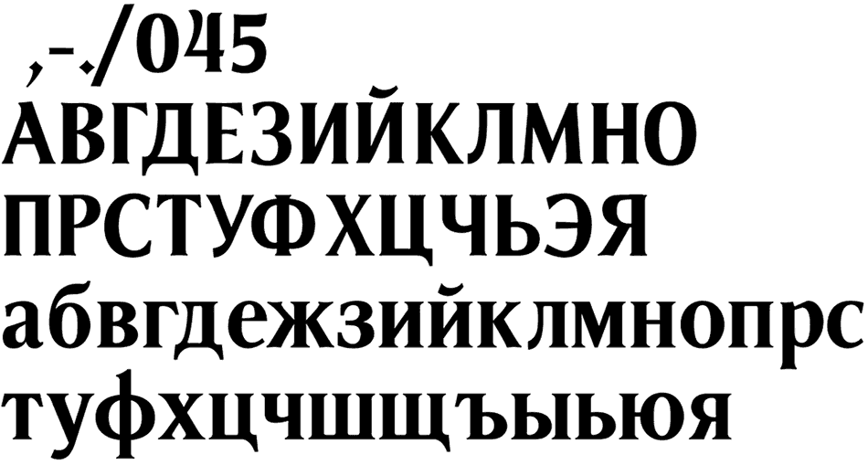
Leaving a few principles that we will use to convey the desired typeface character: proportion of characters, contrast, triangular serifs, narrow letters and wide digits.
Drawing the first drafts.
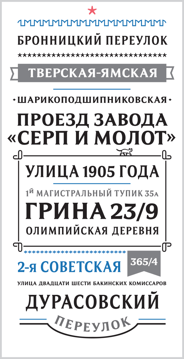
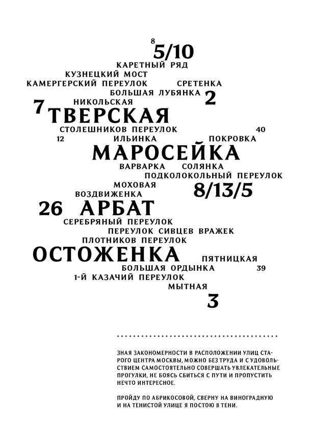
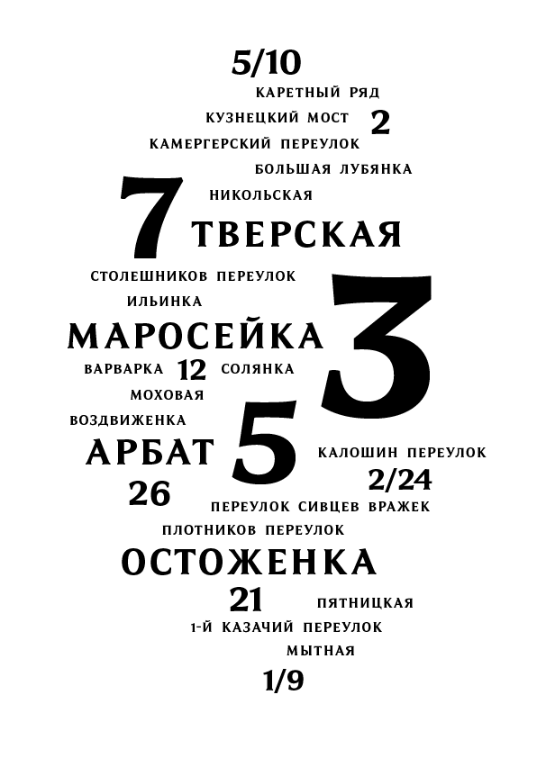
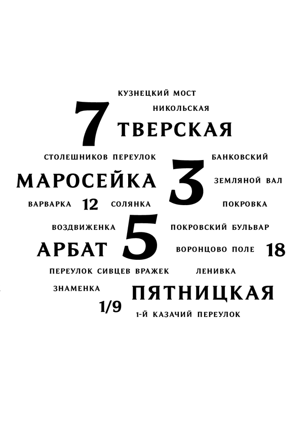
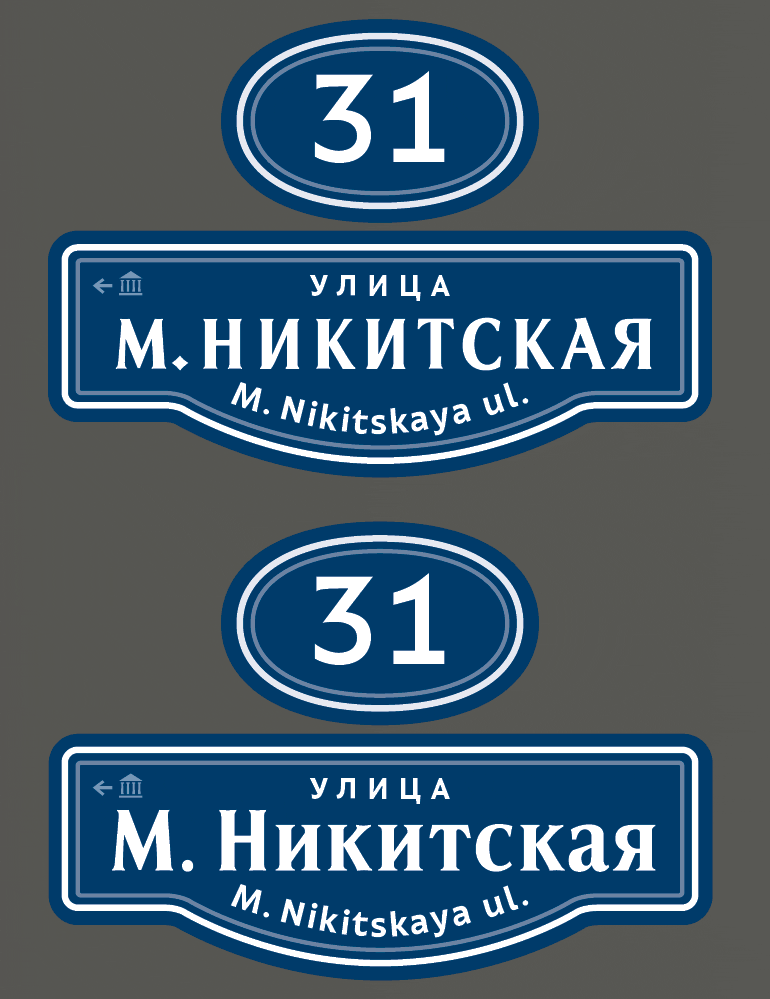
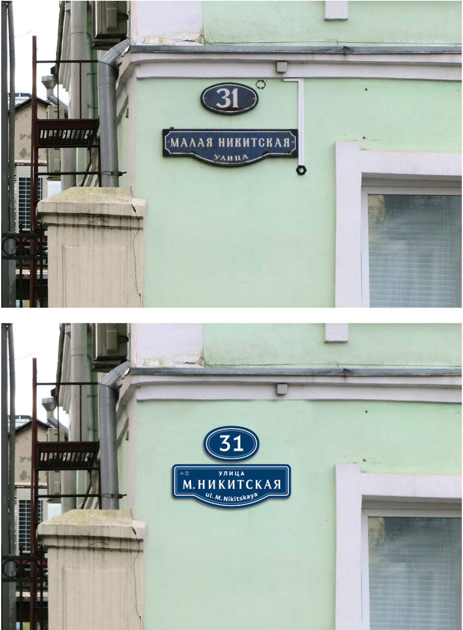
Trying the result on plates.
Choosing between lower-case and upper-case letters. Deciding to abandon lower-case letters and work with upper-case only. Comparing to a historic plate.
Studying the digits on the photographs and drawing our own.
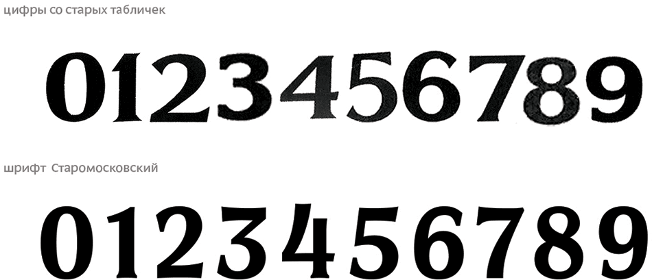
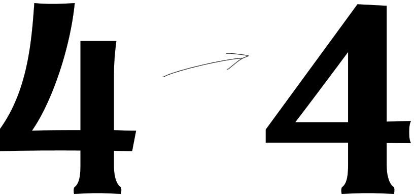
The art director asks to change the 4.
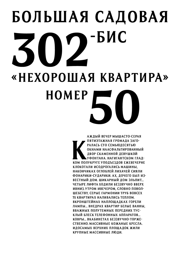
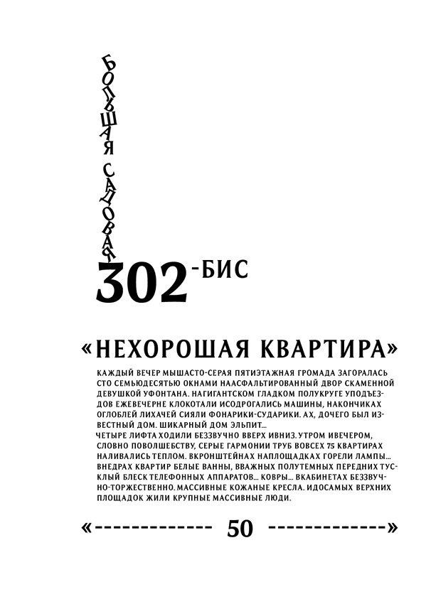
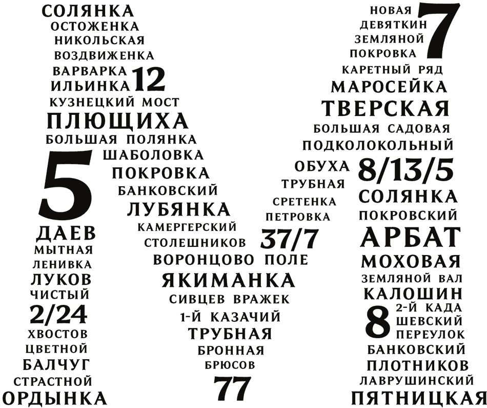
Trying to use the new typeface to type some texts.