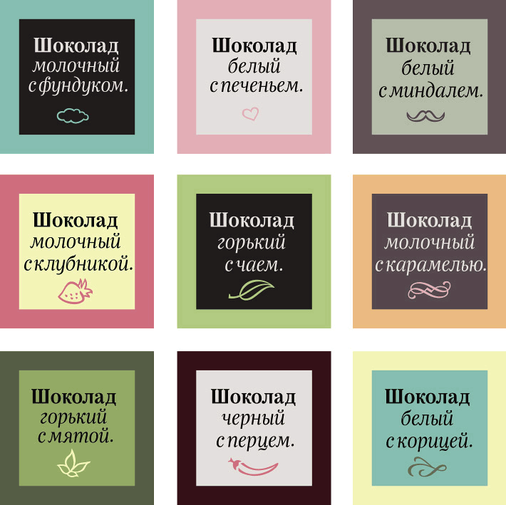
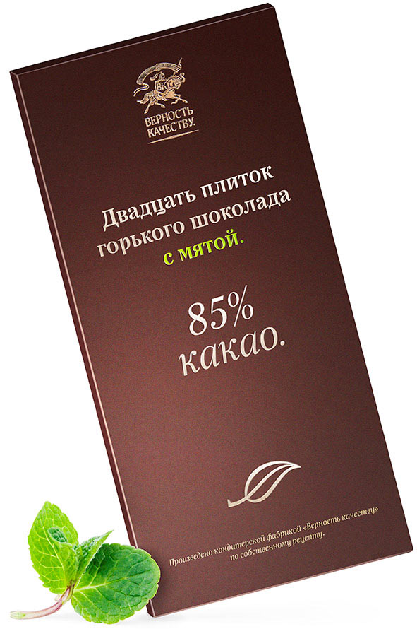
19 O’clock typeface was created for Vernost Kachestvu confectionery factory.
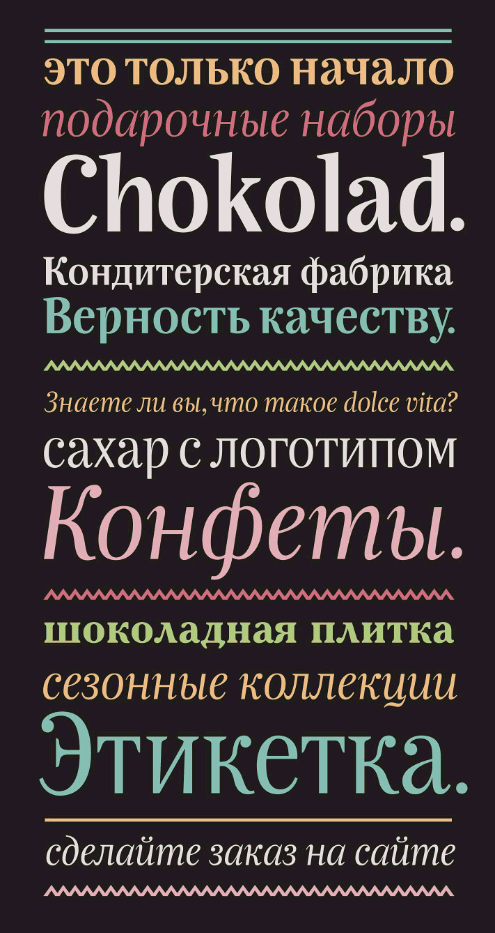
The typeface is characterized by narrow proportions of characters, low contrast and open letter shapes. Absence of bottom serifs, droplets and unique features of certain characters (such as the tail of the letter ц and the lowered semi-oval of the а) give the typeface a memorable and expressive individuality.