Client: We are Russia’s oldest online pharmacy. We were the first ones to appear on Yandex.Market (2011). We are delivering healthcare goods all over Russia, we have minimum mark-ups for oncological drugs, we aren’t playing with prices for hard to find medicines and have the same prices for buyers anywhere in Russia. We help people by selling oncological drugs at an affordable price. This year we have launched a new website but for four years now we haven’t had a budget for rebranding. We simply repainted the old logo in the colors of the new website. We are using our corporate identity on the website, in email, on business cards and in our showroom. Please, help us with the logo. Apparently, we are small and poor seeing as we can’t afford to raise drug prices and make enough money to get our logo redesigned.
Starting to work.
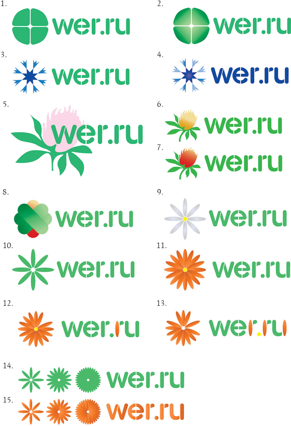
Art director: Right now the first part looks like grass. And the second one has no substance. You need to search some more.
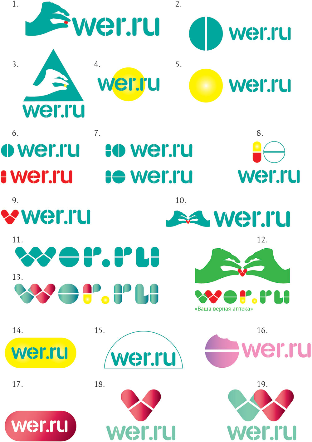
Art director: Pills are a no go.
Designer: OK, I’ll have to think harder then. It’s just that I’m trying to avoid a cross or a plus sign, there are so many logos like that already.
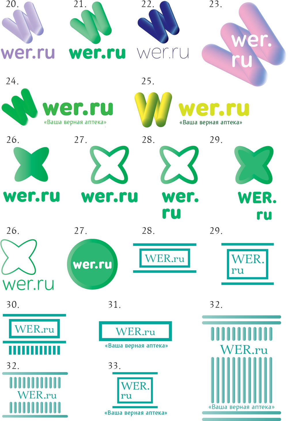
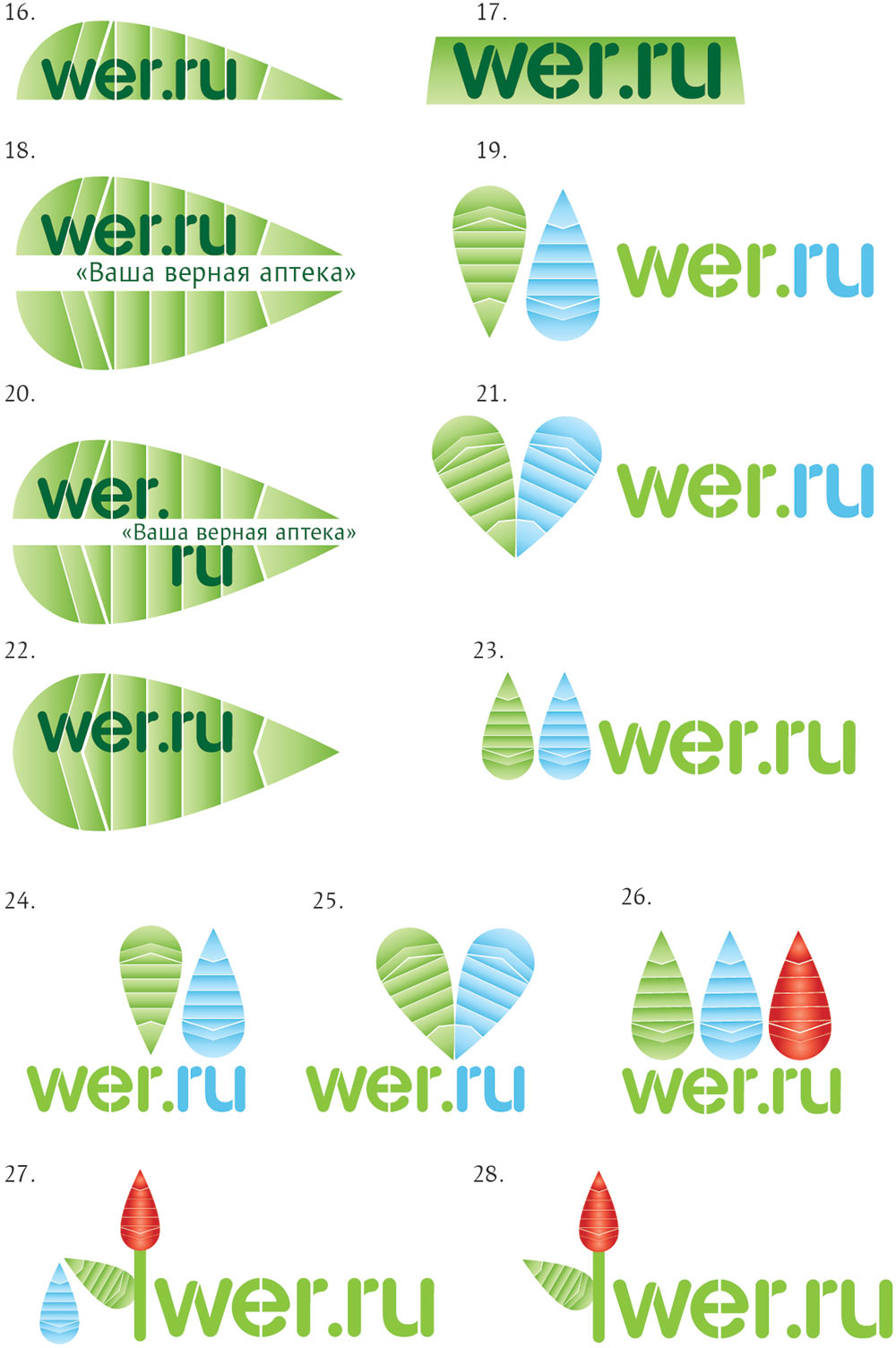
Art director: Numbers 22–23 can be OK.
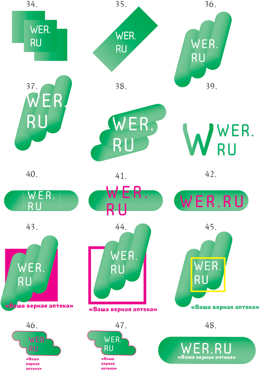
Designer: Do they need to be developed further or should I get started on the corporate identity already?
Art director: Show me how it’s going to be developed.
Designer: OK.
Second designer: What if we draw a snake, but without the cup and a more friendly one?
Art director: We can, why not. Just not a silly-looking one.
Designer: Hi! I finally got around to show how the logo will be developed.
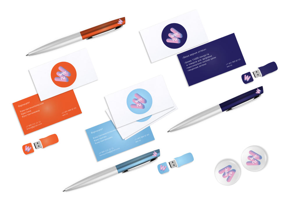
Art director: OK.
