The client needs a website that would speak to visitors in clear language and won’t evoke pity for its heroes. We don’t need to ask for help, we need to show people the very unscary and special world and how the foundation is trying to improve it.
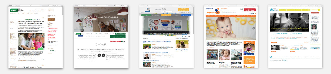
Looking at similar websites. Every one of them is equally sterile and lacks expression.
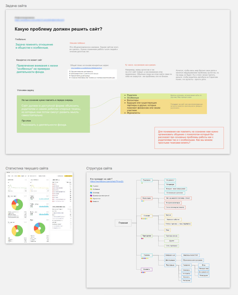
Exploring the statistics of the current version of the website, thinking why the foundation needs it in the first place, creating a structure that will take into account the needs of the audience.
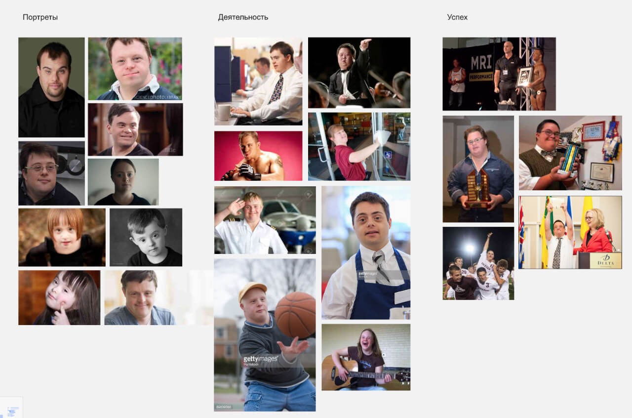
Looking at social advertising, getting inspired by photos and videos showing special people performing regular activities and succeeding.
Realizing that we don’t have enough information and inviting a psychologist for a visit to the studio.
Several hours spent in a meeting room help us understand the most important things:
—the differences between Down syndrome, autism and cerebral palsy;
—which questions we can ask parents of the children;
—how parents of special children and the children themselves see the world;
—what opportunities are available to special people;
—what helps special people integrate into society and how society reacts to that.
Starting to gather ideas that we can use on the website.
Working on the sketches for the main page.
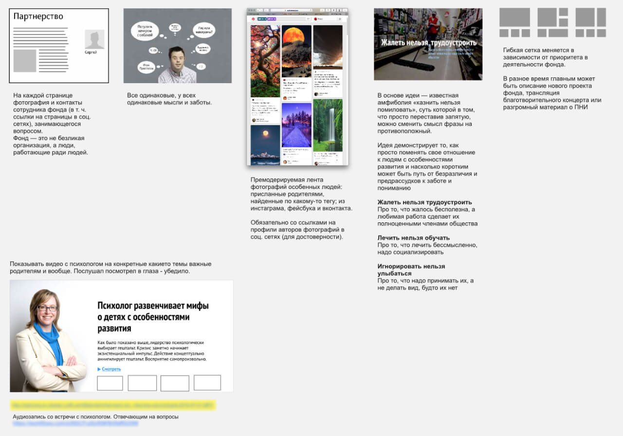
In the first version, the information about the foundation’s work is dispersed with news from the outer world and presented in the form of colorful cards.
Not what we need. The accent is shifted away from the client’s projects and the website lacks references to the foundation’s primary idea. Just change the photographs and headings and you can get a very generic website.
The result looks like a newsletter where everything is mixed together: events, videos, the foundation’s projects, stories from all over the world—it’s about everything at once and nothing in particular. Besides, to make sure the page looks good, it needs to be serviced by an editor and a designer. There is no way to quickly add a piece of news: each picture will need to be prepared and every piece of text shortened.
Moving on, making another attempt.
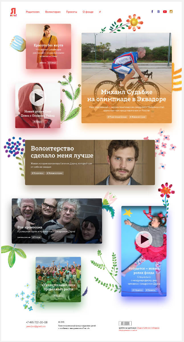
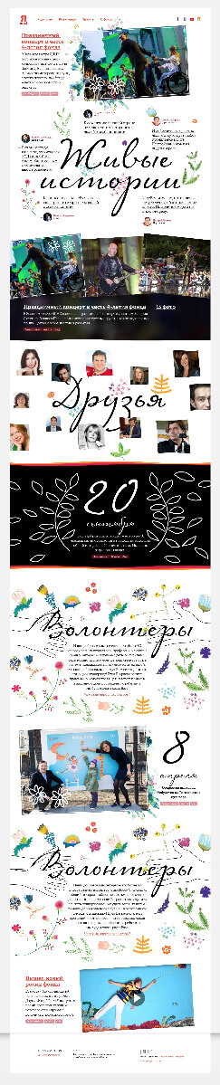
Better. This design does away with the errors of the previous version. It now has big blocks describing the work of the foundation in a clear and fun way. Viewers see something unique on the main page, something that is relevant to the foundation: photos of people, quotes from stories.
The solution with blocks gets developed further. The main page acquires more details. News, photo galleries and event announcements appear. But it really lacks life and some sort of a game element. Gradually, problems with the style start to crop up: the watercolor stains don’t agree with the ink headers, the simple lines of the logo and the signature plants. The ideological integrity of the page and all of its elements does not seem to materialize.
Meanwhile, another completely crazy design for the main page with the parallax effect, flying buttons and full-screen portraits of singers gets created.
We like the idea but it makes the website completely unmaintainable. The client will have to come to the studio each time they want to update it.
We can’t stop and continue to experiment with transformations. We want images on the main page to start as unrecognizable mosaics, circles, triangles and kaleidoscopes that would acquire their normal form when the page is scrolled.
Putting the idea aside and going back to the blocks.
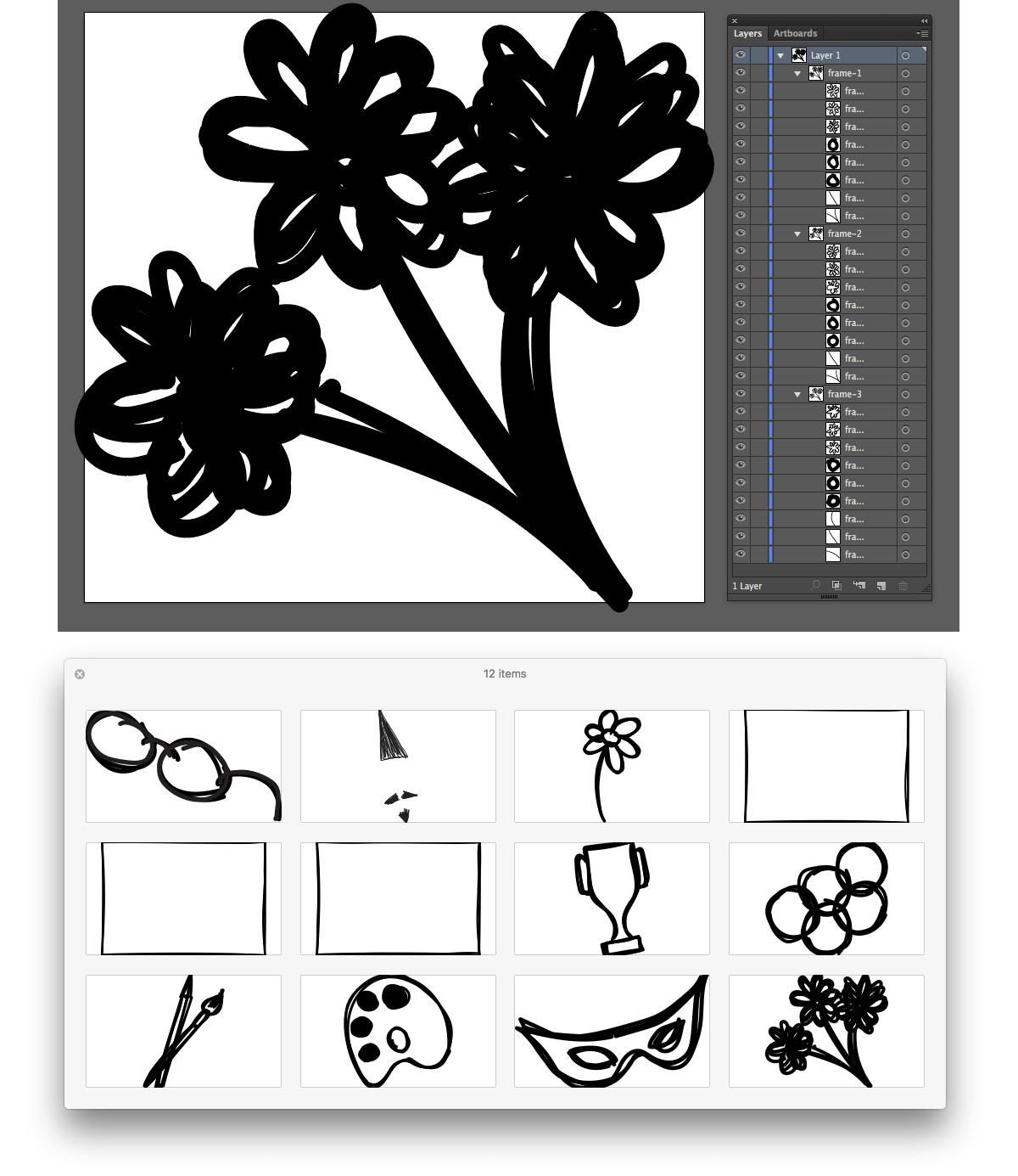
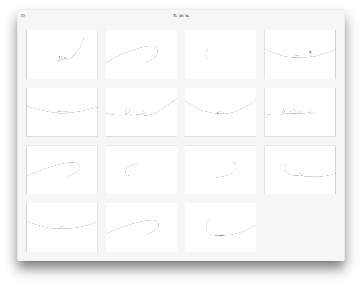
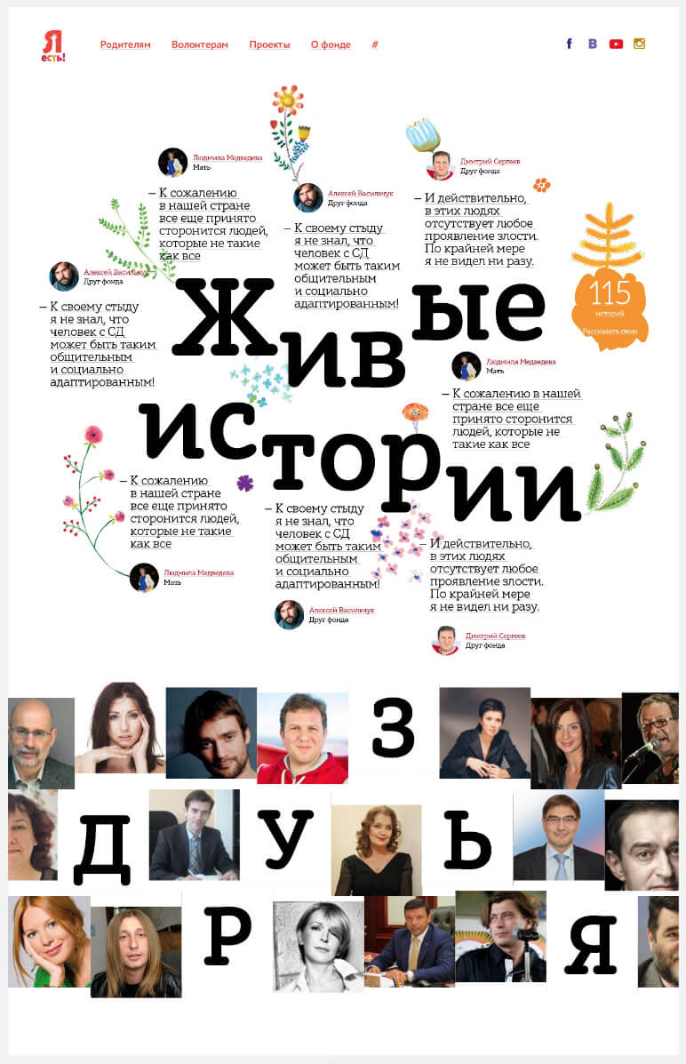
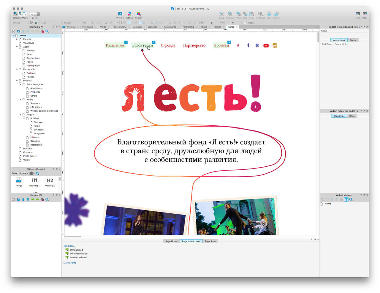
Suddenly finding the solution in the foundation’s logo that was previously hiding shyly in the corner. It turns out that the line from which it is “knitted” can easily go beyond the letter Я.
Trying the line on the main page with the blocks.
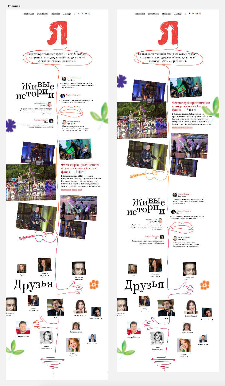
Creating a few more pages to see how the line behaves outside of the main page.
Introducing microanimations with child doodles to reduce the formality of photos and bring some life with delicate carelessness.
To make sure the animation does not distract from exploring the page, deciding to launch it only on scroll or mouse hover.
Putting together all ideas and mock-ups and showing them to the client.
The client likes the result and asks to assemble a brief presentation to get the cofounder’s approval.
Having determined the concept, ideas and structure, we start to work on the details. Creating a prototype.
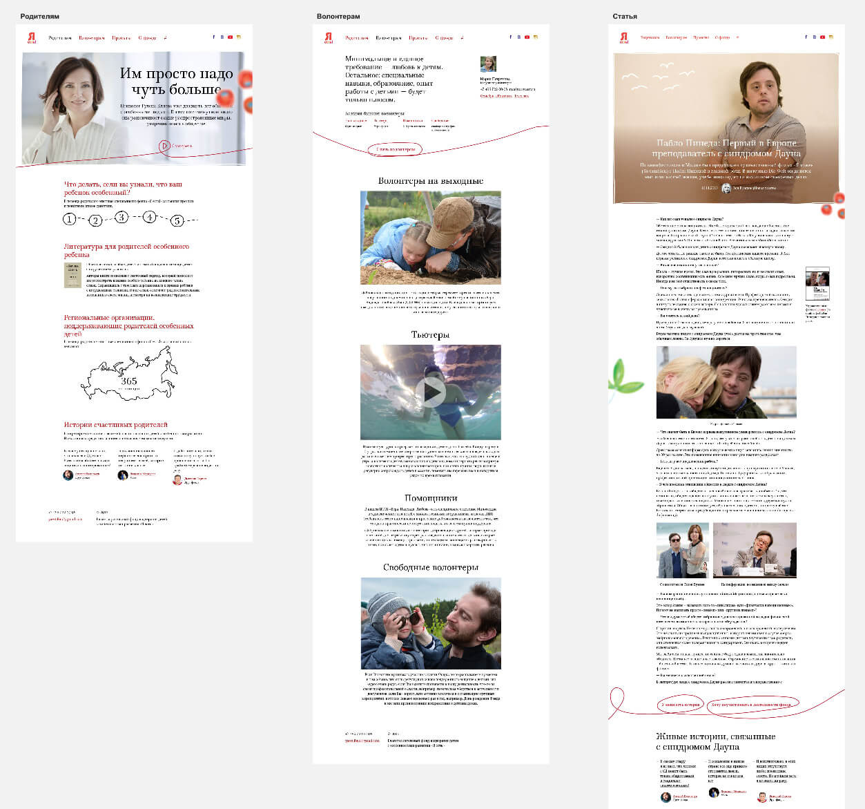
Working on the rest of the pages.
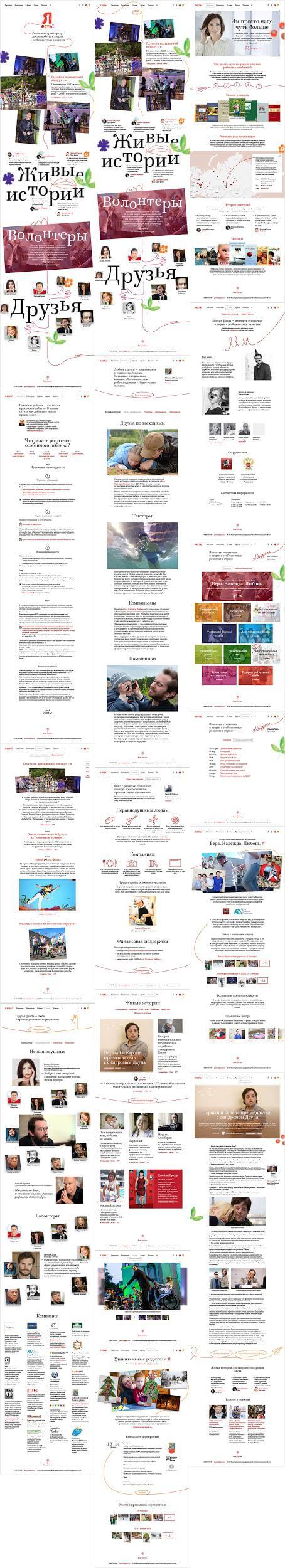
Adding structure, finalizing the details, experimenting with the placement of the logo, behavior of the line and text styles.
Getting the client to approve the pages and sending them to the technologists. While they are busy typesetting, drawing careless animations.