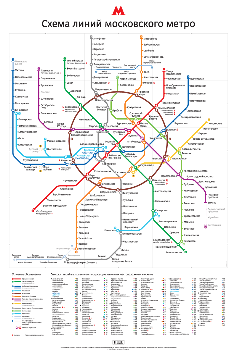
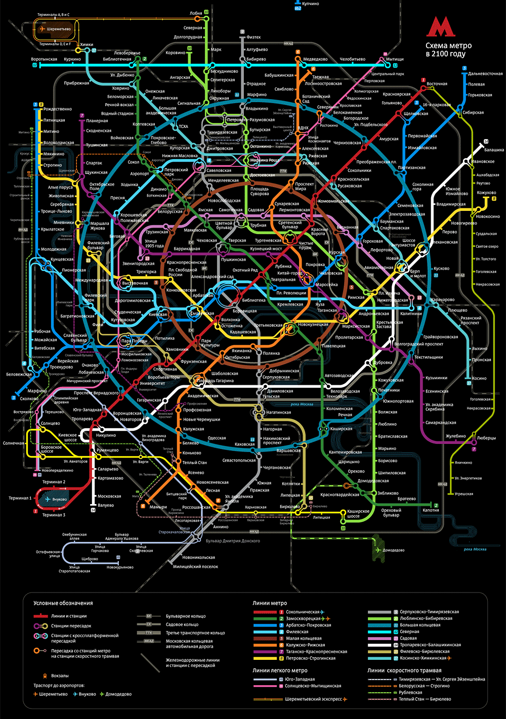
It took almost four years to develop this new map. We aimed to make it recognizable, yet truly novel, to be able to satisfy both passengers’ demands and design requirements. The final design is a flexible graphics system that allows creating a whole range of maps of various size and complexity.
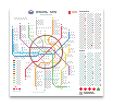
2′×3′ poster version of the very best map of the Moscow Metro has reference grid and an alphabetical list of stations
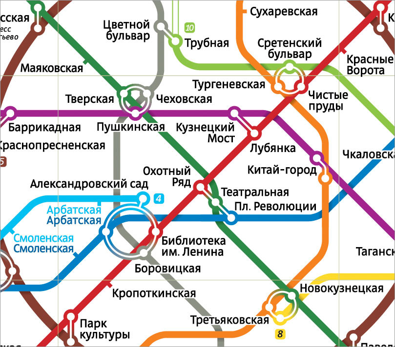
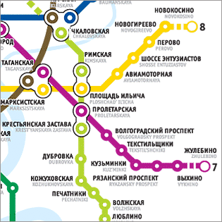
We paid particular attention to how the stations are arranged—we employed mnemonic hints along with thoroughly balanced overall design. If one station on the map appears above the other, whether on the same metro line or at an interchange, it is actually further to the north.
The lines cross casting shadows
Complex interchanges are represented by rings, which makes them more legible and rhymes with the ring line.
For the first time in the history of the Moscow Metro the map follows the capitalization rules for Russian. Station names now use initial capitals and lowercase, whereas previously they were set in all caps.
Before
Now
There are several versions and formats: hard copy and digital, showing waterways and main roads and omitting them, with and without grid reference.