archived |
|
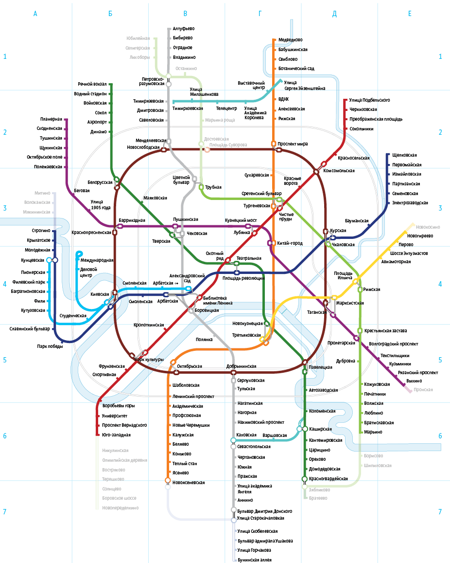
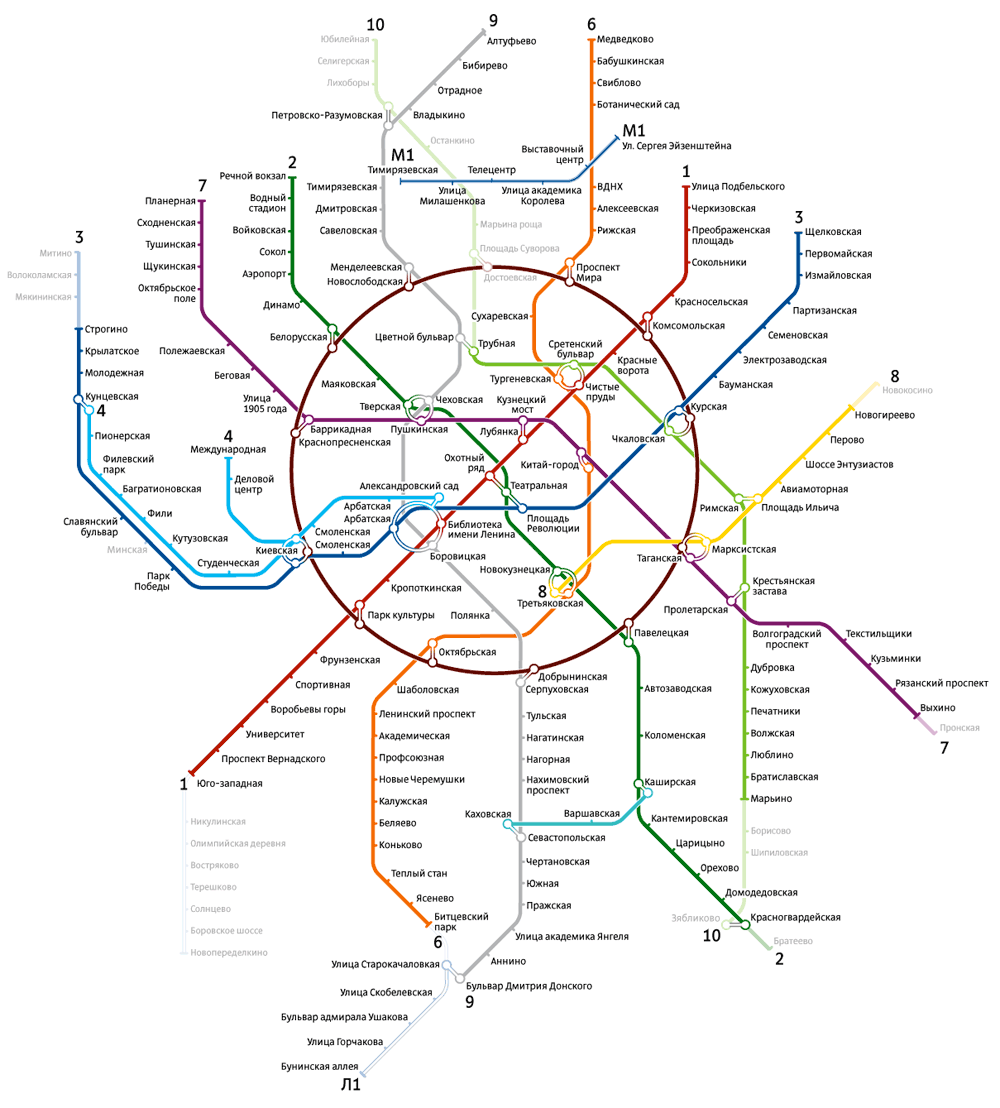
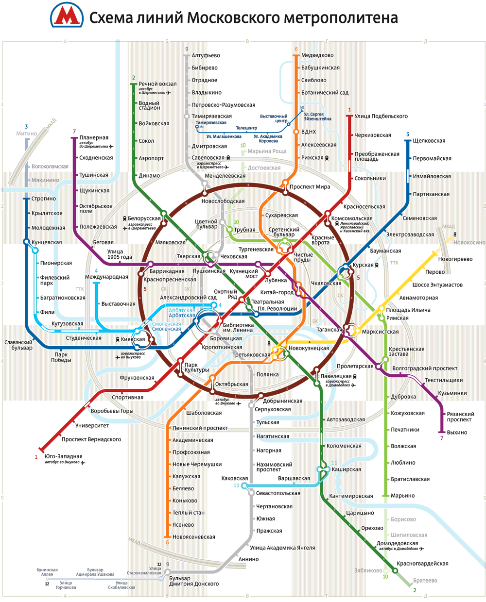
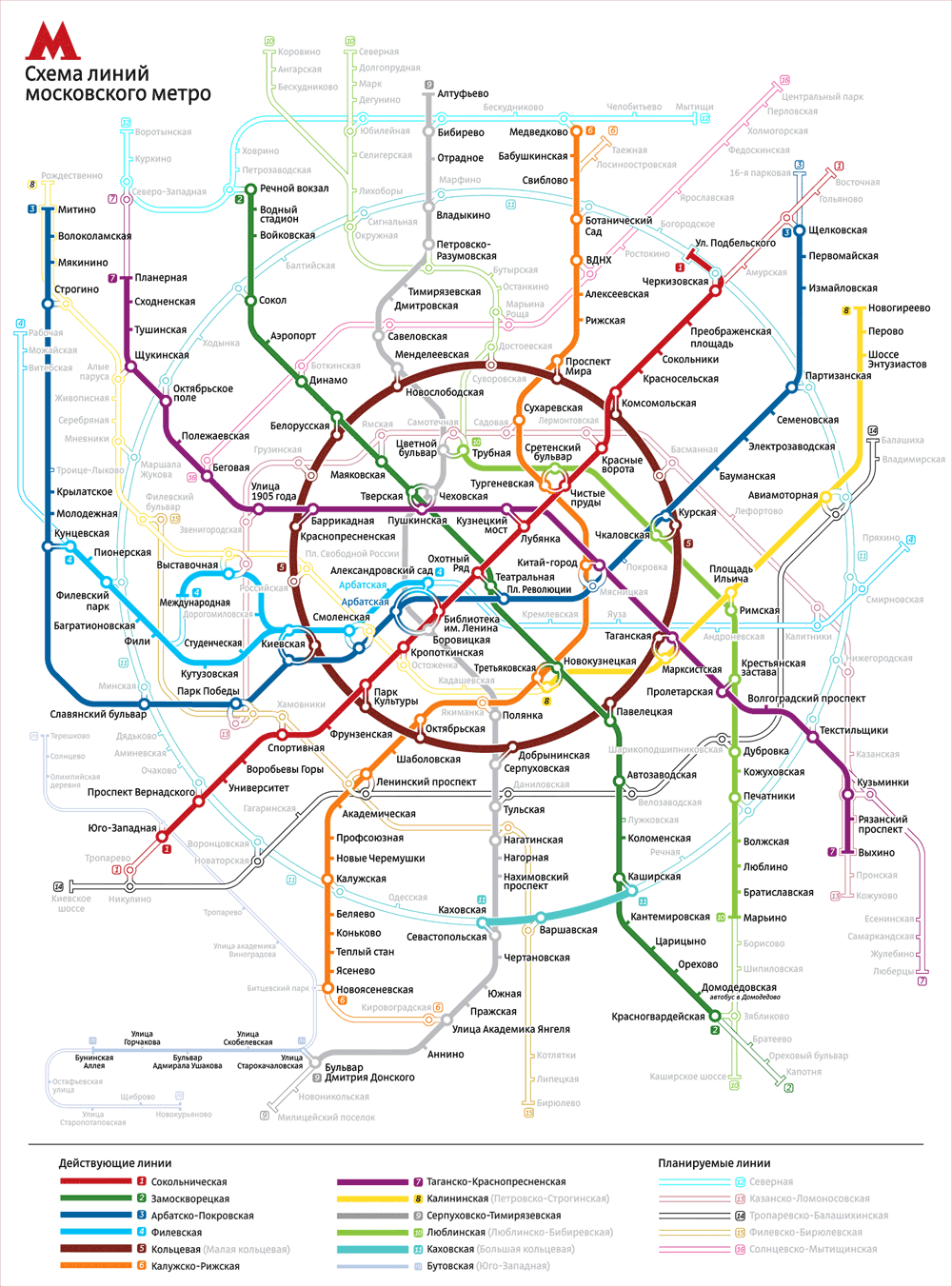
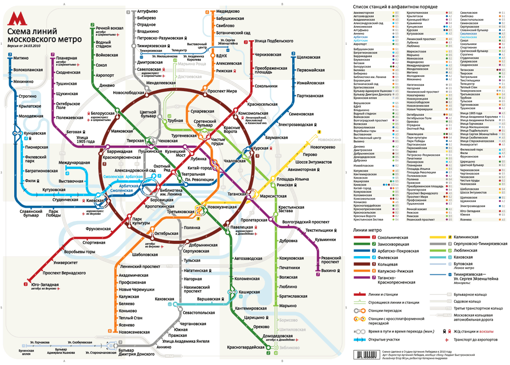
Official maps: | ||||||||


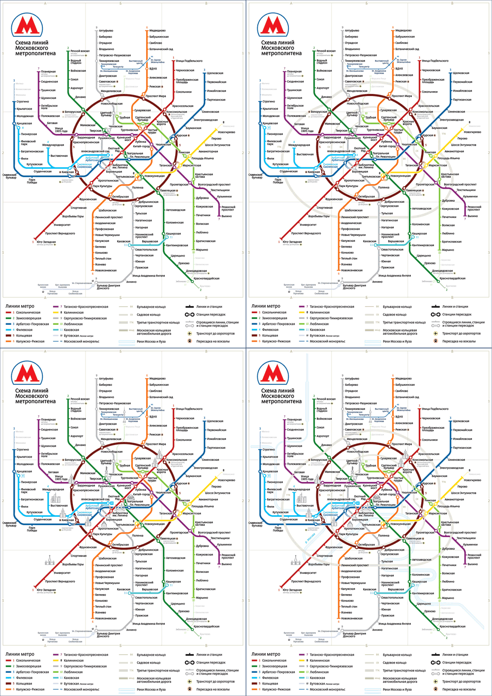
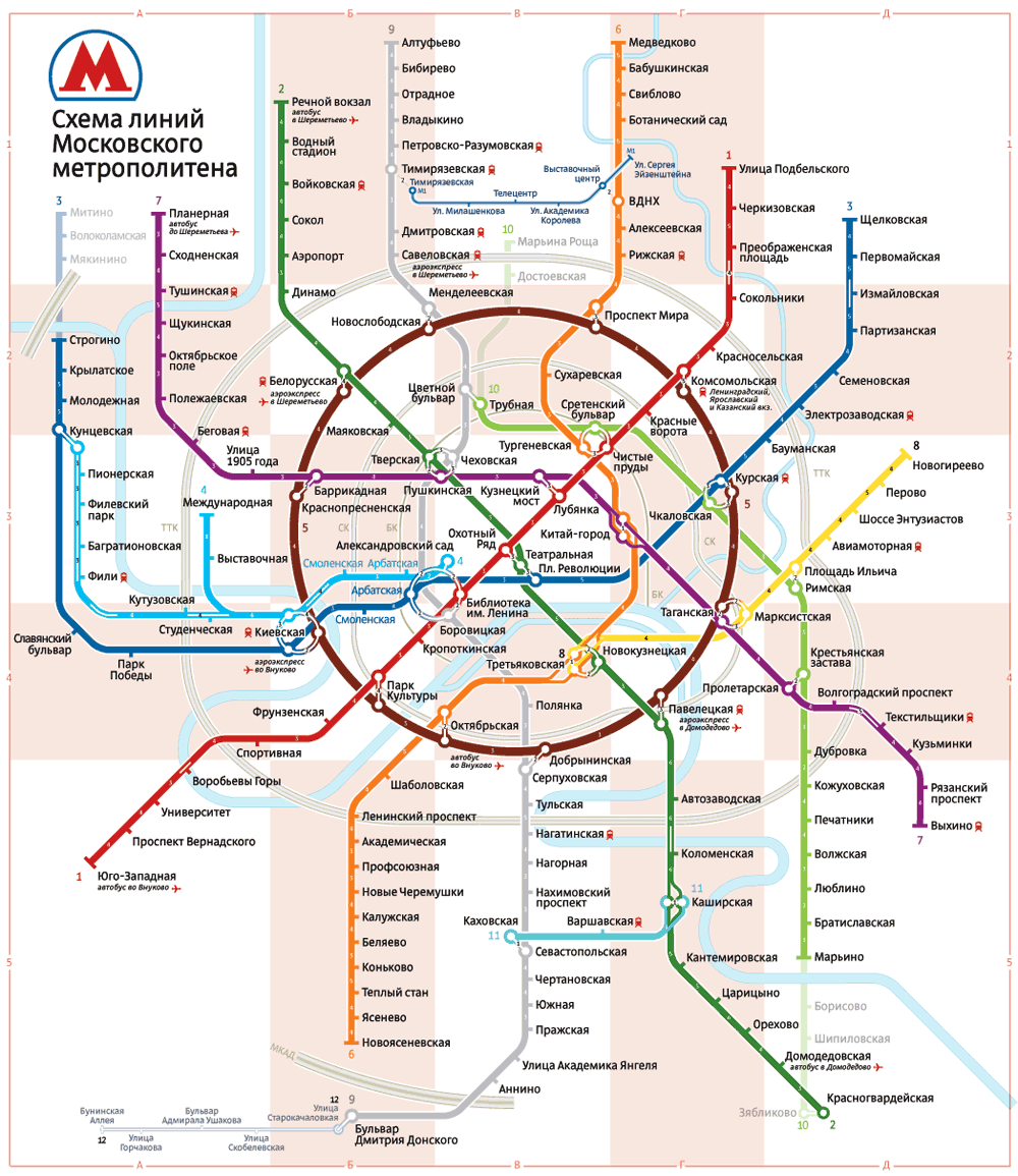
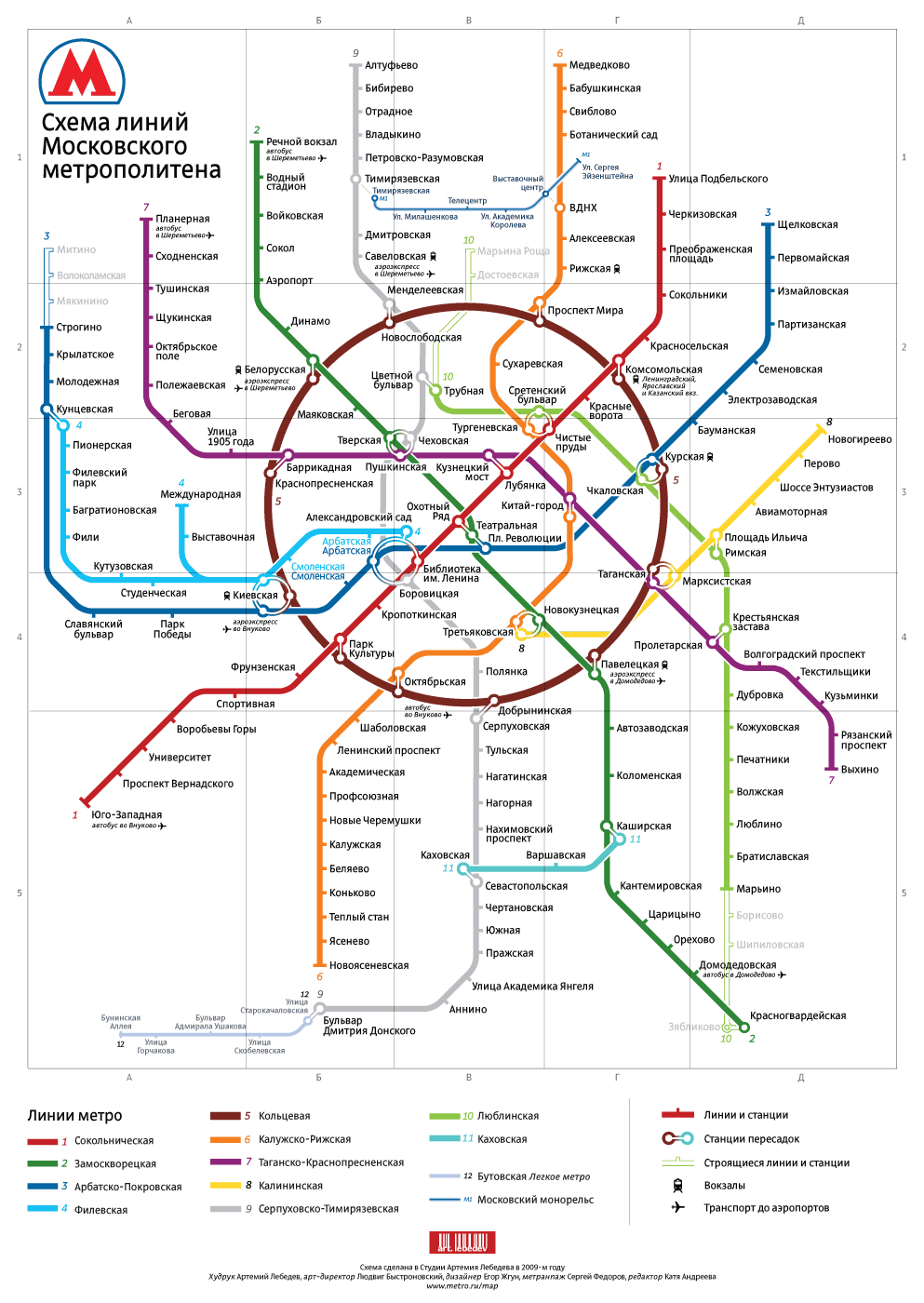
Making of the Moscow Metro map
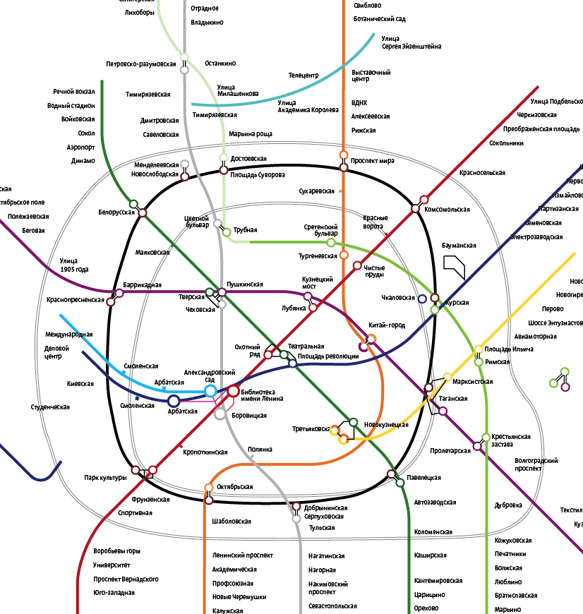
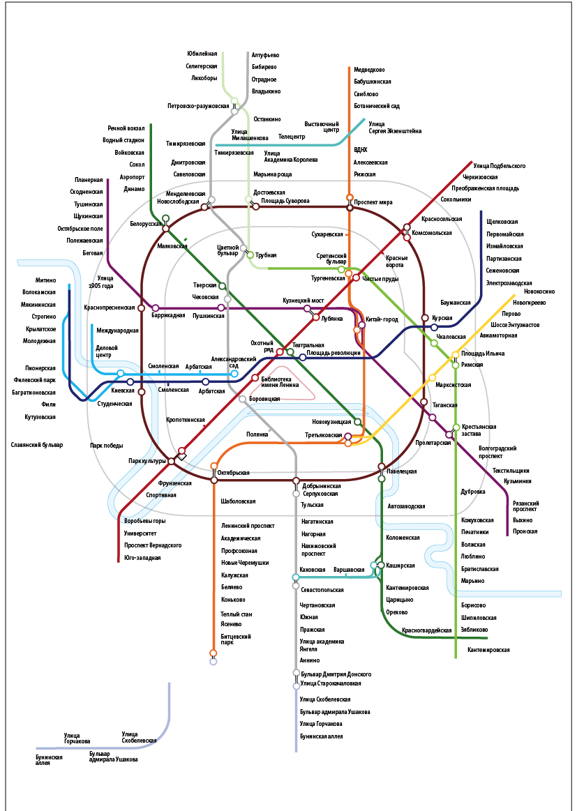
We decided to stick to the principle of arranging all the stations inside the ring as evenly as possible, with no hollow spaces or clumps. Starting to move things around.
Preparing a balanced frame.
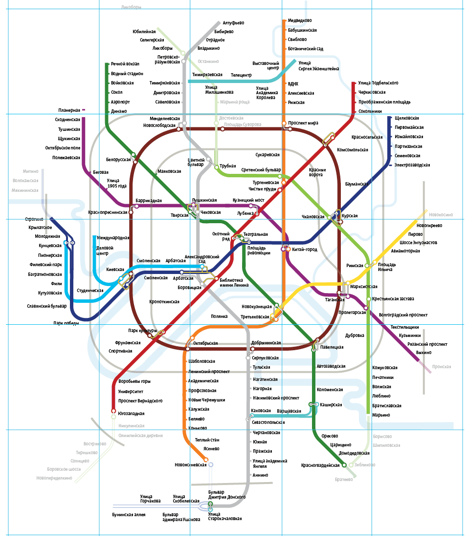
Playing with the idea of a non-round ring, not unexampled in the history of the Moscow Metro.
That seemed fine, but a bit too unconventional. The task was to keep the map recognizable to Muscovites.
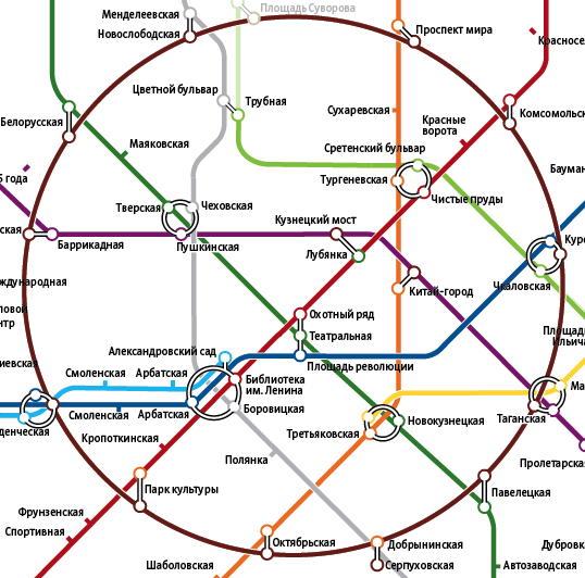
How about this for interchanges?
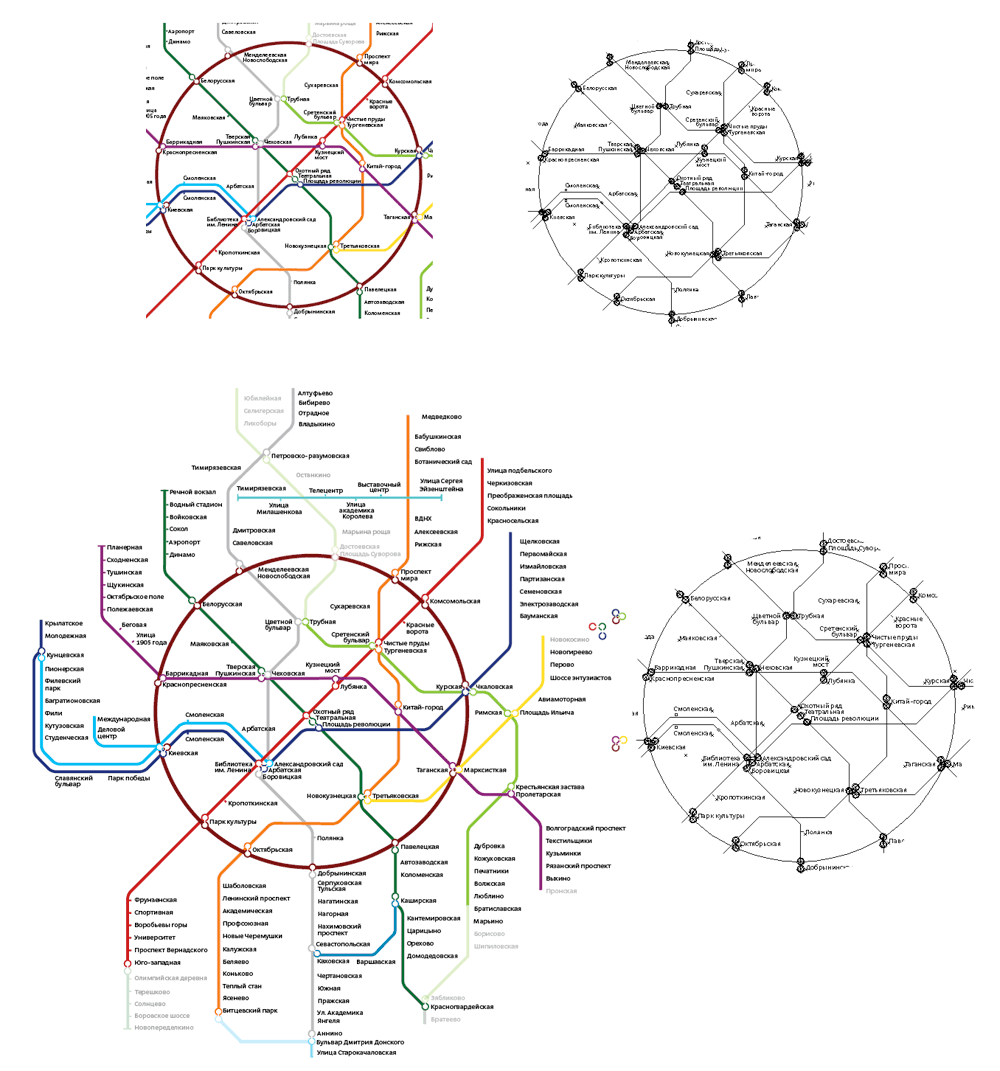
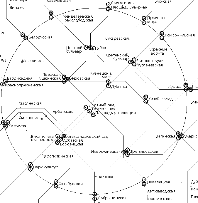
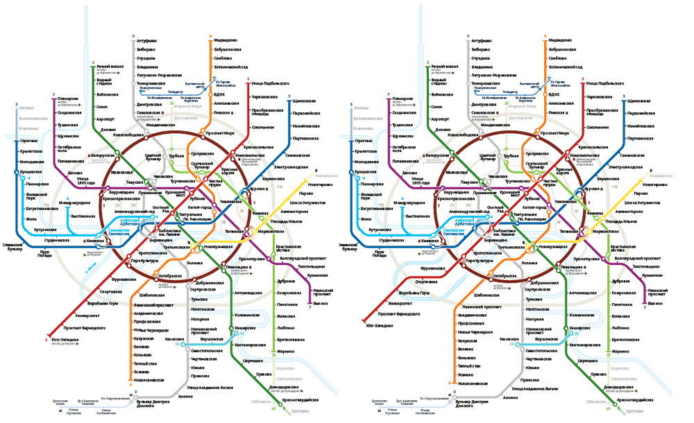
Looking for inspiration, going for topography.
The best thing about that design was that the city center found itself right in the middle of the map. Plus the Garden Ring and the Third Ring Road. But that was it, no more advantages.
At this point though the topographic idea led us to mnemonic hints.
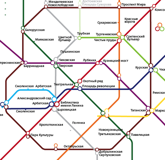
The chromosome in the middle was too much. But then we could see the interchanges. We liked the idea, but disliked how they looked.
Still wasn’t it.
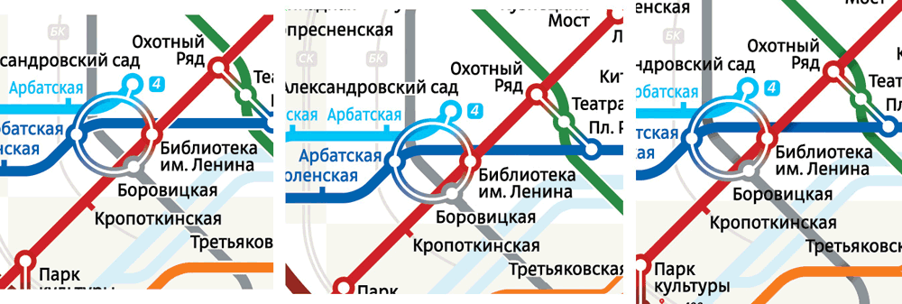
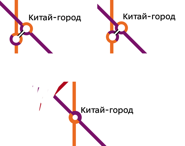
Then we gave birth to the idea of rings for interchange stations. It was the kind of moment like that from an episode of House, M. D., when it dawns upon him and everyone understands the enigma has been solved. “That’s it” is the essential breakthrough for every design project.
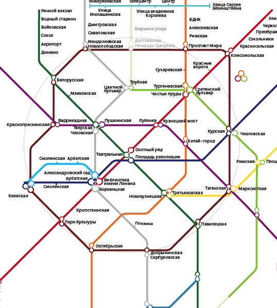
Arranging the stations and interchanges and achieving visual balance.
Incorporating ring roads, adding skyscrapers, playing around.
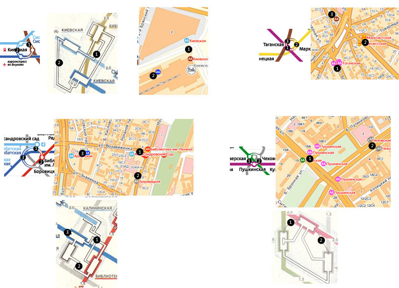
Versions showing exit directions.
London and Moscow? Would the British shading take root in Moscow?
Or maybe red?
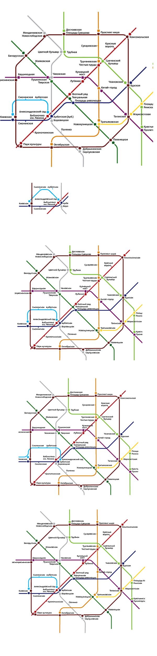
Simple grid prefered. The map is not as complicated as that of NYC. And there are no ticket zones yet.
Examining it as a whole. Rotten, too many bugs, little black things all over.
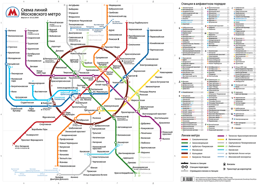
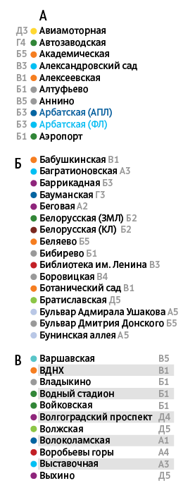
Searching for a solution for the list with color marks and grid references.
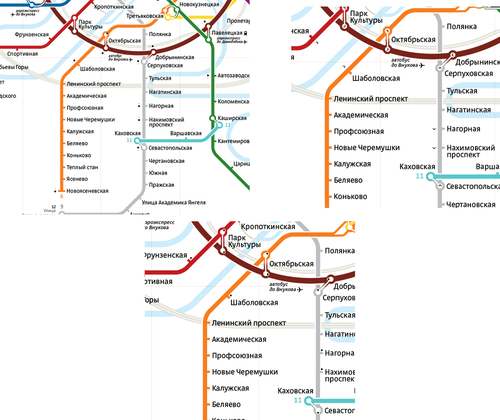
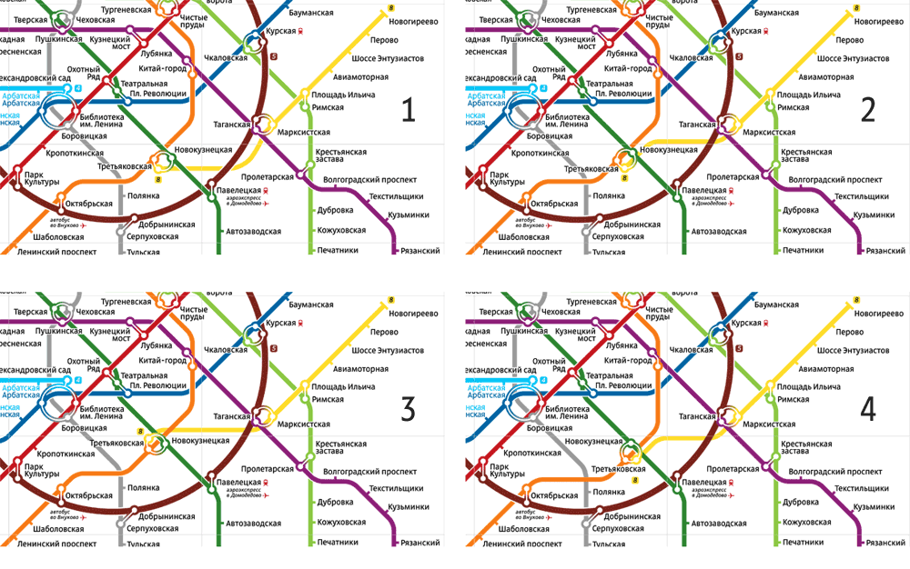
Struggling with one of the interchanges, Tretyakovskaya-Novokuznetskaya, the orange-yellow-green knot where the yellow line just wouldn’t look right.
Would it be able to keep up with the construction to come—we had to think ahead.
Almost there.
Trying different looks for crossing lines: simple white gaps, simple overlap, simple shadows.