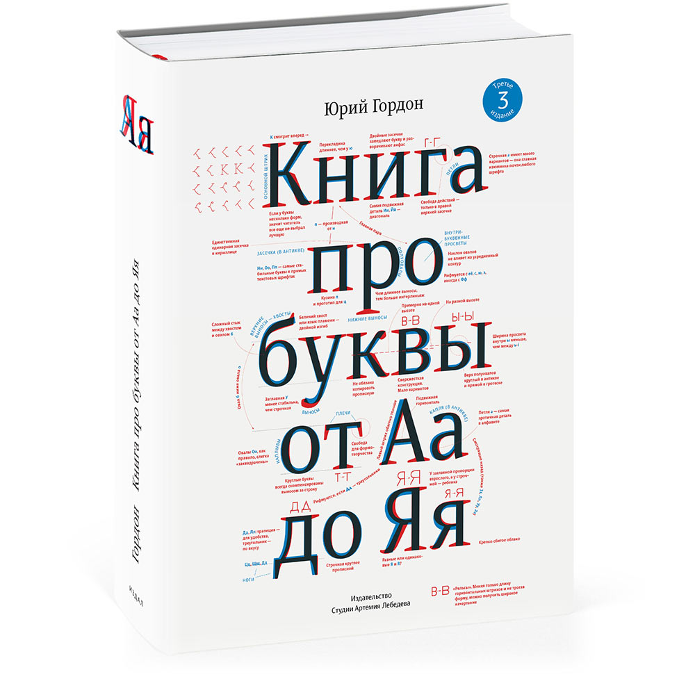
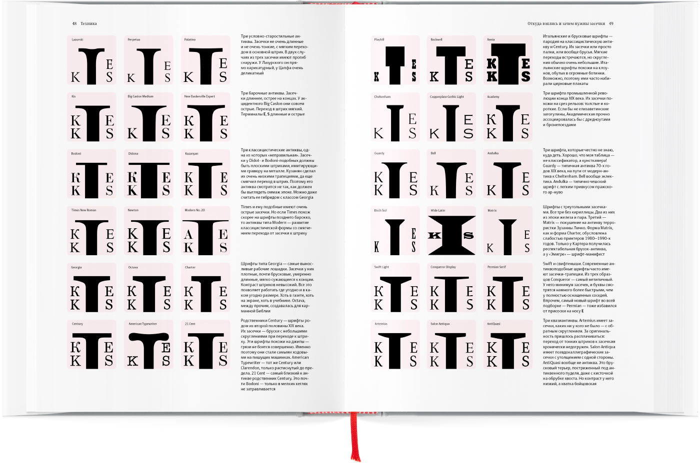
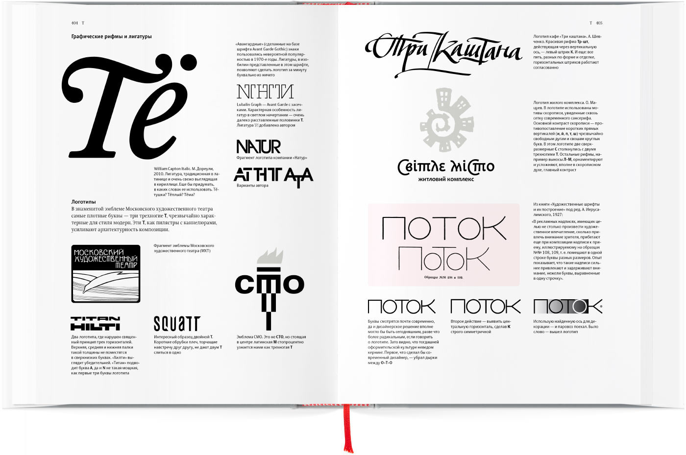
![]() Chapter Where Do Serifs Come From and Why (pages 44–51 of the book in PDF, 783 KB, in Russian)
Chapter Where Do Serifs Come From and Why (pages 44–51 of the book in PDF, 783 KB, in Russian)
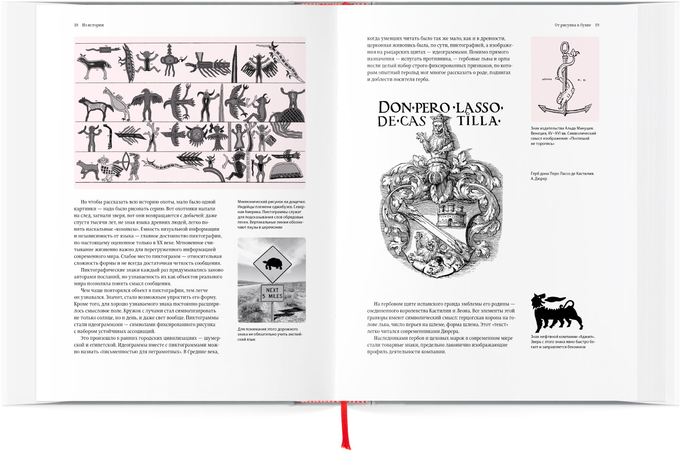
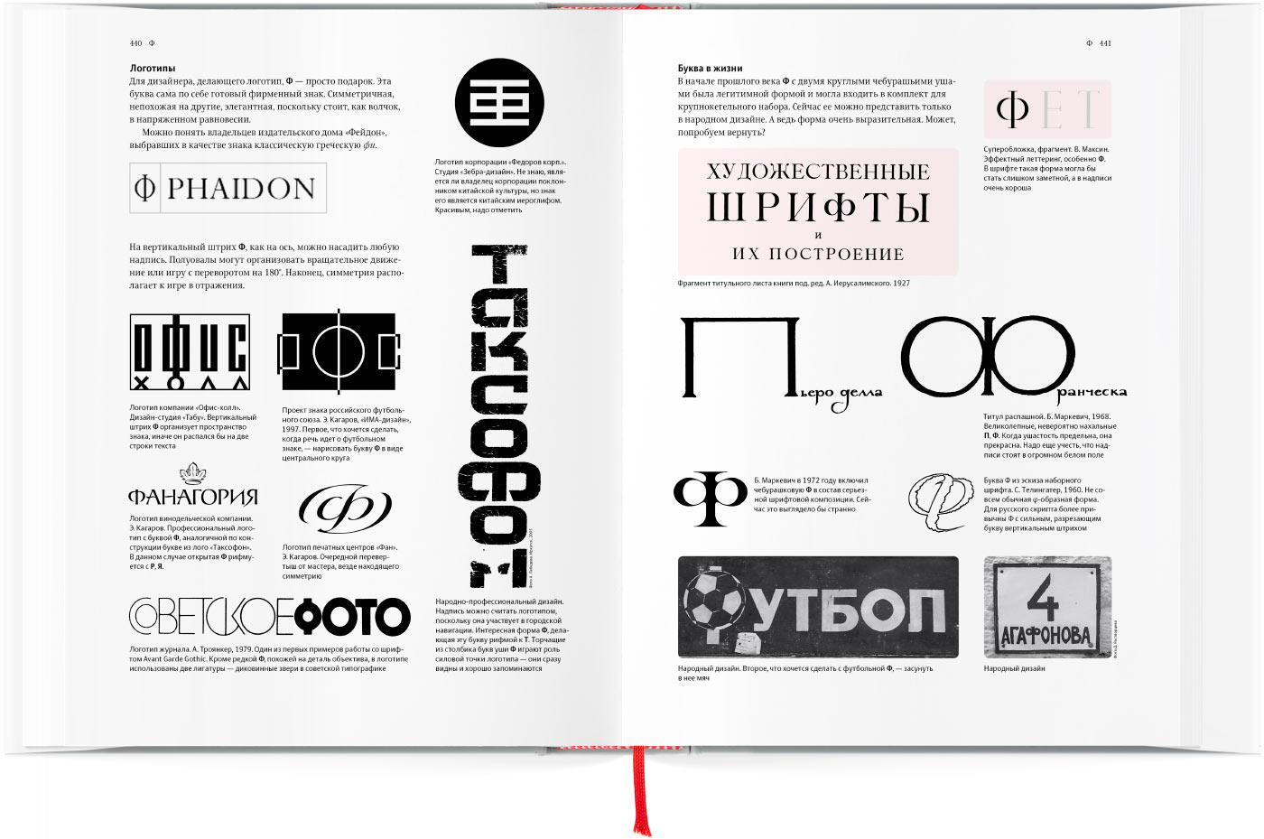
![]() Chapter About the letter Aa (pages 122–131 of the book in PDF, 907 KB, in Russian)
Chapter About the letter Aa (pages 122–131 of the book in PDF, 907 KB, in Russian)
In the Book of Letters, its author carefully analyzes each letter of the Russian alphabet, talks about why our written characters are not as beautiful as their Latin counterparts, and what the designer (not necessarily a professional typographer) can do about it. The book focuses mainly on the Cyrillic letters, but in addition, it also touches upon the Greco-Roman roots of our alphabet.
The third edition has the same content as the second edition which saw the author expand the introduction and chapters dedicated to individual letters and significantly expanded the number of historic examples. In addition to history, types, styles, individual properties and anatomy of letters, a lot of attention is paid to logotypes and different elements of typography and visual communication, so the book will not only be interesting to type designers and typographers, but to a wide range of designers and decorators.
This book is the second attempt to explain to myself, and to all those who are interested, what the letters of the Russian alphabet are and why they look the way they do. Since the first publishing of the book, its author has become three hundred fonts wiser, or at least sixty thousand letters, which he designed himself./q2.gif) From the preface by the author
From the preface by the author
The time has come for me to update my views as described in the Book of Letters from Аа to Яя. In the six years since the first edition, there was a large increase in type designers, and therefore, typefaces. An exponential increase of both, the former and the latter.<...>
My views have changed especially after the “Proteus” program came into fruition, which was used for series of experiments with fonts and form clouds. If before I thought of fonts as archipelagos, isolated from each other, now I see the entire variety of fonts as a single biological system, where everything is interconnected and certain forms smoothly morph into others. Styles, historical characteristics, unique examples seem to me but key points, all connected by an infinite number of common threads.
The experiments with form clouds convinced me that all the text fonts are, in fact, just one font. More precisely, all of them were derived from a single shimmering “matrix,” which seems to me as the bare, neutral font, perfect for reading but devoid of individuality. Therefore, the goal of a font designer is not to “disappear within the text,” as commonly believed, but rather, to give a unique face to nameless, archetypal forms.
Therefore, the second edition is focused much more on the letters for reading—forms closest to the statistically average. In my opinion, the comparison of similar forms can help one, on one hand, to find the widely accepted norm, and on the other—to notice the subtle deviations from it in any given solution.
From the preface by the author to the second edition
art director
chief typesetters
technical designers
endpaper illustrator
editor
index editor
proofreader
project managers
-
- Hardcover
- 596 pages
- Dimensions: 220×290 mm (8.7″×11.4″)
- Press run: 3000
-
ISBN 978-5-98062-099-8
