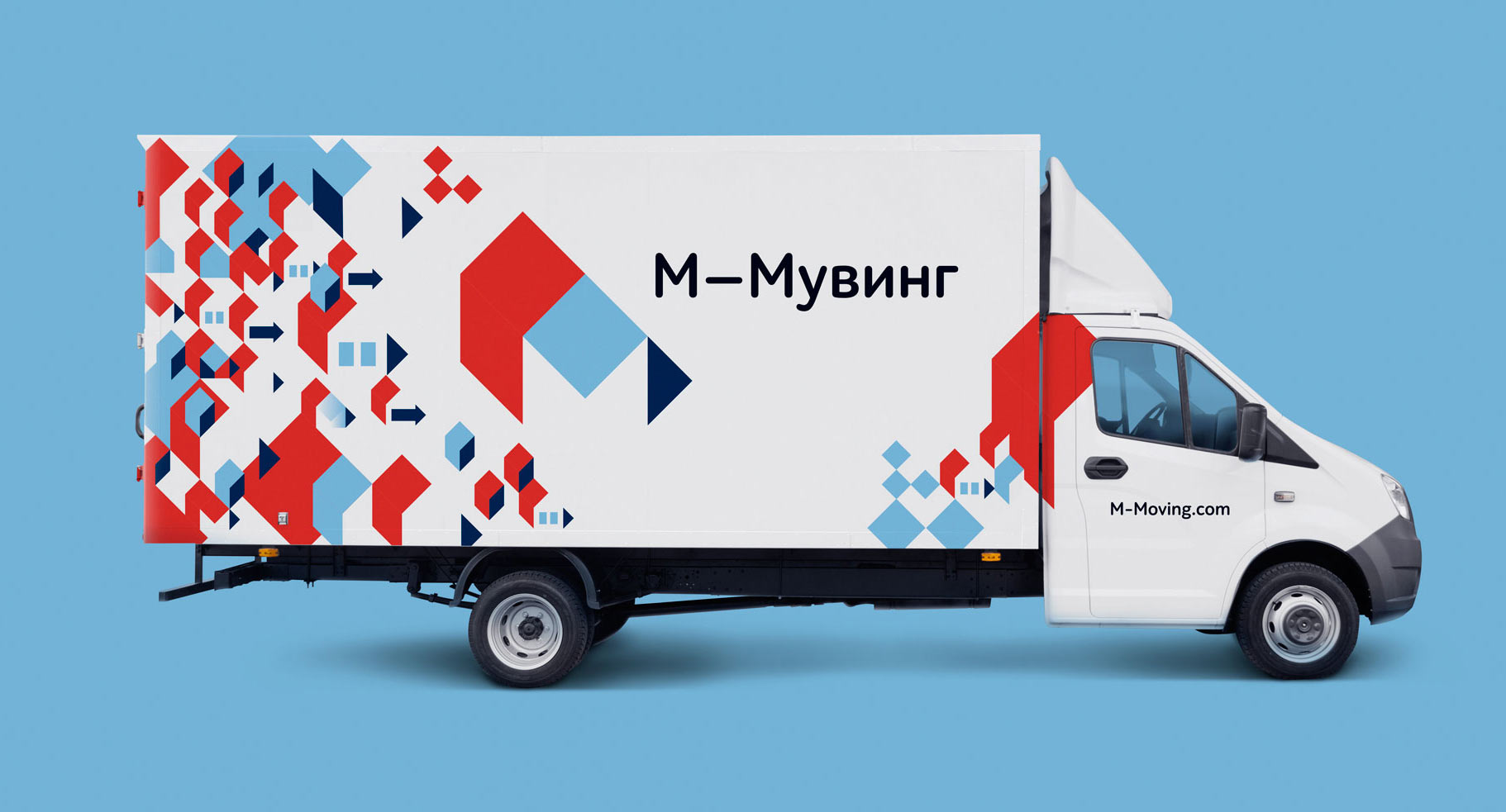
M-Moving organizes high-comfort business and residential relocation. The guys emphasize that instead of providing a man and a van, they offer responsible professionals who will carefully pack and move any valuables.
An expressive logo promoting the very notion of moving was designed at the studio.
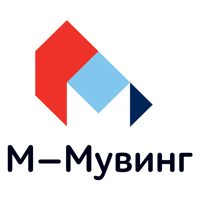
At the core of the logo is the letter M and a schematic drawing of a cardboard moving box. The blue square in the center clearly resembles a closed box lid while the side elements enhance the accent on the letter M.
The logo is accompanied by the name of the company written in large type. The width of the dash emphasizes that M means Moving.
The arrow-shaped shadow enhances the sense of movement and makes the viewer think of carefully carried packages.

The corporate colors are used in movers’ uniforms.
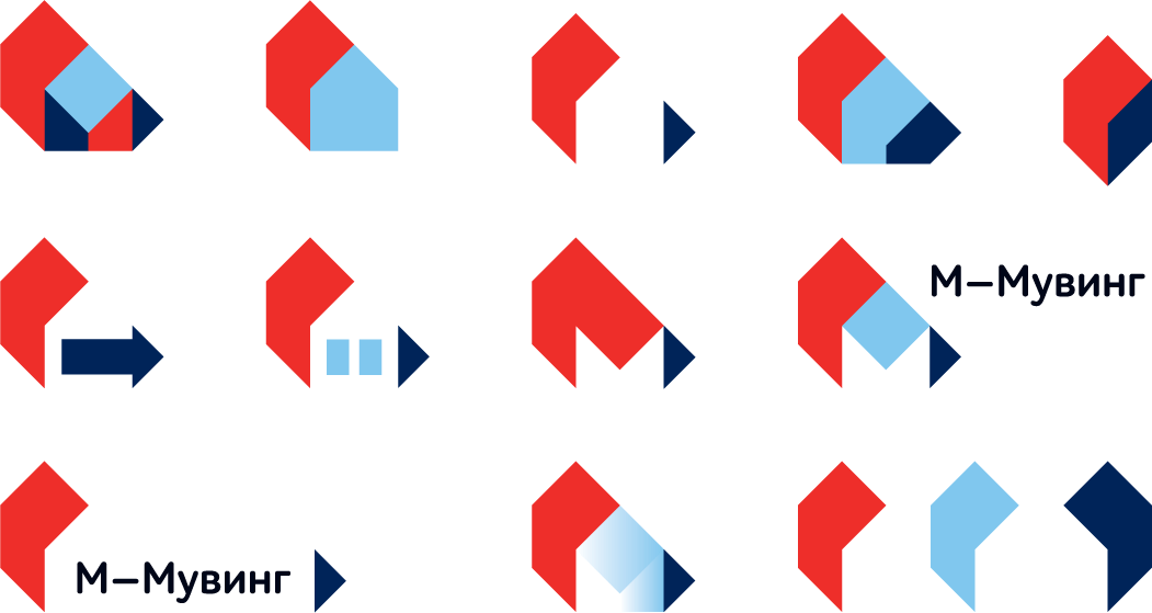
The elements of the logo are combined to create an expressive pattern.
