|
Artemy Lebedev
§ 134. A way to set the limit of font scaling in one dimensionJune 3, 2006 |
Dedicated to Serega
|
What a mercy that in the epoch of movable type you couldn’t distort letters at will. With the emergence of computer typesetting, in the first year of desktop publishing systems’ existence, mankind got to see as many masterpieces of hideousness as all type designers and artists combined could not possibly bring forth in the entire history of book printing. |
|
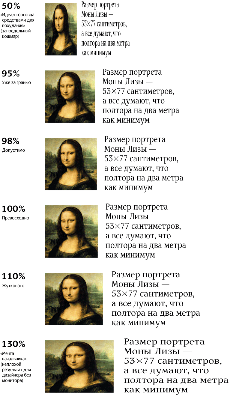
One of the handiest methods to mutilate a font is to distort letters horizontally or vertically. If a font looks horrid, no weight loss or weight gain diets will make it any better. If a font is good, you mustn’t toy with its design: the odds are that it’s positively going to get worse. (Designers who tried turning a typeset word into a “logo” know that: whatever part of a letter is changed, the change is for the worse.) |
|
You can squeeze a font |
|
As a way to train the eye, we suggest that designers (and customers) take their own photo and distort it along with the font. When the distortions become visible on the face, it’s time you stop disfiguring the font. |
|
|
A person who knows something about fonts chuckles at the sight of bloated letters like a child who’s seeing his reflection in a fun house mirror. |
|
|
|