There was hardly a man of any standing who didn’t interest himself in some way in navigation.
S. O. Jewett. The Country of the Pointed Firs
Any objections against all websites having a smart and understandable address are highly unlikely. The user normally backspaces part of the address to the nearest slash and expects to get a level up from where he is.
To make this passage simpler, one may use double navigation, i.e. a bar with links reflecting the structural hierarchy of the website.
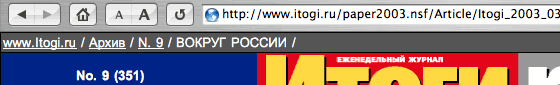
However, the address doesn’t always look the way we described it in the previous section. A good example is the website of the Itogi weekly:
Looking at addresses in the browser address line, the user can never figure out his whereabouts. Therefore the double navigation has in fact become primary.
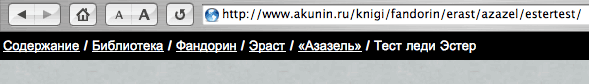
A website should be fine in all its particulars, which also means both an intelligible URL and a good double navigation fit to substitute the major one. The website of Boris Akunin provides a good illustration for that:
If the user doesn’t want to push the “Back” button (for example, after roaming for too long within one directory), he’ll probably be better off to choose an item of the double navigation. In the meantime, the double address line will still manifest the coherence and predictability of the site structure.
Hence the rule: double navigation should be brought into play every time you deal with some logically enclosed content entities, e.g. at news sites, exhibitions, catalogs, online shops etc.