
|
Sergey Kulinkovich
Rules for proper navigation September 13, 2013 |
|
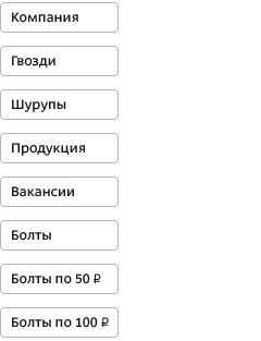
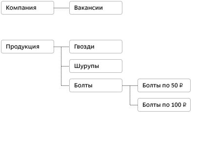
| The easier the website is for the user, the higher the probability of the user coming back, placing an order, filling out a form and making other useful actions. It so happens that most of the websites have a unique design and structure. This leads to the fact that on every website the user has to learn a new navigation principle to get to the required information or to perform an action. The task of the designer and interface designer is to cut down the time the user spends on this learning and make information as accessible as possible. The key to success here is creating a proper navigation system. A good navigation system satisfies the following principles: 1. Simple and logical data structureAt the core of a user friendly interface is correct data organization. Before working on presentation, it makes sense to think about the informational structure of the project. Data should be distributed by pages or screens in such a way as to allow every new user to quickly understand how to get to the required information without seeing the whole picture. To achieve this, fist of all you need to build a logical hierarchical structure based on the data available within the project.
|
Also see Peter Morville, Louis Rosenfeld. Information Architecture for the World Wide Web: Designing Large-Scale Web Sites. |
|||||||||||||
2. Single navigation environmentDesign and positioning of key navigation elements as well as scenarios of their operation should remain the same on all pages of the same level.
|
||||||||||||||
3. Answer to the “Where am I?” question |
||||||||||||||
| Pages should be designed in such a way as to allow the user to understand their place in the overall hierarchical structure of the project and move up one or several levels if needed. One of effective ways to achieve this is to show the path that was taken from the main page to the current page. |
Also see § 49. Double navigation |
|||||||||||||
If a menu contains a set of links to pages one of which is currently open, such an element should stand out and be inactive.
4. PredictabilityThe developers know their product inside out, but each new user sees it for the first time. In these conditions the developers have an important task before them: to make the interface so predictable that a user can always be more or less sure what this or that action will achieve. Care should be taken to remove navigation elements whose meaning and function may be unclear or wrongly understood. To this end, developers have to ensure that the appearance of functional elements matches the traditional behavior scenarios. |
Such navigation style is often called breadcrumbs after the navigation method described in Hansel and Gretel fairy tale by the Brothers Grimm. |
|||||||||||||
If a scenario assumes consecutive switching a defined set of pages or states, such as during a step-by-step filling out of a large form, it is beneficial to give the user the estimate of the progress made and a preview of future steps.
5. ScalabilityAfter launch, websites usually begin to grow and transform. It is essential that a system can handle new elements being added. To ensure that, it makes sense to provide for a twofold increase or reduction of information during the design stage. 6. ContrastProper navigation allows to realize main user scenarios and allows the user to know the answer to the question “What’s coming next?” at any point in time. The designer has to create the system in such a way as to ensure the user can easily follow the route to a required action. In case of an online store it is placing an order, on a news site—reading more news, on a website for a piece of software—downloading a file, etc. To achieve this, the most important navigation elements in the current context must be contrasting and easily accessible.
|
A set of familiar behavior scenarios is defined by the interface of the system the user operates. See for example OS X Human Interface Guidelines. |
|||||||||||||


Order a design...