Navigation Pattern
The making of the Vegas Crocus City navigation system
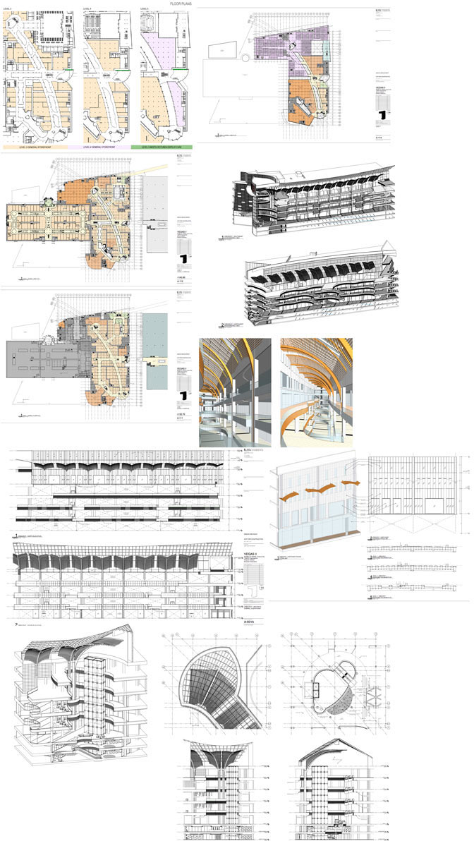
Getting the first part of documentation from the client, generating sketches, looking for metaphors, materials and principles. Vegas is still under construction, so we can’t visit it.
Artistic director: Have a cold one, cool down.
We need to get the right input data. Once more looking at the documentation sent by the client: plans, sections, renders, sketches.
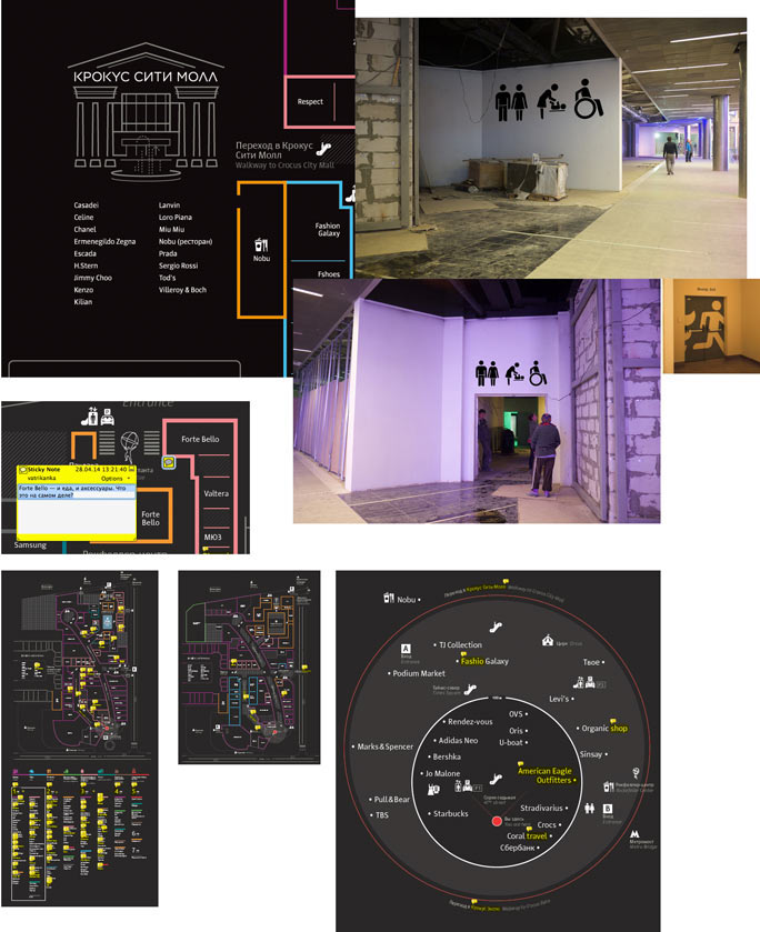
The architecture of the shopping center gives us clues to change our approach. Trying to place architecture at the core of our design. Introducing color coding of columns and the floors. The idea is to put a sort of waypoints along the visitors’ path.
We would also like to experiment with glass. Trying to find inspiration in the near future: touchscreens, transparent media, high technologies. Though it’s important not to make it too much about futurism.

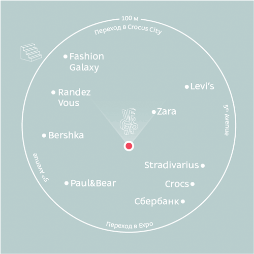
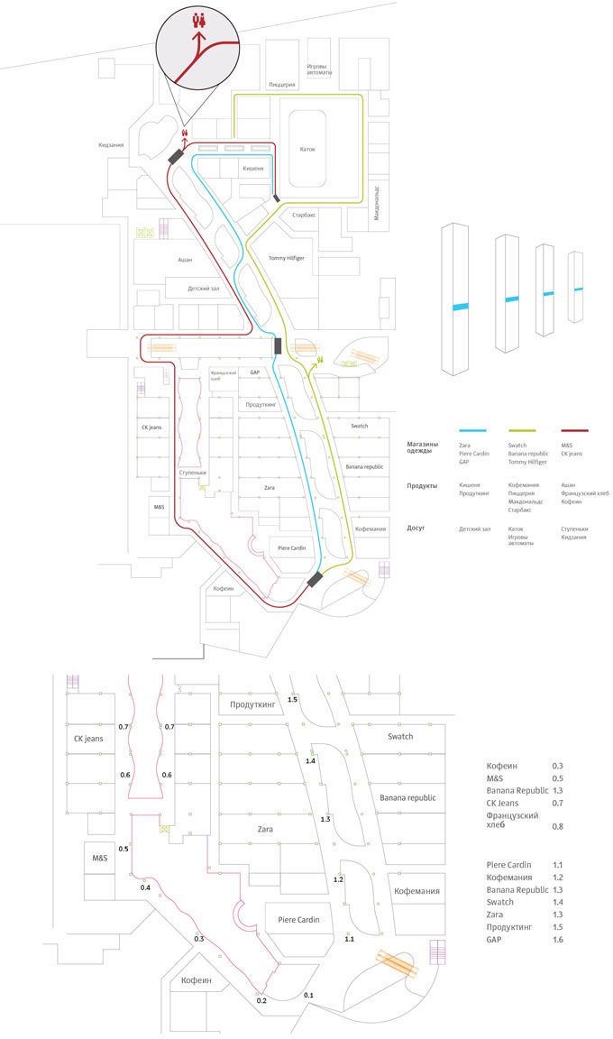
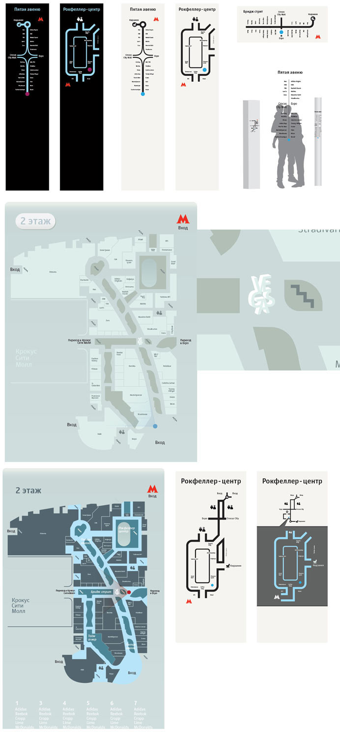
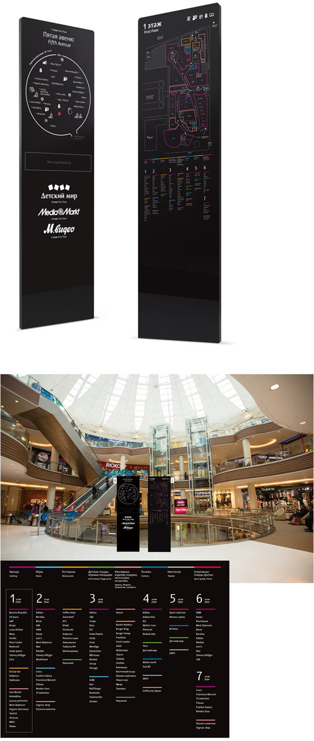
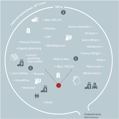
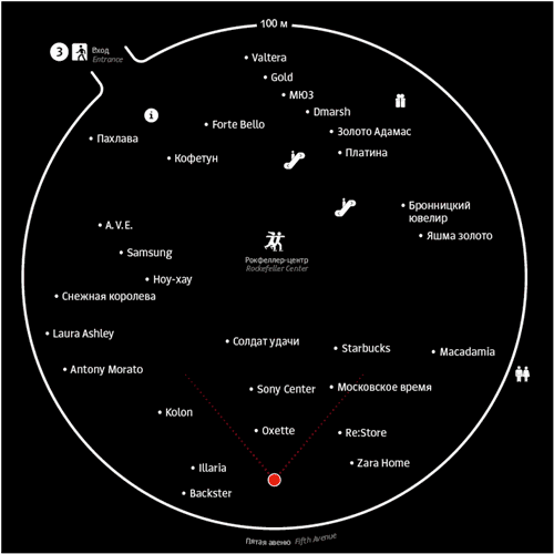
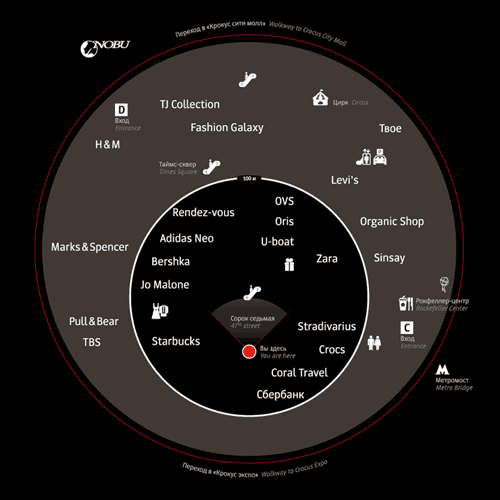
We get the idea to use a radar and a route. It would allow a visitor to see the entire path and the surrounding stores. Also trying to place it on semi-transparent material.
Even though we are busy meditating over global ideas, we need to look for solutions for micronavigation: what it can be and what it should look like.
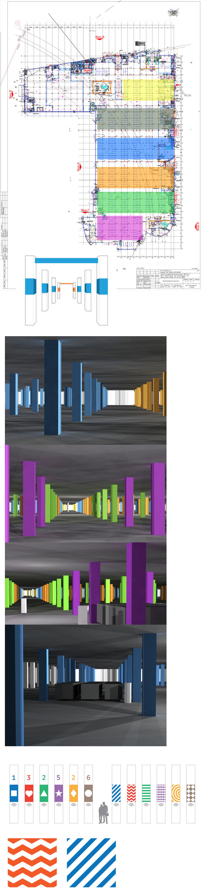
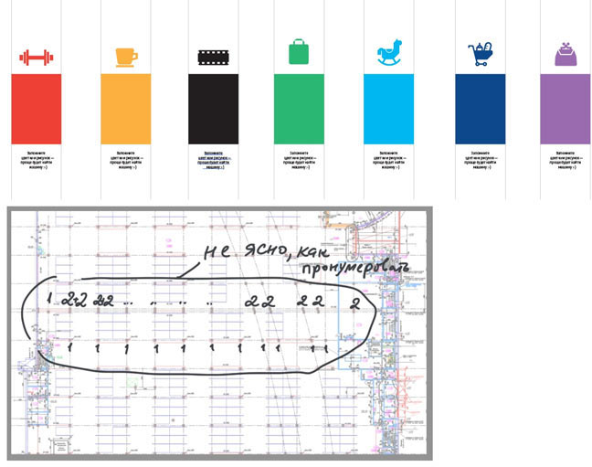
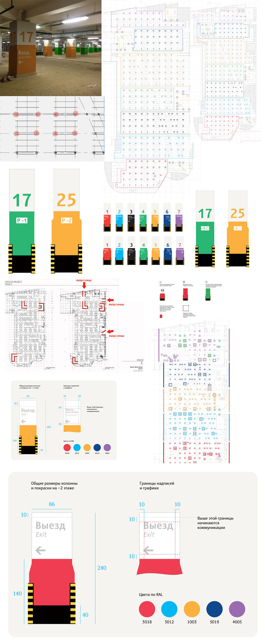
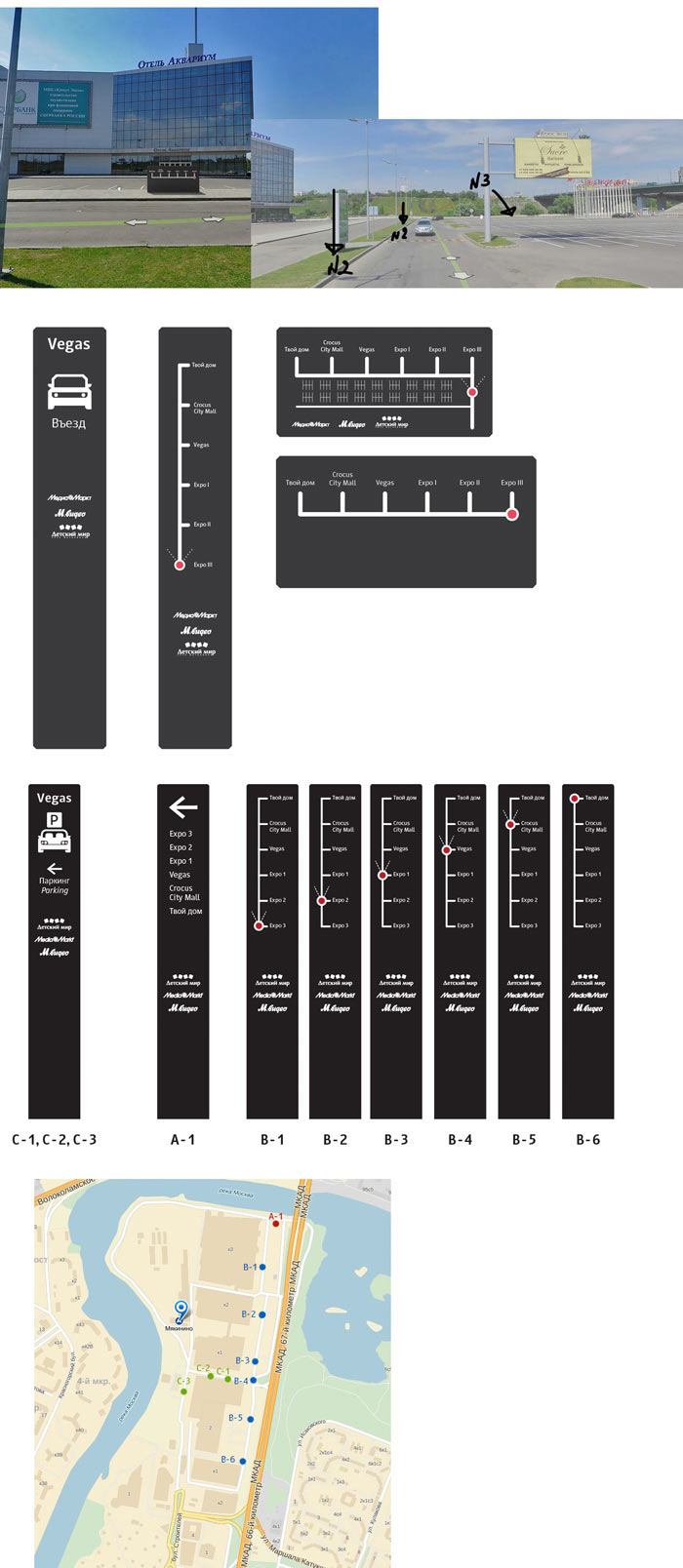
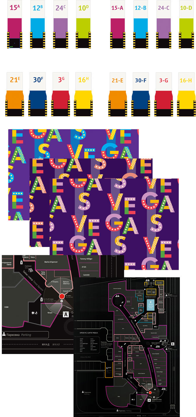
Vegas has a parking lot which also requires our attention. Creating color-coded parking zones, testing visual distance. The art director suggests to try colored patterns.
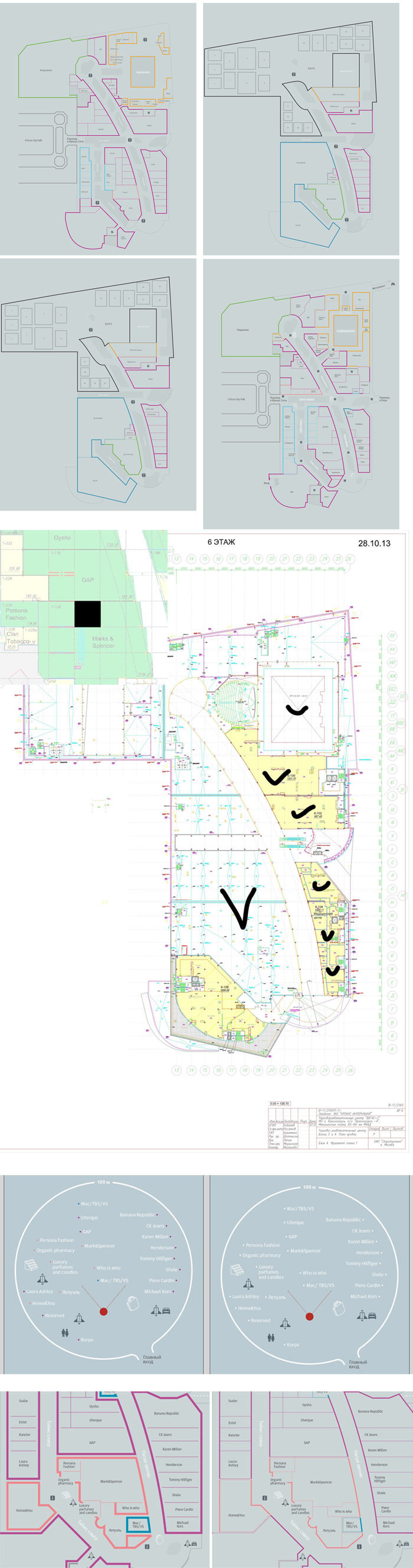
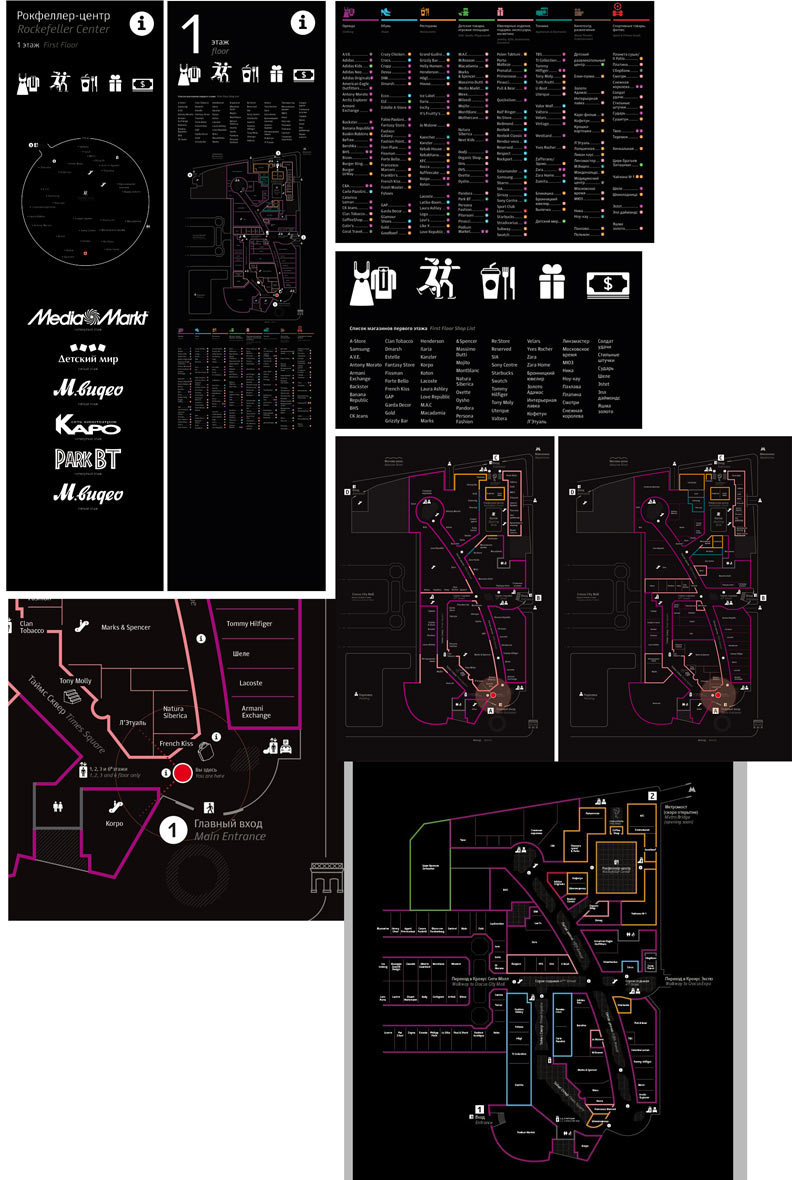
Getting back to main navigation. We need to understand what principles work best here. Routes are a great way to show stores and their location, let’s keep it in mind for future reference. A map would allow us to show everything the shopping center has to offer.
Assembling all the solutions together and having a look at the overall picture. Some techniques will be used, others will become the basis for something else.
Lyrical digression: at the drafting stage when there is still too much incoming data it’s important to switch to other subtasks (parking, stands, consoles, icons). It helps to avoid unnecessary detalization of any one area. The priority is to make broad strokes and find general principles.
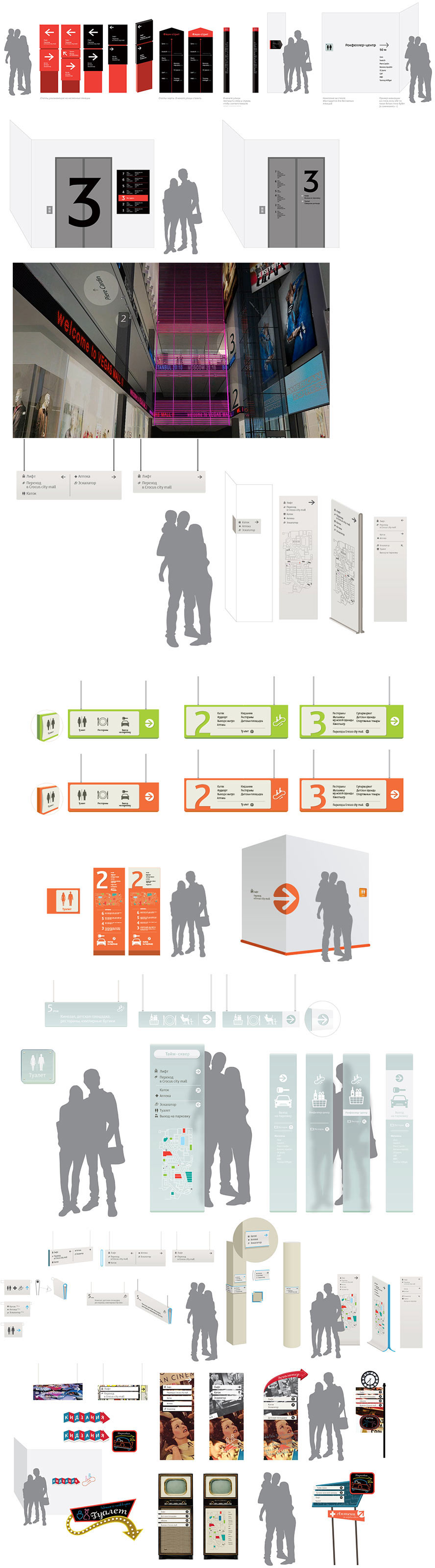
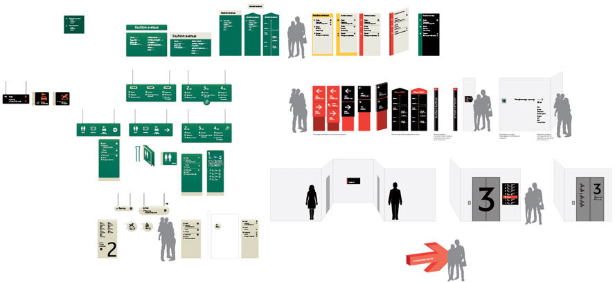
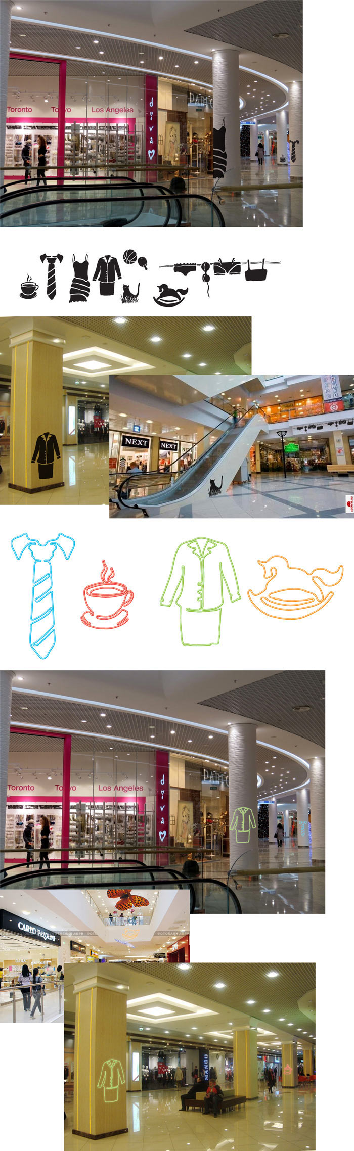
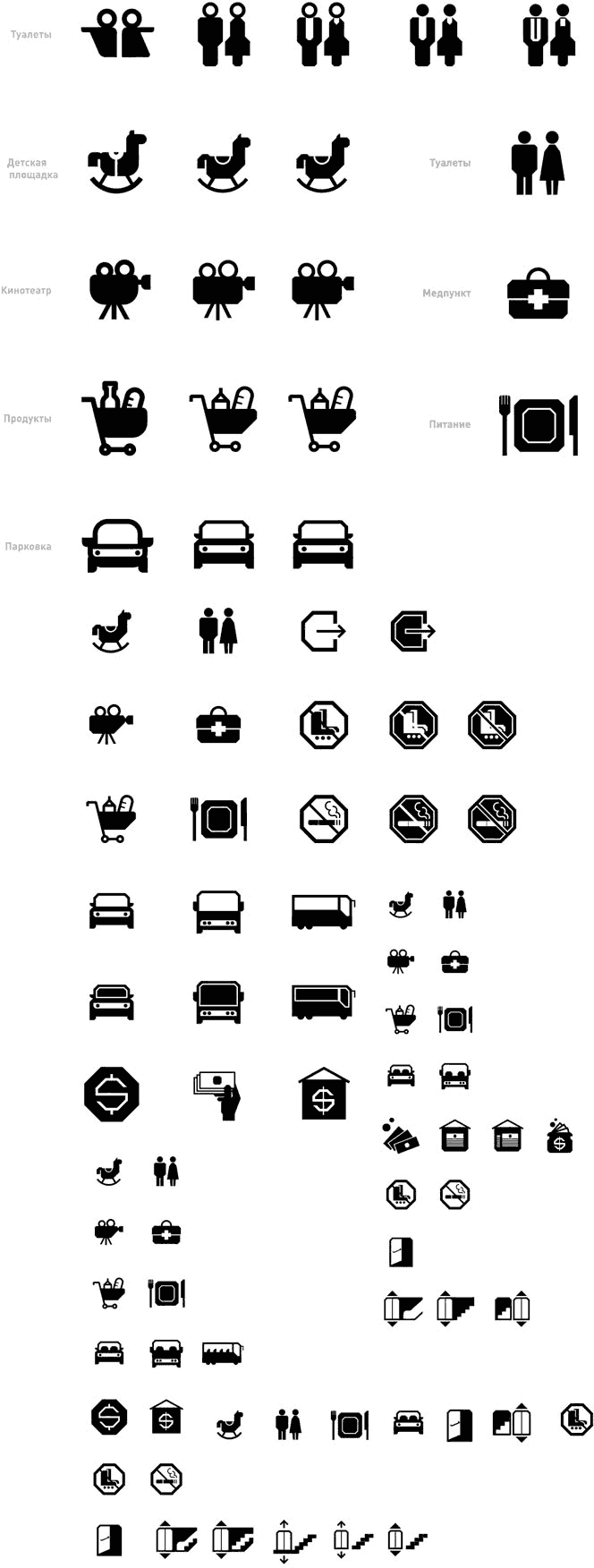
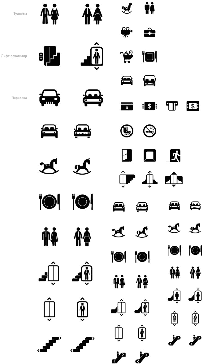
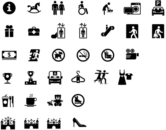
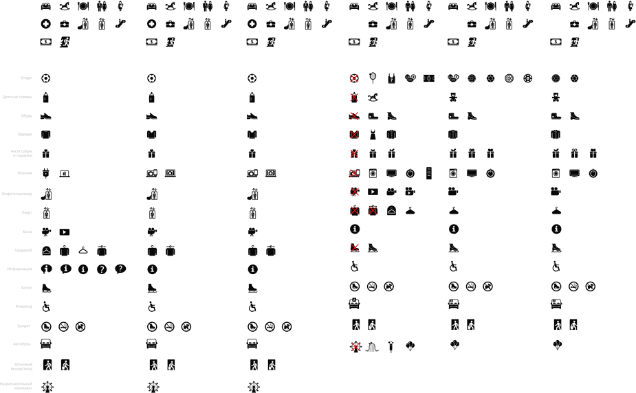
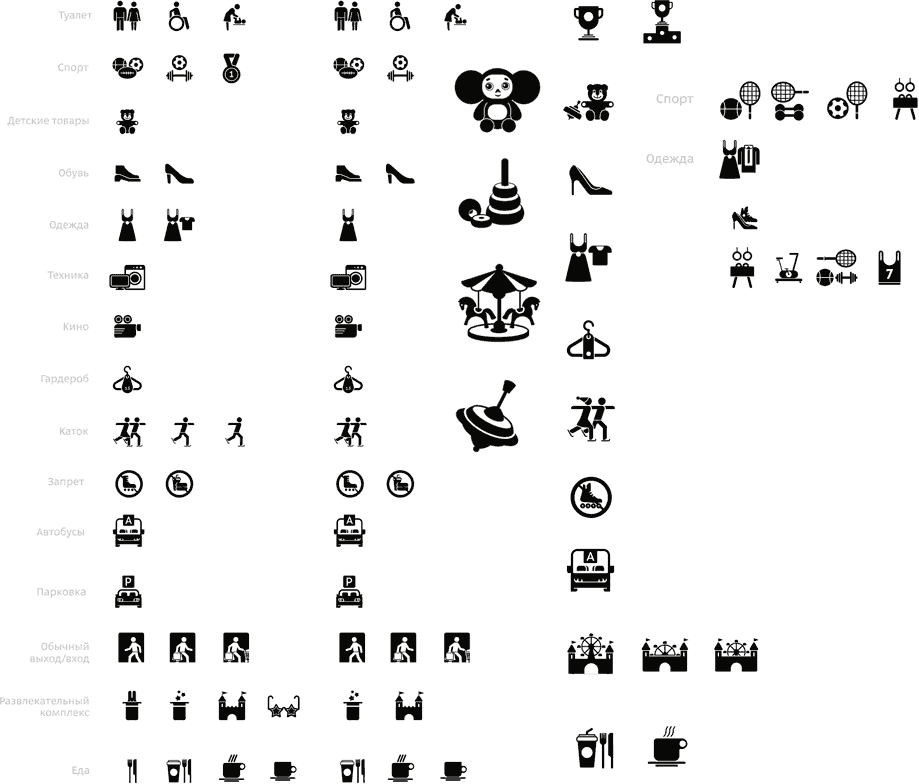
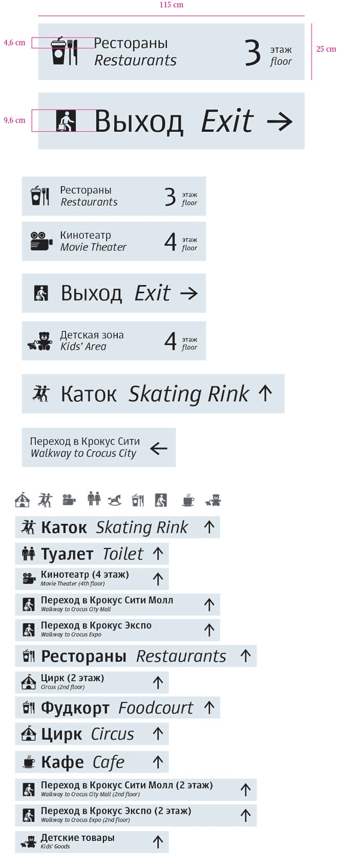
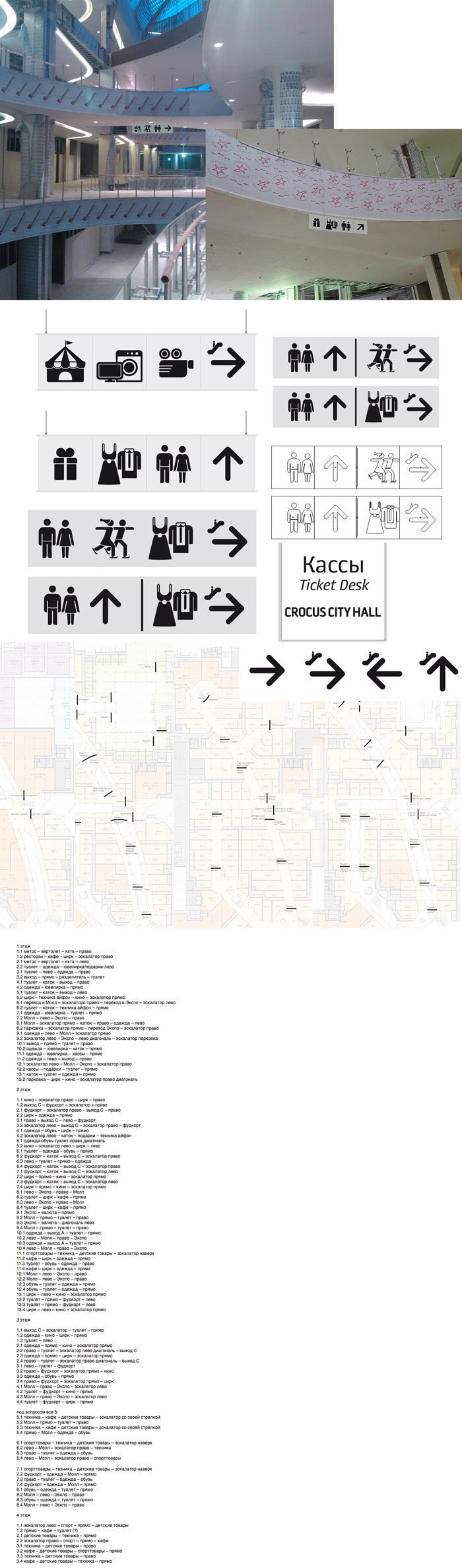
Moving on to pictograms. We want something strict but recognizable.
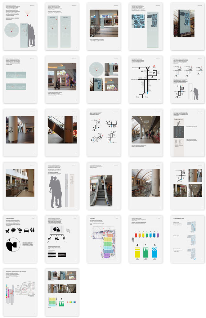
Assembling a presentation.
The client chooses the approach with semi-transparent glass, routes and a circle diagram. We also need to check how the media will look on columns and not forget about tenants’ logos.
The client doesn’t like the angular icons. Adding more softness and realism. Clarifying the number of directions we will need the pictograms to show.
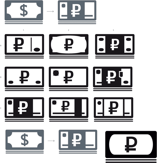
ATMs in Russia dispense rubles, not dollars. It’s better to adjust the icon accordingly.
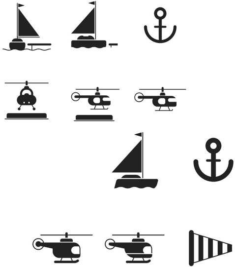
The client asks to add pictograms for the helicopter pad and the yacht berth.
For the time being, let’s get back to the parking lot. We get the idea to use icons instead of patterns, this will make it easier to find a column without adding unnecessary connotations.
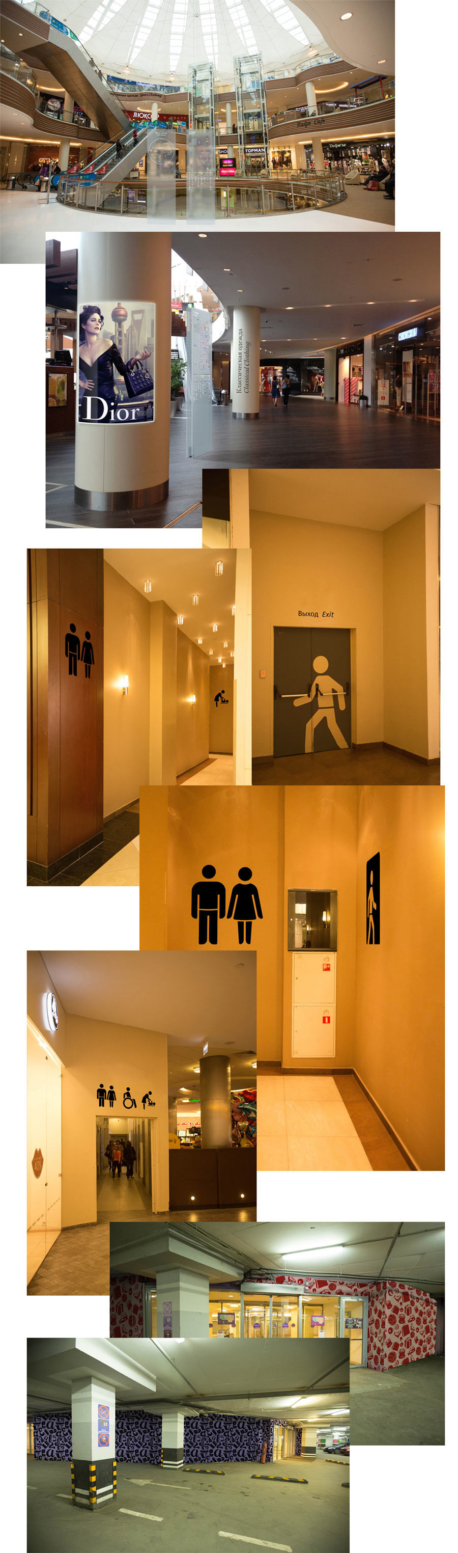
The client asks to add an information icon to the stand so that people won’t confuse it with advertising media. Trying to put it between the two planes. Later, the icon will be printed on the back plane.
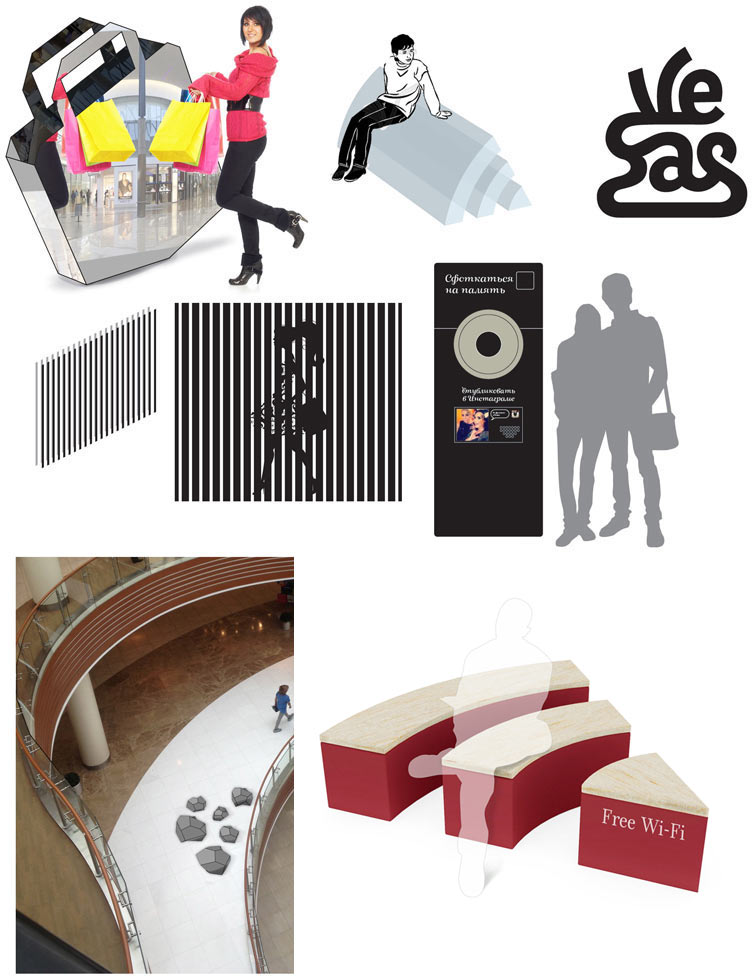
Other options. Simultaneously introducing the idea with art objects which will make navigation easier: when describing their location people often use recognizable objects (“I’m near the larger letter A” or “I’m by the giant hand”).
Now that we have the art object idea, we must develop it. Trying to think what these objects could look like. Besides beauty, we also want them to be functional. A wifi-bench, a mirror in the shape of a bag, maybe a stereographic wall or a photopanel to publish selfies on social networks.
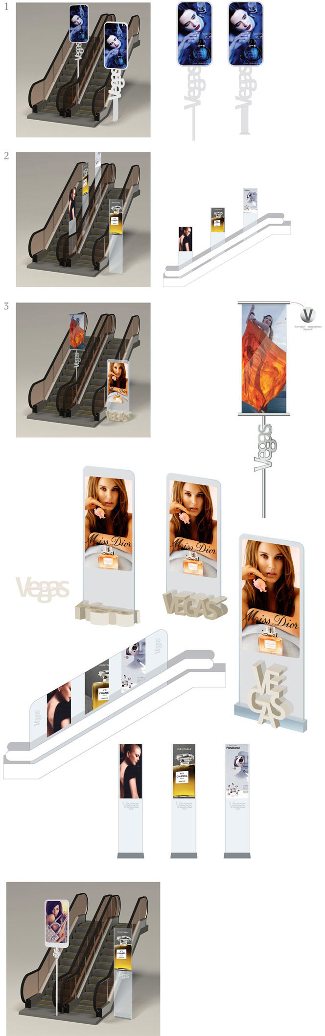
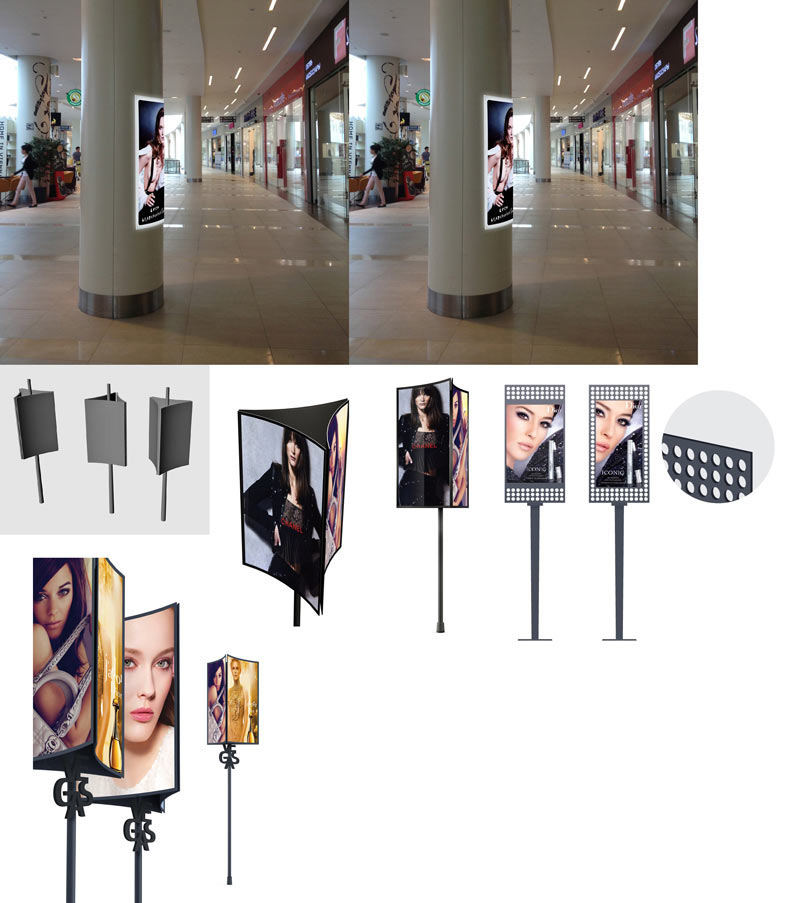
The client also asks to develop drafts of advertising structures and stands near escalators. Making sketches based on the chosen materials. Gradually abandoning them due to impracticality.
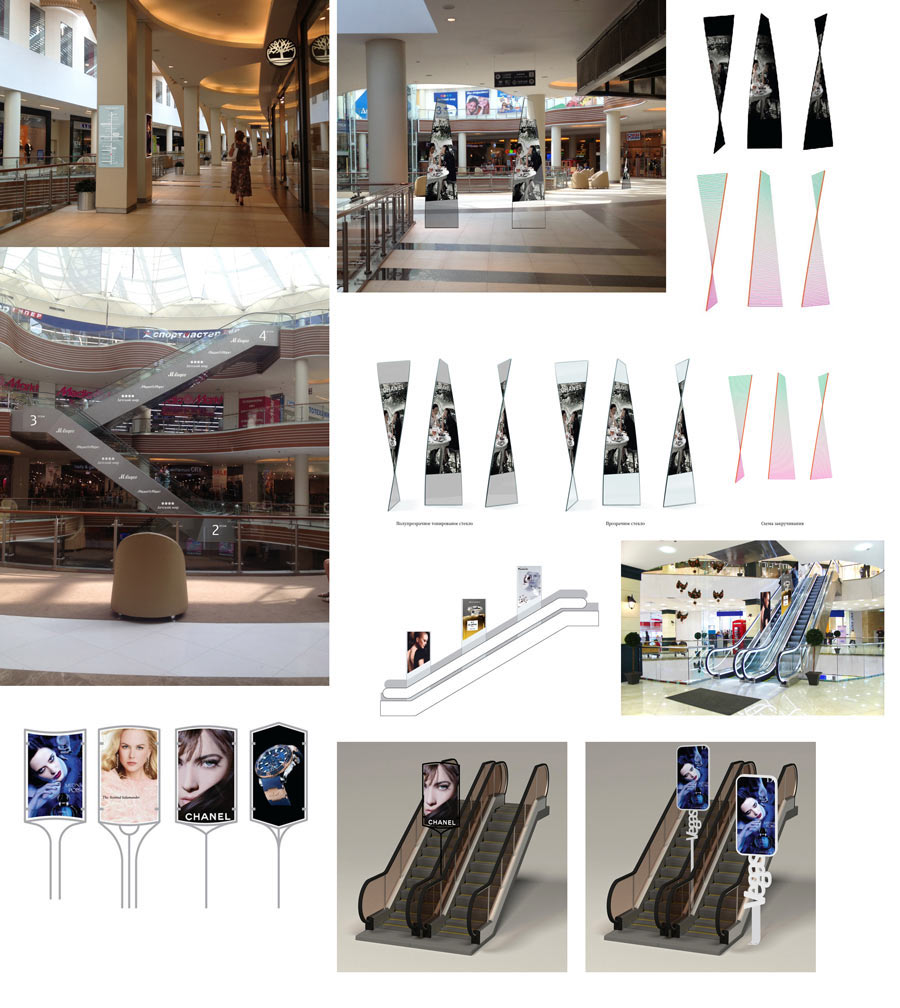
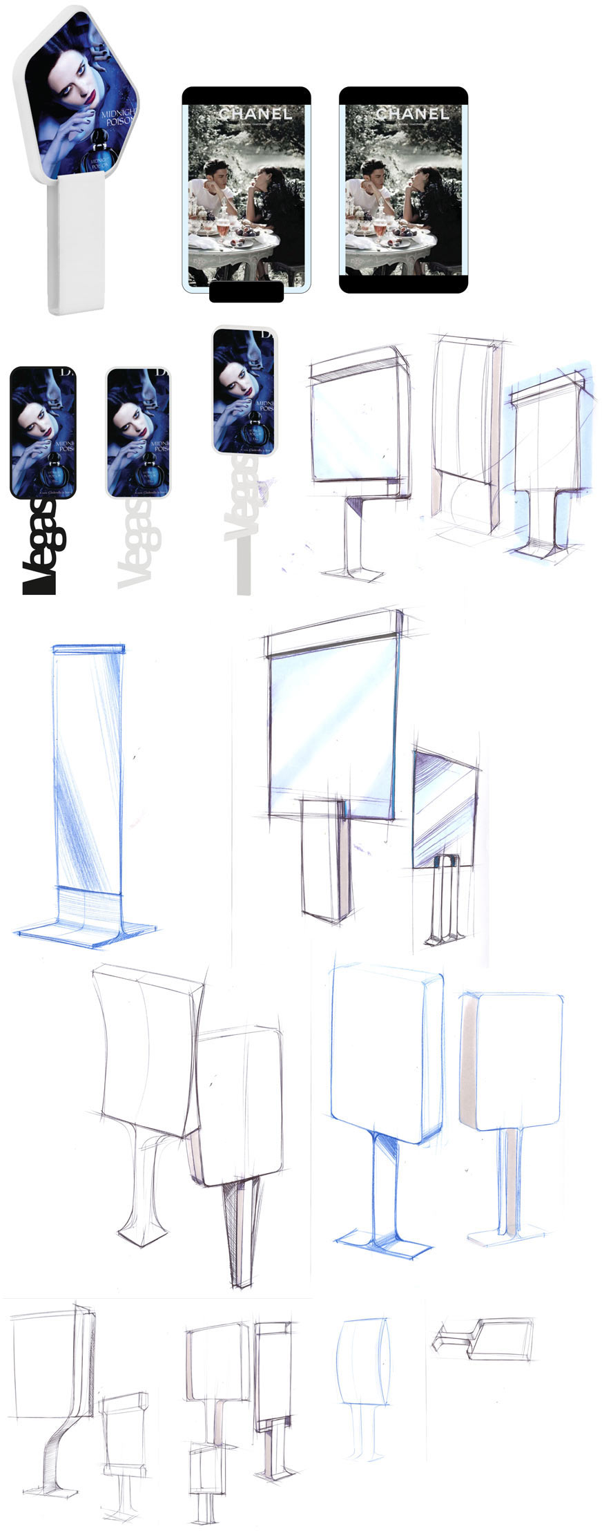
Working with the classic structure: a plane on a stand. Trying to inscribe the name of the shopping center.
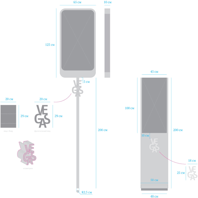
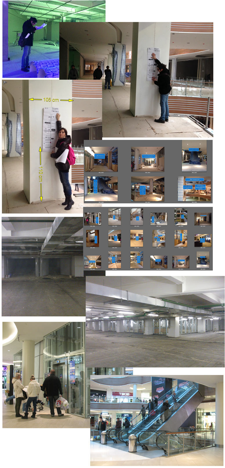
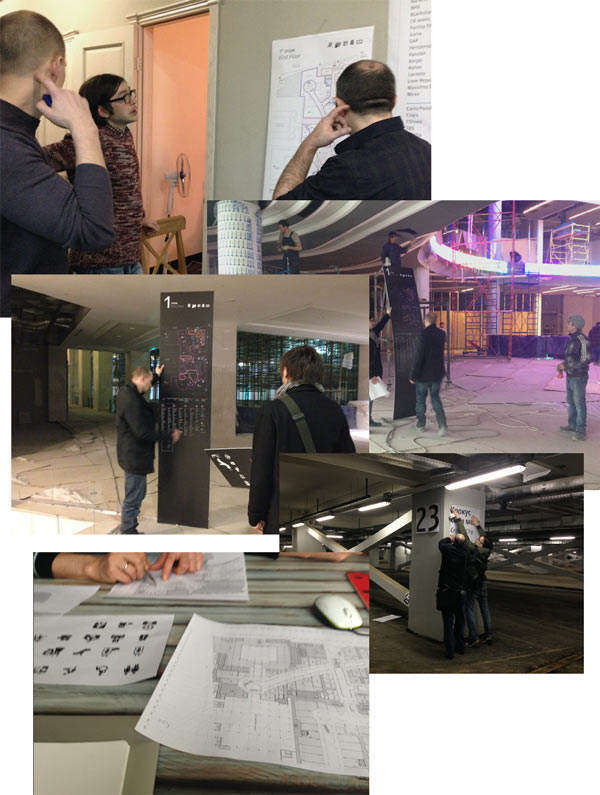
Choosing the sketches and marking the sizes to make the scope of work evident to the manufacturer.
Since we already use columns for navigation, why not place advertising on them, too? Coming up with additional advertising media as well.
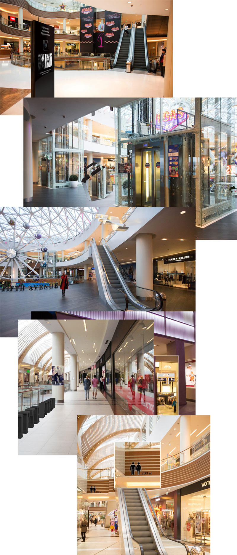
We need to understand the environment our art objects will be located in. Going to Vegas-1 to take photographs. Checking out how the structures will look.
More options for the structures:
All right, we can put the art objects aside for a while, everything seems clear with them. We need to get back to the maps. Working on color coding of different stores and products. Clarifying architectural details with the client since they are important for the radar idea. If something was to obscure the objects, the radar would be useless.
Another idea we have is to put decorative text on the floor. By this time it has already been decided that routes in Vegas will be named after streets. Experimenting in this direction. Ultimately, the client will abandon this idea.
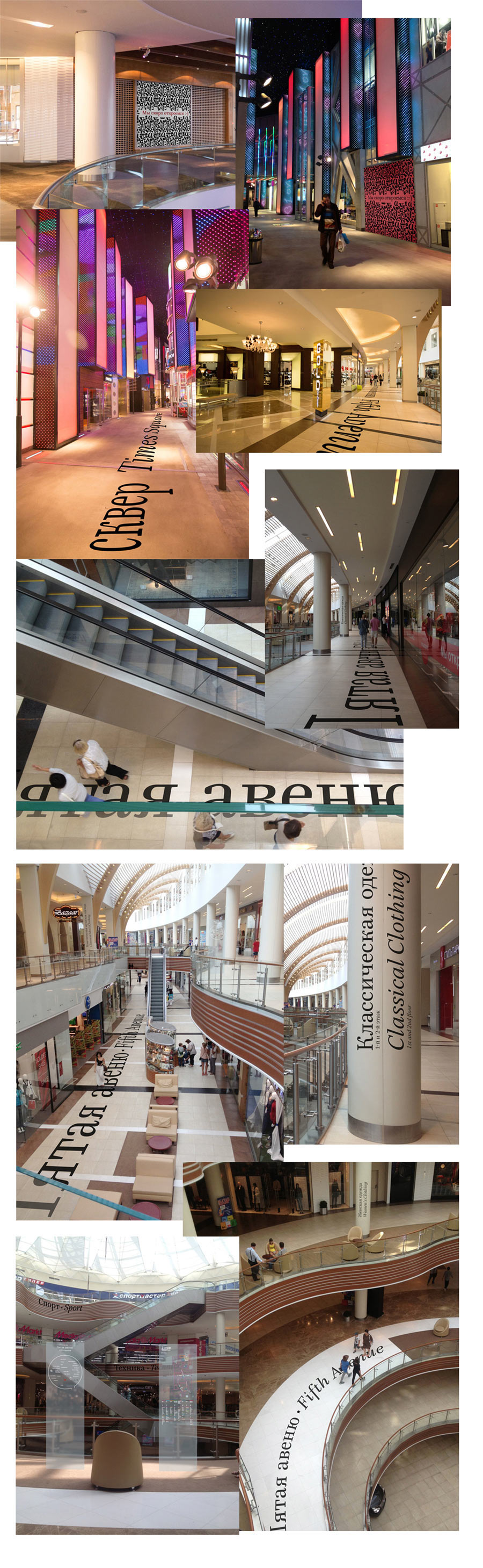
A system starts to emerge. The elements have stopped arguing, now we need to convince them to make friends with each other. Using photographs again to see how the stands will look. Trying to convince the client that typography in an interior design is good. And good typography is doubly good.
Time to decide on the materials. Gathering references on how glass is used. We need a semi-transparent matte glass so we can use both sides.
The client starts to have doubts. First, the stands will be hardly visible among the storefronts and glass decorations. Secondly, there is a chance that glass will look differently depending on the lighting. There can also be issues with the backlight. Deciding to try black alternatives.
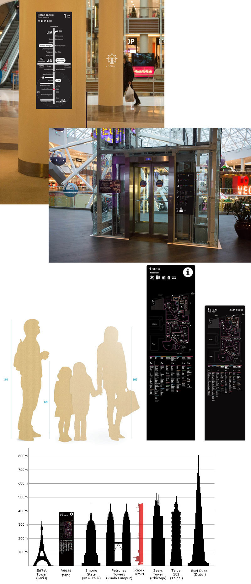
Looking at how the black color works on other media. Also showing the dimensions (since the majority of customers will be young girls, there is a doubt that the stands might turn out too large for them).
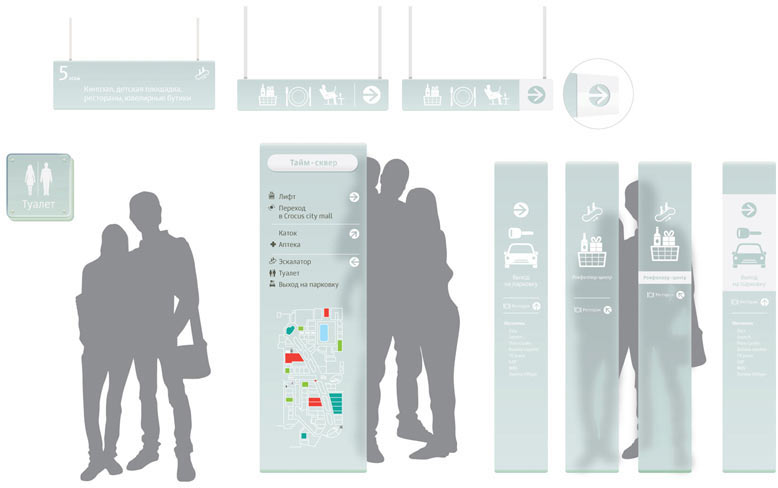
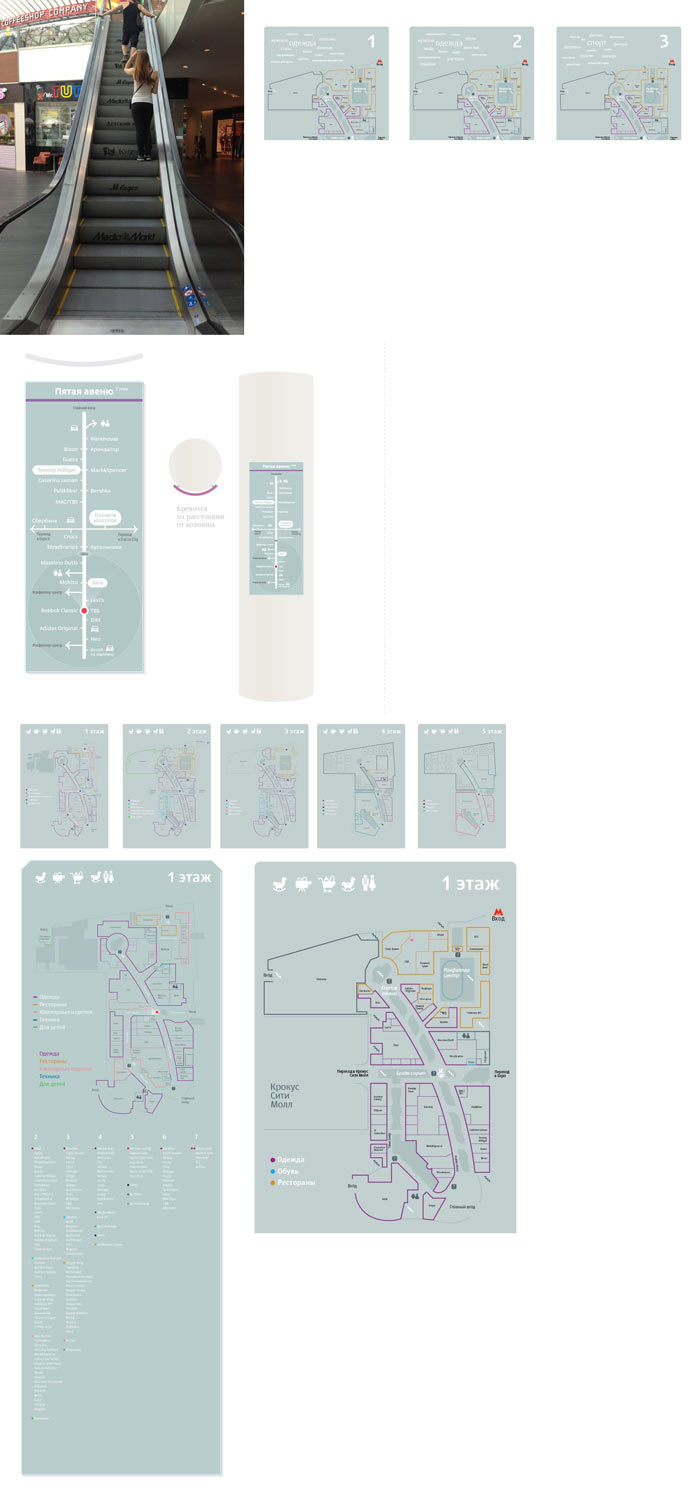
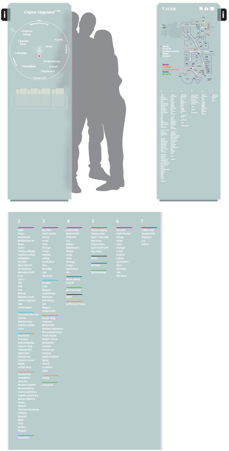
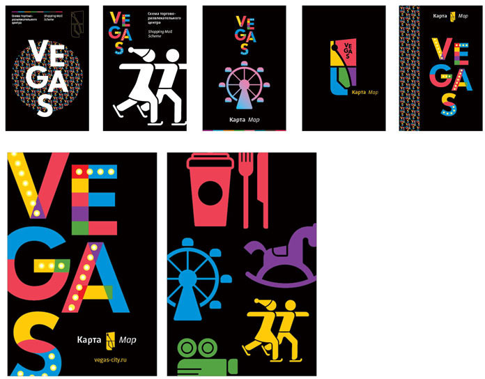
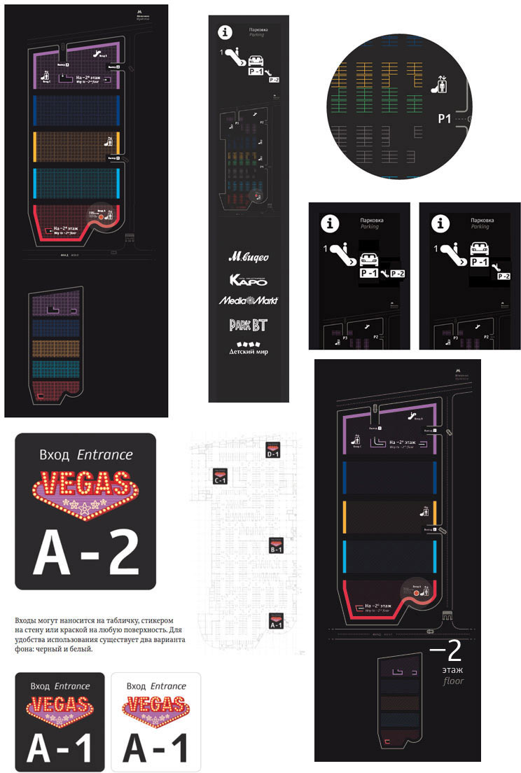
By this time the map has already reached a state where it can be transferred to other media. Like a booklet. Deciding that a folding booklet is a nice format for a seven-floor shopping mall. Approximating the sizes and locations of the blocks. Asking the typesetter to make it look beautiful.
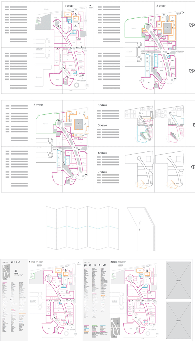
Trying to use our icons and pattern on the cover.
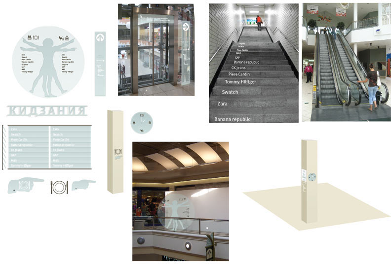
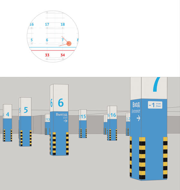
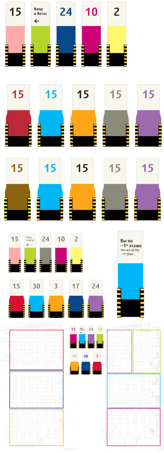
Getting back to the parking lot. Now we get the chance to visit it and see how our sketches would look. It is clear that digits will work much better than drawings: using them removes the connection with icons used in the interior. We also need to decide how to demonstrate the color scheme to visitors. Sure, circles look nice, but they can be difficult to understand.
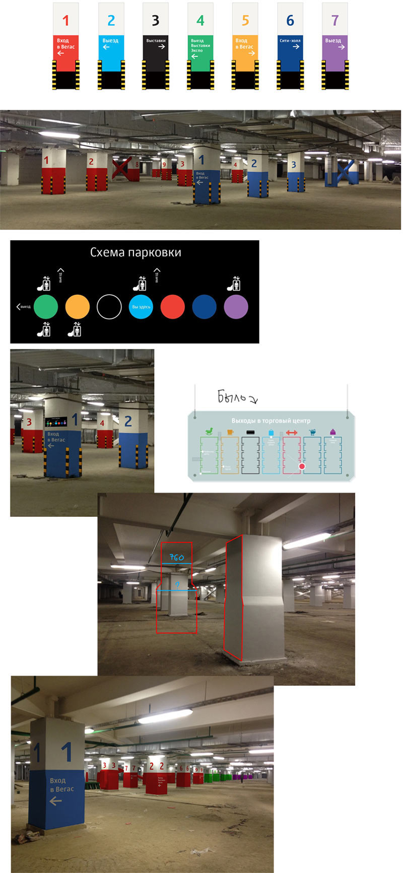
Working on graphics, clarifying the colors and the number of zones. Deciding to make four zones on each level. We also need to show the client the proper way to paint the columns.
Working on the graphics for the gates.
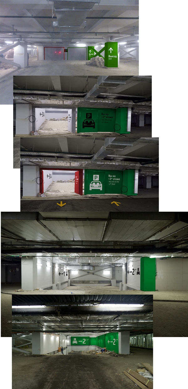
When visitors go down to the parkade, they need to know which level to go to. Using a parking stand to show the levels.
Finalizing the column colors.
Searching for a way to show the exits.
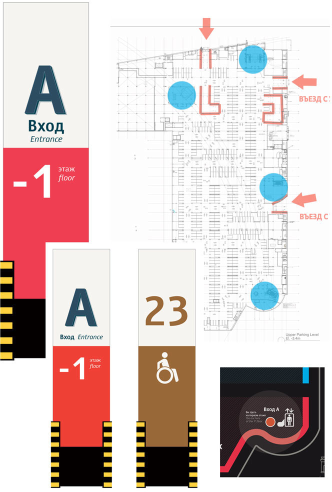
Outside we need to show the directions not only to the shopping center itself, but also to the surrounding objects and exits. Trying to use our route idea.
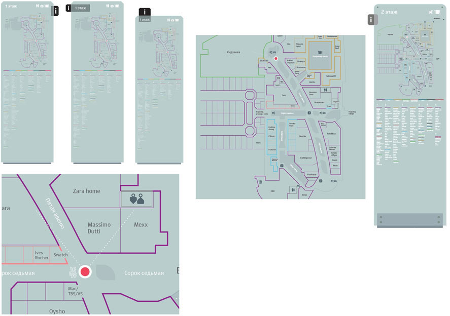
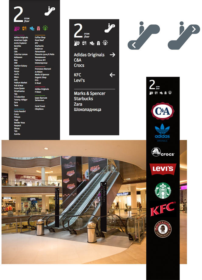
Going back inside. Checking out the escalator stands. They can also be used as anchors for tenant logos. To make sure visitors don’t have to go up and down the floors looking for the right shop, we will tell what stores are located where beforehand.
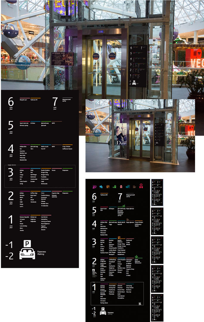
Deciding how elevator panels will look.
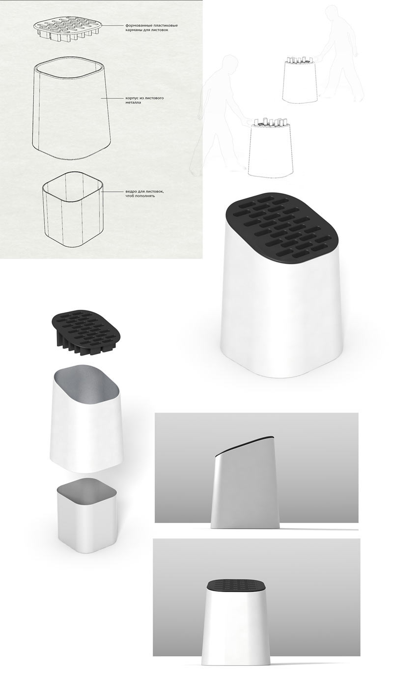
We need to find a solution for the booklets. Adding pockets to stands won’t look too well. We’d like to find an entirely new type of stand for the booklets. Asking the technical designer to help us out with the drafts.
It’s high time to move from pictures to real-life mock-ups. The client manufactures a mock-up of a stand. Looking at the height of the structure, choosing a position relative to architectural elements.
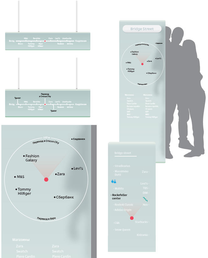
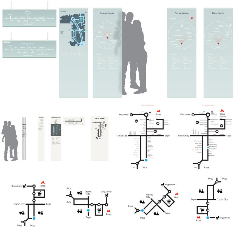
Seeing the entire mall from inside gives us a temptation to make everything simpler. The space already looks familiar and understandable. It’s important to see the space the way it is seen by a person who comes to Vegas for the first time. Some prefer using a map, others like hanging signs. Younger visitors will enjoy using the radar.
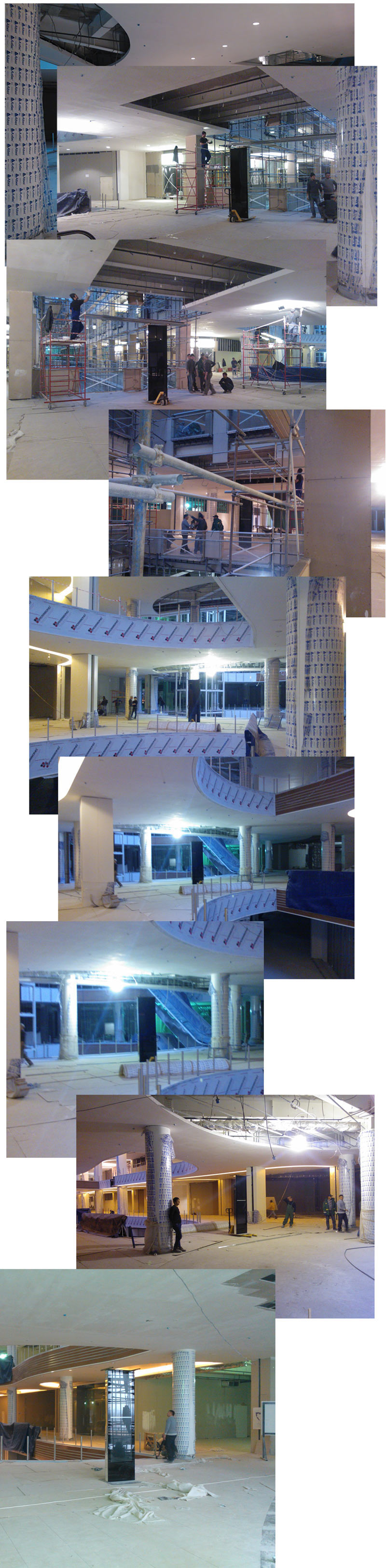
Making measurements, then going to Vegas-1 to see how often and when people use elevators, what they look for, how they behave and if they use stairs at all. Also deciding on the height of structures.
Calculating, making adjustments and trying the updated elements again. For those looking for a specific shop the client has installed interactive navigation systems, so we don’t have to worry about specific search. What’s important for us is to give the visitors an idea of the space and location of categories of products. Many people come to a shopping mall simply to walk and relax.
As for navigation media, we now have a map, a radar and column route maps. The client asks to work on hanging sings as well, since it’s not possible to install stands everywhere. Deciding that each console will point in only one direction.
Simultaneously experimenting with the legend and with showing the adjacent territory of Crocus City Mall.
Evolution of the radar:

We are nearing the finish line. All that’s left is to draw the missing graphic elements, distribute service area pictograms and start making corrections sent by the proofreader.
The artistic director asks to add index to digits on columns, change the color of the pattern to make sure it doesn’t look like a Soviet spelling book and to highlight passages on the map.
We also need to make adjustments to the consoles: we decided to replace the text with icons, this way the structure will be more compact and the information will be easily read. Preparing the location plan as well.
Introducing many more corrections from the editor, the art director and the client, preparing a large guidebook and sending the files for printing.

Order a design...